With Mooreland House, Hacin Flexes Its Bostonian Pride
The hometown firm crafts a visual identity and interior vision for a 1920s-era social house that’s embarking on its next chapter as modern and locally-evocative condominiums.
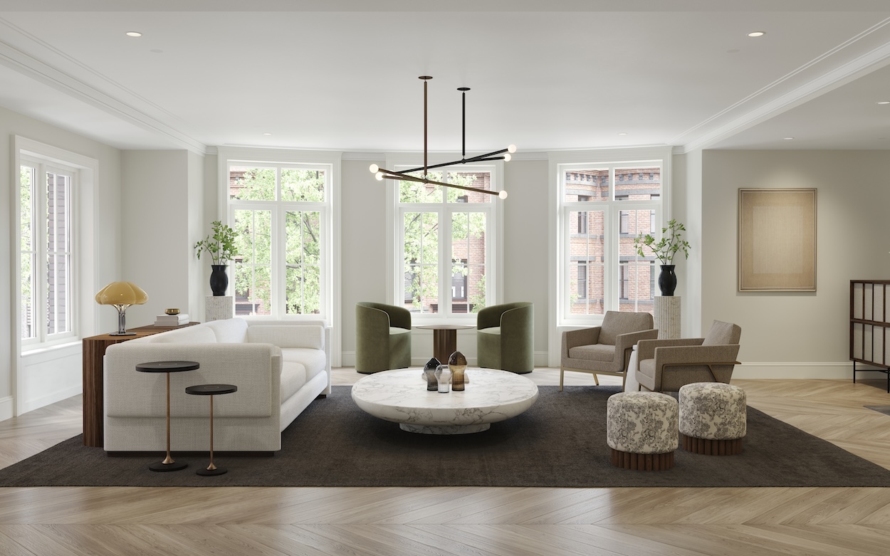
Mooreland House interior rendering. Credit all images): Courtesy of Hacin.…
Boston runs deep in the veins of Hacin, a South End–based design studio whose name has become synonymous with some of Boston’s most celebrated new residences and restaurants. This made the firm, helmed by longtime Bostonian David Hacin, a natural fit to help potential buyers visualize their lives in one of five dwellings in Mooreland House, Back Bay’s boutique condo development. The team, whose scope of work ranged from crafting a brand identity and marketing plan to interior renderings and architectural preservation, found themselves particularly inspired by the property’s raucous 1920s roots as a social house. They channeled that history into a vision that blends the heritage of its Commonwealth Avenue location with Back Bay traditionalism and a dash of youthful daring.
Below, we take a closer look with president and creative director David Hacin, visual design associate Emily Neumann, senior interiors designer Kim Boutwell, and senior architecture associate Eduardo Serrate.
David Hacin: As with many of our projects in historic districts, the larger vision was about marrying the past and present, the traditional and modern. Reaching back into the history of the Back Bay to understand the era’s spirit and character, especially as it related to this building as a neighborhood social club, proved to be a rich source of inspiration. With all of our residential projects, we hope to build a community and create amenities and an identity that future residents can appreciate and relate to. At the Mooreland House, we reference the architecture and landscape of the Commonwealth Avenue Mall.
What colors and materials are central to the visual identity?
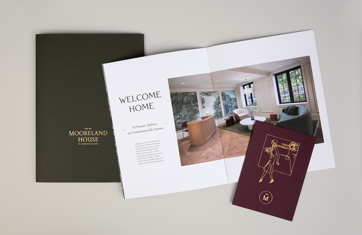
Emily Neumann: The Mooreland House’s color palette was inspired by the building’s 1920s origins and clothing dyes popular during that period. The primary color tone is the darker, loden green, balanced with a natural tone, along with wine and gold foiled accents. Because our team and our collaborative process is interdisciplinary, we aim for cohesion across identity, interiors, and architecture. As a result, the [visual] identity and material palette are linked. Our identity palette determined many of the textures and material selections for furniture and finishes, and influenced the renderings of interiors. Every accessory and material was relative to the identity intent for color and material.
Mooreland House brand identity. …
References of inspiration:
E.N: The original building was built in 1925 and was a social house for male alumni of various Boston-area institutions. For more than three decades, it was home to young gentlemen with newfound independence and we thought it was an interesting starting point. We asked ourselves, what was the energy like in this place, with these residents, in the 1920s, ‘30s, and ‘40s? What were people wearing, doing, and listening to? Because we’re creating an identity and place that is contemporary, with an eye to appeal to a buyer who is looking for a classic Back Bay home, we wanted to blend these ideas in a balanced way.
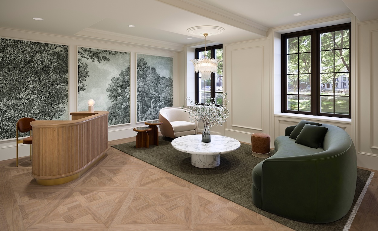
Kim Boutwell: The history of the 1925 building and its Back Bay location played a part in creating the Mooreland House’s design and identity. We found balance and harmony by creating a contemporary foundational design infused with classic details and period references to add soul and character. When designing the lobby, we were able to showcase this approach through the custom tree mural (evocative of the foliage along the Commonwealth Avenue Mall), custom parquet oak floors, a vintage Murano glass chandelier, and furniture, finishes, and fabrics that nod to the 1920s-’40s.
Favorite Detail:
K.B: The Murano glass chandeliers we used in the lobby and the penthouse dining room renderings. We sourced these from Barovier & Toso and love how their style and materiality represent their respective periods, and how they infuse a sense of time and place into the new design. They also add visual interest, texture, and sparkle, drawing you into the room.
Eduardo Serrate: The front façade on Commonwealth Avenue is made of cast stone, as opposed to limestone, which would be more expected in Back Bay. This was a modern decision, but we liked that it aligns with the other aspects of the history of the building, which is about youth and transition.
E.N: A favorite feature of the visual identity was the illustrative nod to Commonwealth Avenue’s tree-lined mall, represented by an adapted etching used on the interior of the folder system, and a matching booklet cover. Part of the creative brief was to reference the trees here, which are specific to this Back Bay location. The graphic found its way into the interior rendering for the lobby, shown as a wall mural, and we’re excited to see the vision realized when the building is complete.
Next project on the horizon:
D.H: We’re excited about the possibility of also redeveloping the neighboring Ayer Mansion, which was designed by Louis Comfort Tiffany and home to some colorful Bostonians who liked to buck the trends of the era with their own style. That sense of being a bit revolutionary spoke to us and we hope that future residents of Mooreland House carry on that spirit as we do here at Hacin. We like to party, too!
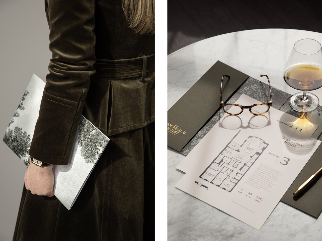
Credits: The project is being developed by CNW Capital Partners and Sea-Dar Real Estate and the project’s general contractor is Sea-Dar Construction. Units in the building are currently available for sale exclusively through Campion & Company. You can learn more about the property at www.themoorelandhouse.com.