Today’s tuned-in consumers are looking for experiences everywhere, and Rafael Prieto knows it. The founder and creative director of Savvy Studio—an architecture and branding practice based in New York and Mexico City—believes that effective brand-building requires a holistic approach to attract such attuned clientele. Savvy will devise everything from a business’s typefaces to its interiors, and boasts a range of impressed clients, from cafes and fashion labels to bookstores and galleries. “We don’t want to put out a pretty image—we’re aiming to create a relevant and solid concept that will connect with people,” he says. Surface spoke with Prieto about the intersection of branding and architecture, authentic storytelling, and more.
At Savvy Studio, Branding and Architecture Go Hand in Hand
Having devised spaces and identities for fashion labels and bookstores alike, founder Rafael Prieto champions a holistic approach—and design-forward clientele can’t get enough.
BY SURFACE October 21, 2020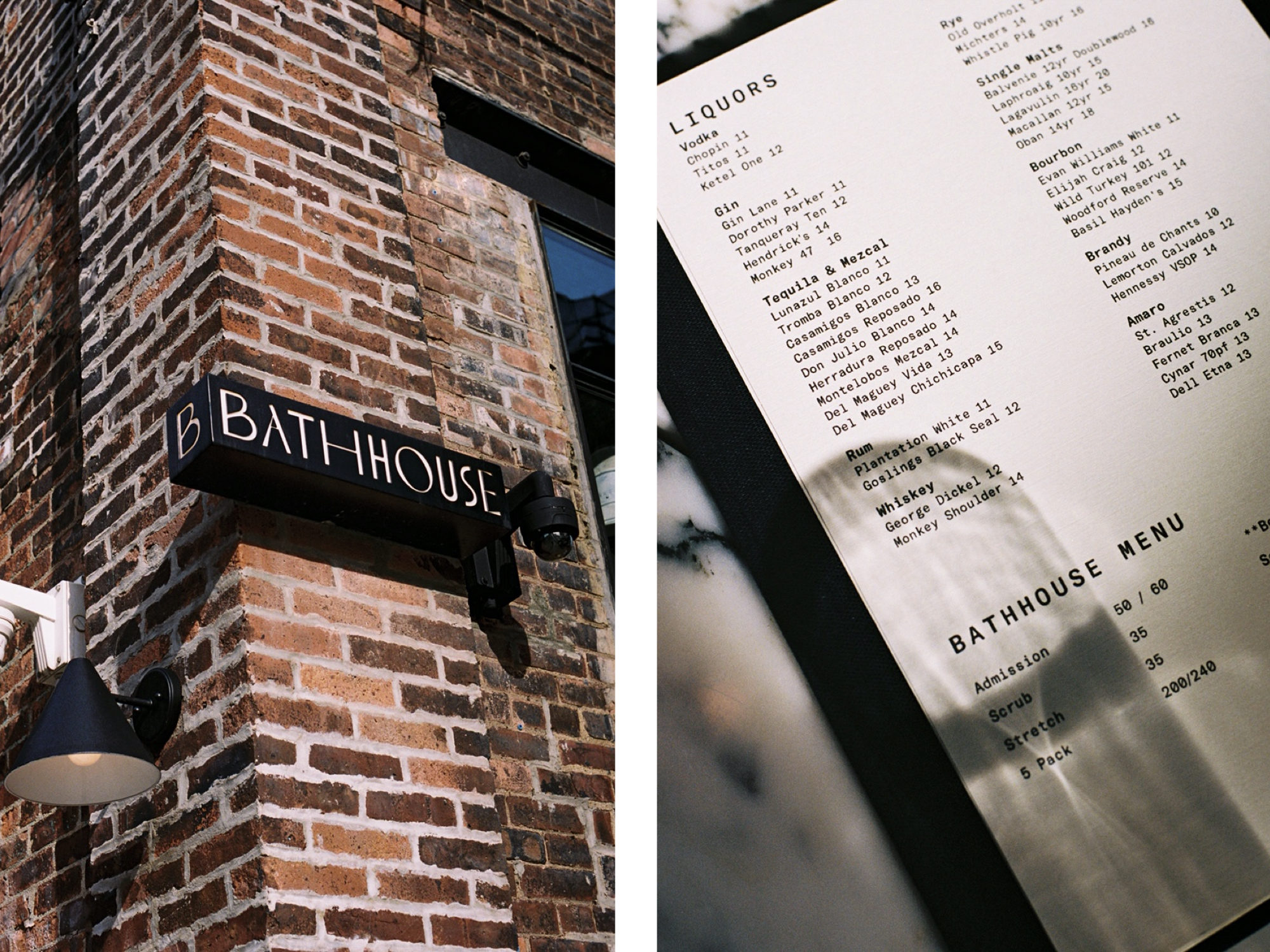
Savvy Studio has such a wide range of clients, from cafes to magazines to a chocolate company. How do you approach such different projects? Are there any common threads, even with such different clients?
We work in very different fields, and we like it—subjects, context, and concepts change constantly, which keeps the studio challenged and learning. The common thread is our process. We’re founded in research and culture, and that’s how we approach every project, regardless of the industry. There’s always a cultural impact and provenance on each project, and we like to find out about it and embrace it as much as we can. Afterwards, we start to get creatively and probably emotionally involved with developing the concept, and translating the knowledge into the overall brand or design of space.
The practice is based in both New York and Mexico City. How do you straddle both locations, and do they work together or separately?
My business partner, Bernardo Dominquez, leads the studio in Mexico. Both studios have their own team and we work on some projects together—it depends on the technique required and who on the team is the right fit. We embrace a constant cultural exchange. It’s good for the studio since we have great designers from different countries and with different specialties, which creates good dialogue.
Savvy Studio definitely isn’t conventional or staid in its approach. How do you bring feelings of modernity to your projects?
We’re in this constant practice of exploration and experimentation. Our work is very based on arts, like music, painting, contemporary, performance, and poetry… That’s what inspires and stimulates me. The process of how a big concept gets translated into one piece—a painting, and installation, a photo—makes me extremely curious.
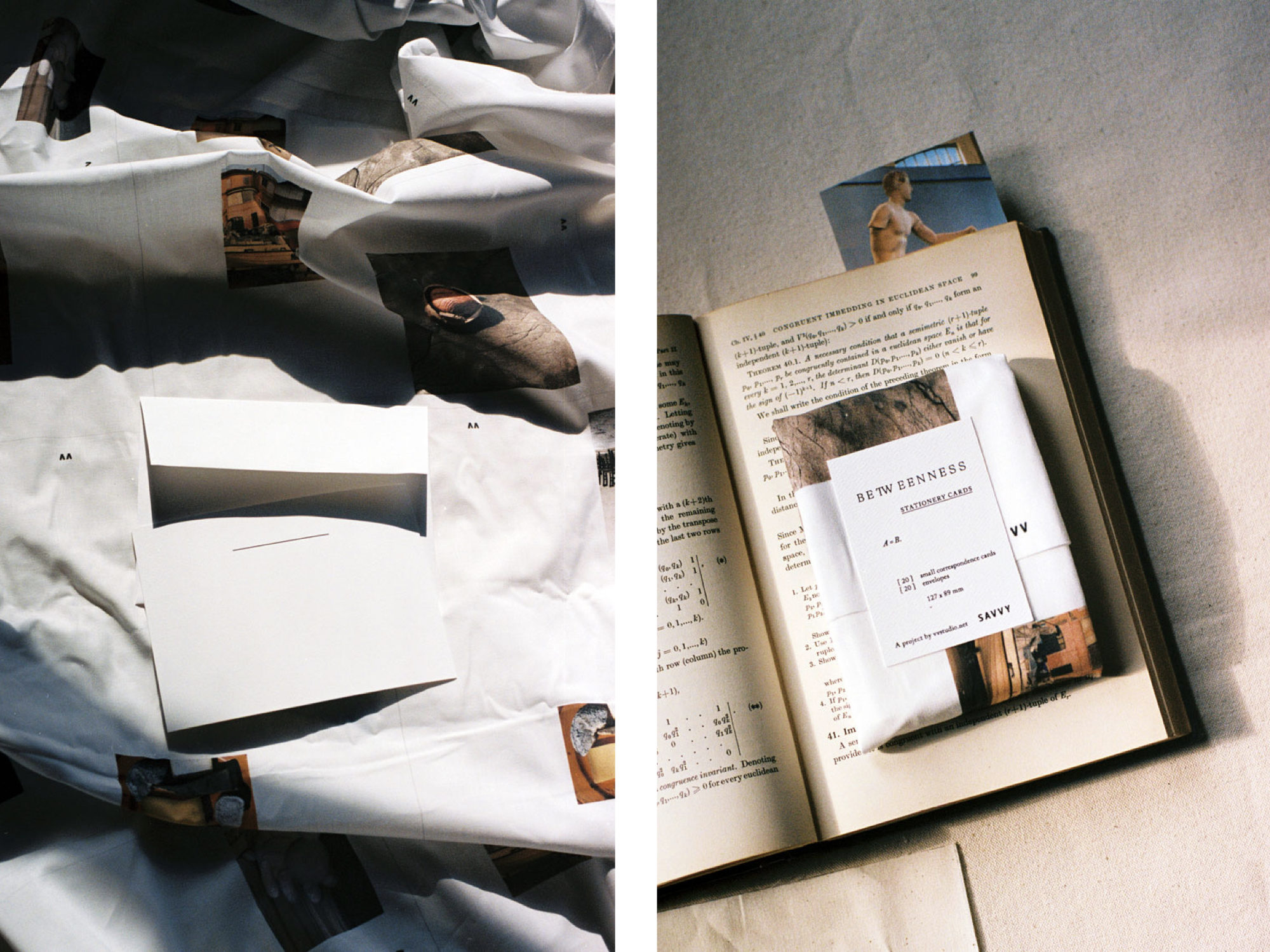
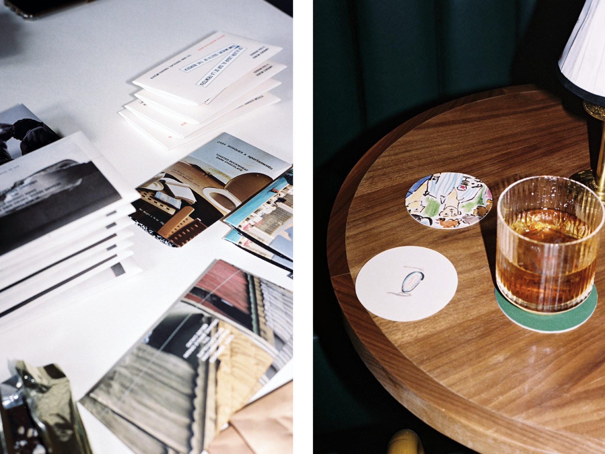
After establishing the foundations of the concept and its culture, we start exploring ways to make it visually interesting, relevant, and real. We use a lot of techniques—we do many logos by hand, and we print on fabrics and different papers to acquire personality and texture. It’s a constant experimentation to create personal output, then get it back into digital and make it work. We like the merge between craftsmanship and innovation, and being able to make projects feel real in the digital world.
I noticed that “Branding and Architecture” is one piece of Savvy Studio’s process. How do these two seemingly different things go hand in hand?
It’s all about an experiential concept. Everything is an experience visually, conversationally, emotionally in all senses. I like to be present and perceptive of spaces and moments, and that’s what interests our practice: to work on creating a whole experience and define all those moments of interaction between both the maker and who’s meant to enjoy it.
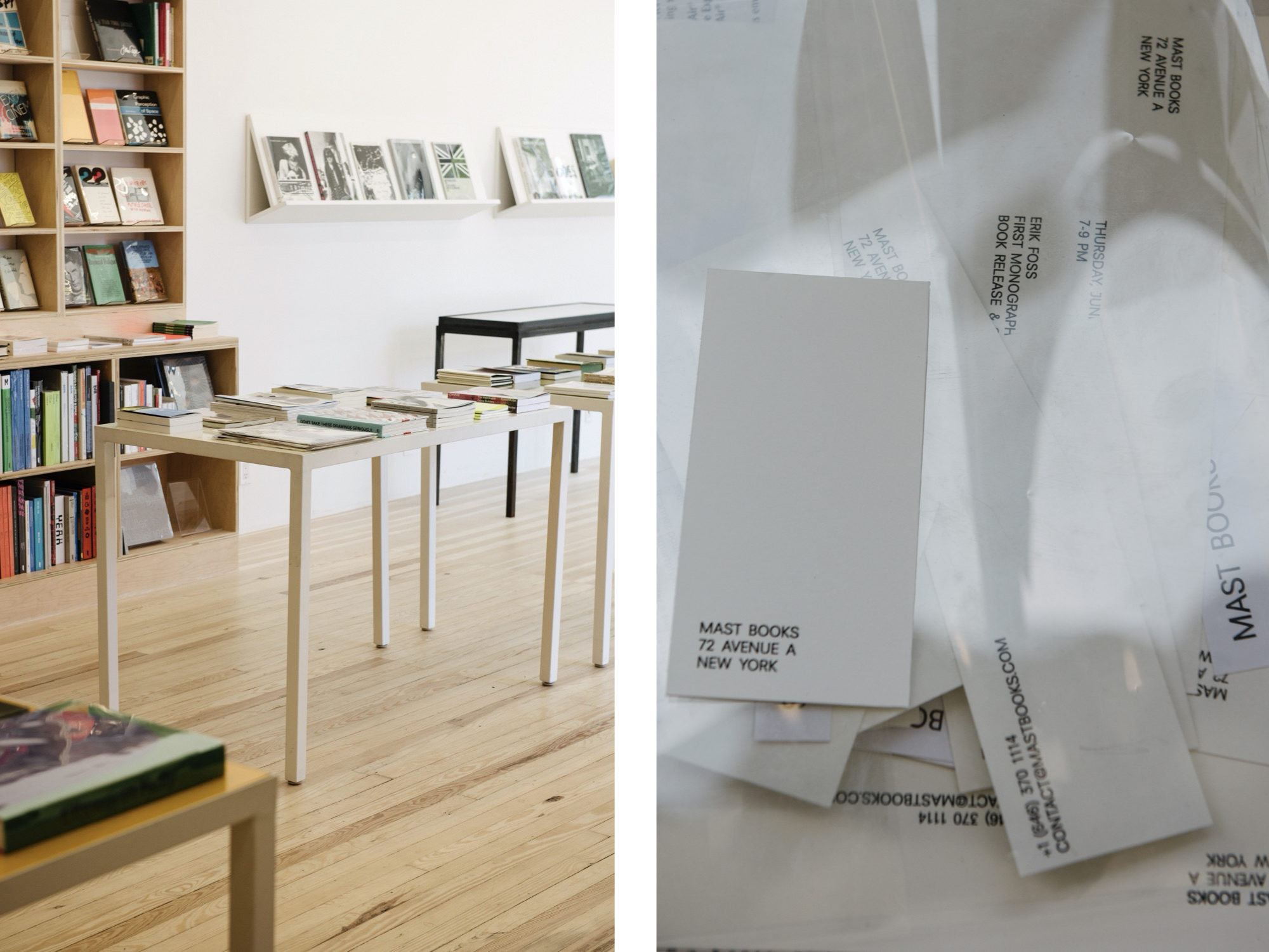
We worked with Mast Books in Manhattan, which has become known as an institution of art books. They were moving into a larger store, so we helped recreate the whole experience of the original bookshop by working on the brand and space. By finding the right typefaces and materials, we wanted to keep the original space’s spirit—to not intimidate anyone by the change and make everyone feel included. It all comes together when you look at it. The subtlety works between the identity, the stationery, and its communication with the space and the layout, the way books are now displayed with more tranquility for the viewer.
Is there a project you worked on in the past year that you really loved? Perhaps one that pushed the boundaries of Savvy Studio to new heights?
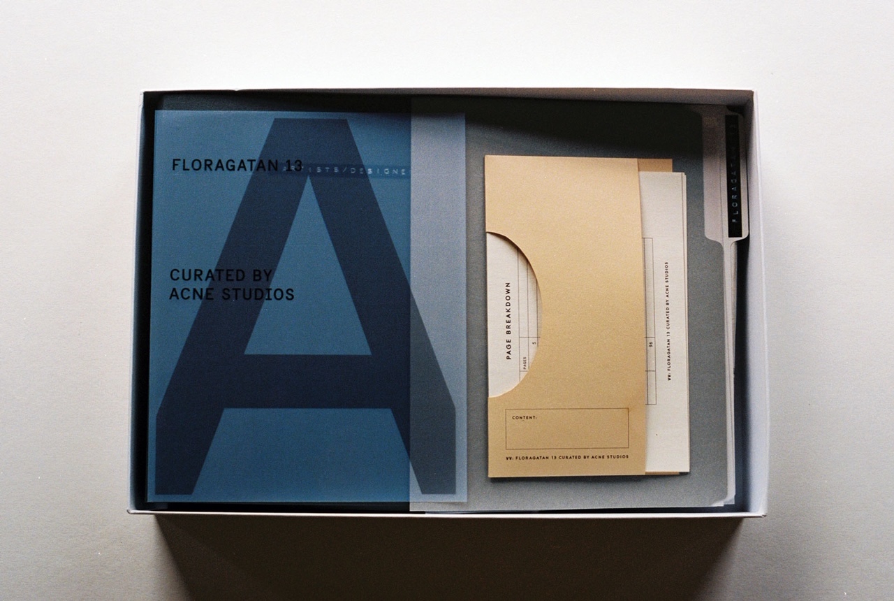
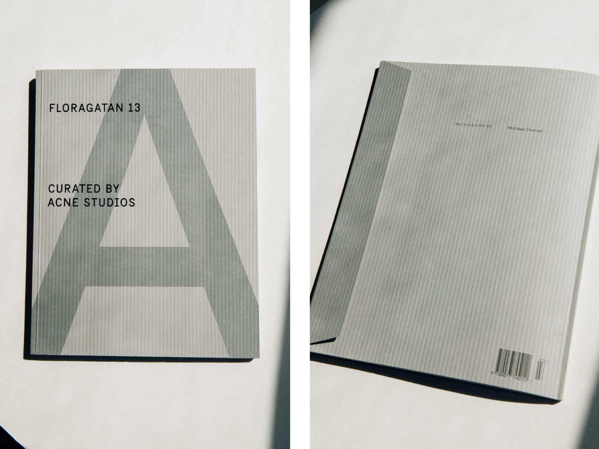
I really love all of them, yet if I were to choose, maybe the publication we did in collaboration with A Magazine curated by Acne Studios. The magazine is a document based on a building Acne Studios acquired and renovated into their headquarters. It’s the former Czech Embassy, and it’s beautiful and architecturally relevant, designed by the brutalist architect Jan Bočan. The magazine is structured to showcase the process of Acne—how they work and how each floor is a different department. It becomes a very intimate document, and was shot by the great photographer Philippe Chancel. Here, we applied our usual process to understand the building history. We analyzed the aesthetics from the architect, then translated them into a publication to reflect Acne’s progressiveness while paying homage to the building.
Savvy Studio is a member of The List , the destination for all things Surface -approved. Want to join The List ? Contact our team to find out how to apply.
