25 Designers On Their Favorite American Designs
To celebrate the nation's birthday we asked some of our favorite designers to pay tribute to American design.
BY THE EDITORS July 3, 2019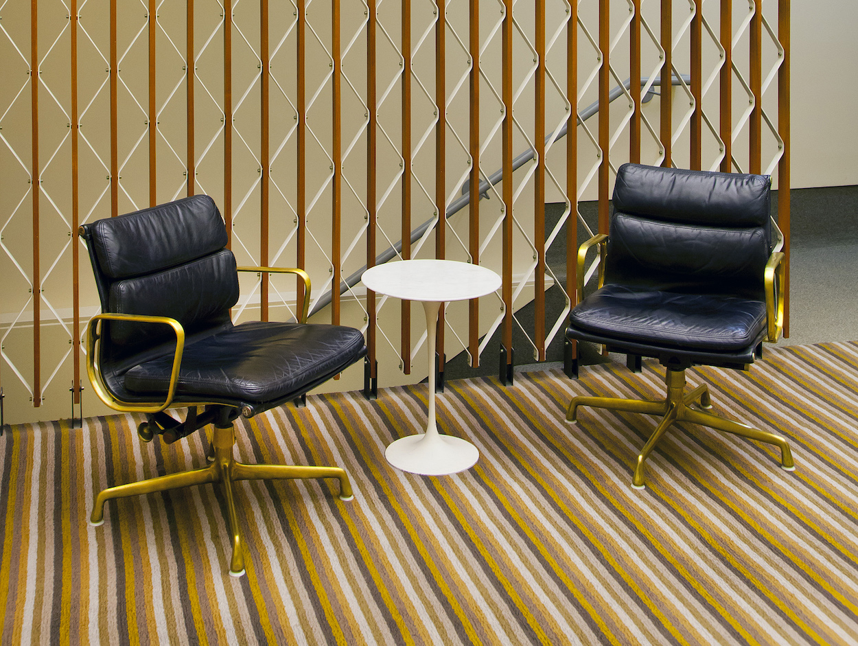
“I love when an idea can be translated into a range of material options and retain the sovereignty of its original design intent. A compelling example of this rigor can be found in a customized suite of furniture inside the American industrialist J.I. Miller’s private office in Columbus, Indiana. These now-classic Soft Pad chairs were designed by Charles and Ray Eames, produced by Herman Miller, and then later customized by Alexander Girard as unique, polished-bronze variations for this discerning client. Personalizing an idea to this extent is exciting and feels wonderfully American.” —Jonathan Nesci, Columbus, Indiana
“I am always writing notes and making little sketches. Since I don’t always wear jackets, the compact size of the Fisher Space Pen allows me to always have it in my pocket. Developed for NASA as part of the Apollo space program in the late 1960s, the ink cartridge is pressurized to work in outer space, so you don’t need a flat, horizontal surface to write with it. The shape is also a bit like a Japanese ‘worry stone,’ so as an object it is something nice to touch.”—Jeffrey Bernett, New York City
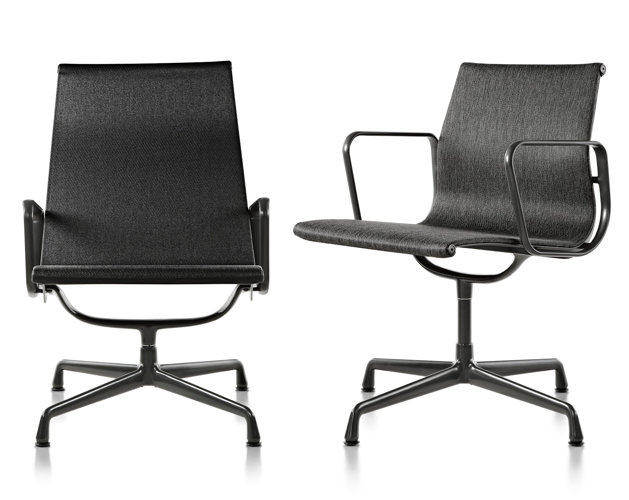
“The Herman Miller Eames Aluminum Group management chair is the only piece of American design in my home. Its comfort and lines are perfection, and it’s proven to be timeless. It is just so perfect. To this day I can’t get enough of it. It makes me want to run my hands over each and every part.” —Felicia Ferrone, Chicago
“For rare books and manuscripts by Gordon Bunshaft, the Beinecke Library at Yale University has to be one of my enduring favorite examples of American design. Conceptually, materially, and visually, it’s a distilled design that exemplifies what we strive for: to find a poetic solution to every design problem. Designed as an imposing jewel box, the building shields and displays its precious contents by filtering light through a facade of marble panels, amplifying the experience of entering a magical space where one finds precious things. A marvelous example of finding the solution within the problem.” —Suchi Reddy, New York City
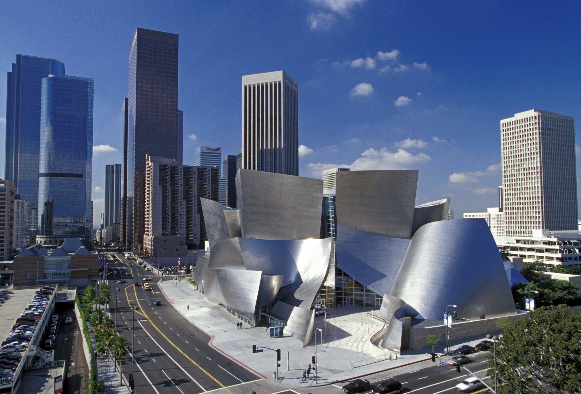
“Who wouldn’t love a spontaneous moment turned into architecture housing beautiful music night after night? The contrast of the reflective, slick, stainless skin exterior with the warm Douglas fir and oak interior in Frank Gehry’s Disney Concert Hall in Los Angeles is masterful. The exuberant shape, the luscious stainless-steel shell, outstanding acoustics, and truly theatrical experience created for the patron are all exceptional. And, of course, Walt Disney was also an American icon!” —Lauren Rottet, Houston, Texas
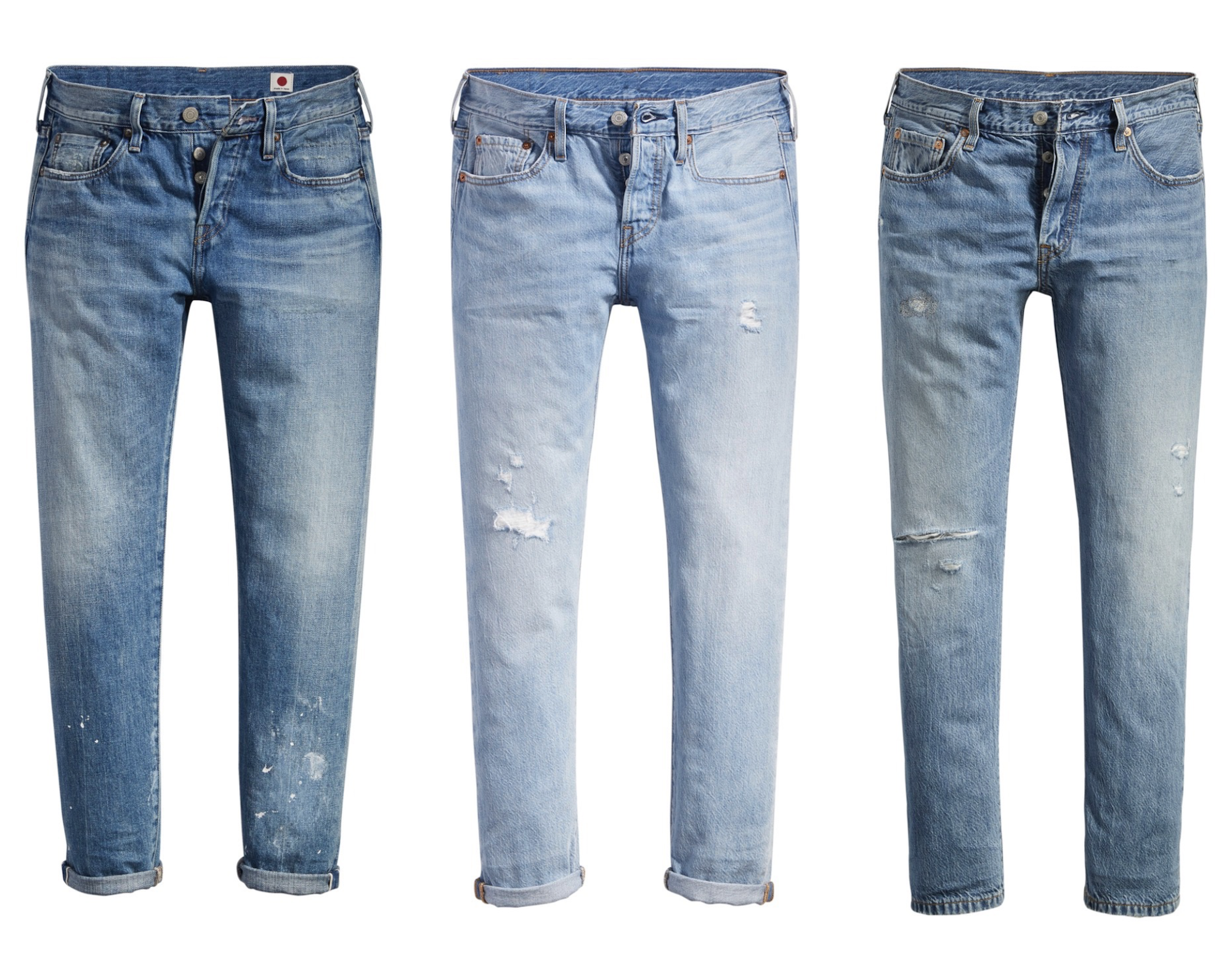
“A pair of Levi’s 501 Jeans epitomizes American design for its roots in utility, its universality of cool across ages, its pocket size, and its continual evolution in fit and finish over time. They are hard-wearing, get better with age, and adapt to the times and tastes of an era. And anyone can wear them—whether you’re a skater, a denim head, a florist, or a banker.” —Jou-Yie Chou, Brooklyn

“The Jeep Wrangler is an undeniable piece of Americana. It’s as recognizable as the Nike swoosh or the original Coca-Cola bottle. Dwight D. Eisenhower arrived in Paris in a Jeep; George S. Patton stormed a route through Europe, leaning his elbows across the top of the windshield, to steady his binoculars. The Jeep became an image of freedom, American grit, and straightforward engineering attitude.” —Aaron Schiller, New York City
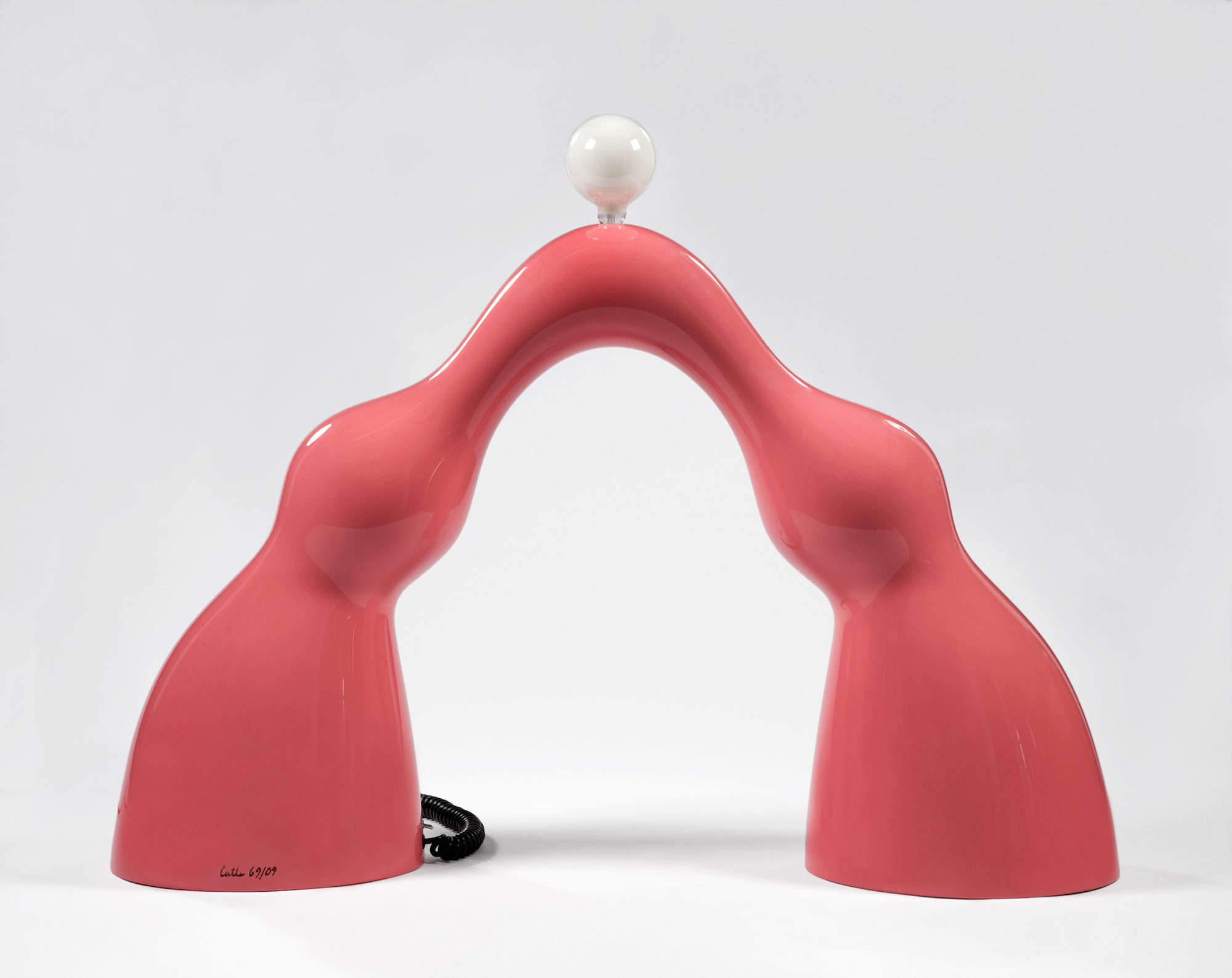
“The father of American art furniture, Wendell Castle was a sculptor who chose furniture as his medium of functional art. This resonates with my belief of creating architecture and design in voluptuous forms. As there are no straight lines in the body, my art reflects this beautiful form. When I see Castle’s work, his curves and sensual lines becomes the microcosm of the lines in the human body.” —Gulla Jónsdóttir, Los Angeles
“I think the Fender Precision bass guitar might be my favorite. I started taking bass lessons in 2002 and eventually got a 2005 Fender Precision bass in black. Every aspect of the design is so well considered and crafted, it always brings a smile to my face. My favorite detail on that model is how the strings are threaded through the back of the body. 1960s Selmer Tenor Saxophones are also incredibly beautiful to me, though I don’t have one … yet.” —Oliver Haslegrave, Brooklyn
”The Sears Plastic Refuse Container (1970) by Charles Harrison is unremarkable, minimal, and clunky. The efficiency of its manufacturing seems more important than the product itself. Designed in a period dominated by Sears-Roebuck—where COGs trumped any obligation to style, history, or innovation—it was developed free of expectation and pretension: instead, it’s just banal simplicity.” —David Weeks, New York City

“One of my favorite things I’ve seen recently is the “Retold” series by Dana Barnes. She uses traditionally patterned Persian rugs as her foundation, then ‘paints’ on them by weaving loose fibers into the existing rug. The resulting pieces are a beautiful combination of two-dimensional imagery with the texture, depth, and materiality of a three-dimensional object. They’re truly stunning.” —Bec Brittain, New York City

“The Avanti was produced by Studebaker from 1962 to 1963, and created by the American designer Raymond Loewy. I thought of this because cars and diners go so well together, and of all American cars, this one has the coolest attitude. I like its sleek lines and tapering contours. It is sexy but not vulgar—which is how I tend to think of other American sports cars, like the Corvette and the Camaro.” —Alexandra Loew, Los Angeles
“Within a relatively restrained and typical restaurant layout, Warren Platner uses a succession of lines to an intricate effect at the American Restaurant in Kansas City. The wood vectors fan out across the ceiling in a decorative pattern that incorporates lighting, producing an exuberant field overhead. What’s most interesting about this use of repetition, like in his eponymous wire frame chair, is that the atypically decorative environment transcends being attributed to an era. Banquette color aside, the interior feels timeless.” —Rafael de Cárdenas, New York City
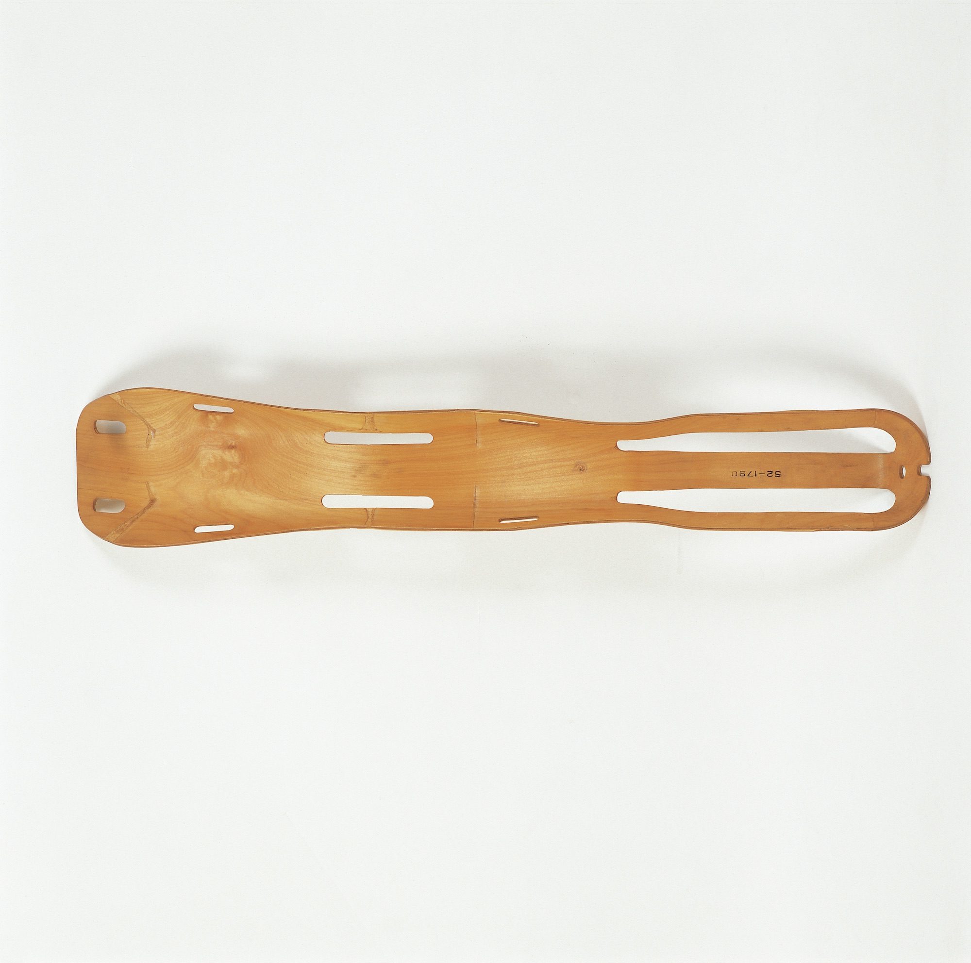
“With the Eames leg splint, designed in 1943, Charles and Ray Eames perfected the process of using resin and molded plywood that they later used for their iconic furniture. The leg splint is a utilitarian object that is also inherently beautiful. It hangs in our studio as a sculptural piece that is a daily reminder of our goal to blend utility, manufacturing techniques, and beauty.” —Jamie Iacoli, Seattle, Washington
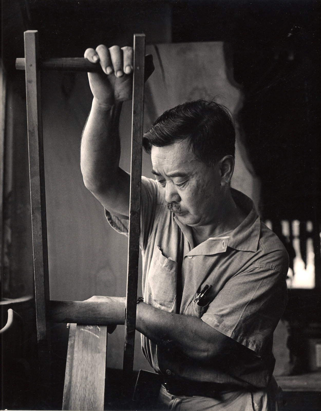
“One of my most beloved icons of American design is George Nakashima. I am inspired by his eloquent approach to design and sensitivity for working in tune with materials. George found beauty in the intellectually uncluttered and believes in craftsmanship—not only in the act of producing a better product, but for the sheer joy of making and exploring possibility.” —Brit Kleinman, Brooklyn
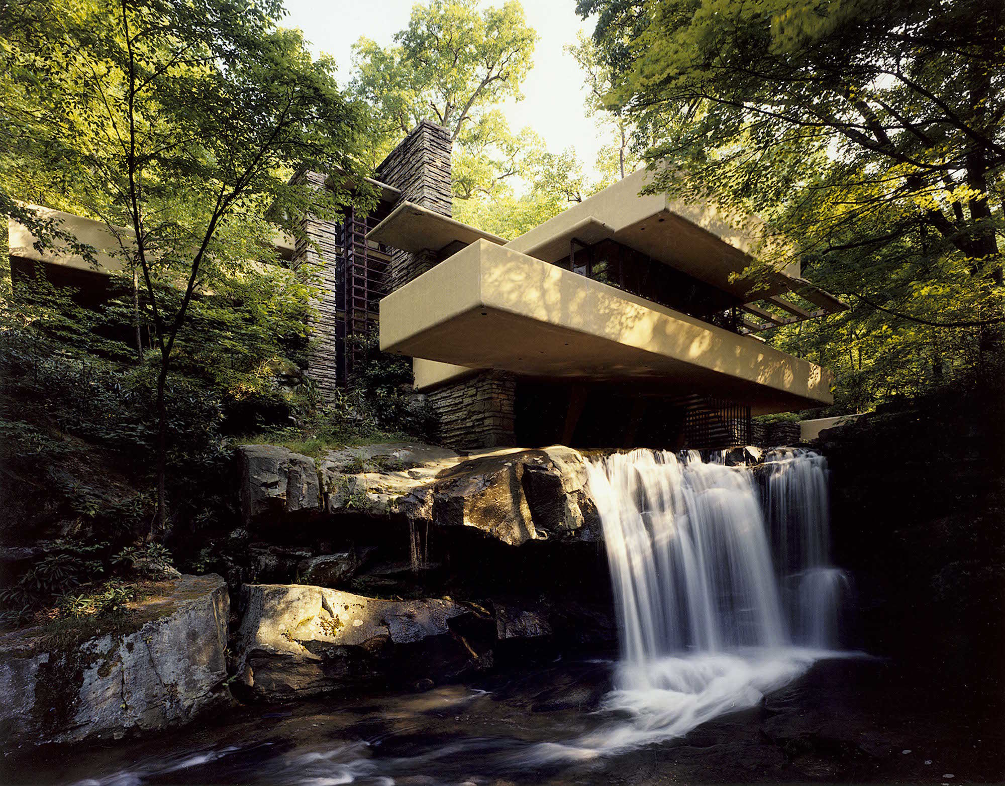
“My favorite piece of American design, as cliché as it may be, is Frank Lloyd Wright’s Fallingwater. The level of innovation, grandeur via simplicity, use of local materials, and enduring sovereignty certifies it as an architectural masterpiece. If I were to design a new home today, it would certainly be on my inspiration board—and it was designed 83 years ago!” —Jon Sherman, Brooklyn
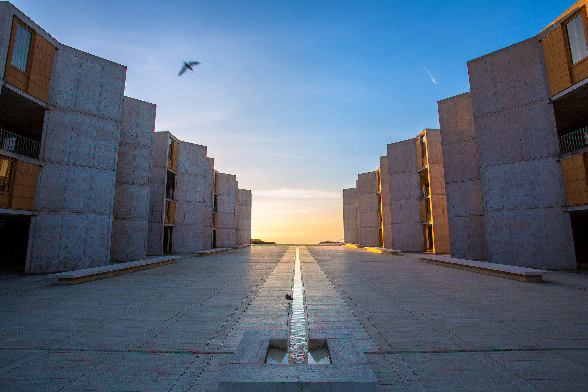
“One of my favorite American designs is Louis Kahn’s Salk Institute in La Jolla, California. It’s the inspiration for my Sunday table. I was immediately drawn by the institute’s bold yet peaceful spatial arrangement and its references to Brutalist architecture, Cubist paintings, and religious monasteries.” —Travis James, Brooklyn
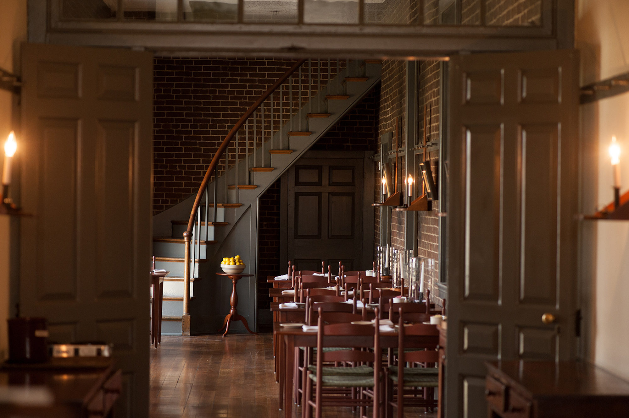
“I’m consistently inspired by the uniquely American aesthetic of the Shaker Village in Pleasant Hill, Kentucky. It is an exceptional example of stunning furniture and interiors. I love their early modernity, graphic lines, elegant proportions, and insistence on craft. That kind of simple elegance and functional practicality is something I strive for in my own work.” —Nicole Cota, New York City
“There’s something really special about the Golden Gate Bridge [in San Francisco]. From its massive size and incredible art deco details to its unmistakable red-orange color popping off an idyllic backdrop, I’m in awe every time I drive over it. I’ll never forget the first time I traversed its massive expanse via motorcycle and rode up into the Marin Headlands to look back down on it from a totally different, yet arguably even more impressive, vantage point to see it there, nestled in the morning fog.” —Gregory Buntain, Brooklyn

“My favorite piece of American design is the Willys MB WW11 Jeep. I own and drive two—one from 1949, and another from 1951. Both embody a kind of poetic, simple, and purposeful design that has functioned for many decades. It’s like a Shaker-designed war vehicle, if that’s not too much of a stretch.” —Tyler Hayes, Philadelphia
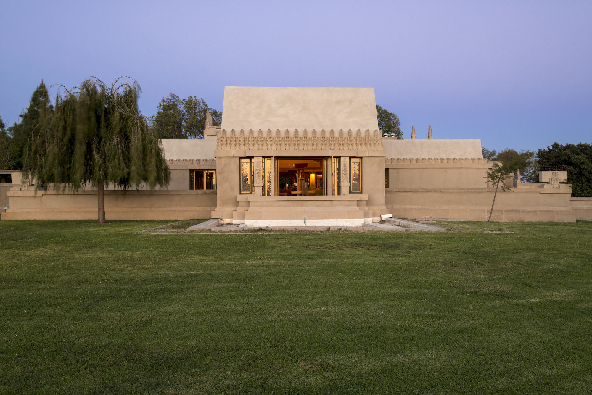
“I am sick of slop craft lump design, and also clean, round design. For that reason, I really like Frank Lloyd Wright’s Hollyhock house in L.A. The structure looks like he designed a prison, and then slapped on some art deco elements—an unapologetic synthesis of brutalism and deco. I find the weight, angles, and seriousness overwhelmingly refreshing. Also, I’m endeared by the ‘Mayan revival style’ it was designed in, which today would be an obvious faux pas.” —Katie Stout, Brooklyn
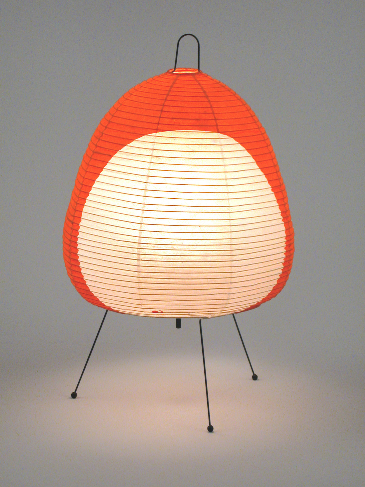
“Isamu Noguchi’s Akari light sculptures have a bold and quiet presence. There is something about them that feels vulnerable and rebellious at the same time. Maybe it is the modest materials combined with traditional Japanese craft techniques. The forms say so much without making a sound.” —Lindsey Adelman, New York City
“One of my favorite American buildings is the self-park garage on 60 East Lake Street in Chicago. The garage was designed by Stanley Tigerman and built in 1986. Besides the building itself, I enjoy the story behind it: The building could only have happened because of the exciting approach of the real-estate developer and the attitude of the architect. Apparently the developer wanted a garage that wouldn’t look like a garage and would complement the adjacent office tower. It was an open competition, to which Stanley Tigerman said he would win anyway! I enjoy it for the in-between qualities. The facade is humorous, narrative, and pop, but also sophisticated and classical. It is a statement of the post-modern American architecture in Chicago.” —Ania Jaworska, Chicago
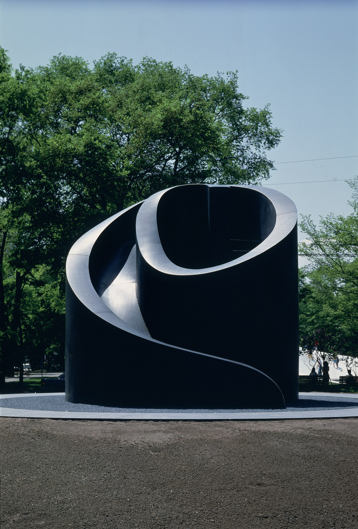
“What wraps up our multitudes? Garish mall culture? McGivery folk craft? Consumer glitz, or wide-open space? I was tempted to choose the Easy Bake Oven, because it’s so kitschy and a performance art piece; it also feels quant and domestic but simultaneously super vulgar. But I think I’ll go with Isamu Noguchi’s Slide Mantra, mainly because it’s the nicest thing in the world. It feels both like a shell with classic stairs, something hypnotic and fun, but also jarringly chic.” —Misha Kahn, Brooklyn
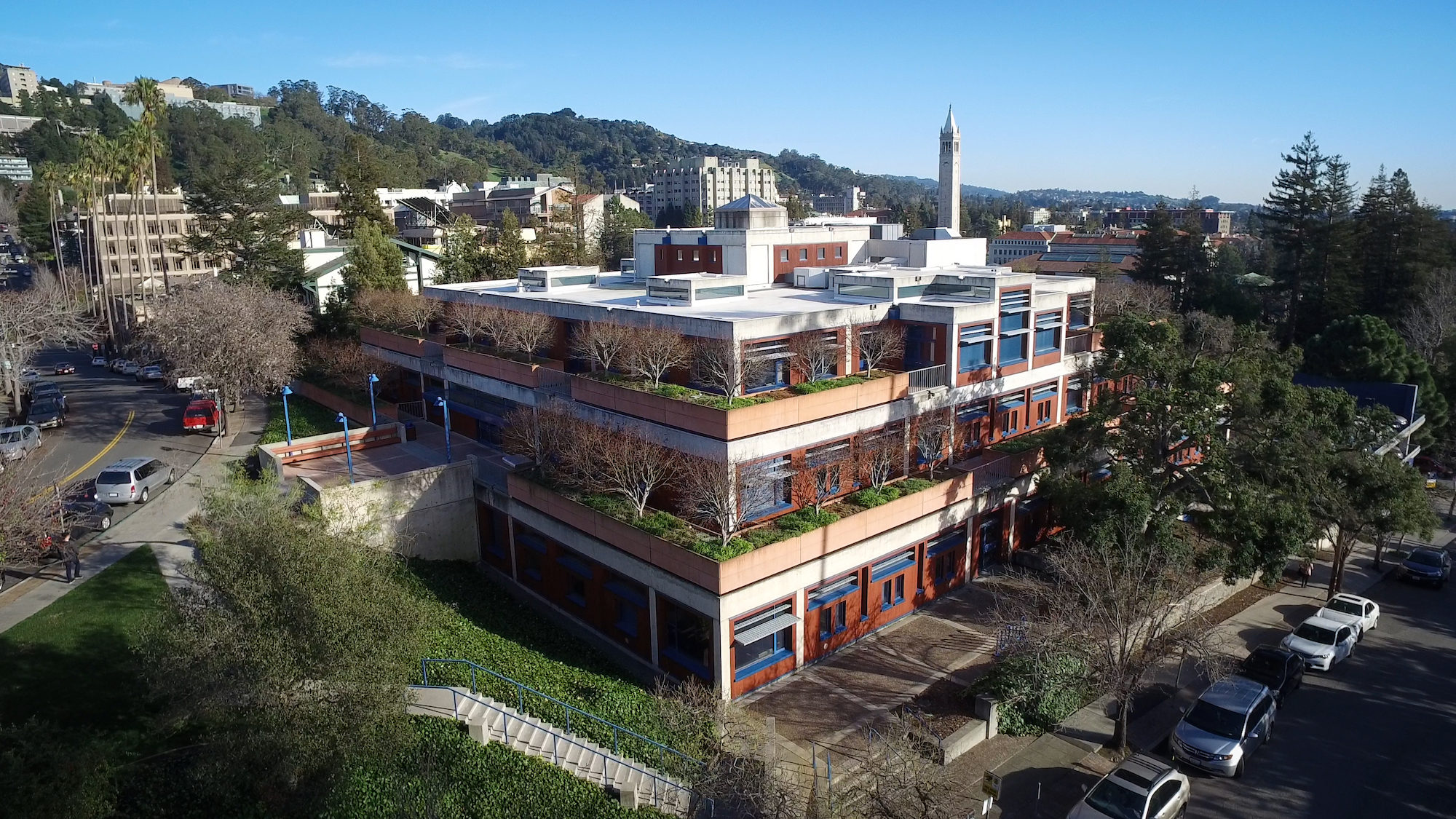
“One of my favorite buildings in America is the Flora Lamson Hewlett Library in Berkeley, California. The building immortalizes the legacy of architect Louis Kahn, as it was based on his preliminary designs of the building and drafted before his death in 1974. I’m particularly fascinated by the circular motif carried throughout the interior and exterior of the building’s architecture—especially the circular concrete windows that allow passers-by to peer into the library’s volumes from the atrium.” —Harry Nuriev, Brooklyn
