Restaurant designers continue to be punch drunk on the Pepto-Bismol tint known as Millennial Pink, as we’ve disdainfully noted. They are just one group among many wrapped up in this global embrace for all things ‘post-pretty’ as The Guardian describes this cultural shift towards “a way to be pretty while retaining your intellectual detachment.” But maybe we’ve been a little harsh on the color.
I understand the attraction, although I trace my affection for pink back to long before the first Millennial was born. My father worked for Technicolor in the early 1970s. Befitting their pioneering color processes for motion pictures, his bosses booked my Manhattanite parents and me into the Beverly Hills Hotel, making flamingo pink the first color in my memory bank. Originally white and now a more muted version of its 1948 makeover, when the hotel was washed in a distinctive blush to complement the California sunset, this currently controversial establishment is where my heart time travels upon seeing the color in any shade, from nature’s sun-kissed grapefruits and salmon sashimi to utterly artificial bubble gum hues splashed across everything in the Museum of Ice Cream.
Much has been written about the psychology of great restaurant interior design. Suffice it to say I think we can all use an extra jolt of sweetness these days, even better while breaking (gluten-free, for me) bread with friends in these restaurants with pink motifs.
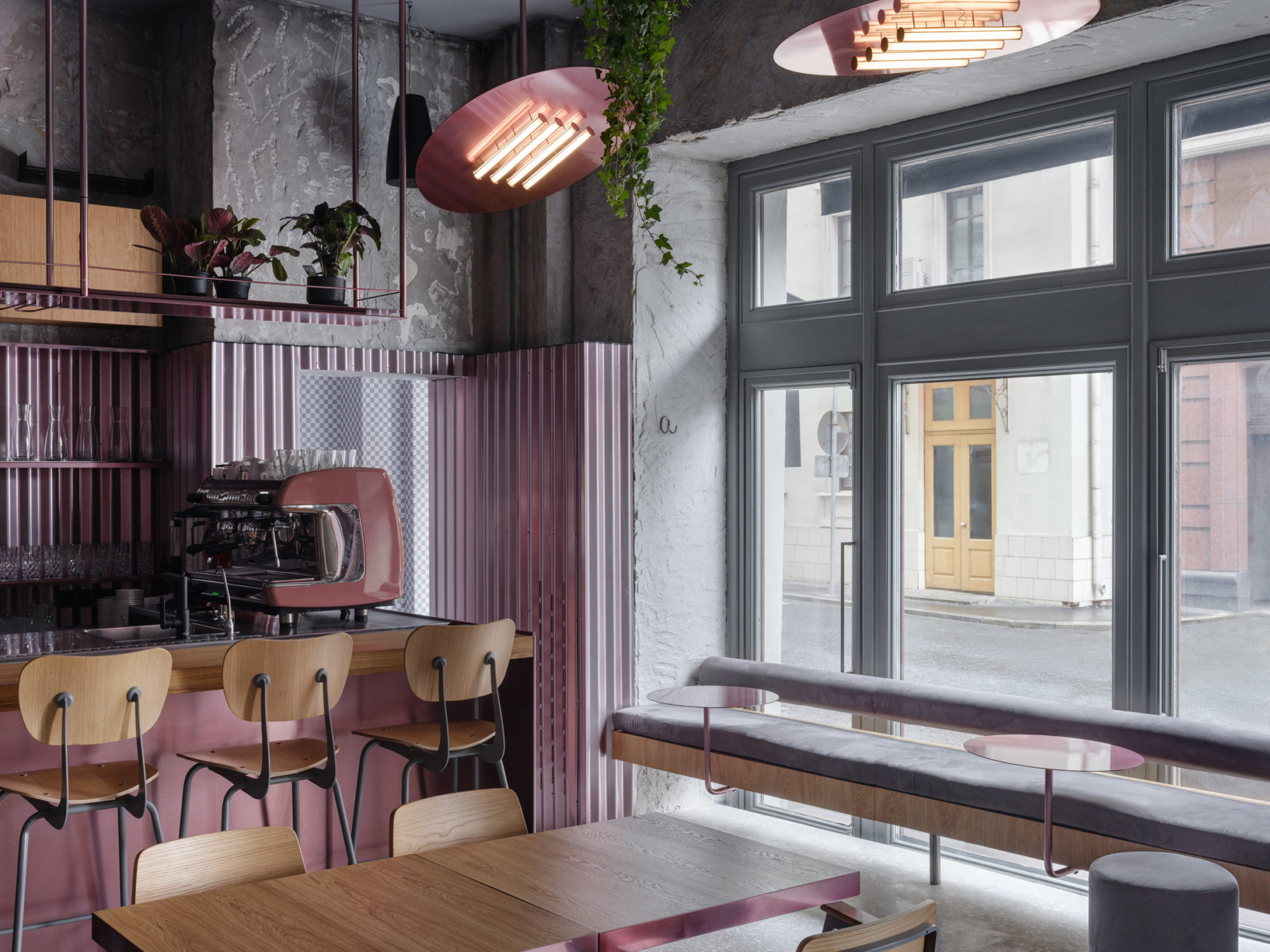
The Brooklyn-based, Russian architect Harry Nuriev and his Crosby Studios had Instagram on their minds when crafting the minimalist palette for this restaurant named for its meat-leaning menu in Moscow’s Milyutinskiy Pereulok neighborhood. The space is awash in raw concrete juxtaposed with metallic rose corrugated sheets, with oversized disc light fixtures that reference pastrami slices hanging from the ceiling. Even the gender-neutral bathrooms are on trend here, housed within two cylinders in a corner of the restaurant that Nuriev likens to art objects.


