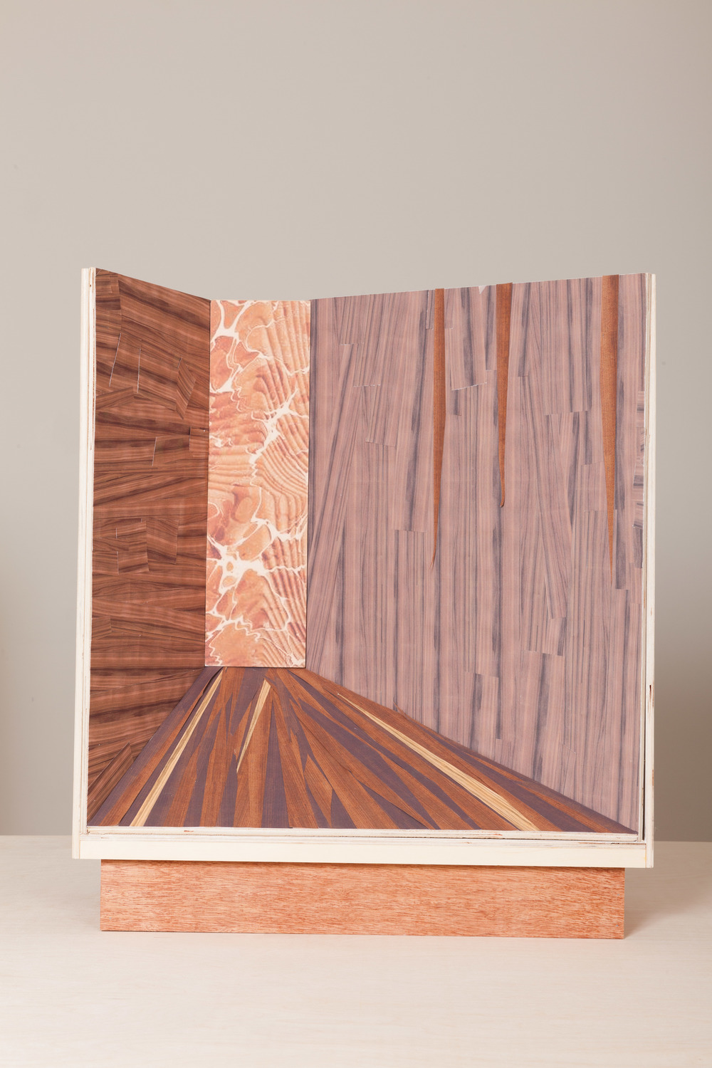
London-based Italian designer Martino Gamper, who for several years has sought to reinvent the corner as a valuable entity, knows this well. Gamer first produced a corner-friendly collection of furniture while studying at the Royal College of Art, and his interest in the subject has never waned. For a new collaboration with Prada, he experimented with adding dimensionality to the brand’s store windows. “My idea was to somehow create a kind of depth in a window, so when you look in it, it doesn’t feel so flat,” says Gamper, who sought to craft a distance architectural narrative that would still allow the display items to tell their own stories. After sketching several ideas, and integrating them with older ones, “Corners” came to fruition. Paying homage to the humble corner, the display vitrines are currently outfitting Prada’s stores worldwide. Different materials and textures will be incorporated into the designs, starting with the wood. “It suddenly made sense to me,” Gamper says, “to create something that was this focal point where everything meets.”
Design
Related Stories
A Sculpture for 65-Year-Old Single Malt Scotch Whisky
A Collectible Design Gallery Embarks Upon Its Next...
Printemps Welcomes Spring in New York City
Timed to NYCxDesign, Vitra’s Newest Showroom Will...
In Aspen, Scale-Model Vintage Racecars Sweep Into the...
Champagne Visionary Richard Geoffroy Applied His...
Ken Fulk Brings Floral Flair To The Interiors Of An...
House of Leon Looks to Milan For Their Fourth...
An Inside Look at Designing Le Veau d’Or
At the Standard’s Boutique Cutout in NYC,...
Next Article

