Madrid’s Boulevard Gran Vía has been called Spanish Broadway, but despite being a major shopping mecca and nightlife destination—and boasting some of the city’s best Art Deco and Art Nouveau architecture—it hasn’t housed top-notch accommodations for visitors. That is, until earlier this year, when the five-star Principal Madrid opened.
Created by Pau Guardans, the Spanish hotelier behind the Único Hotels group, the hotel is situated in a stately 1917 Spanish Renaissance corner building on the boulevard. The interior had been redone by Pilar Garcia-Neto, the head of the design department at Único, and by the interior design firm Studio Luzi. The location was the primary source of design inspiration, according to Garcia-Nieto. Of specific focus were the Gran Vía’s “history and splendor,” as well as the building itself. “We tried to make the best of the building,” he says, “so that architecture and the interior were perfectly integrated—not to evoke a 1917 decoration today, but to prevent the interior from being a stranger to the building.”
Reception, Bar, and Restaurant
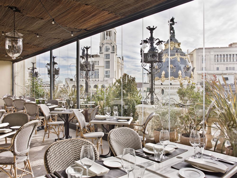
By locating the reception area in the ático—the sixth floor of the building—rather than on street level, Garcia-Neto and the team at Luzi sought to use an exciting and unexpected entrance, to create the feeling of a secret club. They also wanted to play with the notion of a hotel by smoothing the boundaries between traditionally singular spaces—lobby, restaurant, bar—to make a more holistic and cohesive experience. “The functionality of the furniture in the public spaces should be governed by versatility,” Garcia Nieto says. This means that the ático’s lounge area (the kind typically found in a hotel’s lobby) meld seamlessly into a bar, retaurant, and terrace (called La Pergola) on the same floor. “So while one guest is working and enjoying good music,” the designer says, “another next to him is enjoying a good cocktail or dinner.”
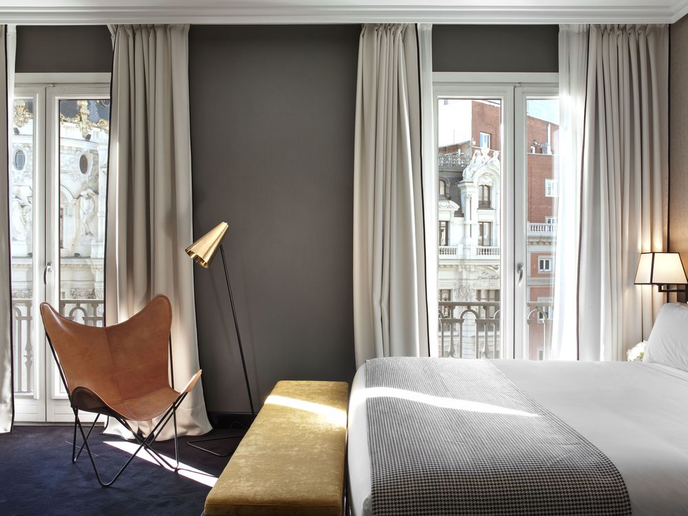
Keeping in line with the history of the building, Garcia-Nieto used materials like solid wood, leather, velvet, and Turkish carpets coupled with midcentury furniture—”all with a color palette that adds warmth and modernity,” he says.
Michelin-starred chef Ramón Freixa runs the restaurant (called Ático) and the bar (La Terraza). “La Terrazzo was our biggest challenge, because we wanted the outdoor space to be spectacular and maintain a luxury philosophy,” Garcia-Nieto says. “And because Spain is a Mediterranean and passionate country, we included olive tress and the color red.”
An abundunce of olive tress, plus plenty of cypresses, fills the space with greenery, and the sound of water enhances the atmosphere for lounging. “Since the building could not accommodate a pool,” Garcia-Neto says, “we decided to bring in madrid’s weather and the refreshing sound of an overflow pool and outdoor showers.”


