A new place called Chef’s Club, though, has involved so many talented, enterprising people and organizations that it’s unlikely to have trouble attracting attention—and maintaining it. Those involved in Food & Wine magazine, Rockwell Group, Murray Moss (the eponymous owner of the legendary, now-shuttered design emporium), and the chef Didier Elena.
The concept: a restaurant whose chef changes every month, all picked from Food & Wine’s list of best new chefs and overseen by Elena. Rockwell Group designed the space, which is located in the Puck Building on Lafayette street in Manhattan. Moss is in charge of its regularly updated art and design installations.
In creating the interior, the Rockwell team—led by principal Greg Keffer—focused on the idea of a chef and kitchen being accessible to diners. “The overall framework of the project was really about deconstructing the kitchen and immersing guests into it,” Keffer says. This meant putting an open kitchen front and center, and then incorporating diners into it by placing tables right up against various stations, allowing guests to engage with the cooks working there. The best table in the house is the “Chef’s Table,” which is adjacent to the main chef’s station and sits directly beneath a 1,300-pound salt shard in a glass box that Moss chose and had chipped from a salt mine in Pakistan. “The head chefs constantly engaging that table and talking about what he’s plating,” Keffer says. For an even more intimate setting available by reservation, a “Chef’s Studio” in the back of the house seats 15 and features its own kitchen.
For most of its project, Rockwell creates custom furnishings and lighting, but in this instance, the mean went further, also working on staff uniforms, graphics for brand materials and the menu, and even collaborating with a potter to create the plates. Inspired by the existing space, which boasts tall cast-iron columns and exposed brick, Keffer chose a simple palate of raw steel, wood, concrete, and stone. “We chose really honest materials, but an interesting combination of them—sort of like all the ingredients that make up a great meal.” Breaking up the rich-but-neutral palette is a bright kitchen backsplash of hand-glazed green tiles, which “makes the kitchen the central focus point,” Keffer says. Also drawing eyes to the chefs stage is a stove hold that Keffer and his team created using a computer-controlled cutting machine. With a compelling, undulating form, the hood acts as a kind of sculpture.
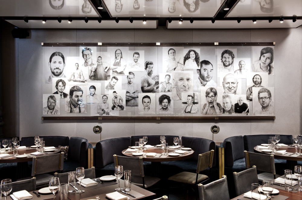
Adding to this thorough focus on the personality of the kitchen is a lard wall of portrait sketches of the chefs who have worked the venue so far. “We found the artist in Central Park,” Keffer says. “The wall will evolve and constantly change and grow as the restaurant continues to grow.”

