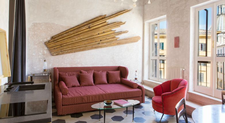
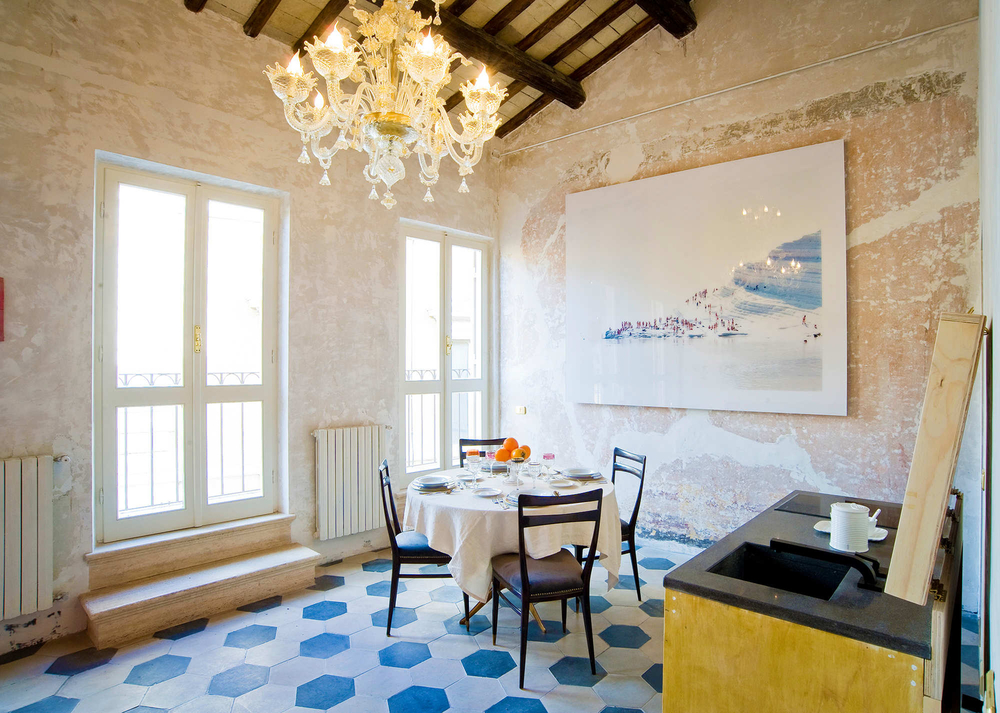
When the owners of PalazzinaG, a Philippe Starck–designed hotel in Venice, set out to open something similar in Rome, they knew they wanted to capture the city’s rich history while creating something that felt contemporary. They also wanted to turn out-of-towners into true Romans, if only for a limited time. The resulting hotel, G-Rough, is set in a narrow, five-story 17th-century building in the center of Rome, and was designed by 35-year-old architect Giorgia Cerulli. “There are traces from the past in the walls, floors, and ceilings, but contemporary art also plays an integral role in the design,” she says. This meant mixing and matching pieces from the ’30s and the ’60s, while preserving patinas on the walls and carefully integrating contemporary art.
In keeping with the focus on creating a truly Roman, anti-tourist experience, the hotel offers a “lifestyle butler” who imparts hyper-local knowledge to visiting guests. “It’s a place to experience real Roman life, and to be accompanied on a very exclusive tour of hidden corners of the city,” Cerulli says. The hotel has only 10 suites—all inspired by Italian design legends and featuring original furniture by them—adding to the homey, but self-consciously Italian, vibe.
Lobby, Bar, and Restaurant
Set up more like a private home than a hotel, G-Rough has no distinct lobby, nor a bar and restaurant. At the entrance to the hotel is a combination of all three: an area to sit, drink, snack, and hang out that the owners and Cerulli call a “contemporary wine gallery.” “It was conceived as a lively, vibrating place, constantly in contact with the intense life of this area of the city,” the architect says.
In choosing furniture, Cerulli sought to reflect the bars of Prohibition-era America, which meant sourcing original midcentury leather furniture. For the floor, Cerulli chose recycled, hexagonal red tiles, and for the walls, bronze mirrored tiles by Seletti. “They create reflections and bring a rarified atmosphere,” she says. A custom brass bar and hanging Giò Ponti lamps—along with Italian infinity light appliqués from the ’70s—add an Italian touch to the American influence. Wallpaper with a leafy design, along with real plants, inserts a Parisian jardin d’hiver sensibility. Many works by young artists are hung throughout the space, compounding the contemporary excitement the designer sought to create.
Guest Rooms
The 10 guest rooms continue the theme of creating a home rather than a hotel, as well as a considered balance between the historical and the contemporary. Each suite is named after a great Italian designer of the 20th century, and the furniture Cerulli sourced for them include pieces by the likes of Ponti, Silvio Cavatorta, Ico Parisi, and Guglielmo Ulrich. At the same time, the designer emphasized the building’s existing materials. “We wanted to bring a new life to that history,” Cerulli says, which she did “by leaving old paint and materials on the wall exposed, and the floor that dates to the ’30s.”
The vintage furniture, mostly from the ’30s and ’70s, “create an exclusive place, something unconventional but luxurious.” In the bathrooms, bronzed mirrored tiles, antique brass taps, and a mosaic marble on the floor create a ’50s atmosphere, and in the penthouse suite, an old double sink from France adds vintage glamour. Of course, as in the rest of hotel, Cerulli was careful not to focus too much on one period: the rooms also contain customized kitchenettes by the design firm Leftover.


