Tetchan sits cheek to jowl with tiny shops and izakayas stacked against each other on Harmonica Yokocho, an alleyway that was once the site of a post–World War II black market and still has the lively mystique of 1940s Japan.
For Kuma, who recently won an international competition to design the new Saint-Denis Pleyel train station in Paris and is currently working on the V&A Museum of Design Dundee in Scotland, it’s not the first time he has given a high-concept twist to a straight-forward project. In 2011, he reimagined a Starbucks in the southern city of Fukuoka as an edgy, dramatically timbered café that garnered much global attention.
Similarly, here Kuma has turned the expected venue for grilled skewered meats on its head. Most yakitori bars are either no-fuss takeaway joints that offer little in the way of high design or your typical open-grill setup with lots of smoothed wood for seating. Tetchan is neither.
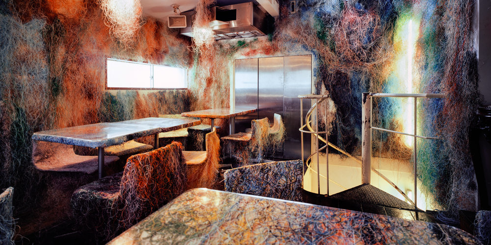
The two-story space is an eye-catching study in harnessing the aesthetic utility of recycled materials. When it comes to the creative reuse process, the second floor is especially revelatory: Kuma and his team draped the room in multicolored ethernet cables—the wires that used to connect computers to the Internet before the advent of WiFi. Everything, from the walls to the tables and chairs, is covered in a rainbow of discarded strings, giving the dining room a mossy, tie-dyed complexion that blurs the edges of its form. Instead of sharp corners or straight lines, clusters of tangled tendrils define the shapes and silhouettes of the space.
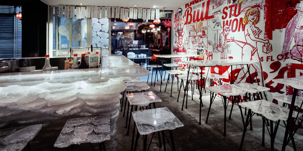
While the top level feels like a dreamscape, the first floor implements loud graphic design elements familiar to K-pop culture, the ineffable pan-Asian music craze. Set against a quasi-pornographic manga mural by artist Teruhiko Yumura, who helped pioneer the heta-uma (unskillful but skillful) drawing style in the 1970s, clear dining surfaces are made from melted acrylic byproducts and resemble blocks of ice. If it weren’t for the very red illustrations on the wall, one could almost call this floor minimalist —a direct juxtaposition to the explosion of color on the floor above.
“We designed the bar from the material, not from the form or style,” Kuma says. “We always decide on material first and that determines the design.”


