The Sydney Opera House is perhaps the most iconic and recognizable architectural structure on the entire Australian continent. So you would think the architect tasked with designing its new restaurant—only the fifth in its 42 history—would be just a little bit intimidated. If so, you haven’t met Tim Greer.
The first thing Greer does when approach- ing a new commission is think about context. For the tri-level Bennelong—which includes the main dining room, the relaxed Cured & Cultured for oysters and charcuterie, and a top-floor bar for pre- and post-show drinks— that meant considering not only the restau- rant’s past, but also its future. Greer calls this“continuum architecture.”
“I always think about the ideas that underpin a project,” says Greer, whose Sydney- based firm, Tonkin Zulaikha Greer, has designed everything from cultural institu- tions and Virgin Australia airport lounges to war memorials and the city’s new Old Clare Hotel. “We like to go in and un-build historicstructures, figuring out where those concepts came from and how to take them forward.”
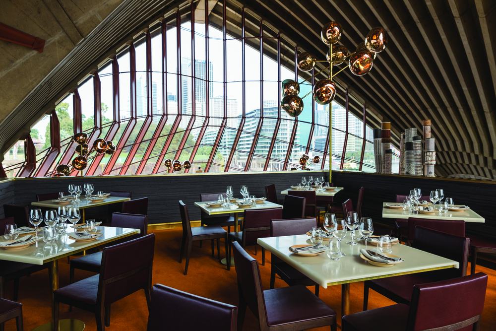
Take the lights. An old iteration of the restaurant had 1970s globe lamps—leading to the decision to use Tom Dixon’s new Meltlamps, which debuted at this year’s Milan Design Week. “We played with the original idea and just reinterpreted it in a sophisti- cated manner,” Greer says. The new lights have an almost unstable quality, in that they appear to float in space like a constellation.
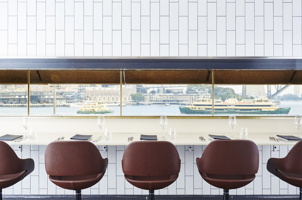
Greer and his team also played off the Opera House’s color scheme and natural tones, though each floor takes a different approach. The bar has a bright ochre carpet “in celebration of people being excited about going to the theater,” he explains. In the main dining room, the hue is more subdued, allow- ing the other showstopping elements—the building’s soaring concrete ribs, the view of Circular Quay and beyond—to shine through. According to Greer, it’s the only spot in the entire building where you can see the complete structure. “If you want to explain to someone how the Opera House was made, you go and stand in the restaurant and you can just see it,” he says.


