How do you develop an aesthetic based on a feeling?
That was the question Hong Kong-based Design Systems grappled with when conceptualizing the look of the Tuve hotel in the city’s Tin Hau district. We’ve seen architects take reference points from locations, colors, even textures, but Tuve’s impetus marks a departure from convenience: the hotelier was so taken with a particular collection of images that a property became an unlikely ode to a body of water a world away. Danish photographer Kim Høltermand’s haunting black-and-white panoramas of Sweden’s Lake Tuve made a lasting impression on the hotel’s owner, and Design Systems was tasked with transforming the mood imparted by the visuals into tangible materials.
“The photographs of the lake served more as a start of the conversation. It’s not a translation from the visual to the spatial,” says Design Systems director Lam Wai Ming. The challenge is that we wanted to differentiate the hotel with an unusual uniqueness.”
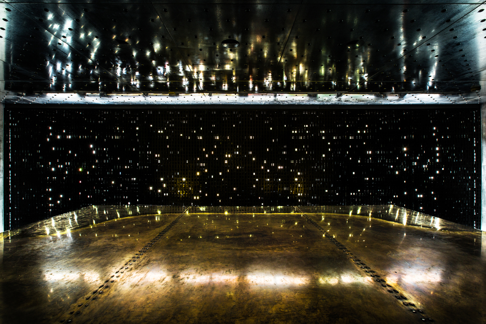
So they took the brief from the owner who prefers to maintain a low profile, and interpreted the moody imagery with raw, natural materials: carbon, brass, marble, granite, oak, glass. Exuberant swirls in the stone and gold flecked crevices in the concrete dance under meticulously orchestrated lighting. “Our approach is to rediscover and enhance materials’ natural beauty with surface treatment and lighting effects, to let the space exude its authentic aura and induce emotions in the travelers,” Ming says. To wit: the interplay of the light against the natural surfaces awakens feelings akin to those evoked by Høltermand’s landscapes.
Rooms
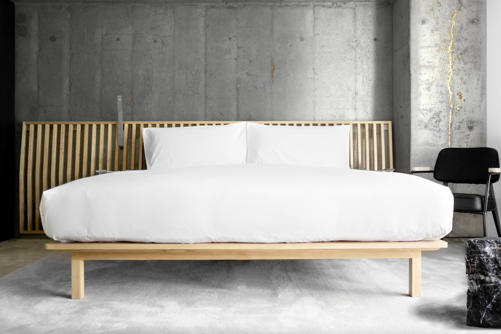
The two-year endeavor culminated in July with the unveiling of 66 rooms redolent of Scandinavia’s hallmark minimalist aesthetics – spare wooden beds; exposed hooks and handles; utilitarian boxes that contort into desks and cabinets – while exuding luxury at the same time. “Luxury as a style has somehow ben stereotyped and vulgarized nowadays, so instead of drawing on the clichés and putting together extravagant elements, we focused on presenting materials in ethic states and pure forms,” Mind says. Here, luxury lies in simplicity and mystery, with natural imperfections in the stone, concrete, and brass walls ensuring that no two rooms are alike – so guests never know quite what to expect. Bathrooms are swathed in marble and come with brass accents. “We think designing by subtraction helps us develop a sense of place for the hotel for its purity and rarity as an alternative to the mainstream,” Ming adds.
Public Areas
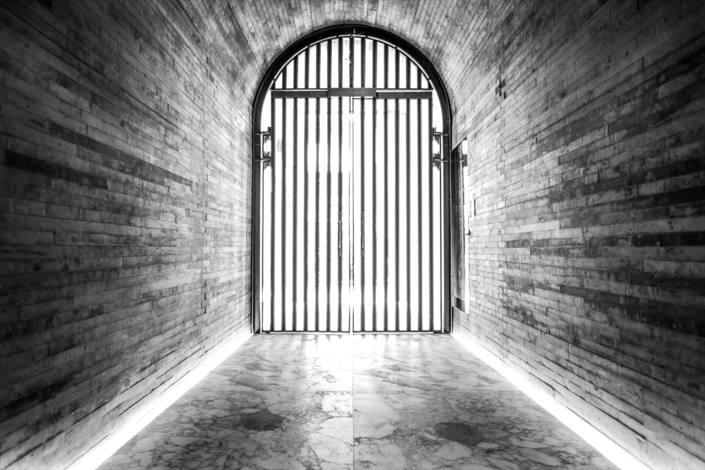
You might walk back and forth on Tsing Fung street a few times before you figure out where Tuve’s facade is: the long, cave like entrance tunnel is secreted next to hulking oxidized metal doors, and the location is heralded with an understated brass-and-marble sign. Once you’ve found your way inside, shards of light are diffused all over a marble lobby dominated by brass reception area. The ground-floor Silver Room restaurant serves Italian fare with Japanese inflections; the dimly lit space is presided over by nest-like metal sculptures.
At Tuve, natural materials converge in a mellow harmony designed to elicit similar emotions within guests; where other hotels are on a quest to impart a sense of place, Tuve’s team chose to deliver a sensory experience. Whether or not it succeeds is entirely up to the travelers who find their way here.


