Here, we ask an artist to frame the essential details behind one of their latest works.
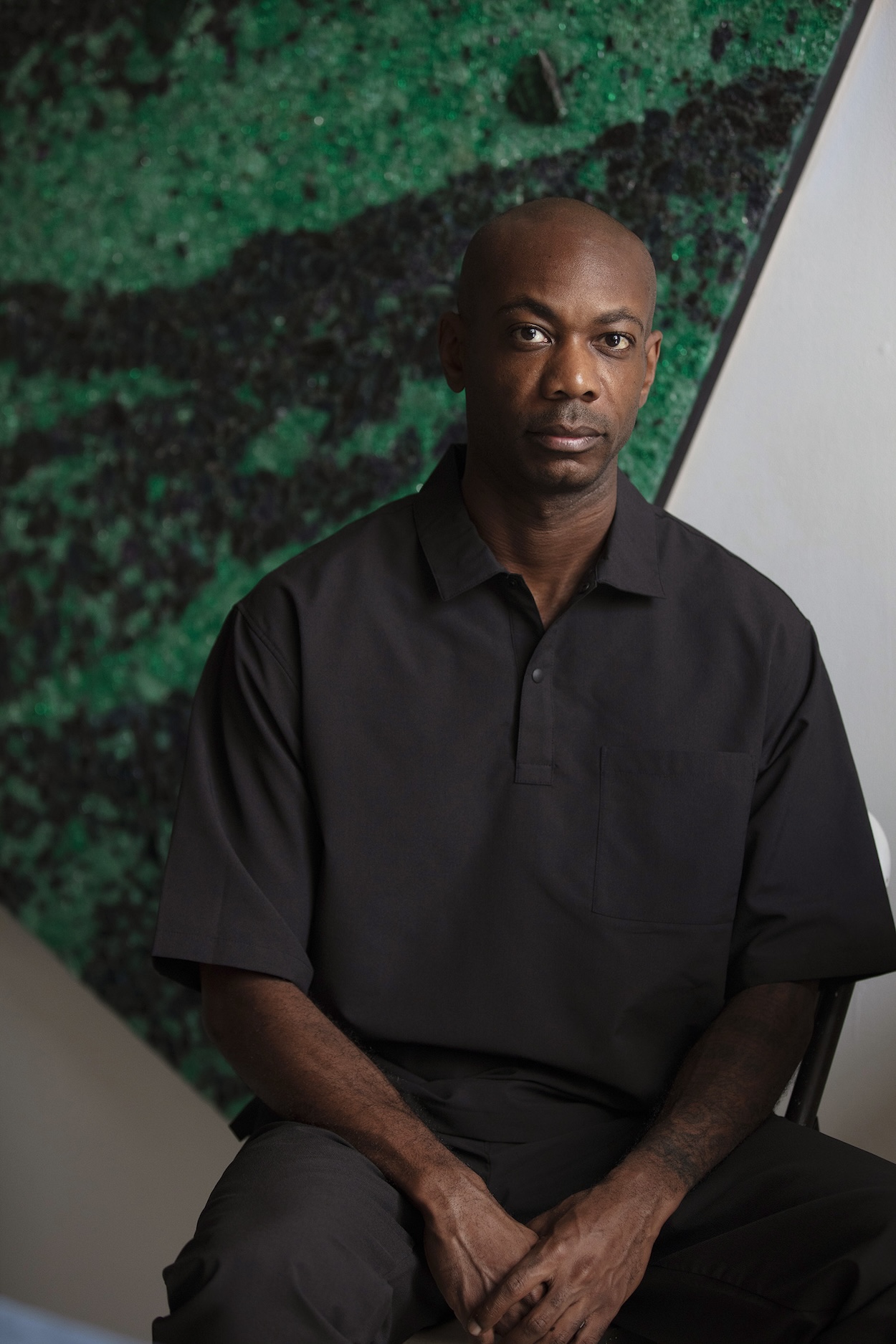
Bio: Alteronce Gumby, 39, Mott Haven, Bronx (@alteroncegumby)
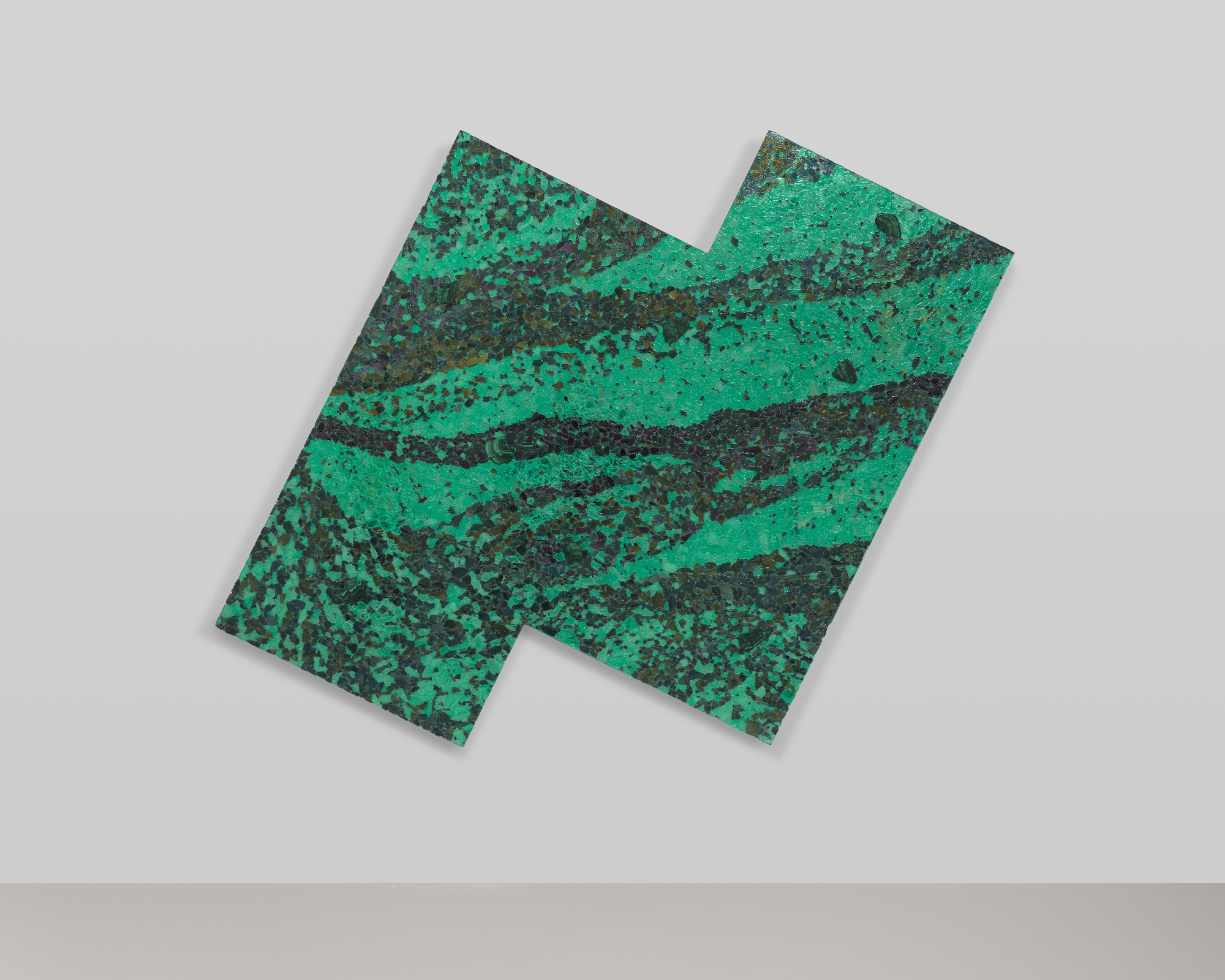
Title of work: Energy Flows Where Focus Goes (2024).
Where to see it: “Prince of the Far Rainbow” at Nicola Vassell Gallery (138 10th Ave, New York) until Dec. 14.
Three words to describe it: Create your destiny.
What was on your mind at the time: Lately, I’ve been reflecting deeply on nature and the elemental laws that govern our existence. As I’ve started taking trips upstate and incorporating hikes into my travels, I’ve felt the profound interconnectedness of all things. This connection has influenced how I approach my art, especially my understanding of color in the natural world. I’ve realized that engaging with nature helps me better understand myself and my practice, as color shapes how we perceive life.
Green, the most common color in nature, surrounds us in trees, grass, and even the ocean’s interaction with sunlight. Yet, I’ve often avoided using green in my art, perhaps because of its association with the claymation character “Gumby.” Despite this, green carries a rich history and symbolism, resonating with life and growth. With this painting, I was ready to explore what green could teach me, opening myself to new insights and understanding. In a way, this work became a conversation with nature, guided by curiosity and a willingness to learn.
An interesting feature that’s not immediately noticeable: This piece features Malachite and Aventurine embedded within the work. Malachite, with its rich green bands, stands out in size and depth, creating natural, raw brush marks. It carries a history, having been used from ancient Egypt to Renaissance frescoes to evoke an earthy, vivid green. I’m drawn to Malachite because it resembles wet brushstrokes frozen in time, adding weight and grounding the piece in both art and nature.
Aventurine, by contrast, is smaller and subtly embedded within the glass. Its shimmer is delicate, revealed gradually as the viewer spends more time with the work. Historically used in mosaics and ornaments, Aventurine’s soft glint adds a hidden, quiet depth. I wanted these materials to speak, layering into the piece to evoke a sense of history, color, and materiality. The work becomes a conversation between the visible and the sensed, bridging past and present.
How it reflects your practice as a whole: This piece reflects my overall practice through its monochromatic palette and emphasis on light. My work often delves into color perception, and I’ve developed a series of tonal paintings that highlight the nuances within a single hue. Here, I chose green—a color I previously avoided but now engage with to explore its depth and natural associations.
The inclusion of glass and mirrors emphasizes the role of light in how we perceive color. These materials reflect and refract light, interacting with the environment to create a dynamic experience that shifts with changes in light and viewer movement. This work invites viewers to see color as fluid and responsive, shaped by light and perception. Ultimately, it explores the intersection of color and light, aiming to challenge perceptions and deepen sensory engagement with the world around us.
One song that captures its essence: “Afterlife Residence Time” by Immanuel Wilkins.


