In the hills of Los Angeles, fearless mid-century architectural experimentation presides at nearly every corner. The leaders of this movement, among them visionaries like Richard Neutra and John Lautner, championed free exploration of new design languages that bring the outdoors inside. Now a hallmark of regional architecture, smooth indoor-outdoor transitions that bask in the region’s chilled-out climate guide many of L.A.’s most prominent firms.
Assembledge+, an award-winning studio known for its deftly-designed, understated homes, recently revamped a spacious single-story residence in the foothills near Laurel Canyon that upholds the traditions of its regional forebears. Founder and principal David Thompson describes his design process, explaining how he lived on-site to experience the home in full, preserved a century-old oak tree, and treated the landscape as its own interior space.
The List’s Project Spotlight column features unparalleled projects created by our forward-thinking List members. By going straight to the source—and having the designers demystify the methods behind their designs—we hope to enlighten and inspire our creative audience to further push the boundaries of what is possible in the realm of design.
Assembledge+ is a member of The List, the destination for all things Surface-approved. Want to join The List? Contact our team to find out how to apply.
APPLY
Project Description: When we acquired the 18,000-square-foot property, which is located in the foothills of Fryman Canyon in California, we decided to live on-site during the design process to establish a true sense of place. Throughout the year prior to starting new construction, we learned about sun patterns and environmental conditions to ascertain how the property and house could best be oriented to conform to the lifestyle we desired.
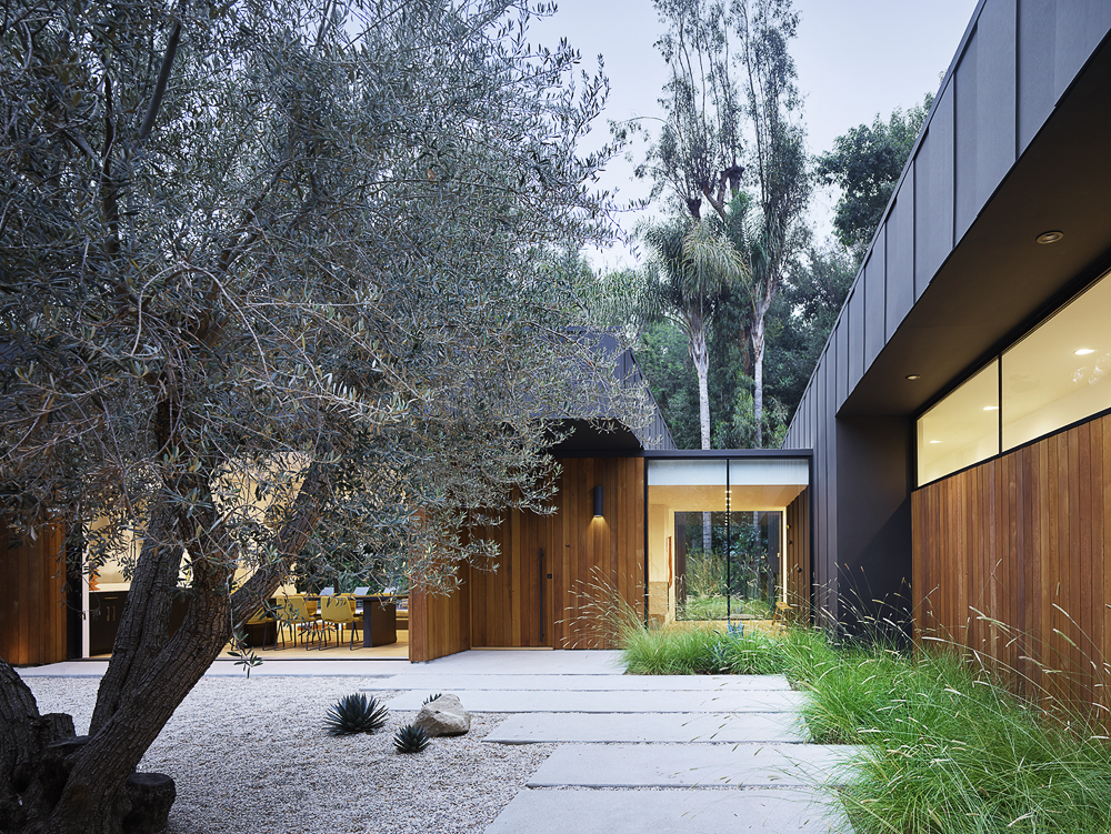
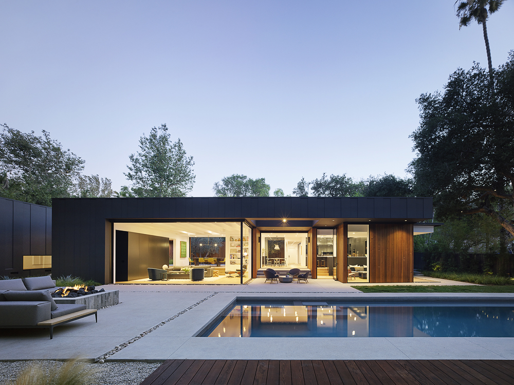
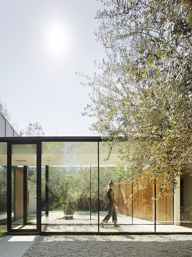
The result is a residential oasis in the heart of Los Angeles. The single-story home features three pavilions connected by a series of glass hallways, establishing a fluidity between living spaces that creates a harmony of transparency and lightness. One of our main goals was to let the living experience engage with as much of the surrounding landscape as possible. Large windows, skylights, and pocketing doors conjure a series of layered vignettes and flood the interior with natural light.
Inspiration: The home’s architecture pays homage to Southern California Modernism and weaves into the community fabric harmoniously, rather than aggressively.
Blueprint: The original house had decent bones, but had undergone additions that enclosed outdoor space and created a chaotic, rambling floor plan. We considered tearing down the whole house but wanted to keep elements such as the front courtyard. After reviewing every option, we chose our first ‘back of the napkin’ design. It created the most seamless flow, optimized use of the lot, and was the most efficient way to build the structure. The lot is also home to a century-old California Live Oak—a protected species—so we opened up windows in the family room and master bedroom to bring views of it inside.
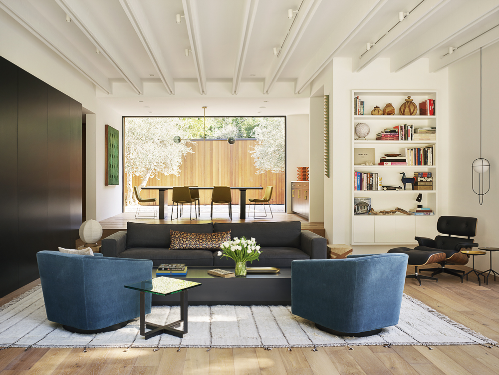
Materials Used: We chose simple, contextual materials. Western Red Cedar, darkly painted cement board, and glass blend unobtrusively with the property’s surroundings. In the interior, white oak hardwood floors and marble countertops lend warmth. We treated outdoor spaces as indoor rooms to make the most of Southern California’s temperate climate, so landscape choices held as much weight as other materials.
Challenges: Though relatively flat, the lot’s slight grade change proved tricky. The gradual step-down design of the living and family rooms lends each space definition in an otherwise open-concept floor plan.
Uniqueness: We expanded our focus beyond the structure itself. Our design extends to the landscape by creating a series of outdoor spaces that bring the living experience outside. By extension, we treated the entire site as we are accustomed to treating interiors.
Takeaway: We hope visitors experience the courtyards and open spaces in a manner akin to public pavilions and plazas. A design is successful when users enjoy themselves in a space but aren’t quite sure why.
All photography by Matthew Millman.
VIEW ON THE LIST
