The List’s Project Spotlight column features unparalleled projects created by our forward-thinking List members. By going straight to the source—and having the designers demystify the methods behind their own designs—we hope to enlighten and inspire our creative audience to further push the boundaries of what is possible in the realm of design.
There’s nothing architects and planners want to see more than a big empty square of land waiting for them. It’s a blank canvas as familiar to the eye and mind as the paper or computer screens on which they will eventually draft the property that will occupy the space between those right angles and parallel lines.
But not all sites are as comfortably rectilinear as one might hope. Topographic oddities, boundary lines, roads—any or all of them can turn the creator’s canvas into less of welcoming box than a irregularly shaped beast that won’t easily allow you to make the best of the volume it holds.
But such uneven footprints are welcome at Dallas design firm Bodron/Fruit, which has made its reputation by calmly, intelligently reacting to challenges—topographic and otherwise—to creating spaces that embrace site peculiarities rather than pushing against them.
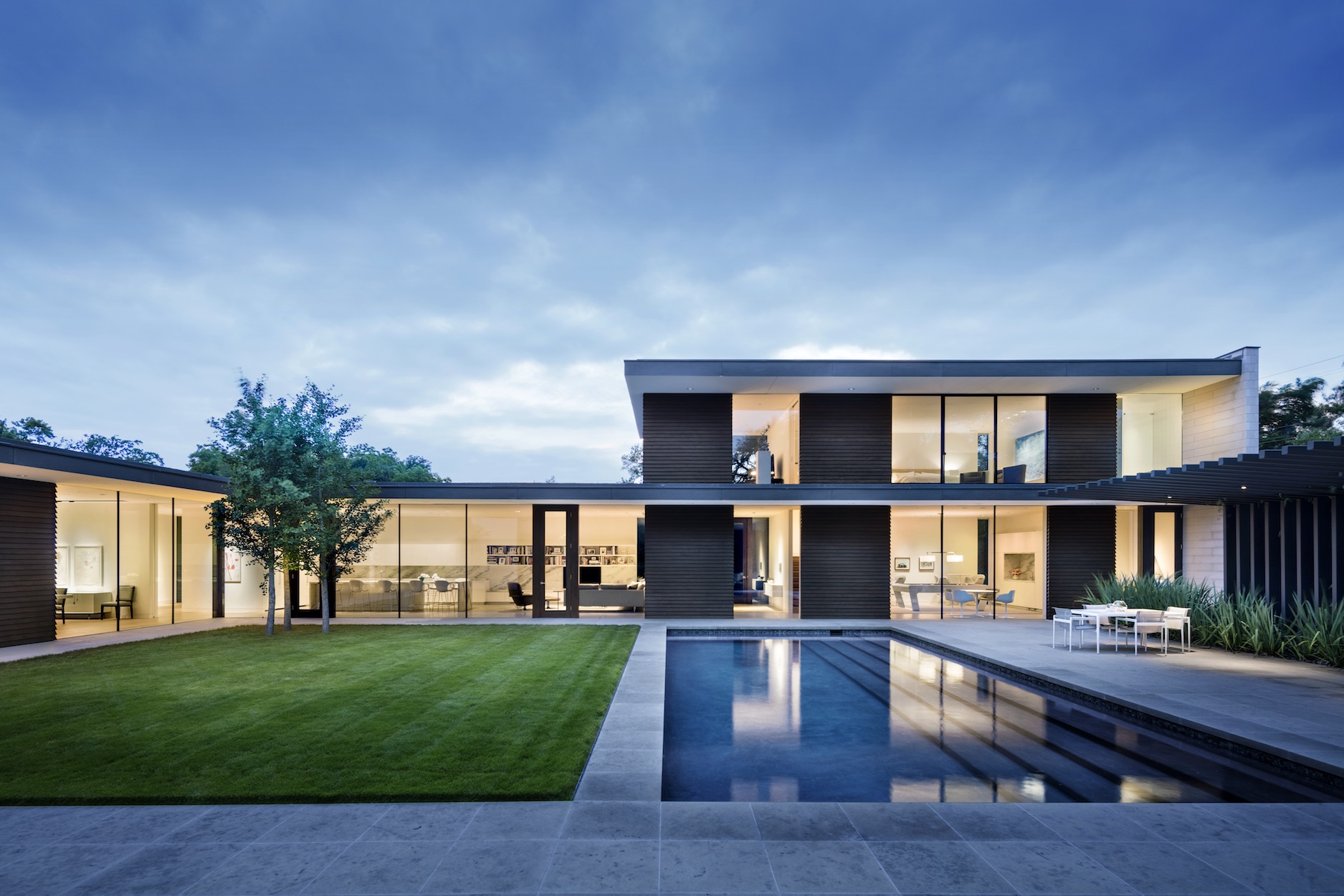
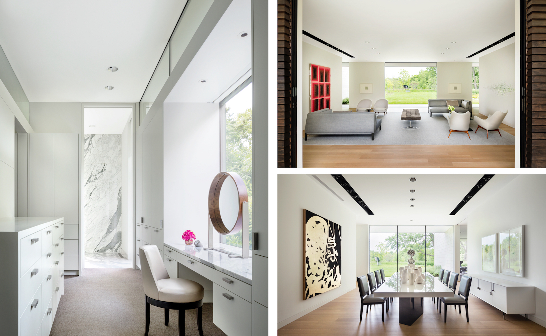
Proof positive is the new two-story, light-as-air family home the firm worked on in the breezy Dallas neighborhood of Preston Hollow. As much a airy, neutral gallery for the owner’s healthy art collection as it is a light, relaxed spine bringing order its irregular site, it makes full use of a footprint that complicates itself through curved borders and organic angles.
Surface spoke to Svend Fruit, Co-founder of Bodron/Fruit.
The List’s Project Spotlight column features unparalleled projects created by our forward-thinking List members. By going straight to the source—and having the designers demystify the methods behind their own designs—we hope to enlighten and inspire our creative audience to further push the boundaries of what is possible in the realm of design.
Bodron/Fruit is a member of The List, the destination for all things Surface-approved. Want to join The List? Contact our team to find out how to apply.
APPLY
Property Acquisition: The Williamsburg lot sat on the market for a long time despite being located in the coveted neighborhood of Preston Hollow. Its irregular shape—defined by the curved street bordering the front of the property—made it appear smaller than it actually is. Also, with little natural landscape, there was a lack of privacy on the exposed corner lot. After carefully studying the site with our client, we developed a plan that took advantage of the unique angles by positioning the house to maximize the views from the new building.
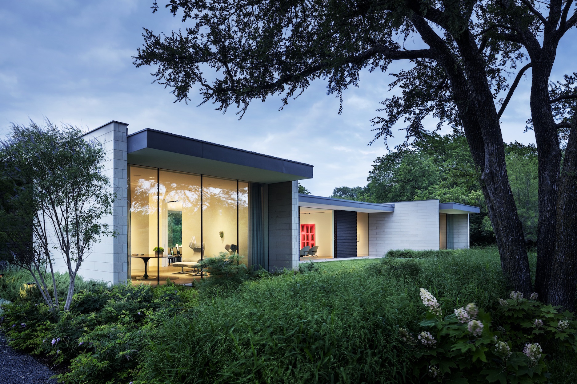
Inspiration: Varied topography and unusually shaped pieces of land are interesting to us because they give us something to react to. We wanted to make the property feel bigger than it was by taking advantage of its length when planning the views from the main living spaces. Creating seamless connections between the interior and exterior was foundational to the project. Our client’s art collection played a major role in designing the interior elements, from large floating art walls to the placement of expansive glass windows.
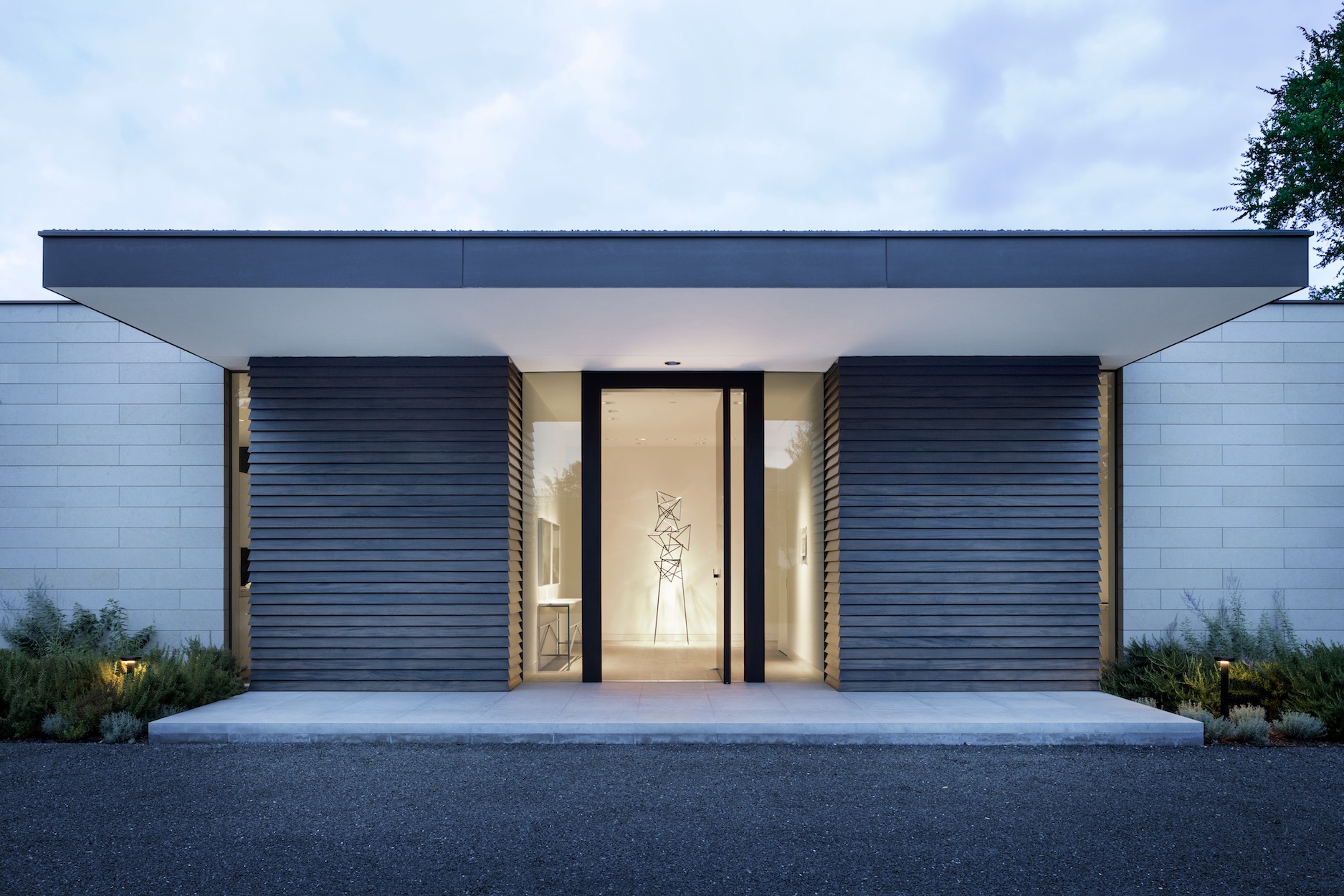
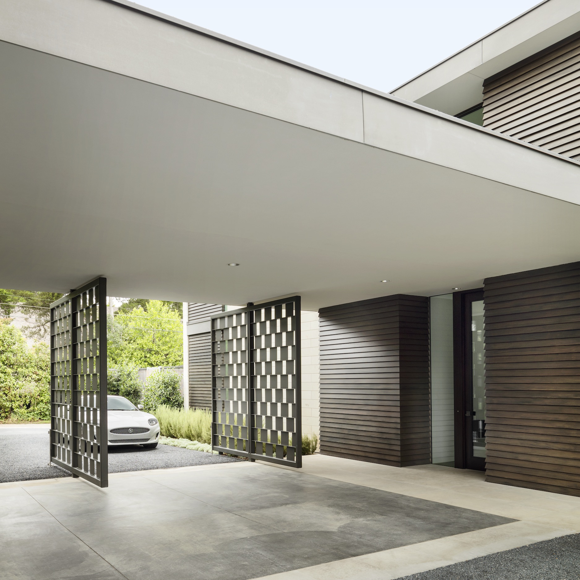
Materials: We used Kansas limestone, dark-stained mahogany, white oak, glass, and steel to create a simple, neutral palette that complements the artwork and the views to the outside. We selected furniture for the clean lines and comfort—united in tone but varied in texture. The interiors of the home are meant to be beautifully submissive to the art and architecture.
Challenges: Again, although the property was over an acre, the shape made it seem smaller than the actual size. Studying the topography, sunlight, and various views was all part of planning the perfect site for the building. Incorporating natural light and exterior views into a home centered around our client’s growing art collection took meticulous planning from start to finish.
Uniqueness: Our design philosophy is not about being unique or standing out. We strive to balance impeccable interior design and exceptional architecture to create noteworthy buildings with purpose and function.
Takeaway: Properties with something to react to make more interesting buildings. With this project, we were able to site the house to maximize views from the home and create a vanishing point to the horizon from the primary living spaces. These views are framed by a series of exterior and interior planes that allow the landscape to extend from exterior to interior. The interiors were thoughtfully planned to showcase art and create views to the landscape outside.
VIEW ON THE LIST
