The List’s Project Spotlight column features unparalleled projects created by our forward-thinking List members. By going straight to the source—and having the designers demystify the methods behind their own designs—we hope to enlighten and inspire our creative audience to further push the boundaries of what is possible in the realm of design.
Employing Belgian, American, and Slovenian inspirations, Maša and Jon Kleinhample—the married duo behind Klein Agency—have brought their clean-lined sensibilities to popular pastry chef Lincoln Carson’s new Arts District French eatery, Bon Temps.
The colors here are gentle and the designs minimal, simple, and sturdy, but no less stunning or pleasing to the eye. And that shouldn’t come as a surprise: Klein Agency always remains tasteful and never indulges in capricious modern trends when executing furniture, architecture, or interiors.
Below, Klein Agency’s Maša Kleinhample walks us through the completed work.
Klein Agency is a member of The List, the destination for all things Surface-approved. Want to join The List? Contact our team to find out how to apply.
APPLY
Project Description: We designed Bon Temps as a modern California brasserie, set in downtown Los Angeles’ burgeoning Arts District. While its kitchen is rooted in French technique, its space makes nods towards a new industrial philosophy where the distinction between front and back of house is blurred, exposing its guests to the inner combustion engine that makes Lincoln Carson’s first solo venture burn so bright.
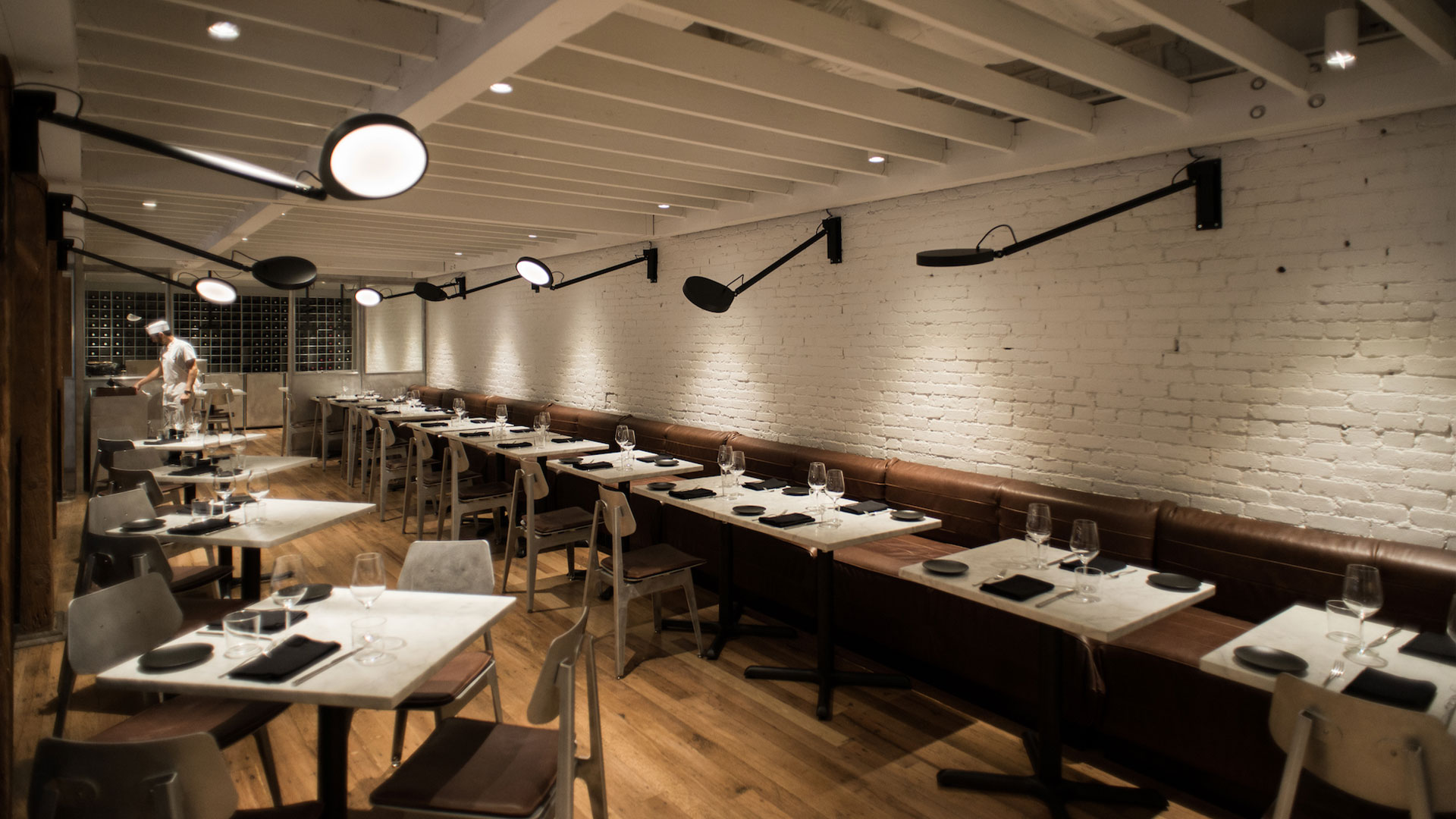
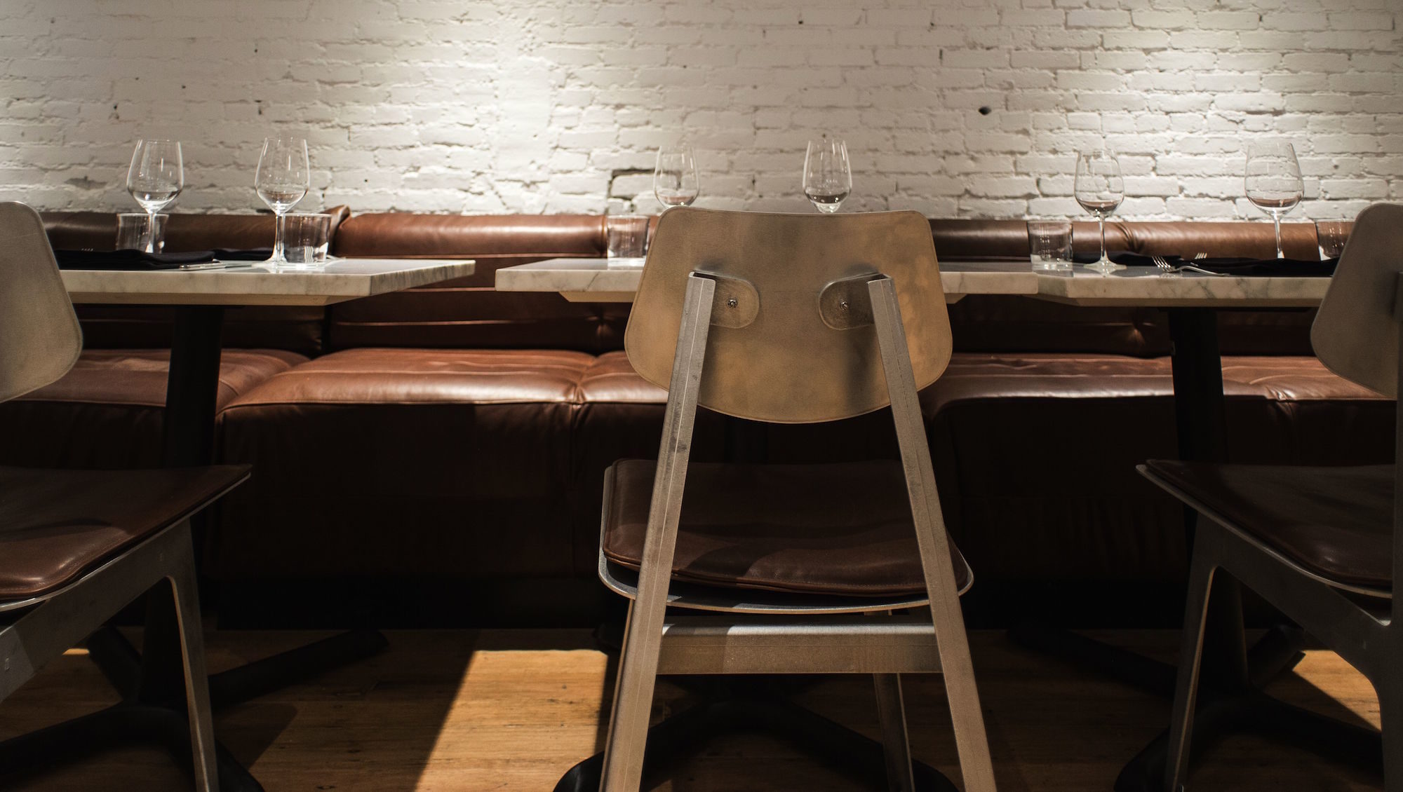
The purposeful indoor/outdoor space is a contemporary homage to materiality and function, building upon the history of the space (a former Heinz loading dock) with a minimal palette and honest worn in elements. A custom 30-foot, Carrara marble bar top, leads with a partitioned display section, serving as the pastry case by morning before transitioning into a raw bar by night. Anchored by hand-finished, matte aluminum, the same cut of marble traces a curvature that leads to the interior dining room, furnished warmly with supple cognac leather banquettes and bookmarked by two kitchen spaces—one for savory, the other for baked goods.
Floor-to-ceiling windows in the front room look out into the charming, 45-seat outdoor alleyway, where locals and visitors alike can gather over Carson’s all-day menu.
Inspiration: While the design is clean and minimal, the purity of the materials in their most basic state creates an inviting atmosphere. Anything that is superfluous has been stripped away, while decoration is discovered in wood grain, the marbling of stone, and the subtle variation in leather hides. The bespoke aluminum grid that repeats throughout the space serves as the embodiment of a spatial ideal, the warmth of human vitality captured by the rational. Fragments of its industrial past combine with a contemporary industrial approach to form a rich, spatial collage for the visitor. History is not shed away, rather built upon, in this contemporary homage to materiality and function.
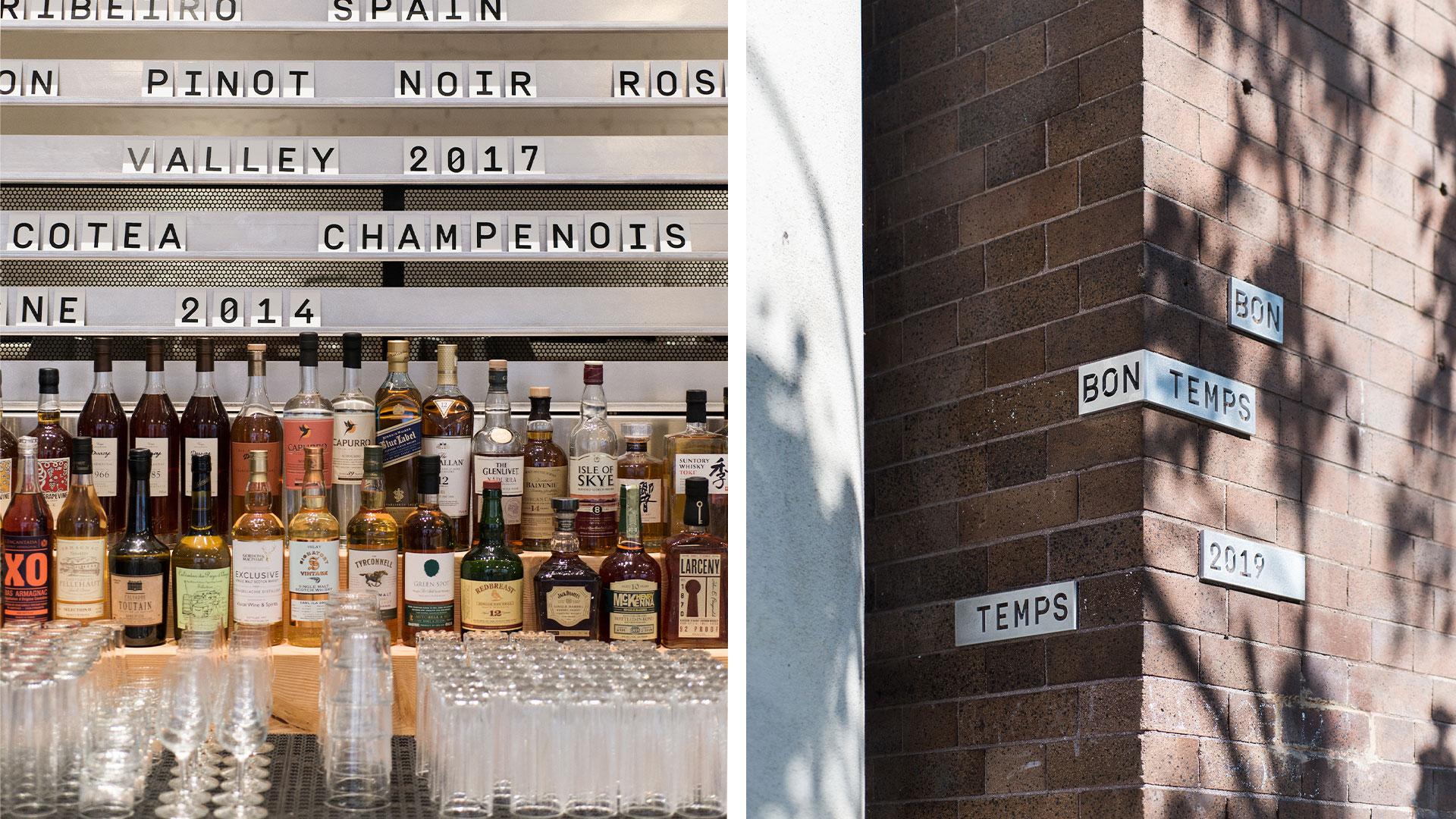
Materials: We combined jitterbugged, aluminum sheet material, cut and formed into waffle structures, combined with reclaimed Douglas fir lumber and supple cognac leather. The focal design feature is a long, curved, 4-inch thick, 30-foot Carrara marble bar top, anchored by an aluminum waffle structure. The stone itself takes on a softness often found in the surfaces of historic Parisian brasseries, simultaneously contrasted by the expression of utility through the aluminum grid. An 8-foot portion of the bar is meticulously tooled to form an undulating top surface that serves as a raw bar by day and night, and through a wooden insert, pastry case by morning. The car-sized block of Carrara that lands in a 4-inch thickness as Bon Temps’ central bar, tracks through the rest of the space—as bar height drinking tables in the main floor as well as dining table tops on the upper level. Aluminum spills into the entry brick alley way as well through millwork units and custom bench planters, where hand-finished metal consoles are softened by the integration of wood slats and protruding, wild greenery.
Uniqueness: Set within the former Heinz testing kitchen in downtown Los Angeles, Bon Temps sets out to break down the distinction between back and front of house all while showcasing the beautiful tension between warm and cold materials. The guest immediately feels part of something larger than simply a dinning experience, rather the sounds of the open kitchen combined with a sense of functional utility set forth by the aluminum furniture. Every aspect of the design points towards the expression of a transparent and honest dinning experience driven by Chef Lincoln Carson.
VIEW ON THE LIST


