The List’s Project Spotlight column features unparalleled projects created by our forward-thinking List members. By going straight to the source—and having the designers demystify the methods behind their very own designs—we hope to enlighten and inspire our creative audience to further push the boundaries of what is possible in the realm of design.
The Salon Art + Design comes but once a year—and for its 2018 fair, on view at the Park Avenue Armory today through Nov. 12, List member Callidus Guild was tapped to create a site-specific installation in the building’s Library Room. Together with gallery partner Jeff Lincoln Art + Design, which curated the selection of iconic furniture that accompanies the Guild’s art, Callidus Guild is staging an exhibition that highlights the collective’s vertical sculptures. Callidus Guild’s owner and creative director Yolande Batteau walked us through the inspiration, obstacles, and dynamism of the installation ahead of the highly anticipated design fair.
Origins: Callidus Guild is constantly investigating new materials, methods, processes, and styles. This year, we expanded our capacity and we were looking to showcase some of our new work. We have long been curious about doing a series of experimental rooms, so the timing was serendipitous.
As of late, my work has waxed intimate. The pieces I created for Salon are much more raw and personal than my work as Callidus Guild, and I am keen to share them with the collector community. I’ve taken a step away from the uber-preciousness of the luxury design market and have dug into my roots, investigating ancient cultures and diving into the more idiosyncratic corners of the sculpture world. I am informed by ancient methods of tooling and incising, polishing, carving—the methods of making that are ubiquitous among ancient cultures from all over the globe. Vertical forms are likewise omnipresent in this world: obelisks, columns, and tablets have been a staple of form and construction for centuries. My vision was informed by decades of investigation and study.
Loren Daye of Studio Love is Enough has been a close collaborator of mine for years—our shared aesthetic toggles between abstract form, textured pattern, and articulation. We are both driven by experimentation and she has been invaluable in manifesting these stelae.
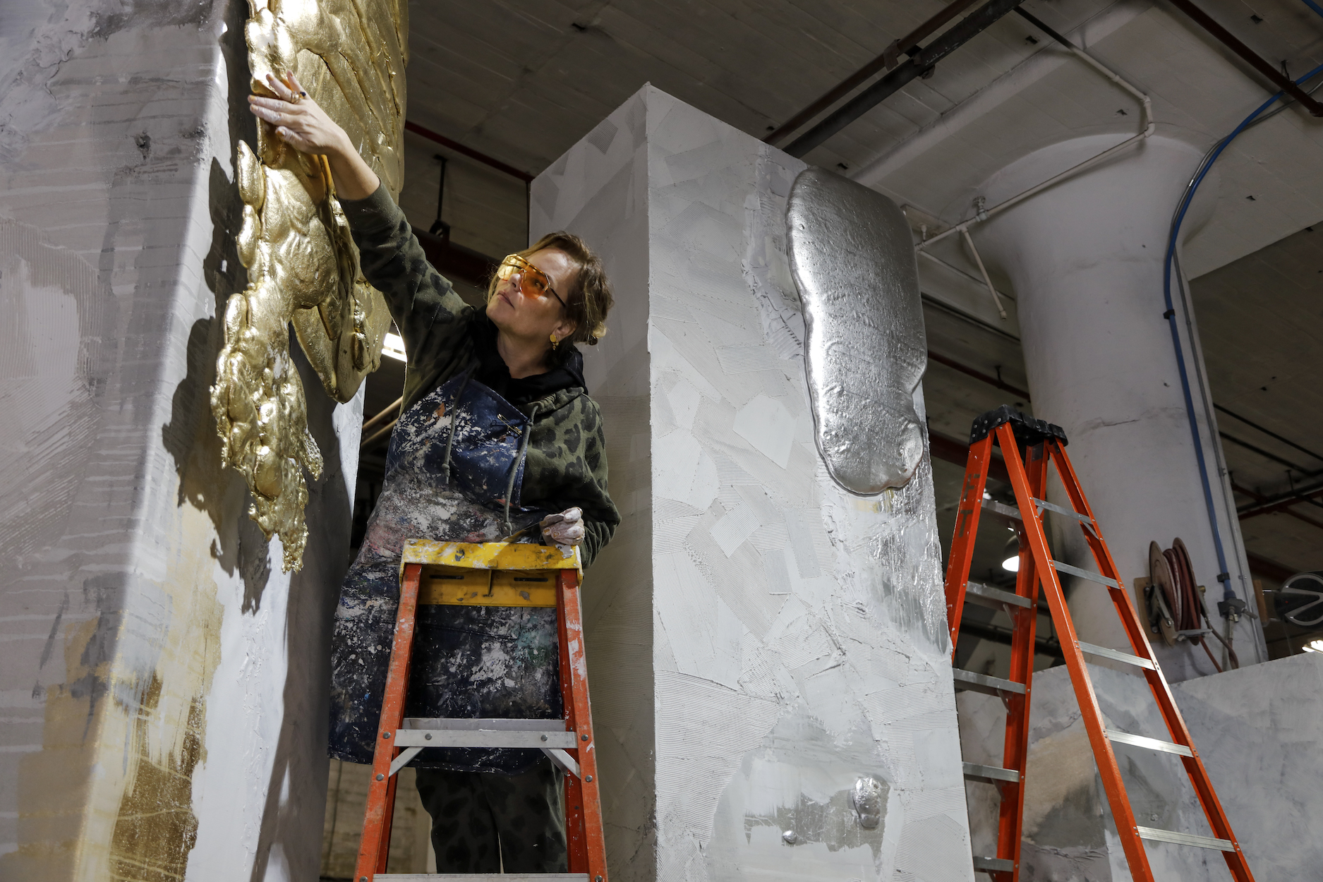
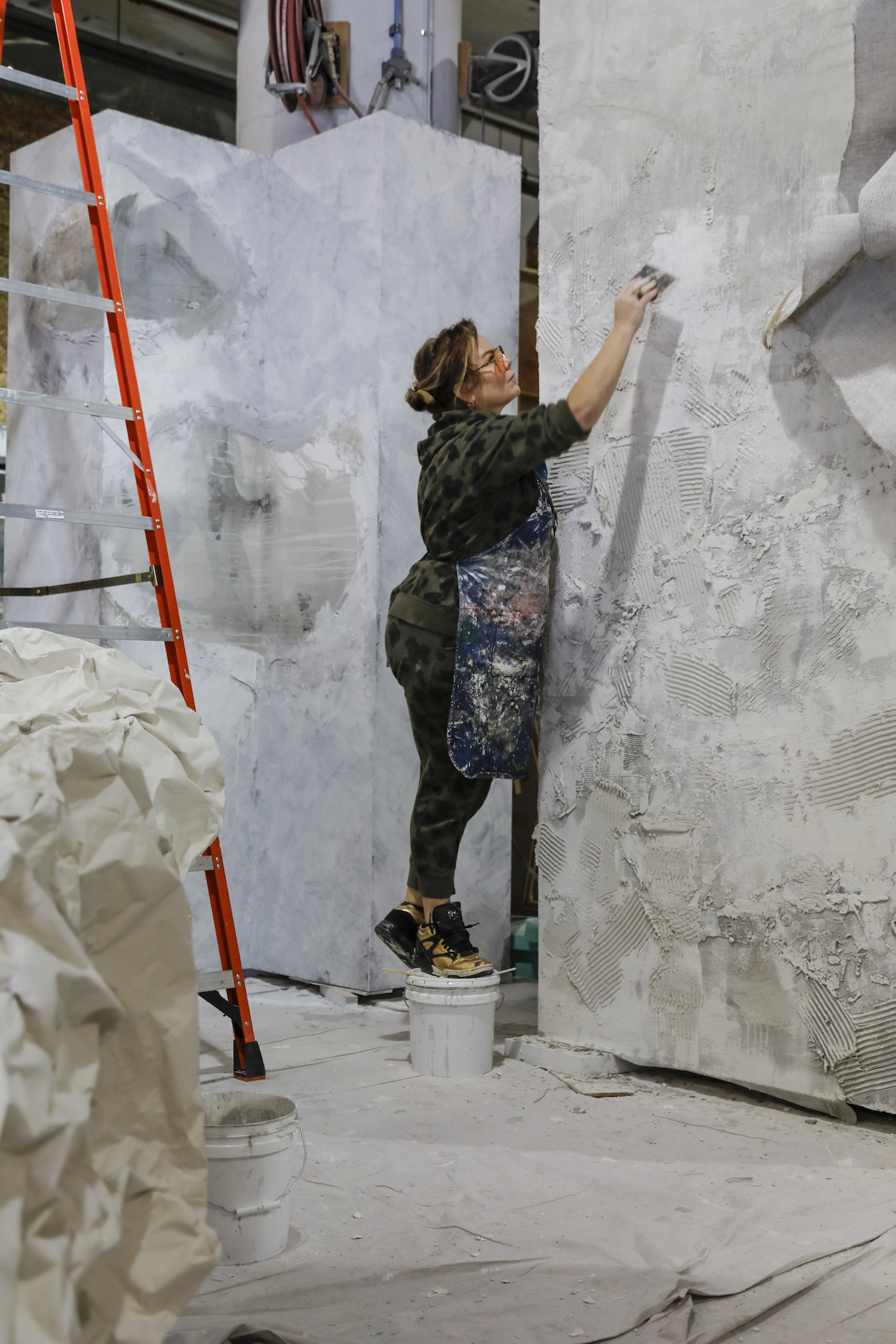
Process: The experience of making these stelae has been incredible. This show has been one of our most challenging undertakings—creating brand new art at such a scale and under deadline is never an easy task. Our time was split between acute technical planning and explorative art production. After visiting the Tiffany room, taking measurements and noting our site conditions, we began planning. We made rounds and rounds of clay and canvas maquettes, ran dozens of material tests. Once we had reached a place we liked in miniature, we began scaling up. Under Loren’s direction, our team produced scale drawings and renderings for fabrication, and, after several rounds of edits, the forms were built off-site.
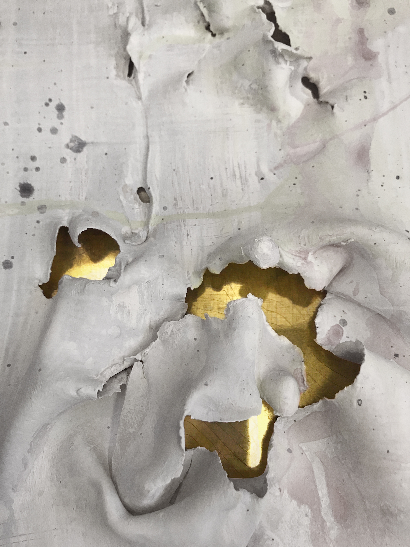
Our specialty team of fine artists then spent long hours at the studio, applying surfaces, carving plaster, gilding glass and crystal. We supplemented our existing methodology with experimental application and materials at a colossal scale. We were inspired by ice, cave dwellings, aluminum, gauze and mesh, primordial incising, tooling and embedding. We manipulated new and old materials to see what we could make them do. We spent weeks tweaking and fine-tuning the final product.
Making and presenting your own art is such a visceral and intensely emotional venture. Assembling the artistic contents of your mind and heart and then putting those contents on display is inherently taxing and brings up all kinds of vacillation and uncertainty. Production of these stelae pales in comparison to the emotional and mental challenge.
Inspiration: We’ve been working with a collector in California for some time on a monumental handbuilt ceramic wall, and last spring we dug out clay, silica and pigments in the High Sierras. The scale of the mountains and the open space there just doesn’t exist in on the east coast; the west has maintained an enigmatic wildness that many of us seem to have forgotten. We dove into crystal-clear springfed lakes hundreds of feet deep and half a mile wide, hiked through gulleys and among giant redwoods. Experiencing an environment of that scale inspires a hunger to expand, to go bigger—to create works on a sublime scale, that reminds people of the immensity of the natural world and their tiny, significant place in it.
In this installation, we wanted to make formations akin to prehistoric volumes of futuristic material, which create a series of spacial relationships that play with formal symmetries and asymmetries, broken by collapsing shapes. Loren is a real designer, a true chameleon; I trust her sense of spacial experience more than anyone I know. She is someone whose aesthetic opinion I value—I know she will be honest, and most certainly, right. Our collaboration gives me constraint, but also the courage to go weirder, to be true to myself. We all wanted to show the most incredible work we could.
Uniqueness: There were several aspects of this project that required a lot of research and practice. We used one material in particular that was extremely sensitive to the working environment—humidity, temperature, the speed at which it was mixed. Every time we used it it was a bit touch-and-go, and it was totally unpredictable. It’s been invaluable, however. The most precious materials are also often the most volatile.
We’ve also never experienced constraints quite like the historical guidelines the Armory has set in place to protect the integrity of the building. Altering designs and incorporating site rules into the aesthetic direction of the project, while completely necessary, was something we have not had to do at this scale or intensity.
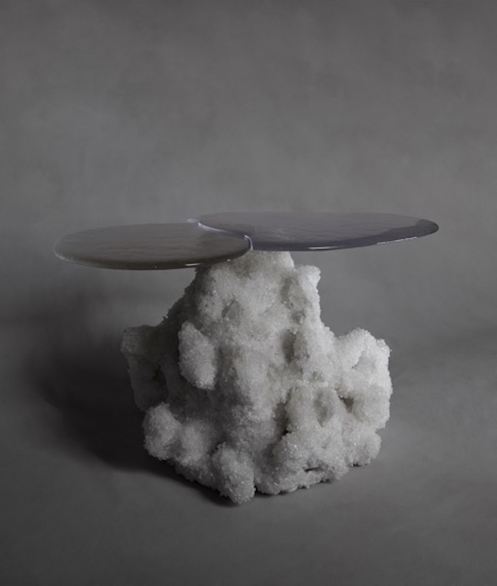
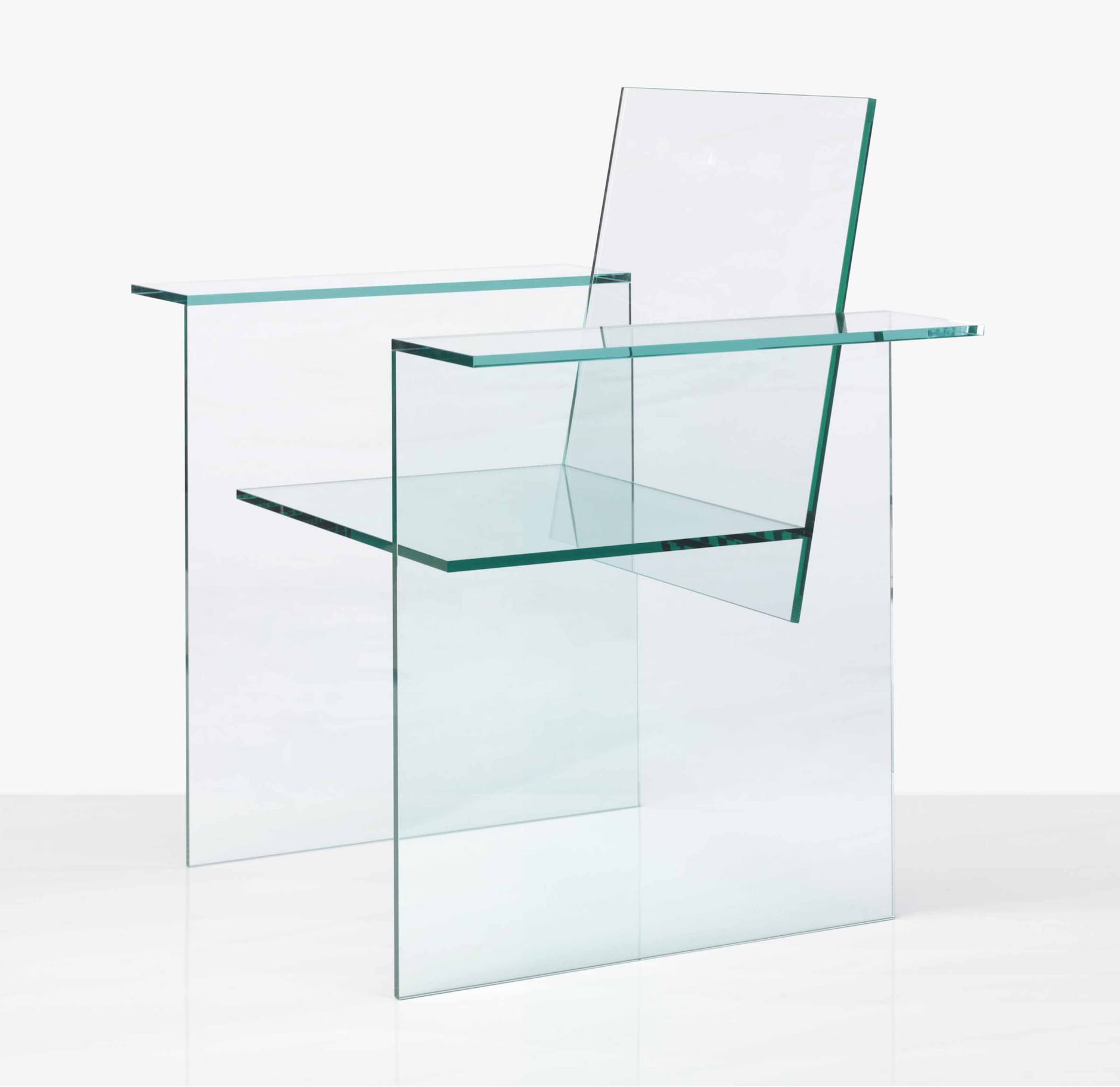
Dynamism: Counterpoint to our stark monoliths are a selection of highly curated pieces provided by Jeff Lincoln. We have a Shiro Kuramata chair, John Pomp tables, Peter Lane ceramics, Hun Chung Lee stools, and a sculpture by Alex Hangentorn. These artworks simultaneously live in the space and give it a polished edge. The relationship between the rough, untamed walls and the delicately placed and finished pieces create a sense of harmony—we want to give people a sense of how our surfaces live and the dynamism that high/low materials and aesthetics can bring to a space.
Takeaway: The luxury art and design market is oversaturated with precious and polished artworks. I am excited by emerging artists that are seeking to shake up the status quo and offer collectors something unexpected and unpredictable, un-homogeneous. Glass and ceramic artists are making great leaps and bounds in tabletop sculpture; some of the newest collectible work is so good at demonstrating chunky, jagged, scored, new surfaces. I want to bring that level of tactility to walls, on a grand scale. I hope that people take away a renewed sense of Callidus Guild’s approach to surfaces and materiality.
(Photos: Courtesy Callidus Guild)


