The List’s Project Spotlight column features unparalleled projects created by our forward-thinking List members. By going straight to the source—and having the designers demystify the methods behind their designs—we hope to enlighten and inspire our creative audience to further push the boundaries of what is possible in the realm of design.
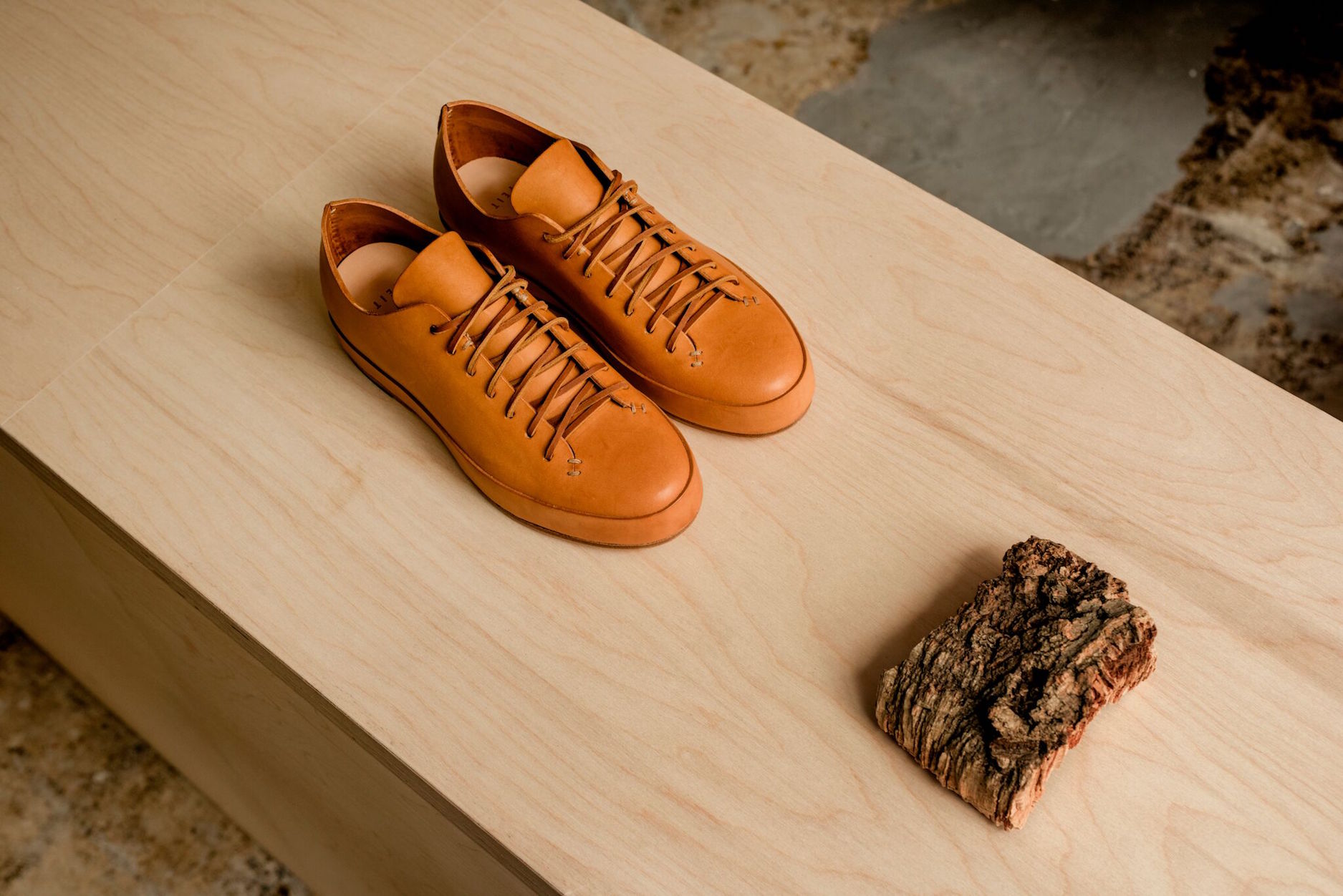
FEIT offers up exactly the kind of footwear we can’t help but buy again and again every time we’ve worn out one of its long-living pairs: simple, smart, luxurious, and timeless. Yes, hypebeasts will line up for the latest madcap colorway on Nike kicks, but there’s something equally alluring about the earthy, high-quality materials and handcrafting that meet in these cush lace-ups.
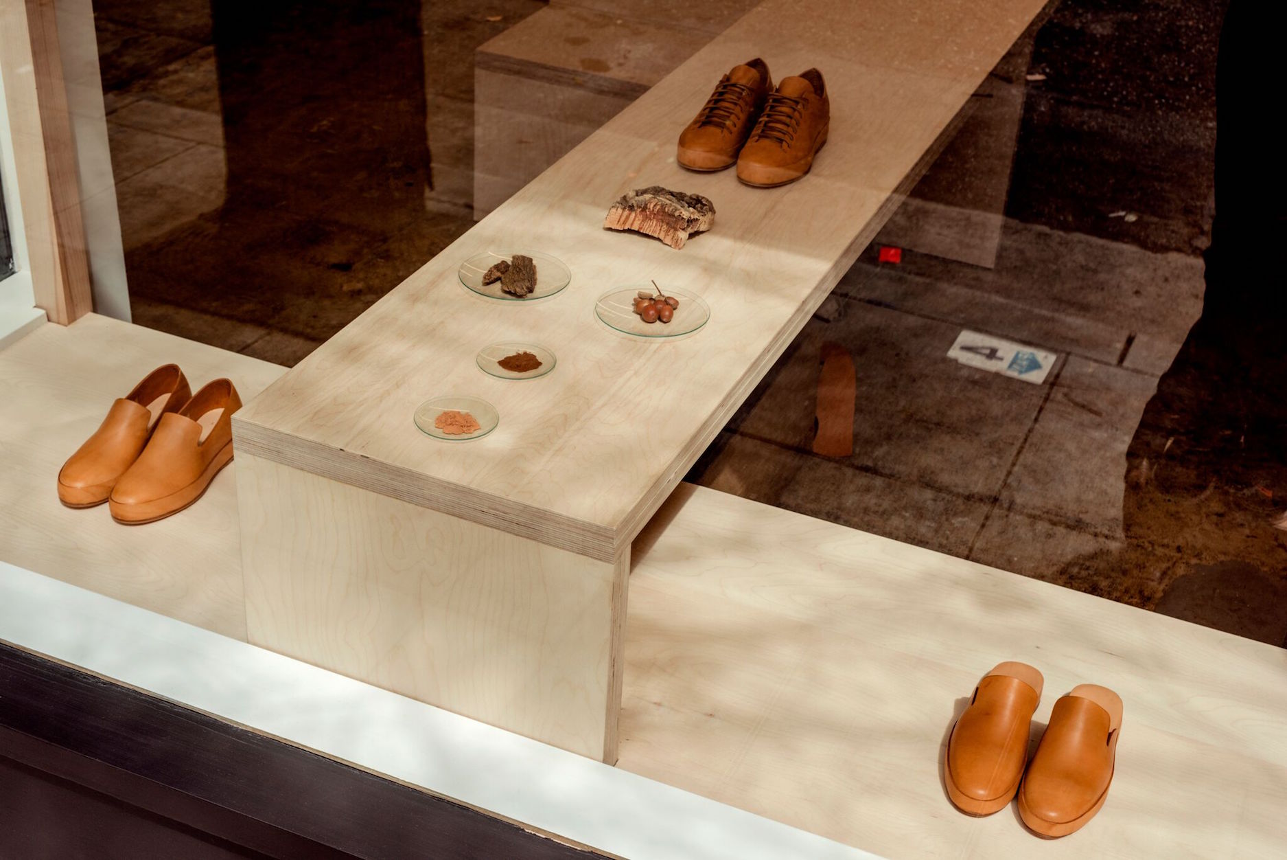
So, how do you display a shoe this simple and yet so complex? It was a question FEIT faced when working on its San Francisco store. Today, the team behind the shoe takes us into the design and commissioning process that resulted in a birch-toned tribute to shoe stores of old and a casual, relaxed, but nonetheless strong aesthetic statement.
FEIT is a member of The List, the destination for all things Surface-approved. Want to join The List? Contact our team to find out how to apply.
APPLY
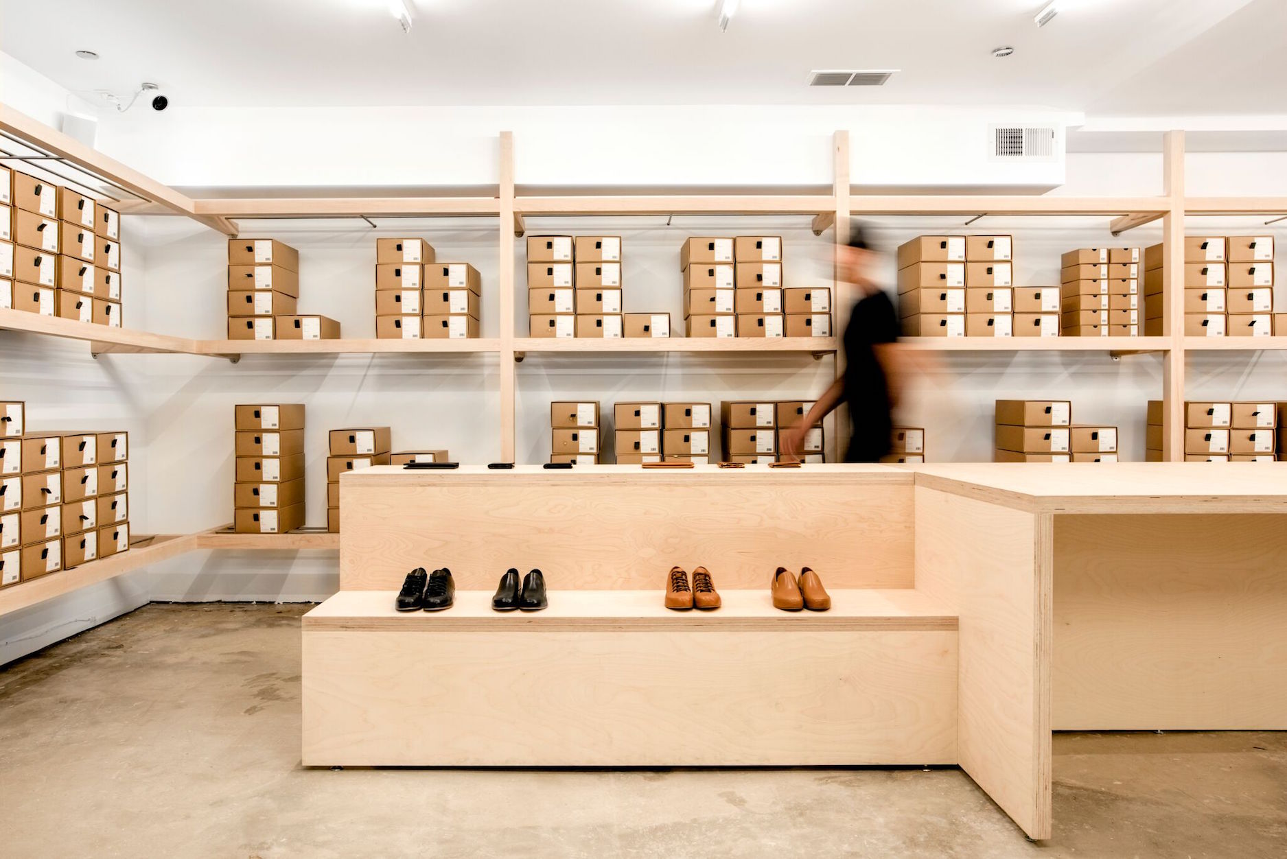
Inspiration: The concept for FEIT San Francisco is a modernization of the classic shoe store. Design elements reference shoe stores of the past—boxes stacked tall and rolling ladders roaming the aisles. We wanted to honor this history, tradition, and a focus on product and packaging.
Blueprint: We worked with Jordana Maisie Design Studio (JMDS)—the practice we collaborated with on the design of our two New York City stores. The existing interior was entirely gutted to open the space up—it now stands at 80 square meters. The approach from there was really to maximize horizontal display and integrate the seating element and the key “disruptor” to the display language. In all three of JMDS-designed U.S. stores, seating has always been integrated into the display language, creating shared spaces between product and customer. For this store we looked at creating more clear separation between each component—seating, storage, service and product, flat versus stacked versus hung. The streamlined material palette keeps with the aesthetic established by JMDS on the NYC stores, and features Baltic Birch plywood, stainless steel, and large, immersive mirrored surfaces, punctuated with a strong linear lighting strategy.
Challenges: The biggest challenge was creating complete transparency in this space, combining all the programmatic elements into an open plan layout. Nothing is concealed. All stock, full displays of 40-plus shoe styles shown as pairs, ample room for seating, and the capacity for small leather goods and clothing are designed to not feel displaced within the broader display language.
Uniqueness: The main point of uniqueness is the final elevated service element that is facilitated through the seamless, integrated design. Because stock is highlighted as a design feature, it means we can provide a fast, frictionless experience for the customer—associates never have to leave the floor to access additional sizes or styles. It’s tactile and personal.
The use of large mirror surfaces is also key to the uniqueness of the FEIT spaces—the architectural and lighting design is always considered in relation to reflection and play, i.e. how can we remove the sense of a solid boundary and encourage a feeling of expansiveness regardless of the simplicity and consistency of the material palette, product and packaging?
The hanging display is a custom detail using a 1-1/4″ diameter stainless steel pipe with a seamless connection at the mirrored wall surface. The leather strap—that uses the same leather stock used for FEIT shoe production—picks up the front end of the cantilever and ties it back to the maple beam above.
Takeaway: The unique spatial and material identity of the New York stores built strong brand visibility and helped to expand FEIT’s following—showing that a brand is more than just a product, it is a holistic vision encompassing product and production practices, as well as site specificity (location + context), materiality (natural vs. synthetic), display, user experience, and the activation of one’s imagination. Having established FEIT’s unique brick and mortar identity, we are now able to utilize these established design elements to hone in on a message of minimalism and service.
Impact of Project: Having established a strong identity with the two East Coast stores, San Francisco allowed us to strip the spatial experience right back and really focus on the notion of “service” at its crux, which beyond product and sales includes post-purchase care and repair to maintain and extend the lifespan of our products.
VIEW ON THE LIST


