DESIGN

How Formafantasma’s New Website Minimizes Carbon Emissions

Alarmed by the internet’s staggering amount of pollution, the Italian studio unveils a pared-back website redesign that uses small images and basic typefaces to reduce its environmental impact.

The internet consumes enormous amounts of energy; in fact, it’s the world’s fastest-growing carbon-emitting industry and will soon eclipse all other industries in terms of worldwide pollution. According to GreenGeeks, the growing number of data centers that host web servers currently accounts for two percent of global carbon emissions—a number that’s expected to rise to 14 percent by 2040. Recent studies show that Bitcoin is consuming more energy than Argentina, a country of 45 million people, and residents of Chandler, Arizona, were recently galvanized into action after incessant noise from data centers upended everyday life.

Concerned with these revelations, Formafantasma embarked on a total overhaul of its website to reduce its carbon emissions. The Italian design studio, led by Andrea Trimarchi and Simone Farresin, enlisted the like-minded firm Studio Blanco to create a new website that features small images, basic typefaces like Arial and Times New Roman that avoid unnecessary HTTP requests, and a pared-back logo created from standard Unicode symbols—features that require less energy to load on computers and smartphones. Visitors can also toggle between light and dark mode, which reduces energy consumption on devices that often use bright OLED screens.
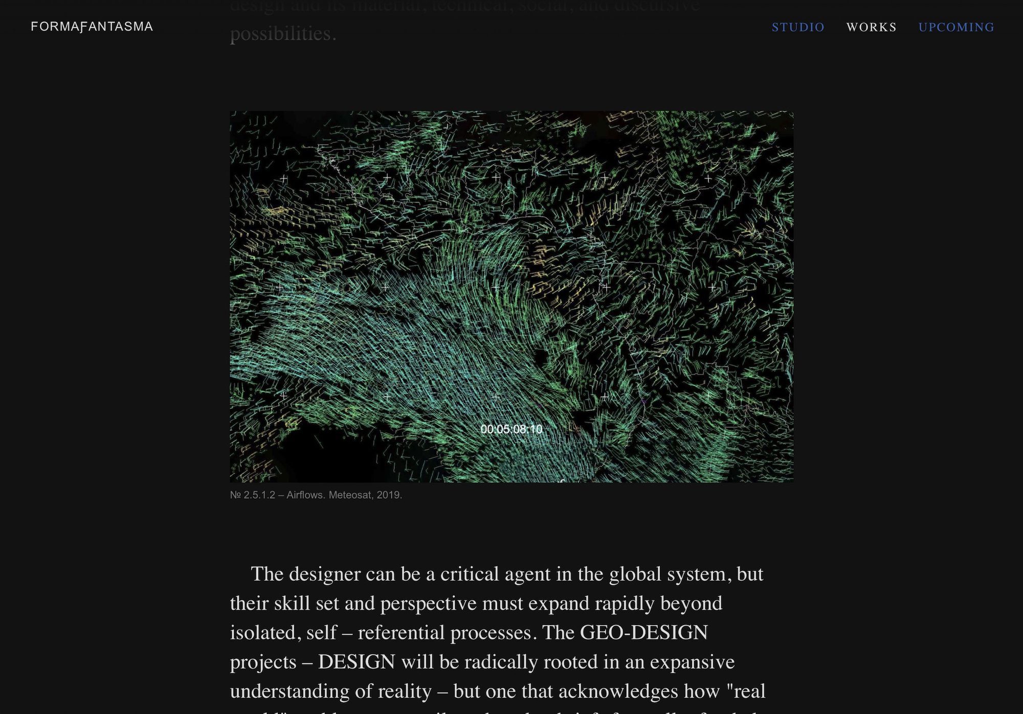
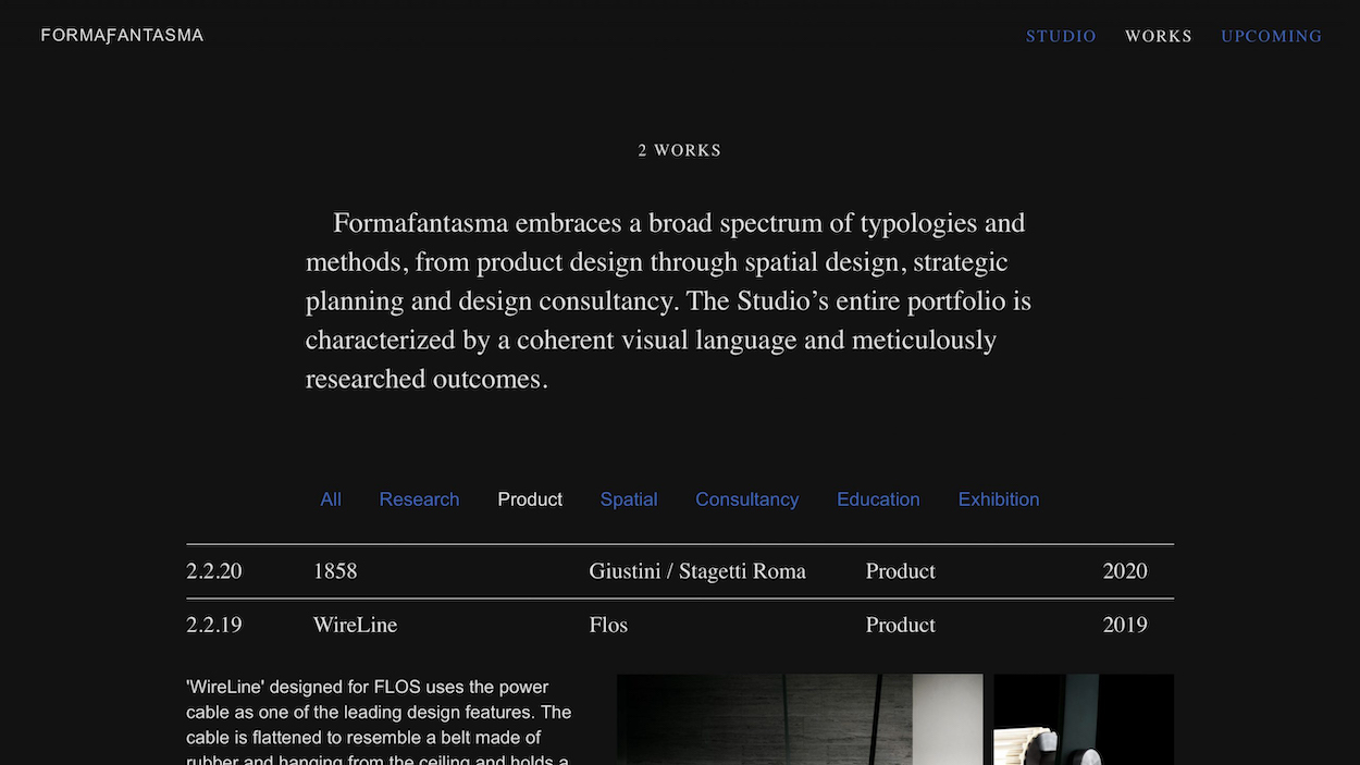
According to the duo, whose award-winning work has long explored sustainable narratives and interrogated the environmental impact of major industries, the redesign “started from a personal urgency and questions we had about pollution connected to the internet,” they told Dezeen. “We all know that when using digital tools, we’re consuming energy and emitting carbon dioxide. We felt it was an excellent design task to use new, more sustainable parameters as limitations for the website.”

The studio’s new virtual home intentionally eschews flashy graphic design trends; some may even draw comparisons to the makeshift websites commonly found throughout the internet in the mid-to-late 1990s. This is, of course, by design, and was intentionally streamlined to avoid loading unwanted content—a feature likely welcomed by anyone who reads news publications online without a subscription. Free of needless embellishment and pesky intrusions, the newly unveiled website begs the question: exactly how innovative is web design if it fails to take into account carbon emissions? It’s impossible to say, but the studio recommends perusing Low Tech Magazine—a solar-powered digital publication about the development of sustainable websites—for further reading on the matter. 

All Stories