The List’s Project Spotlight column features unparalleled projects created by our forward-thinking List members. By going straight to the source—and having the designers demystify the methods behind their designs—we hope to enlighten and inspire our creative audience to further push the boundaries of what is possible in the realm of design.
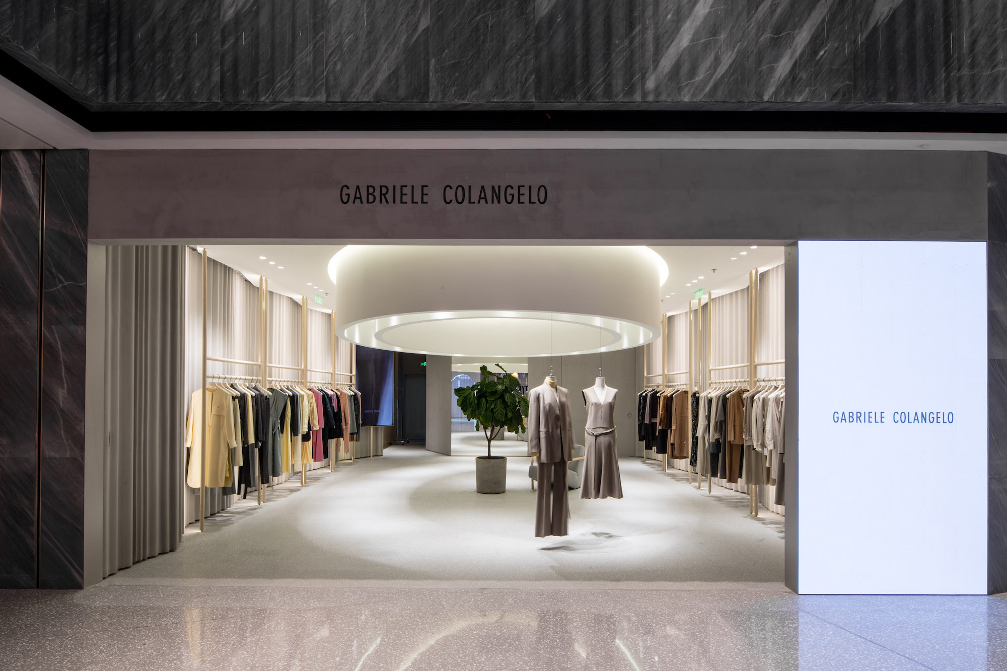
China isn’t short of bad places to shop. Still, the first store for Italian fashion designer Gabriele Colangelo offers an experience most flagships don’t. Emulating the label’s well-tailored garments, Montalba Architects conjured a luminous space lit by a suspended ring that draws shoppers inward, beckoning them to touch the garments.
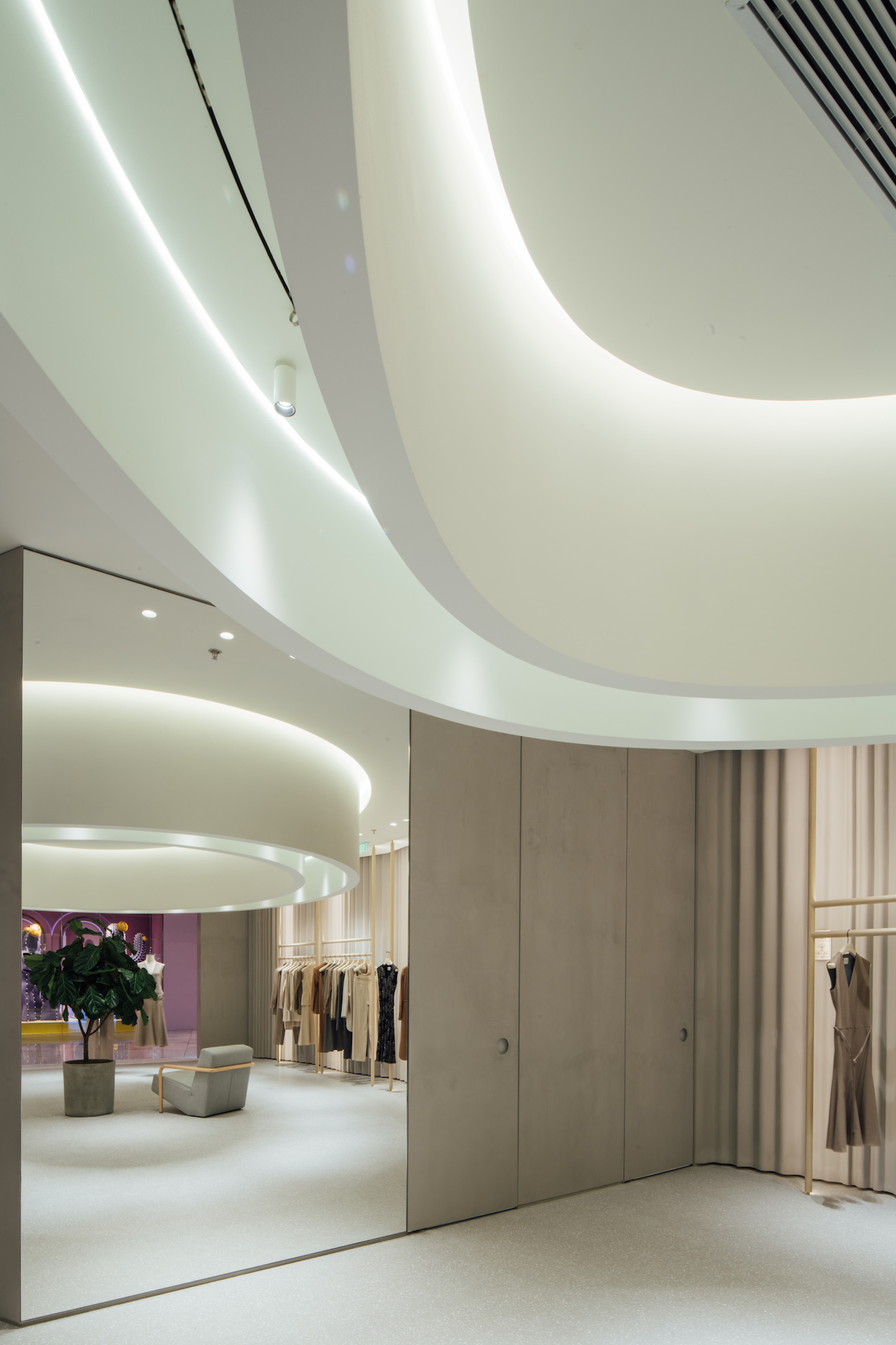
The common thread, so to speak, between Colangelo’s bespoke clothing and his new flagship is the treatment of materials and fabrics. Colangelo is refined, yet not completely restricted. His body of work is like the sculptural equivalent of Sophie-Elizabeth Thompson, the painter parallel of Conrad Jon Goldy, and the fashion counterpart of installation artist Robert Irwin. Grasping what’s between the lines, Montalba Architects transformed the idea of how Colangelo treats fabric and translated that into an architectonic landscape made from CNC-milled concrete. The result is an otherworldly partition system that emulates the gentle folds of fabric. The prefab concrete cylinders are rendered in a sprayed concrete, at once soft and bold—what looks like a veil actually feels like a mineral composite.
Below, the practice explains how it approached the project and delivered a flagship that creates an experience like no other.
Description: The first flagship stores for Italian designer Gabriele Colangelo, in Beijing and Shanghai, offer a gallery-inspired experience and a place to view his latest collections that reflects the intimacy of a living room. It provides a direct customer experience by illuminating the store with a bespoke ring of light suspended in the middle of the space that further draws users toward the displayed collection. The ring’s flexibility opposes the rest of the store’s straightforward protocol: there’s an accurate position designed for each element. A mineral curtain made by CNC technique combined with Douglas fir wood creates furniture elements, which were refined enough to not overpower the apparel. The new spaces reflect the ever-changing user experience of retail with a focus more on artistry and technology than an influx of products and branding. The conceptual design creates a minimalist, yet intimate experience that offers an open invitation to interact with the tailored collection.
Inspiration: The project started with a proposal inspired by Gabriele Colangelo’s collections and the way in which he works with fabrics. Colangelo wanted to re-create an art gallery space with a minimalist but warm atmosphere, while also having the intimacy of home. For the brand, the inspiration came from interacting with the collection, which is an ongoing performance that continuously creates new customer experiences—almost like a fashion show.
Blueprint: The customer and performance experience is achieved through a suspended ring of light that delineates the interior and provides the means to display the collection. The sculptural ceiling also provides lighting and air ventilation. The idea is for the customer to interact with the collection while in a lounge area and beyond it.
Takeaways: Designing the ring as a performance-oriented space creates an overall one-of-a-kind shopping experience. The CNC wall cladding also mimics a wavy fabric curtain and further creates movement and delineations.
Challenges: The projects began at the start of the pandemic, which created a few logistical challenges at the start, especially given the projects’ international locations.


