Born in Milan on February 16, 1918—100 years ago today—Achille Castiglioni went on to become one of the most noteworthy architects and designers of the 20th century, creating a slew of timeless products that remain relevant now. Throughout his 52-year career, Castiglioni never ceased to surprise, amaze, and inspire, designing roughly 150 objects, including lamps, watches, and vacuum cleaners for companies like Flos, Alessi, and Zanotta. Until his brother Pier Giacomo’s death in 1968, Castiglioni worked alongside his brother on many of these projects. Most of the objects he created were at once aesthetically beautiful and utilitarian. While his designs could be quirky, Castiglioni followed a rigorous approach that led to the lasting products we know today. Here, nine leading figures from the world of architecture and design choose their absolute favorite Castiglioni creations and tell us what makes them so special.
John Pawson, Barbara Bestor, and 7 Other Top Design Minds Celebrate Achille Castiglioni
To honor the 100th year of the Italian legend’s birth, we asked a few of the world’s best designers to share their favorite works by him.
By Spencer Bailey February 16, 2018
Barbara Bestor
Founding principal, Bestor Architecture
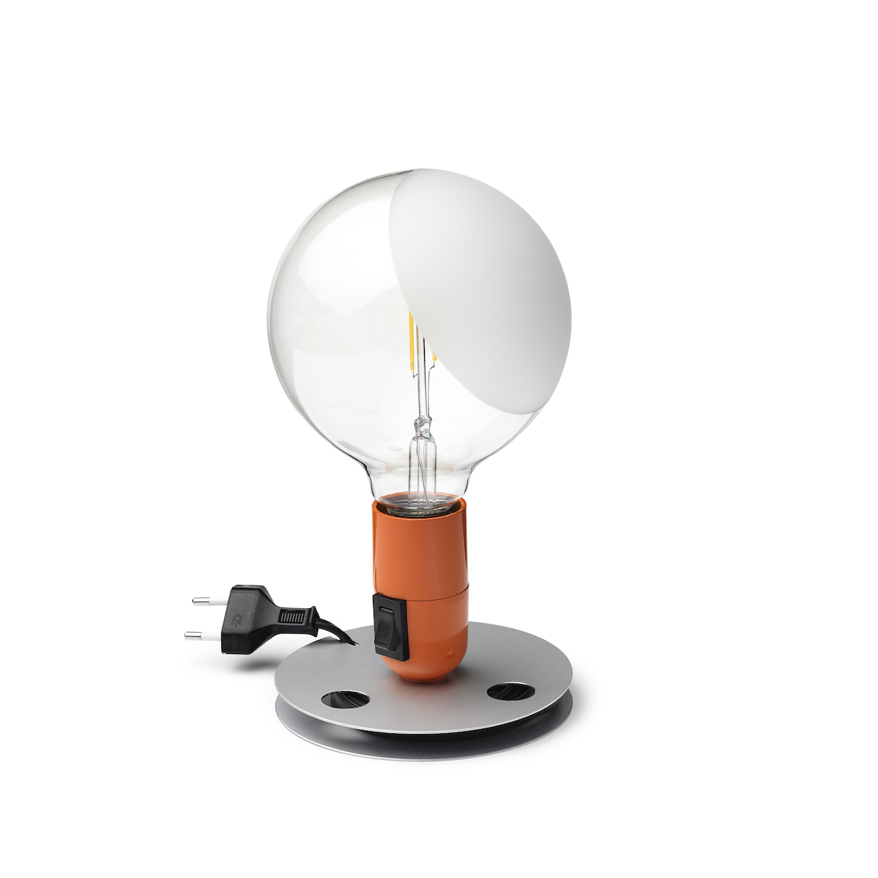
Lampadina Table Lamp for Flos (1972)
“I love that this is a sort of Duchamp meets high-tech approach to a table lamp. It’s unadorned and proudly displays its industrial form, but the designer has created a lovely steel minimal base and a sly [light switch] in the bulb holder. It’s a pop art dream.”
Lee Broom
Designer (London)
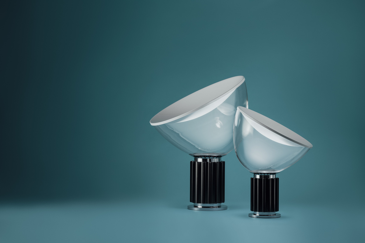
Taccia Lamp for Flos (1962)
“The Taccia is a classic. I love products that look contemporary while having a design heritage. When I first started designing lighting, this was a piece that resonated with me and inspired me to create a point of difference. I’m a fan of altered perspective in design, and with Taccia, Castiglioni created the illusion that the light emanates from the shade when it’s actually the base of this lamp that houses the bulb, with a concave spun reflector shade and a blown glass diffuser that can be positioned to adjust the light. I also like the use of simple materials. The lamp is formed from a metal base, aluminum reflector, and transparent glass diffuser, which creates the illusion. It is, without question, one of my favorite lighting pieces.”
Joe Doucet
Designer (New York)
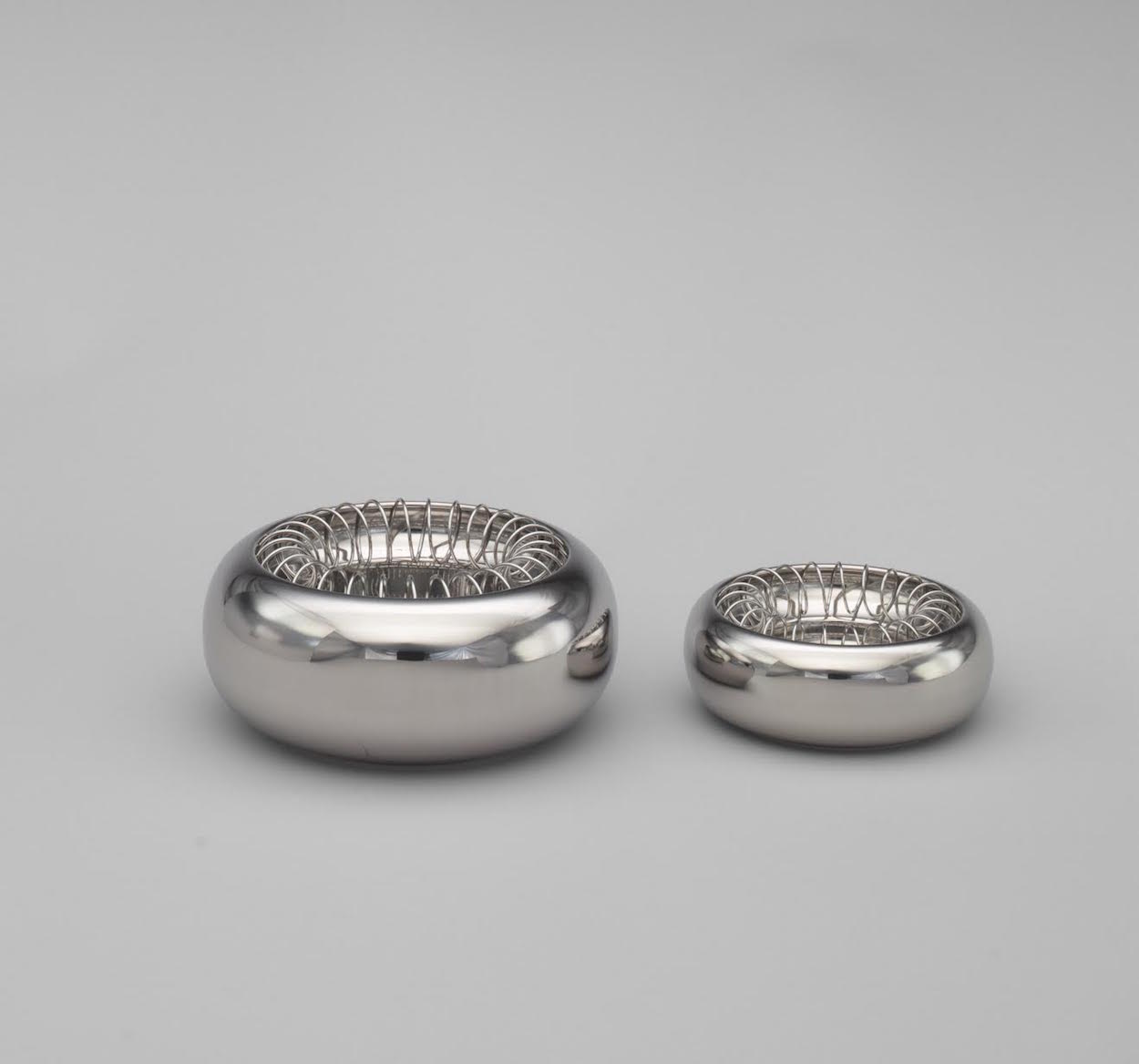
Spirale Ashtray for Alessi (1970)
“Although what I would consider masterpieces by Castiglioni are almost without number, I would consider the Spirale Ashtray not only one of his finest works, but a perfect distillation of the genius of his approach to design. In it you will find a very clever use of a common industrial material, a metal spring, which in this case is perfectly adapted to a new purpose: keeping cigarettes from falling into the bowl. You will also find his sensitivity to form in the perfectly proportioned bowl to which nothing could be added or taken away. Such beauty and ingenuity imparted on so mundane an object is a touchstone for the work of Castiglioni, and I find no better example of it than this.”
John Pawson
Architectural designer (London)
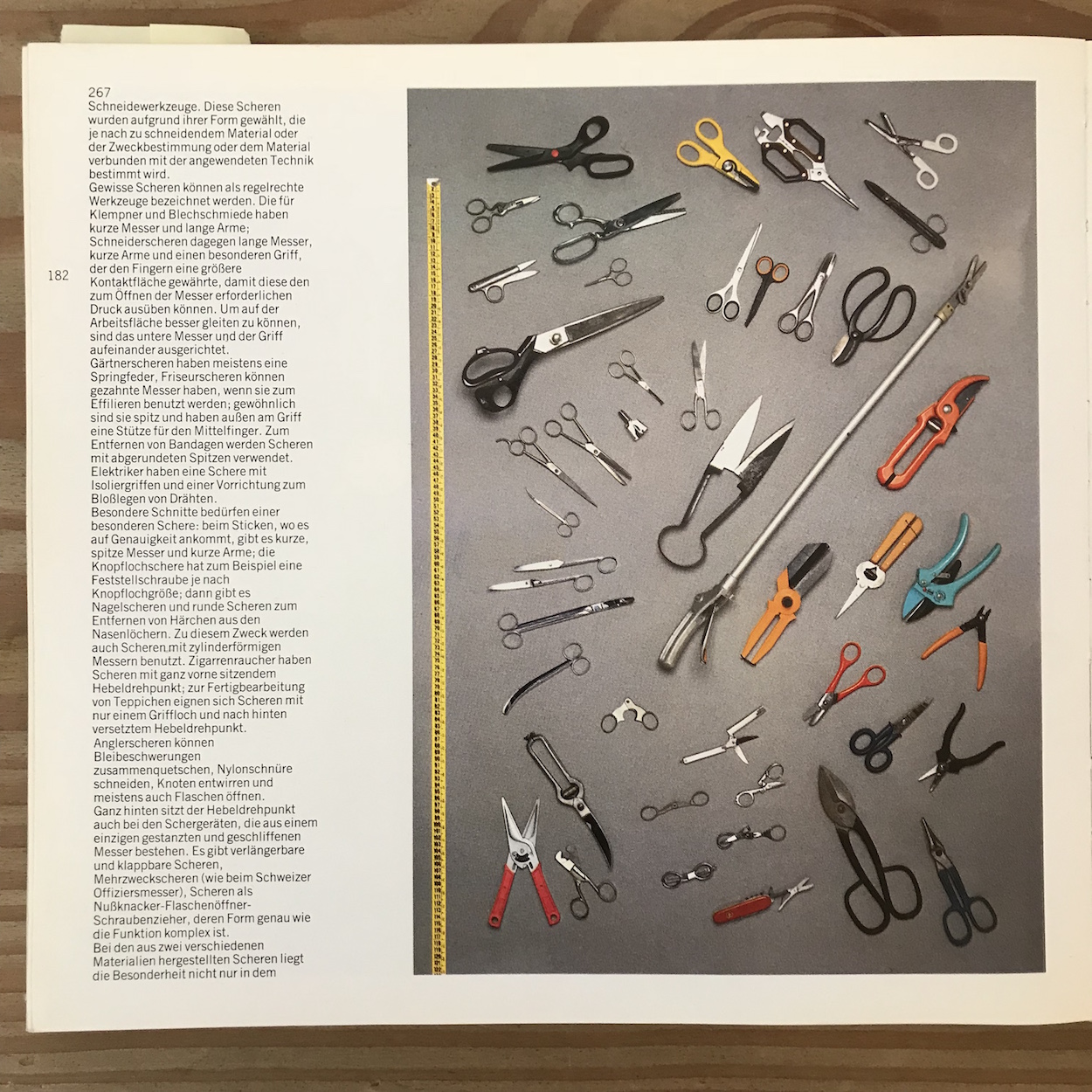
Castiglioni’s collection of found objects
“It’s always difficult to choose a single favorite design. So often it’s the way of thinking that you want to characterize. Looking through a book of Castiglioni’s work recently, I was particularly drawn to the photographs of his collection of anonymous objects. They evoke very strongly the atmosphere of purposeful order that I remember from his studio and his fascination, as a designer, with the ‘reciprocal sympathetic bond’: ‘I’d rather the things I designed were not recognized because of their brand, but for the reciprocal sympathetic bond that is created between the person using the object and the person who designed it.’”
Rafael Prieto
Co-founder and creative director, Savvy Studio (Mexico City and New York)
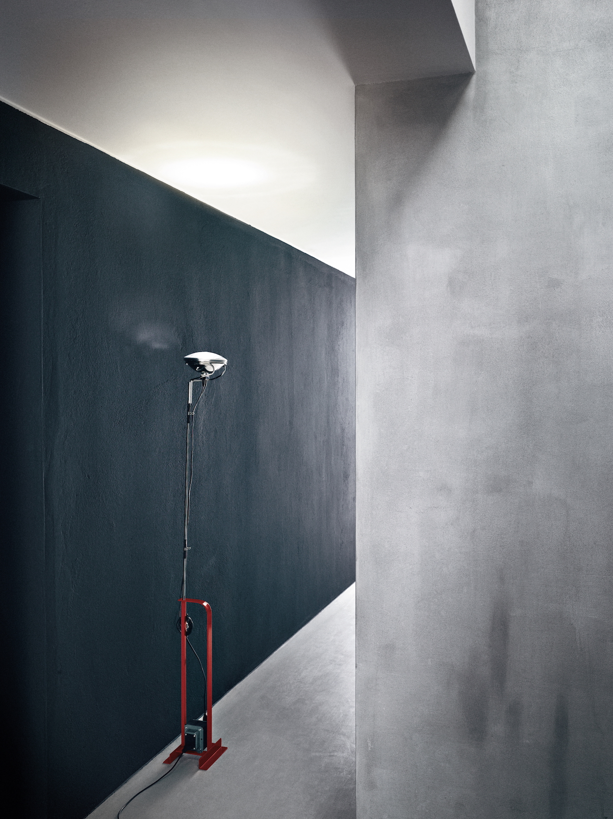
Toio Floor Lamp for Flos (1962)
“It’s an interesting and functional translation of its inspiration: a car lamp. The materials, the curves around the bulb, the mechanical aspects of it, the adjustable cord, its finishings—the Tolo is a beautiful object.”
Leon Ransmeier
Designer (New York)
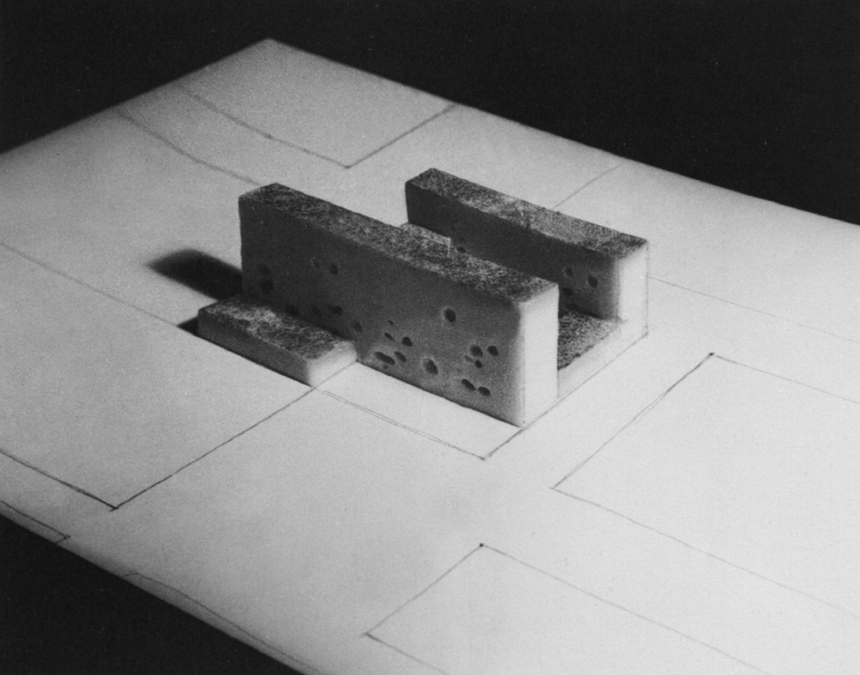
Fascist Cultural Center (1940)
“When Castiglioni created this work in 1940, Mussolini ruled Italy as a fascist dictator. In addition to the implicit absurdity of creating a building from cheese, the title ‘cultural center’ itself carries an irony. Extraordinary food, including cheese, is one of the many things that Italian culture is known for. I enjoy the thought of the nationalist fascist bureaucrats sitting all day in a stinking, oily room of cheese, tormented by the recontextualization of a cultural touchstone. It leads one to consider: What material would be appropriate for a ‘cultural center’ for the current U.S. administration?”
Suchi Reddy
Founder, Reddymade Architecture & Design
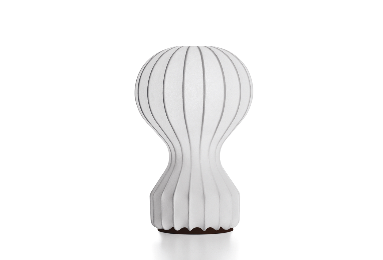
Gatto Lamp for Flos (1960)
“A timeless shape made with a sprayed resin technique, it exemplifies his capability to create beautiful design from the essentials: line, texture, and form. One of my favorite things to do in Milan is to visit his studio, now maintained partly as a museum to his creative process, and seeing the Gatto prototypes there is a true delight.”
Kulapat Yantrasast
Founding partner and creative director, wHY Architecture (Los Angeles)
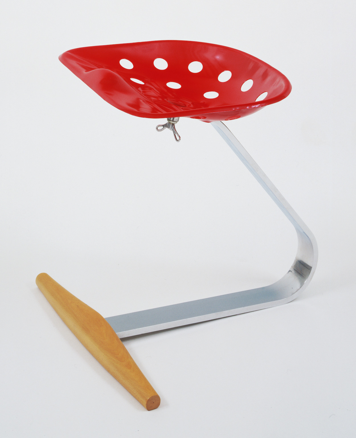
Mezzadro Tractor Seat Stool for Zanotta (1957)
“The stool is great because it’s so witty, kind of a play on Duchamp’s readymades with fun Italian agricultural chic. It’s Castiglioni at his best: ironic and playful, turning the humble tractor seat into a high-end design object. It also mixes different items from everyday life—the fixing screw, for example, was a kind found in bicycles at the time. I like the casual nature of this combination, the curious openness to incorporate diverse objects to create a truly new design language.”
Claire Weisz
Founding principal, WXY Architecture + Urban Design
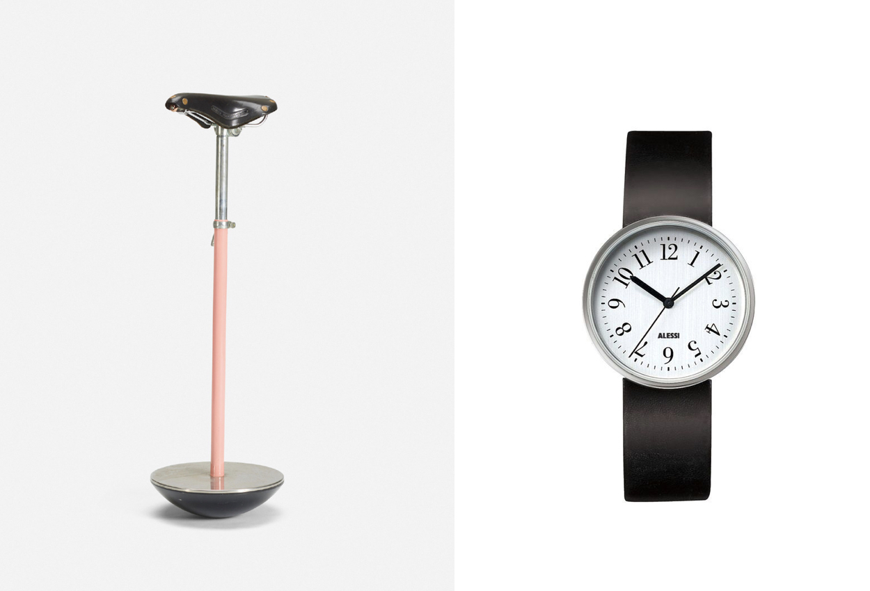
Sella Stool for Zanotta (1957)
“Who but Castiglioni could pull off creating an object that is so disjunctive and yet so compelling? A black racing seat on a pink stem sits on a rolling half sphere. Seriously, this was before millennial pink. Rumor has it that this was designed for its time, when phones were down the hallway and shared by a whole apartment floor and expensive. You would perch on the stool and quickly do your call and not get too comfortable. It now seems so contemporary, with the need to stop sitting so much and to perch while working on one’s USM hydraulic desk.”
Record Wrist Watch for Alessi (1989), with graphic designer Max Huber
“My watch—I mean, his watch. Best-detailed watch ever. A thin wafer of a leather strap is kept in place by two curved bent rods. This means that the circular bezel reads like it’s floating on your wrist. To top it off, the alignment of the numbers follows the angles of the second hand, making you notice the serif font choice in a totally modern composition. A perfect setup.”
