There’s a black-and-white photo, taken in 1986, of the Japanese American artist and designer Isamu Noguchi at the then rather stuffy Venice Biennial. In it, he stands confidently atop his spiraling “Slide Mantra,” a Carrara marble sculpture that rests on a bed of wood chips in front of the U.S. Pavilion. Though he looks content and somewhat nonchalant, the message Noguchi was sending to the art world at the time—if not to the world at large—was clear: Come play! (And, while you’re at it, stop taking yourselves so seriously!) One of the last major works in his six-decade-long career, the sculpture has endured in the 30-plus years since its creation: In 1991, it was installed in Miami’s Bayfront Park. A couple of years ago, I saw several kids giddily going up and down it in circles, with no sense of time nor care in the world, lost in the action of play. I imagined the tens of thousands of children (and adults) who must have experienced that slide there over the years. When play and good design converge, as with “Slide Mantra,” the outcome can be groundbreaking and, for many, life-changing.
13 Architects and Designers Imagine Playscapes of the Future
From a clever slide sculpture to a hide-and-seek–inspired teahouse, this is what play is going to look like in the years ahead.
By Spencer Bailey May 10, 2018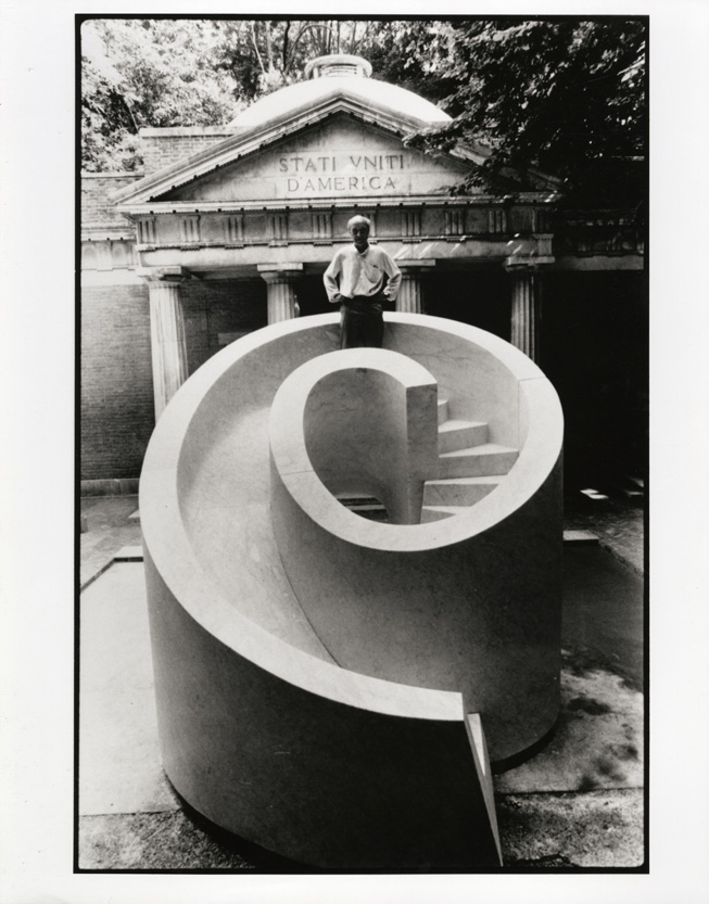
For this feature, Surface tasked 13 designers and architects with the lofty goal of celebrating play in the 21st century by reimagining the playground for 2018 and beyond. The brief I sent to them all was rather straightforward, albeit maybe not so simple: “Create an object for a playground of the future. It could be whatever you want it to be—as long as it’s about play and makes sense within a playground setting.” For reference points, I sent them two strong examples to consider: Noguchi’s “Slide Mantra,” as well as “Imagination Playground,” a system developed a few years ago by the architect and designer David Rockwell to encourage unstructured “free play” at schools, parks, hospitals, and the like.
A broad array of ideas resulted, some of them admittedly more realizable than others. They range from, yes, another clever slide sculpture (by Paul Cocksedge), to a fountain and water balloon–filling station hybrid (by Frederick McSwain), to a hide-and-seek–inspired teahouse (by Stephanie Goto). In one case (Studio Dror’s), the designer collaborated with kids themselves to come up with the creations—musical chairs, literally. If there’s anything that ties these projects together, it’s the idea of the multifunctional—that good, sound playground design needs to be something that’s fluid and can be experienced in many different ways, from various angles, with no one-size-fits-all model. These are ideas, I’m confident, that would enliven Miami’s Bayfront Park—or most any public green. And in the cases of a few of them, I could even see them making a nice addition to the next Venice Biennial.
Ramping Up Play
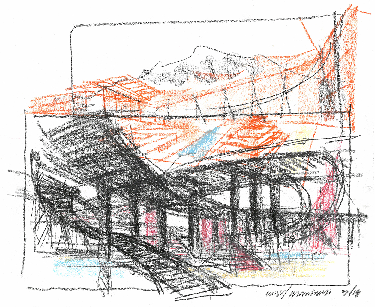
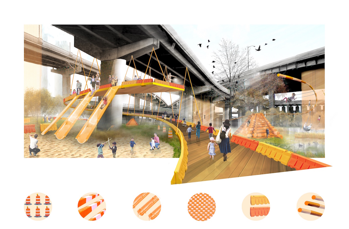
“Suspended from the concrete jungle, these aerial, pop-up playstations reclaim interstitial sites of single-use infrastructure. Fluid worlds of exploration, independent of scripted beginnings and ends, they invert the notion that new playspace requires new ground. This design uses infrastructure’s free gifts, providing shelter from sun and rain and robust structures capable of suspending miles of play, to create new playgrounds in underserved urban neighborhoods and activate spaces vulnerable to privatization. Connecting neighborhoods separated by the world of on and off ramps, the aerial play spaces are constructed from the recycled debris of temporary infrastructures: netting, tubes, cables and scaffolding, concrete pipes and water-filled highway barriers. These materials change from one geographic location to the next—an infinite variety in an infinite world of leftover space.”
Zoids!
LevenBetts*
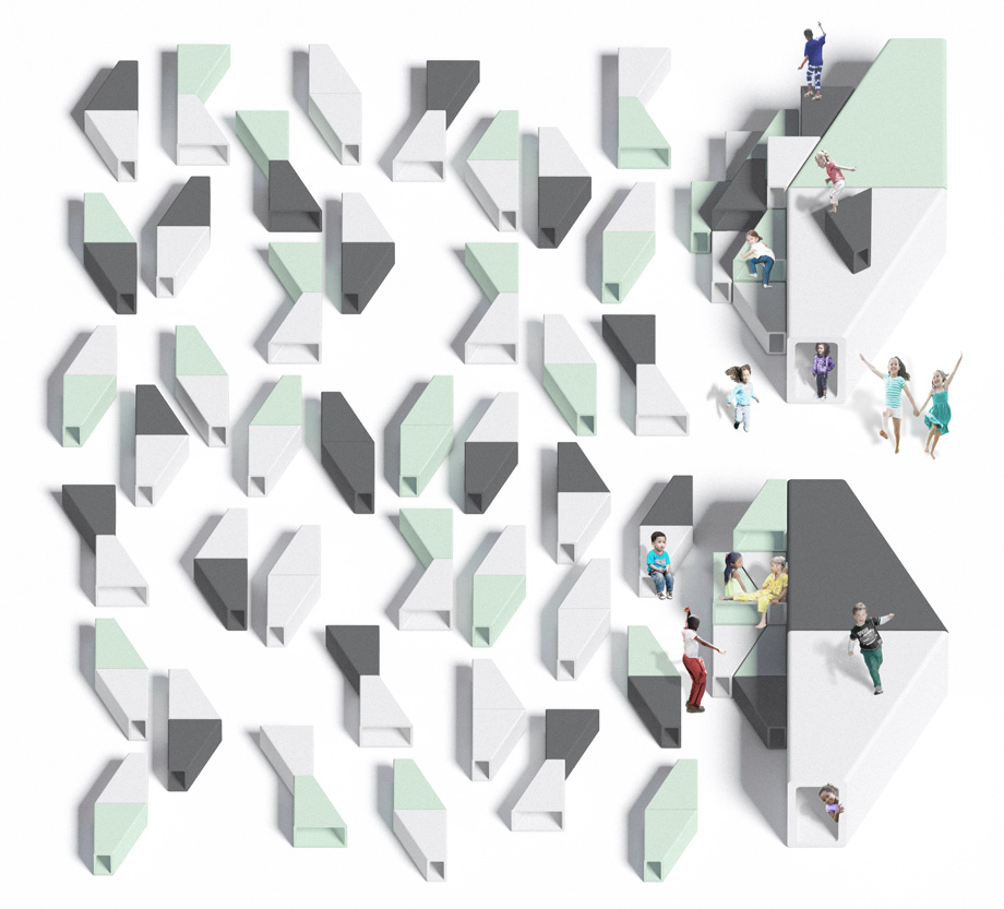
“Zoids! are right-trapezoid–shaped ‘things’ made of mycelium (basically, mushrooms) treated with mineral paint, so they’re totally healthy and nontoxic for kids. They’re soft and fun and can be assembled into infinite shapes and configurations. Zoids! can be a seat made of one small piece, a berm made of many, a funnel to be crawled through, et cetera. They create an ultra-healthy playscape for kids—and even adults. They are the future of play: No longer do soft and durable kids’ playthings need to be passive, and made from petroleum. Zoids! makes play fun, mind-expanding, and healthy. Formed by the aggregation of one simple repeating trapezoidal volume at two scales, seating, landscape elements, and building blocks combine to create an all-encompassing, changeable scape of play and ‘zoidal’ discovery.”
*Developed in collaboration with the Healthy Materials Lab at Parsons School of Design.
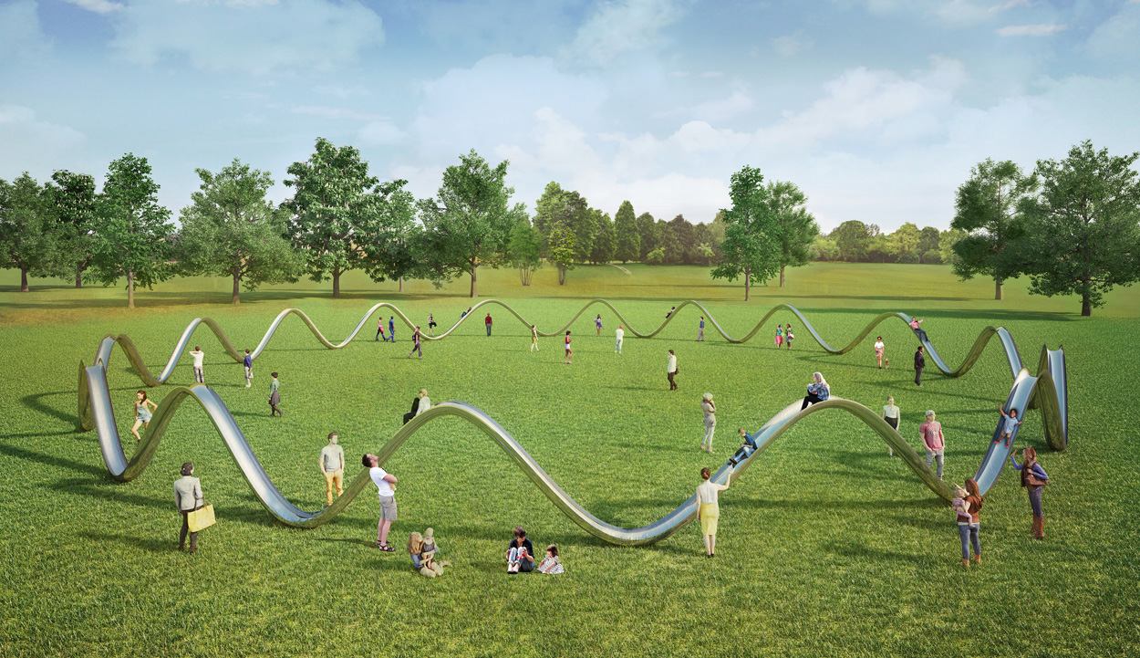
Oscillate Slide
“Childhood memories of the joy of sliding, and the freedom of that movement, were the inspiration for this piece that celebrates infinite motion. The sculptural form of the Oscillate slide defines the park’s playing area, encircling trees, picnic areas, and places to gather. People can walk in and out beneath the arches, as well as slide down the top. We hope this piece offers a return to the playground’s original purpose as a place for us all to run, have fun, and be free—in the absence of electrical noise.”
*Rendering done in collaboration with the London-based 3-D architectural visualization studio VMAVI.
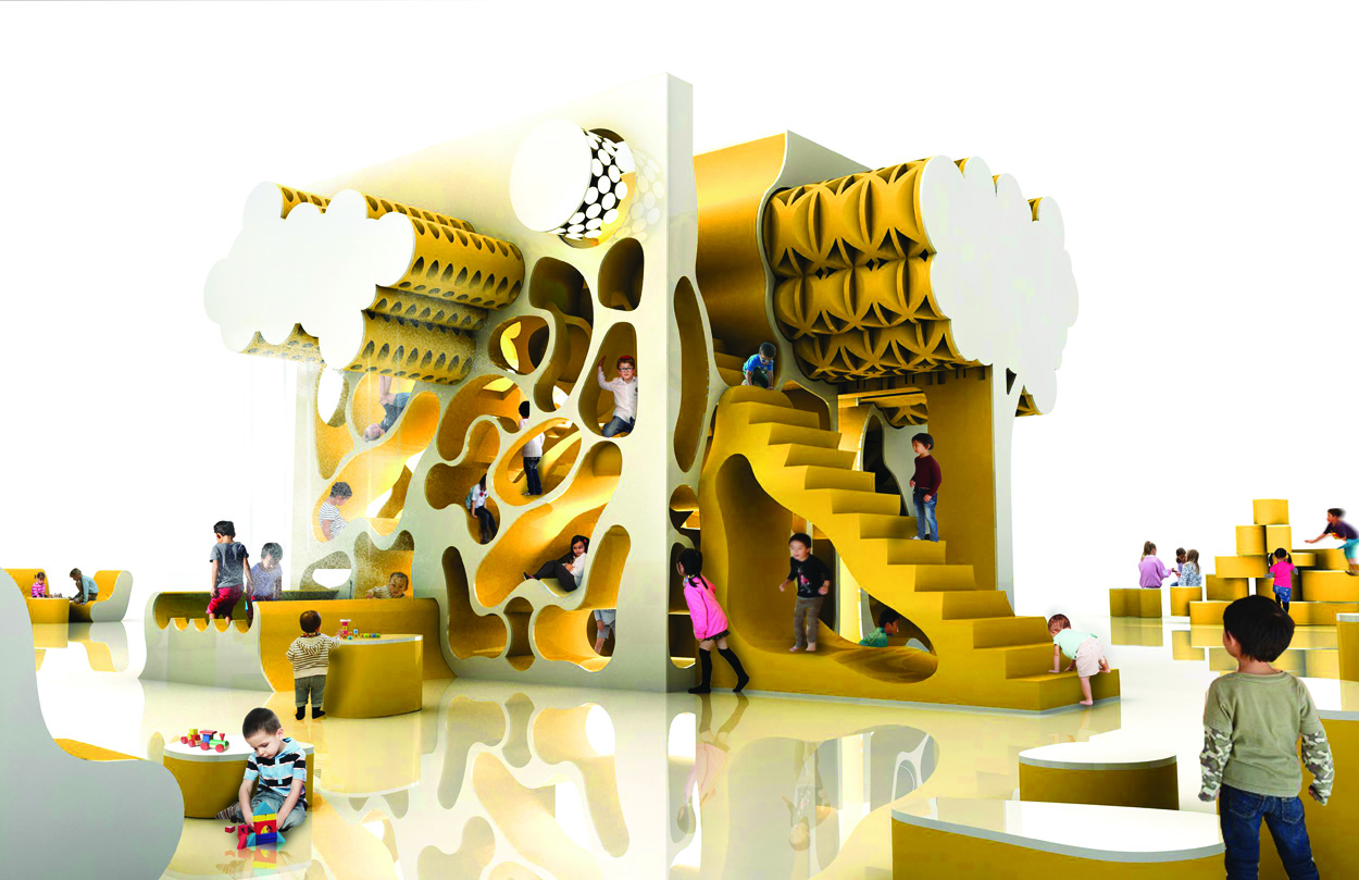
Kewby
Hollwich Kushner
“Kewby is a magical place that’s always changing, yet always familiar. It starts as a huge and simple cube that visually dares young visitors to tear it apart. Lightweight pieces in the shapes of stairs, trees, waves, jelly beans, et cetera can be easily pulled from their nests and strewn around the park. Every piece that’s removed reveals tiny spaces to explore. Larger pieces take on functions like providing shade or serving as a table. Kewby is a hub of activity with thousands of permutations—the only limit is its users’ creativity. Make a fort, a theater, a classroom—whatever. Ambiguous forms allow the user to give purpose to each piece as they see fit, creating an endless array of items for play, entertainment, and rest.”
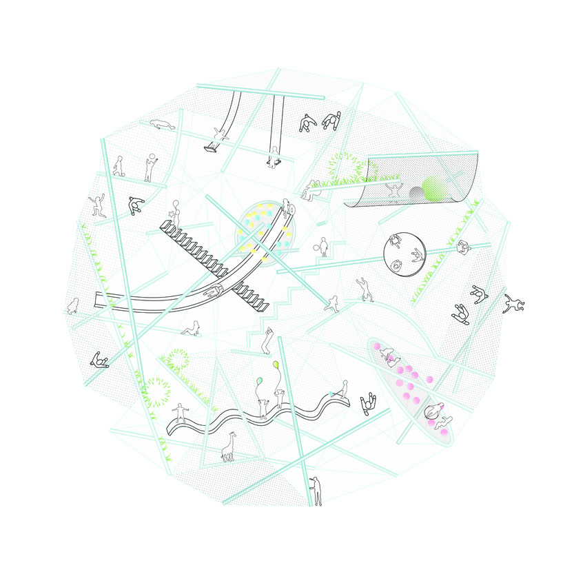
Tumbleweed
SO-IL
“Tumbleweed is a mobile playground that can be positioned in a variety of settings. Its spherical tensegrity structure is filled with slides, trampolines, monkey bars, and other equipment. As a ‘tumbleweed,’ it can roll over and transform an empty lot into a place for learning and adventure. The structure bounces around, settling into a position where a different set of equipment is accessible. Every time a playground is ready to be explored, a new game is possible: If yesterday the swings were near the ground, today one has to find a way to climb all the way up to get to them.”
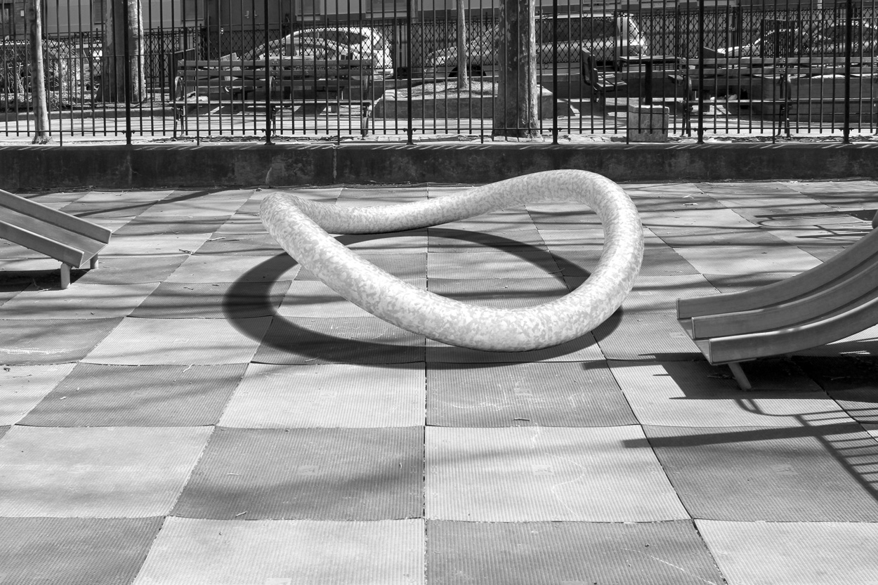
Precarity Ring
Leong Leong
“Precarity Ring prompts precarious play, banking on risk to build resilience. Its ambiguous form piques curiosity and invites people to negotiate its inherent instability together, requiring physical coordination as well as social cooperation. A ring of galvanized steel tube, eight feet in diameter, is deformed to create an object that is simultaneously foreign and familiar, rugged and elegant. The circular form maintains a sculptural stillness until activated, but it requires two or more people to balance as a seat or to make it rock as a seesaw. Precarity Ring also draws a boundary that can either include or exclude, creating a site for imagined scenarios and social negotiations to take place in collective play. As a piece of human infrastructure, the Precarity Ring transforms any space into a social space of play.”
Fil
Frederick McSwain
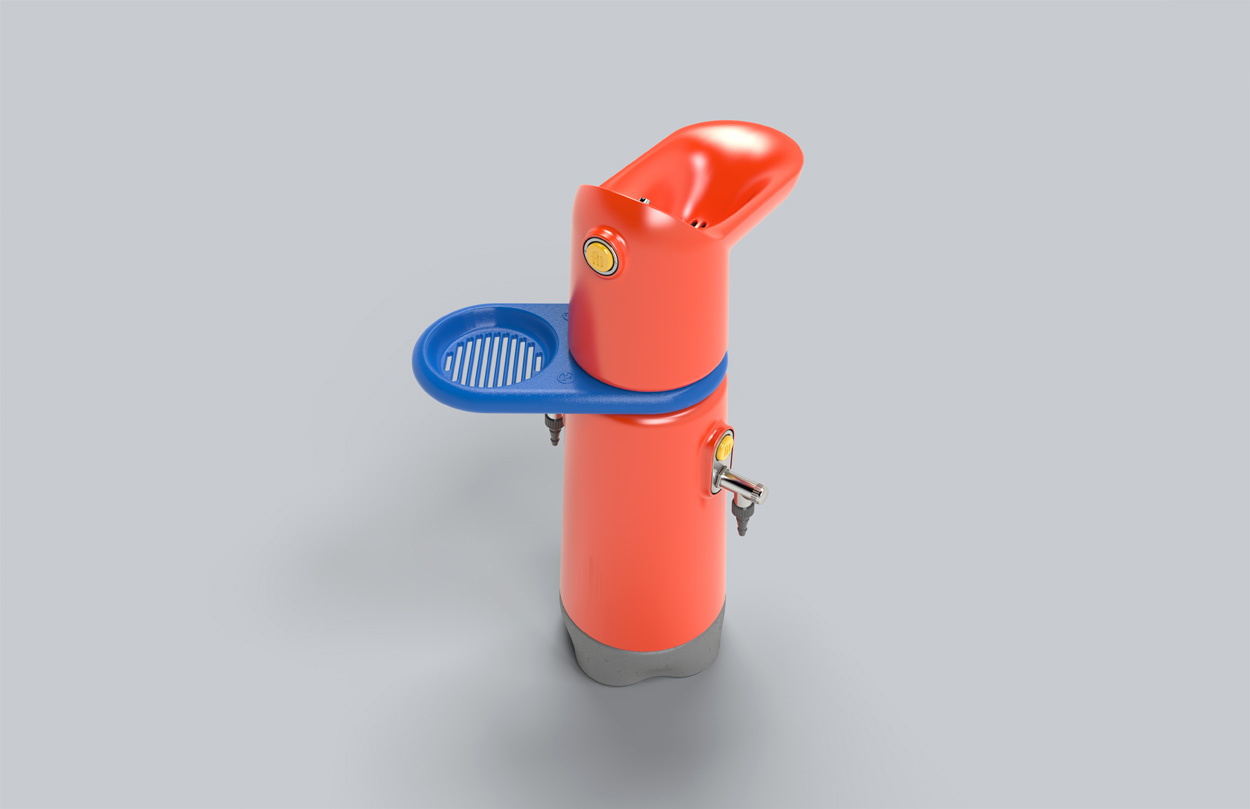
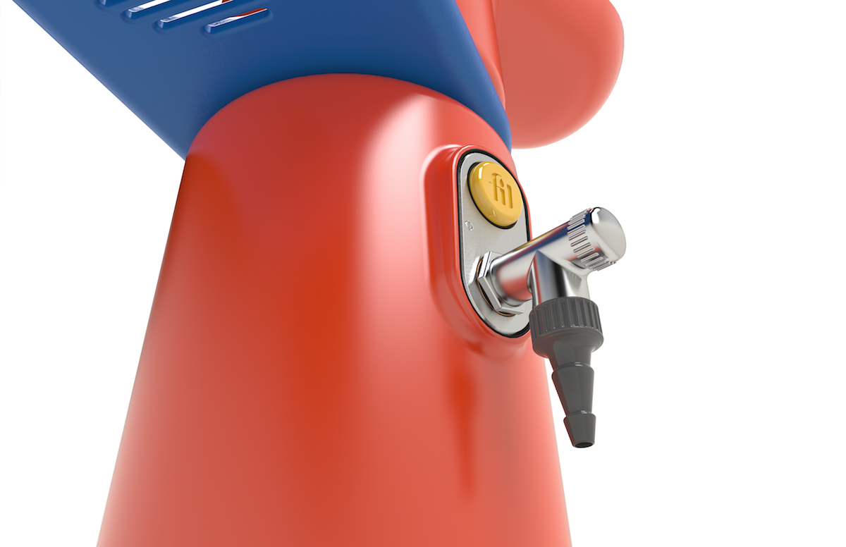
“In the warmer months, a commonly isolated and critically overlooked staple of the playground emerges from hibernation: the water fountain. Although designed for drinking, this bubbler’s primary function is often reappropriated as a filling station for various water-dispensing devices, from buckets to balloons. The surrounding area gradually pixelates into a vibrant terrazzo, full of colorful shrapnel on damp concrete. Fil’s playful aesthetic and multifaucet access offer the ideal pivot point for young summer soakers. Colorful and characterful, Fil acts as a catalyst for both sensory play and the imagination.”
Witt
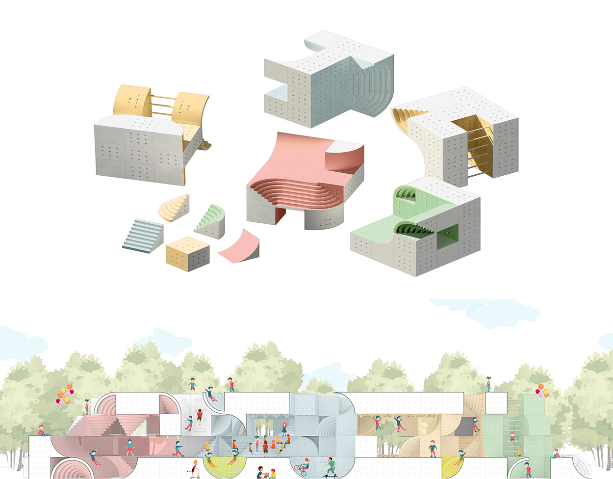
“Twist it! Turn it! Stack it! This playground is reimagined in an interactive module that lets children reshape their play spaces, creating small cities as playgrounds. The Witt module is a dynamic and interactive system for building the next generation of public playspaces. The primary system of the playground is composed of five distinctive blocks, each with a specialized function: a simple cube; two triangular wedges, which act as reciprocal surfaces to allow for climbing, or together create amphitheater seating spaces; a stair module; and a concave wedge, which acts as a climbing and sliding surface. The surfaces of each cube are covered with soft rubberized material to allow for grip and [to provide] impact surfaces. Each cube is also perforated, to allow a tube to serve as a connection or as a plug-in for swings, ladders, and monkey bars. The primary units are combined to create a larger three-by-three cube. Due to the uniform cube dimensions of the modules, any face of any cube can be reoriented to join an adjacent module, allowing for limitless combinations of diverse playspaces. The subsequent three-by-three cubes can then be combined with one other to create a larger playground mega-structure.”
Observatory Slide
Christian Wassmann
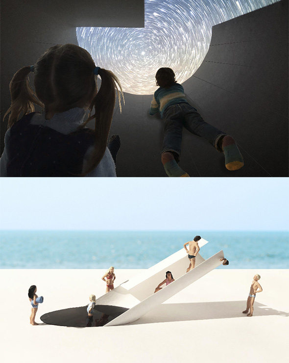
“The Observatory Slide is a multifunctional playground structure precisely shaped by its location. A half-buried fiber cement U-channel cantilevers out of the ground parallel to the axis of the earth. It serves as a sundial, a stargazing instrument, a shading device, a micro-solar power plant, and a waterslide. Children and adults enter the installation through an elliptical pool. They can then crawl up on the dry sides of the channel or hold on to a central railing, through which one can also see Polaris. Next to this pipe are perfectly oriented photovoltaic panels that produce the power for the water pump needed to lubricate the slide.”
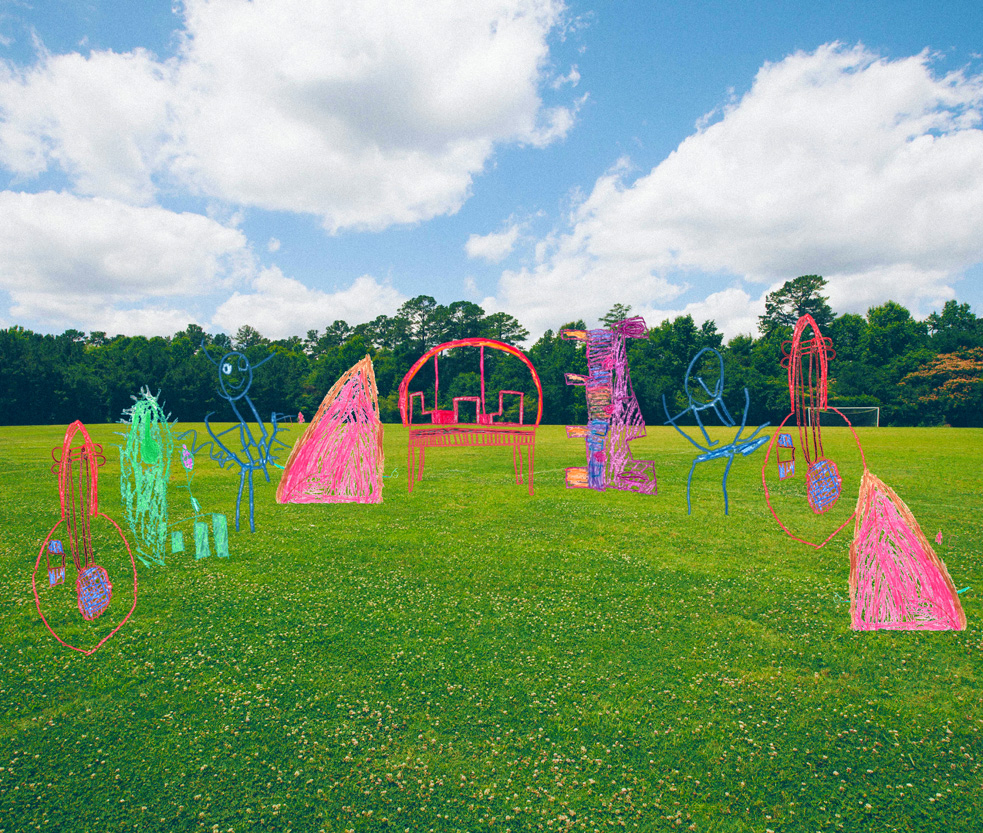
Playchestra
“For the past couple of months, I [Dror Benshetrit] have been mentoring the kids from WeGrow in a class called ‘What is Design?’ WeGrow is WeWork’s new school that’s committed to unleashing every child’s superpowers and passions. Through an integrated, individualized curriculum that elevates all aspects of the child, WeGrow aims to nurture growth in children’s minds, bodies, and spirits. The goal is to create conscious global citizens who know who they are, understand their gifts, and approach life with wonder, joy, humility, and a profound desire to share. The school will be opening September 2018, in New York City, for children in pre-K through fourth grade. During the class, the kids have been learning about design, and through one student named Hilla we came upon the idea for chairs that function as musical instruments. The discussion evolved into the entire class thinking about multifunctional seating. The kids continued to evolve their ideas and thoughts into creating a place of music-making and play, which they called ‘Playchestra’ or ‘Parkestra.’ The kids came up with inventive names for each element, like ‘Chair-cello,’ ‘Chair-kulele,’ ‘Tree of Music,’ ‘Windourine,’ ‘Musical Monkey Bars,’ and ‘Electric Slide.’”
*Developed with students in the “What is Design?” class at WeWork’s WeGrow school.
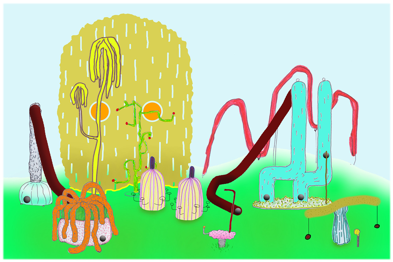
Kizombori
Jonathan Trayte
“This sculptural playwork garden combines an assortment of bizarre and surreal apparatuses installed in a rich environment of shrubs and trees. The devices have ambiguous function, and children are encouraged to interact independently, interpreting their own methods of play. Using casts and renderings of huge vegetables and contrasting textures, this [seemingly] edible landscape manipulates scale and form for hallucinatory effect.”
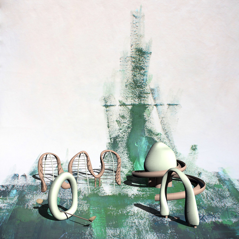
Clayground
Faye Toogood
“Toogood’s design gives physical form to the concept of playfulness. Its chunky, ludic shapes—originally developed as clay maquettes—resemble the forms that children make as if by instinct when using plasticine: long sausages, doughnut rings, rounded eggs, and so on. The simple, art brut sculptures were tailored to accommodate the practicalities of play, reflecting the flights of imagination by which a child’s mind can transform the most ordinary object into something magical. Scaled up, these familiar forms lend a cartoon wonderland feel to the playground, transforming it into an inviting presence with which children can interact. In a friendly, ice-cream palette of strawberry, vanilla, and chocolate, the four pieces—a wiggly climbing frame, an archway swing, a ring-shaped seesaw, and a helter-skelter orbiting an egg—can be realized either in durable steel-framed fiberglass to facilitate off-site construction, or as painted concrete structures to allow for a more permanent installation.”
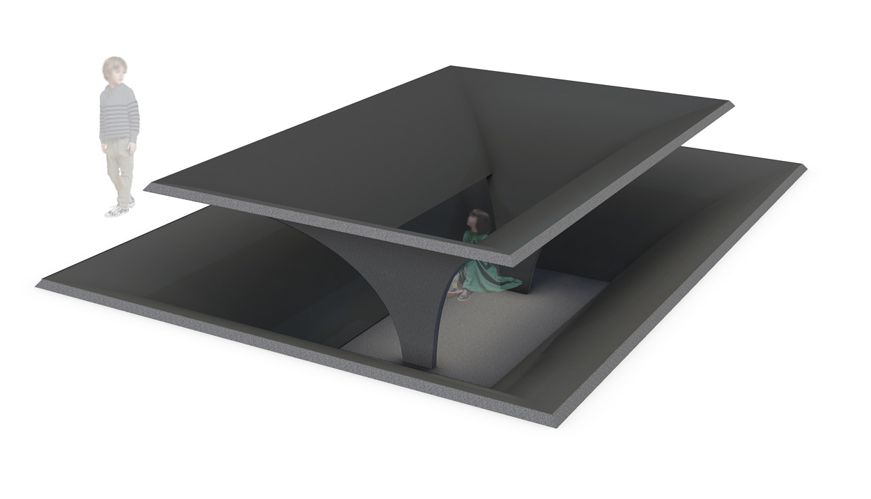
Hide-and-Seek Teahouse
“The universal game of hide-and-seek is the inspiration for this children’s teahouse. Mimicking palms upon a face that gently recall the sloping roof lines of teahouses in Japan, Hide-and-Seek presents conditions of seeing and being seen, activates the spirit of play, and provides moments of reflection. Engaging the ground plane, Hide-and-Seek—which is made of hammered and honed black granite—is a place of discovery, a timeless analog moment that engages our senses free of devices.”
