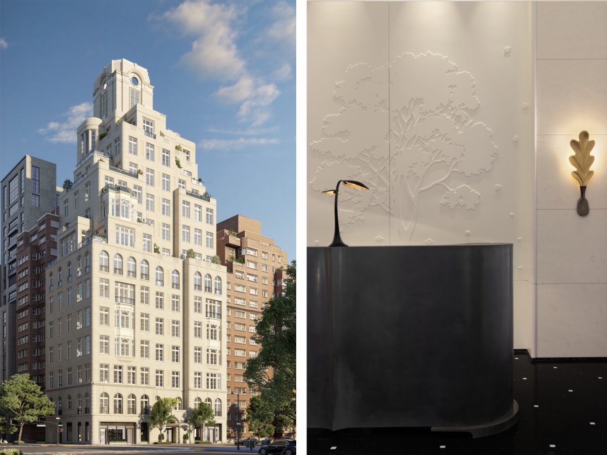
The Upper East Side is the go-to spot for prime examples of Gilded Age and Neo-Revivalist residential architecture in New York City, but the district isn’t frozen in time—within the fortresses of late 19th- and 20th-century splendor, contemporary new-builds have taken root and added depth to the neighborhood’s skyline. Case in point: the Bellemont building, developed by The Naftali Group, whose classic masonry exterior by Robert A.M. Stern Architects harbors a refined and modern interior scheme courtesy of Achille Salvagni Atelier, the acclaimed Rome-based interiors firm known for skillfully blending styles from different eras into projects that feel both timeless and of-the-moment. (For instance, a Miami Beach estate with Gio Ponti vibes and the studio’s sumptuous atelier in London.)
Below, we take a closer look at the project.
Project Description: The firm designed all of the residential interiors and the shared spaces, imbuing the building’s 12 units with soft aesthetics that pay homage to the grand old homes of both New York City and Paris. Situated just one block from Central Park on Manhattan’s Upper East Side, the building was designed by Robert A.M. Stern Architects. It features a classical masonry facade of hand-carved, hand-laid Indiana limestone, European-style casement windows, and ironwork accents. Achille Salvagni Atelier contributed light wood finishes, sophisticated lines, and high baseboards to the dwellings. Amenities include a rooftop terrace, cinema room complete with wet bar and popcorn machine, children’s playroom, squash court, and holistic fitness center.
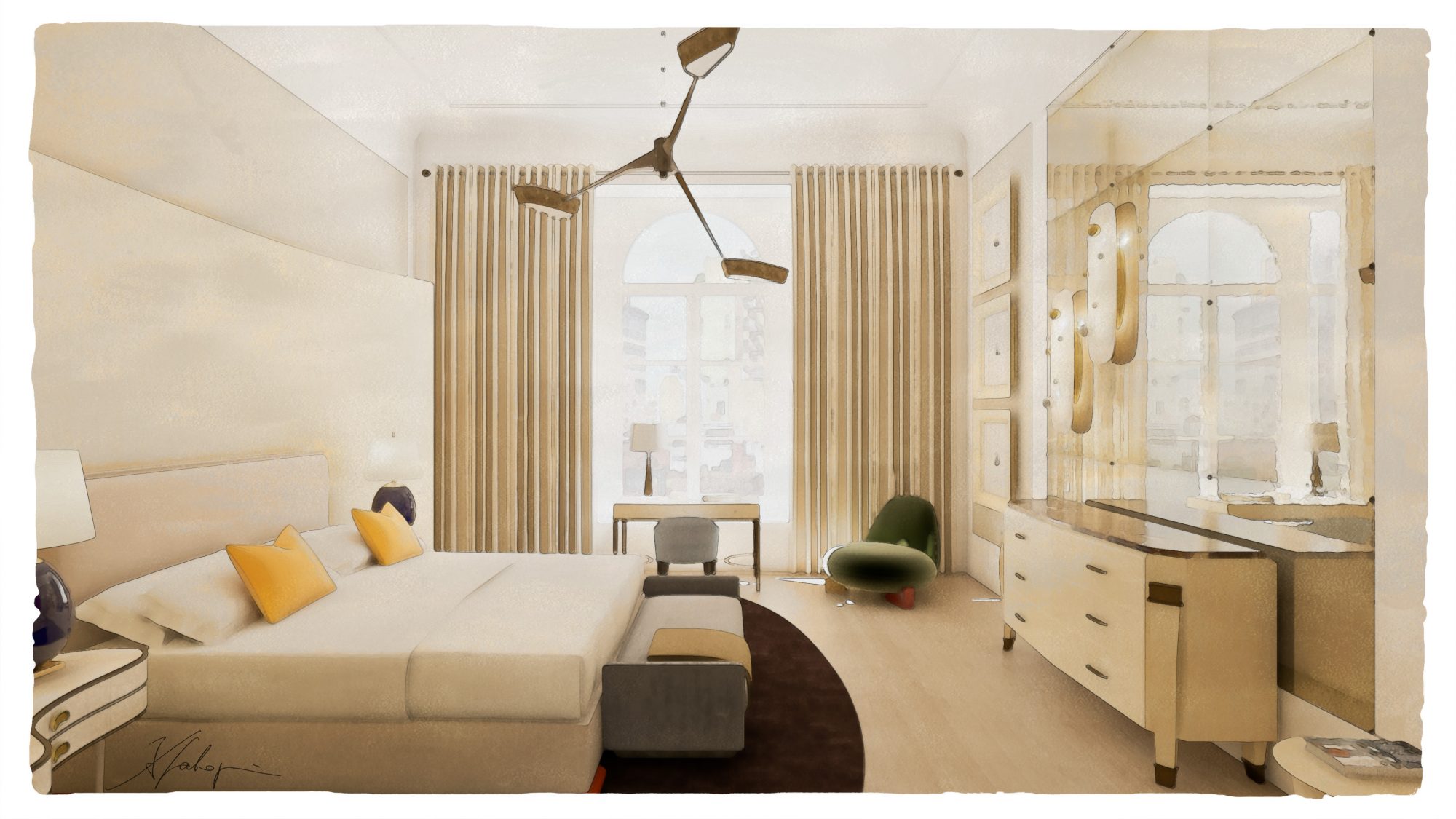
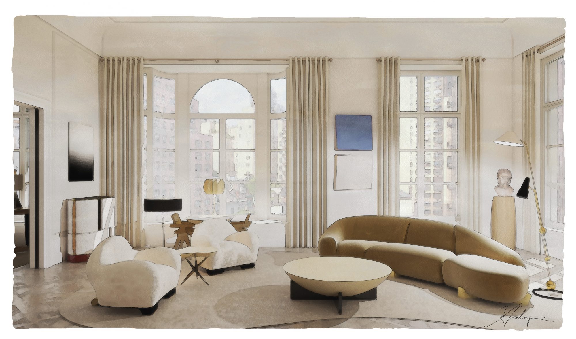
Project Inspiration: Our starting point of reference for the residences was a grand Parisian apartment, directly inspired by the famous Hotel Particulier in Montmartre. For the Bellemont, we used a palette of soft butter and ivory colors that we contrasted with darker ebony, like the keys of a grand piano. We employed soft, curved edges to bend the ceiling towards the wall and maximize the incredible light. The aged parquet de Versailles flooring compliments the dark stained millwork, and together they contrast very elegantly with the matte ivory shell.
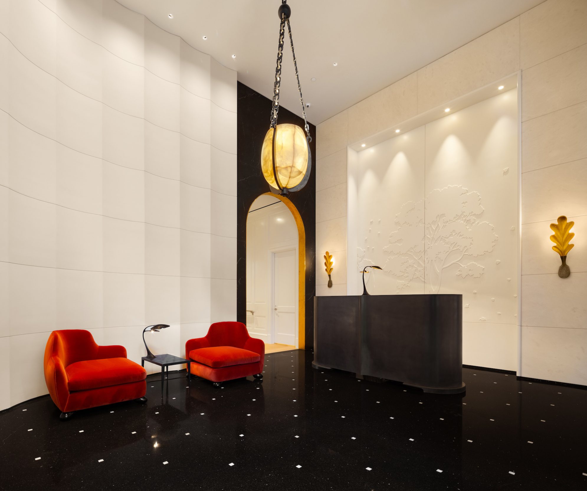
The lobby channels French orangeries and Central Park, with walls featuring a subtle bas relief depicting a treescape scene complemented by custom terrazzo floors with white marble leaf inlays. The reception desk, meanwhile, is a custom cast-bronze centerpiece facing a stone fireplace. Overhead hangs a grand, orb-shaped chandelier of onyx and bronze. The building offers incredible high ceilings with soft mouldings and decorations, allowing for great volume spaces which are quite extraordinary.
Project Blueprint: Each of the 12 residences was designed to be understated, chic, and timeless, much like the building. Grand yet graceful proportions embody contemporary living, allowing personal space while ensuring both intimate and convivial moments. In select residences, we added additional touches such as fireplaces framed by custom-designed limestone surrounded with Nero Marquina marble hearths and private vestibules with limestone entry foyers. For the amenities, we created entertainment spaces that appeal to multiple generations.
Project Takeaways: The predominant feature throughout the building is the amount of natural light each apartment receives from large-scale windows and terraced doors. Coupled with spectacular views of Central Park, this rare quality accentuates the design details and gives an overarching sense of the extraordinary scale and space.
As with everything we do, our focus is on the details: millwork, flooring, ceiling mouldings, and decorative plaster finishes. Each decision was carefully considered. Demonstrating attention to detail is the most important thing a designer can do to ensure a good first impression.
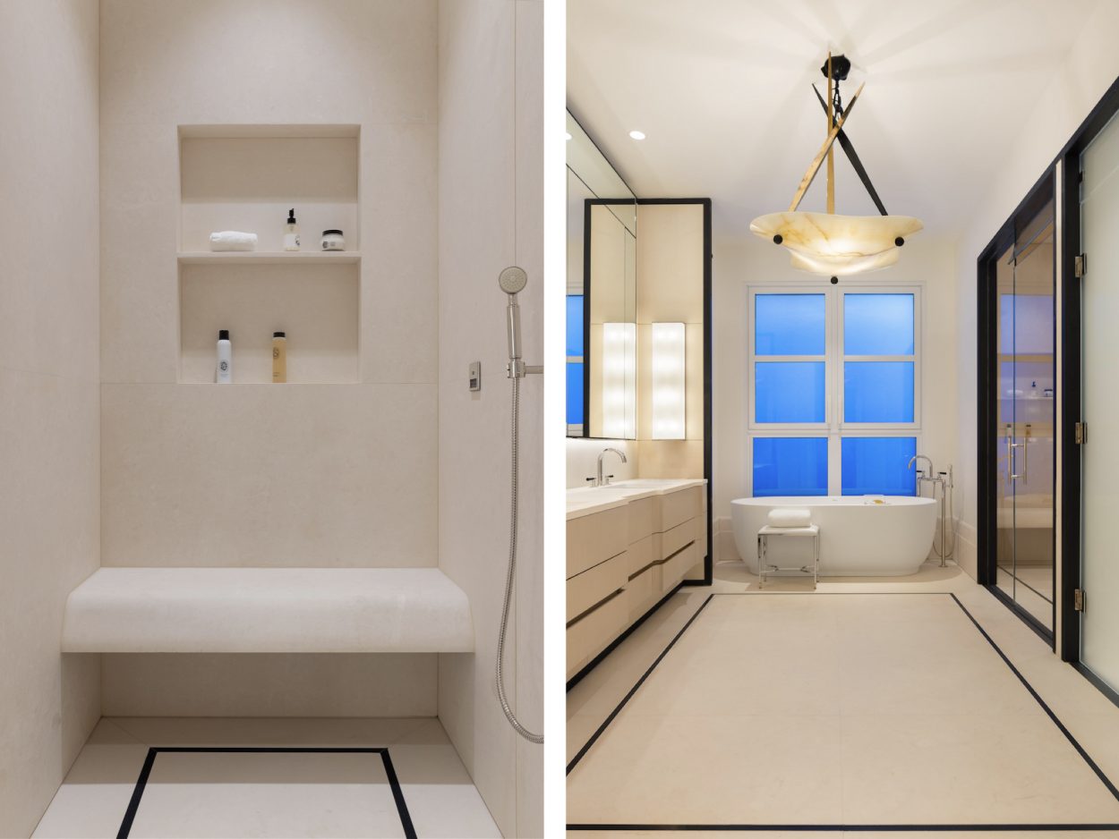
Project Challenges: Sophistication comes from understanding how a space will be used, how a material palette can influence how a room will be used, and which details make it stand out. It was also important that we designed just enough of the residential spaces to make them comfortable and appreciated while leaving enough room for the owners to add their own personal touches. Striking that balance between creating a “wow” factor and offering a blank slate was a real challenge, but by choosing elevated materials and finishes we created a great foundation for anyone stepping in.
