The List’s Project Spotlight column features unparalleled projects created by our forward-thinking List members. By going straight to the source—and having the designers demystify the methods behind their designs—we hope to enlighten and inspire our creative audience to further push the boundaries of what is possible in the realm of design.
You’re suing someone. You’re getting sued. You’re buying a tricky asset. You’re adjusting your estate. You’re protecting your possessions, your family, yourself. Basically, if you’re inside the offices of a law firm, you’re either doing some or all of these things, or you’re one of the many staffers working long hours in a fast-paced, high-pressure environment for clients that are. You could be forgiven for never wanting to visit one, even if you are a lawyer.
But then there’s the 55 Hudson Yards location of top-flight litigation firm Boies Schiller Flexner. To match its broad, global, high-profile, and big-ticket portfolio, the firm has a space that feels international, ordered, and, yes, luxurious. There’s drama here, but thanks to soft edges, organic references, warm lighting, and limited use of warmer woods, the design offers something that is perhaps even more welcome to both hard-working legal professionals and clients dealing with crises: serenity.
The team behind the creation of the office—architecture, design, and strategy group Schiller Projects—offered us this look at how it approached the commission, how it executed it, and how it made a place we might want to work in and even visit, even if we don’t need legal protection.
Schiller Projects is a member of The List, the destination for all things Surface-approved. Want to join The List? Contact our team to find out how to apply.
APPLY
Project Description: 55 Hudson Yards is the third of four projects we have done and are doing for the Law Firm Boies Schiller Flexner. We began this partnership by doing a small test space for an open office environment for them in Palo Alto. That space, unlike anything else they had in their global network, was a test case in implementing progressive workplace strategies. It was determined a success by the multitude of partners who rotated in and out from their offices across the U.S. and in Europe, and launched our larger collaborations. Schiller Projects was thrilled to be commissioned to work with BSF at 55 Hudson Yards during this pivotal time in their history as they reassessed what a legal space and what a Boies Schiller space can be not just now, but for the foreseeable future.
Inspiration: Our inspiration comes from research. Here, the research took the shape of months of workspace observation, digital surveys, journey mapping and widespread team workshops. The data we extracted and compiled from these efforts told the firm’s leaders more about how their teams worked at all levels then they could have ever gleaned on their own and gave us the tools necessary to design for beauty substantiated by effectiveness.
Blueprint: Schiller Projects begin every project with a robust data collection and research phase, allowing us to analytically respond to our clients’ needs, empowering their decision making, and validating our design decisions. Surveys and questionnaires, site observation and mapping, as well as anecdotal interviews and peer sessions, allow us to understand our client’s needs, translating that data into design solutions. We ultimately created an opportunity for BSF to invest in physical improvements geared toward enhancing their workplace community and collaborative culture. The project reflects a client-driven overall rethink on how they could best invest in the future of their practice and employees.
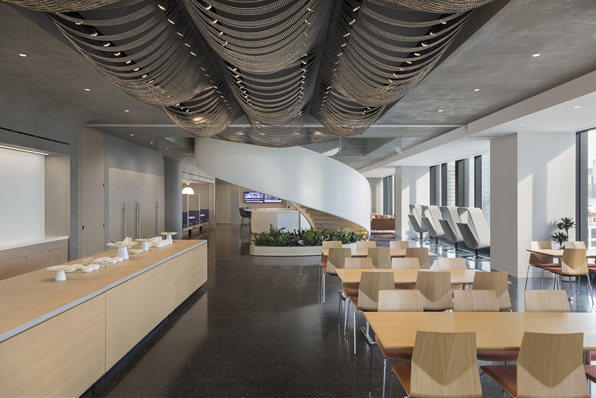
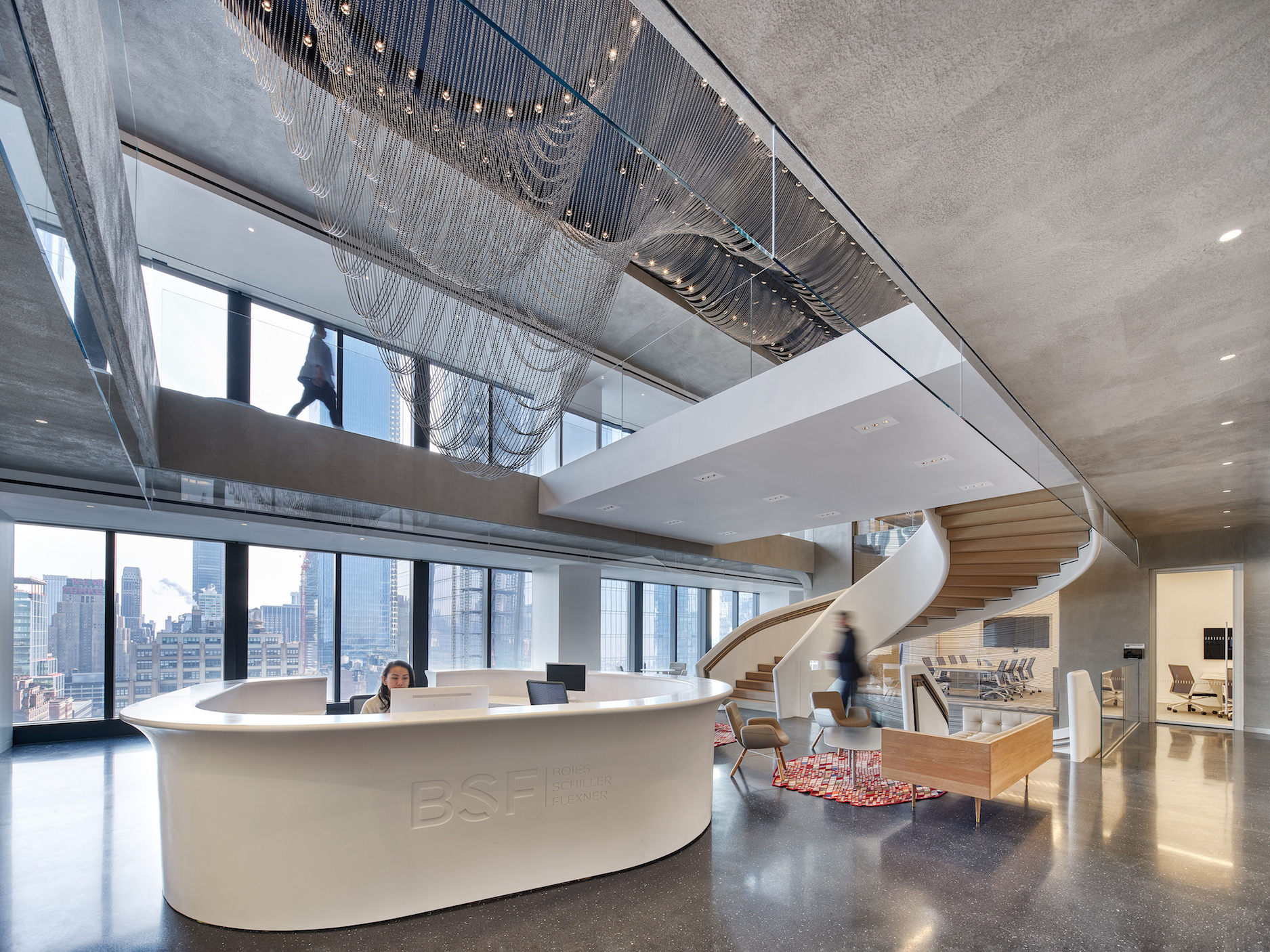
Materials: We were lucky to work with a number of complex and craft-driven materials in this project. The Ribbons, a building-wide sculpture, was fabricated by UAP Company. We built scripts to estimate the weight of each individual ball and designed the sculpture by utilizing gravity as our primary means of form-making. The curving walls of the project are plastered concrete with an absorptive element to reduce the echos in the open spacing, while the curves spill light from the ceiling down the walls.
The space also features handmade, furniture pieces from artist friends including Caleb Woodard, Jonathan Nesci, and Fort Standard. The main staircase, which unites the entire space, was site fabricated by Caliper Studio utilizing a gantry crane we built over the opening.
Challenges: One of our greatest challenges throughout the project was focusing on creating a space for BSF that balanced both the legacy components of a traditional law firm, while also expanding their thinking to consider how they might occupy space for work without legacy constraints.
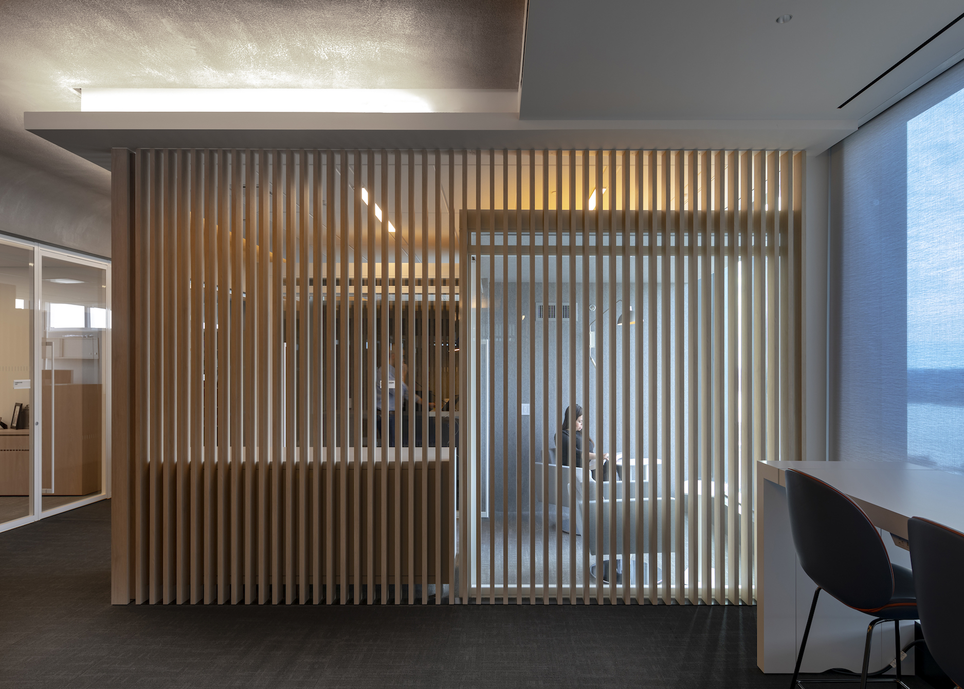
Uniqueness: BSF’s offices at 55 Hudson Yards are distinct due to their dedication to diversity of space. We could determine how many meetings, calls, heads-down work each employee needed to handle in a typical day and then we leveraged the entire office platform to account for those activities.The result is not “deskless” attorneys, but rather people who are empowered to utilize the entire infrastructure of the office platform. It is analogous to thinking of the office as an urban plan rather than a multi-resident occupancy.
To increase retention and encourage recruitment, we emphasized the creation of these new types of shared spaces. We approached connectivity architecturally by understanding how and why employees interact with one another in an office setting. The café and coffee bar are open to all levels, engendering use and giving the space a sense of activity from the front door deep into the space. Stacking a mix of conferencing spaces around this space gives employees a place to eat together, work socially, entertain clients and break away as needed. Impromptu meetings and new collaborative work spaces replace the legacy water cooler setting. These encounters can have a huge impact on the feeling of the community
Takeaway: The flowing organic nature of the office’s design reminds people that there is always something around the next corner, above or below you. A central sculpture spans the three main floors of the space connecting people visually across the business. Critically, the design took associates out of private offices for the first time in a leading American legal practice. This controversial decision was supported by rigorous data analysis and a design focused on supporting the entire office space as “the office” freeing the focus from “the desk.”
VIEW ON THE LIST
(Photos: Courtesy Schiller Projects)


