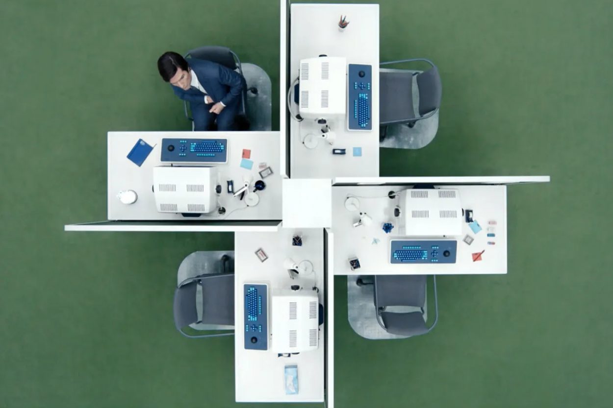
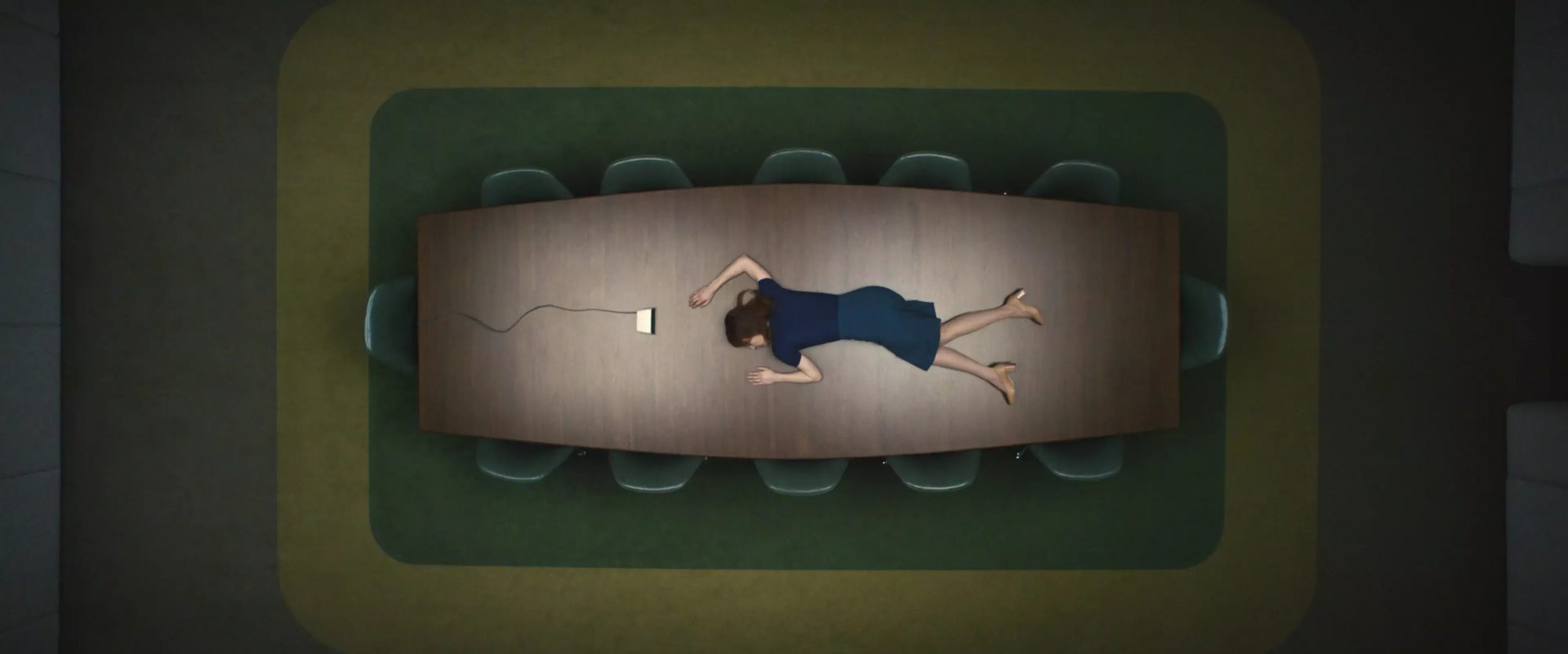
In Severance, the limited tragicomic series written by Dan Erickson and directed by Ben Stiller, a company town called Kier serves as home to the eerie Lumon Industries. Lumon’s employees live in drab masses of company housing, and work in a mirrored monolith surrounded by a regimented maze of company parking. Outside, cast-members including Adam Scott exist, shattered by grief and other symptoms of life, in dimly-lit small-town simulacra; Scott and others undergo a strange new kind of brain surgery that separates their consciousness from time spent on and off the clock. Inside, he and cast-members including John Turturro and Britt Lower perform strange data tasks in a minimalist fantasia on corporate Modernism, unaware of what goes on beyond business hours but supervised by oddball all-stars like Patricia Arquette and Christopher Walkin.
Severance’s sci-fi storytelling is grounded in familiarity: Eero Saarinen’s iconic—and recently restored—Bell Works building in New Jersey plays the part of corporate HQ. Production designer Jeremy Hindle found clues to how companies established authority using architecture and design via another Saarinen project, the rugged Cor-Ten complex he designed with Kevin Roche for John Deer in Moline, IL. “All those companies in the 50s and 60s, they had so much style, they had the most beautiful spaces, and they were proud of what they were doing,” Hindle tells Variety. “They believed in it and their aesthetic was part of that. It was about power and control and commerce and everything rolled into one.”


