Spatial Awareness

Spatial Awareness: Heatherwick Studio's Biophilic Balconies in Singapore

Like the biblical garden, the residential building Eden in the historic Newton district is a luscious paradise. Here, a closer look at the project's stunning balconies.

All images courtesy Hufton + Crow

Spatial Awareness is a new column that hones in on a standout element of a new project deserving of a deeper look. In this edition, we train our lens on the jungly shell-like balconies of Heatherwick Studio’s new Eden residential building in Singapore. 

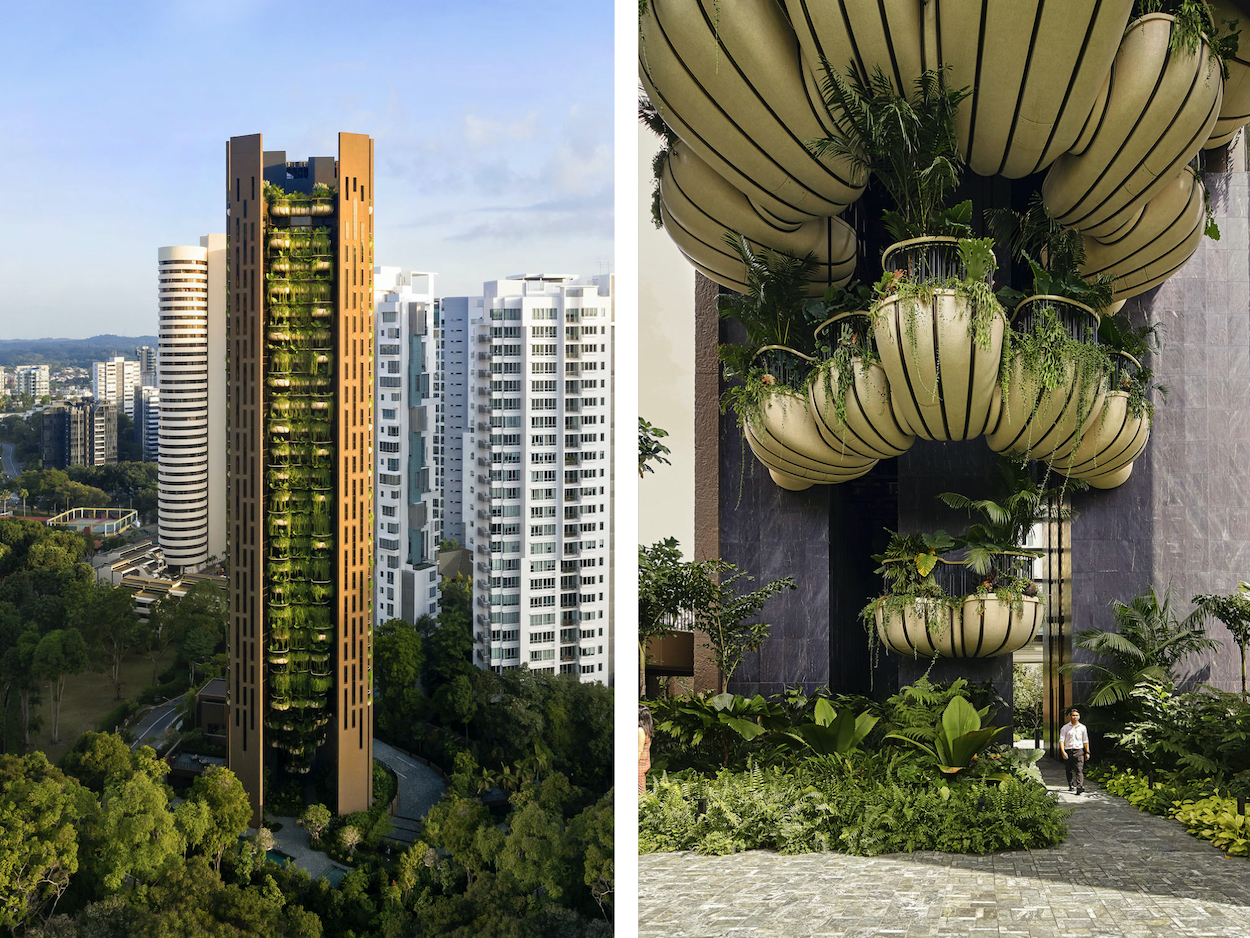
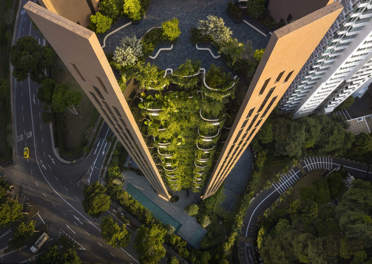
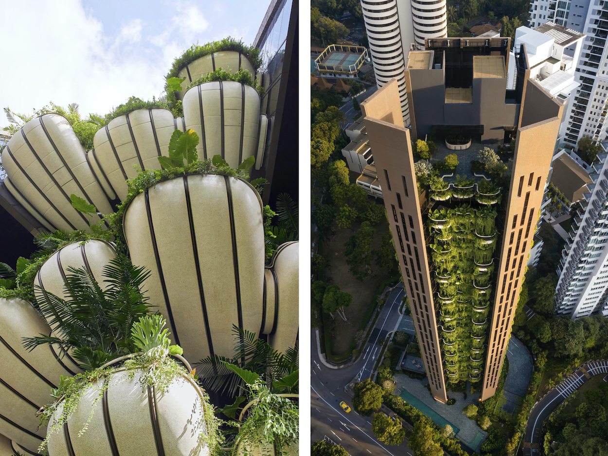
Inspired by former Singaporean prime minister Lee Kuan Yew’s “city in a garden” vision over fifty years ago, Heatherwick Studio’s design for Eden is a radical departure from the glass-and-steel tower typology. The firm’s first residential project in Asia is a cylindrical structure whose distinctive facade is a three-dimensional abstraction of the country’s terrain. A chasm reveals the interior spine’s verdant plant life draping each apartment’s balcony resembling the shape of an oyster shell, an assortment of over twenty flora species that collectively create the appearance of a vertical garden. The result is an addition to Singapore’s skyline that is both idiosyncratic and contextual to its verdurous landscape.

Below, we ask Mat Cash, Heatherwick Studio partner and group leader on the project, about Eden’s most striking attribute.

Firm: Heatherwick Studio

Instagram: @officialheatherwickstudio

Practice location: London, United Kingdom

Project: EDEN

What were you visualizing before you put pen to paper?

Our first response was to understand how we could design something truly contextual to Singapore. Before doing anything, we looked at how we could distill the spirit of Singapore and put that into a building. The concept of the “city in a garden,” which was the cornerstone of how Singapore was founded, seemed really important. So we knew that the proximity to greenery, nature, and how you interact with it would form the basis of how we would approach the project. The key relationship would be the interactions between the building, the natural world, and home comforts.

What colors and materials are central to the visual identity?

The dark oak color of the façade plays a vital role in differentiating EDEN from the surrounding developments. Finding that ideal tone that would appear natural and complement the concrete required more than a hundred shades of deep reds, purples, and browns to be tested under the Singaporean sun.

Then, there was also the exposed polished concrete on the underside of the balconies and planting, which helps to form a contrast to the darker facade. The balconies’ shell-like shape protects and lifts the greenery into the air, almost as a gift to each residence, but also gives Eden a unique visual identity.

In terms of space, how does the layout flow?

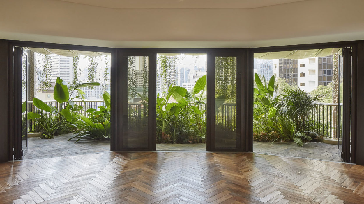
It was imperative that when the windows and doors were open in each apartment, there would be a seamless connection between the internal spaces and the landscape outside. We deliberately tried to blur those thresholds and not have a defined edge. For example, the wooden herringbone pattern on the apartment floors flows out to the balconies, where they are recreated in a similarly toned slate. The balconies themselves vary in size; they are more cozy and quiet near the bedrooms, yet more expansive and inclusive along the main living spaces.
What stands out to you the most now that you’ve finished it?

Now the building is a year old, it is fantastic to see how embedded in the landscape the building has become and how lush and verdant the planting has grown. It was something that we always envisioned would happen, but the reality of it is truly exciting.

What tools were indispensable from ideation to actualization?

Our studio’s in-house workshop played a critical role in the design process because it allowed us to engage in large scale prototyping and testing of materials and form. It resulted in a faster, more iterative process because we could explore how the balconies would sit alongside walls and relate to each other and/or a person at a human scale. We were able to test those interactions and proximities at a 1:1 scale in London before building anything on site.

Something that happened along the way that was pleasantly unexpected:

One of the project’s central ideas was to minimize the amount of solar gain, which you can experience in extremely hot and humid climates like Singapore. We reduced the amount of glazing on the facade and the balcony planting helped shade areas with larger openings. We were pleased when we walked through the final apartments to see how bright and open they were.

Did you encounter anything that was unforeseen that was especially challenging?

We understood from the outset that the materials and color palette would play an important role, but the process of selecting those was quite challenging. Subtle changes in the textures of the concrete and color of the facade had a significant impact on how you felt in the building. We looked at hundreds of different color and material options and their relationship to each other to get something, that we felt, was the best possible combination. That process took a lot longer and was more involved than perhaps we had envisaged at the beginning.

References of inspiration:

Singapore itself was the inspiration. The juxtaposition of landscape and buildings was explored in various projects such as Gardens by the Bay and different office buildings in Singapore. It was this juxtaposition of nature and man, in close proximity, that was inspiring and alluring. It led us to start thinking about how we could do that in an unusual and interesting way. We were inspired by testing the limits of the human relationship with biophilia.

What’s your favorite detail?

I love the façade and its simplicity with the concrete’s topographical texture—it has a pleasant warmth to it. It makes the other elements of the project sing, like the balconies and the greenery: the interrelations between the hard concrete with the softness of the leaves and the smoothness of the balconies.

Next project on the horizon:

It is a pretty exciting year for the studio. Little Island, a new public park and performance space in New York, is opening this spring. Also in New York, we are completing Lantern House, which is the studio’s first residential project in North America. Later this year, 1000 Trees, a mixed-use retail and cultural development, is set to open in Shanghai.

All Stories