Spatial Awareness is a new column that hones in on a standout element of a new project deserving of a deeper look. In this edition, we train our lens on the lighting inspired by Richard Lippold’s brass sculpture suspended above the Four Seasons grill room bar, among other stately details.
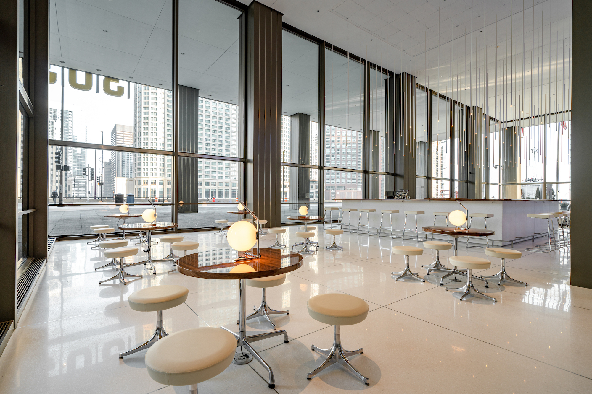
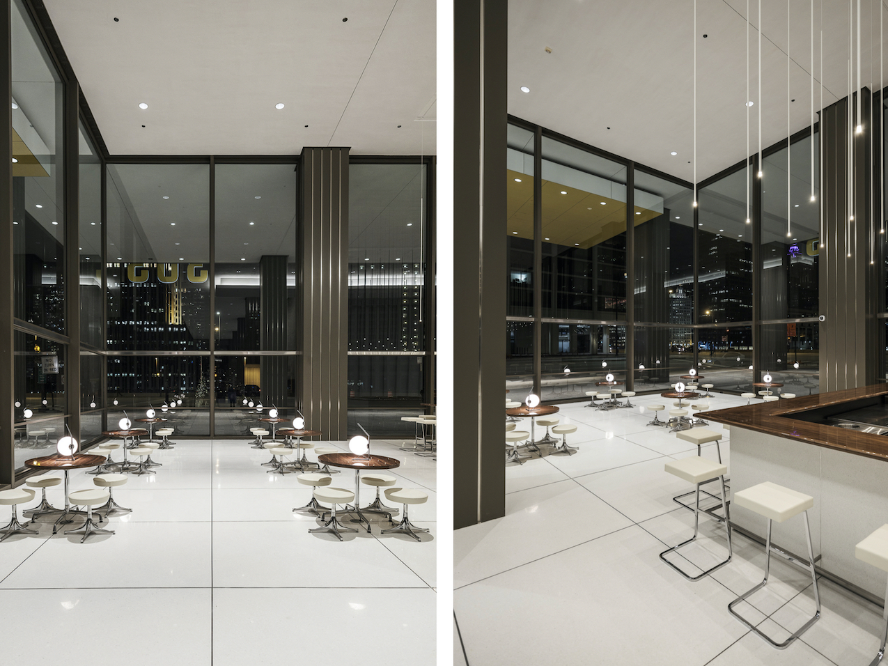
When Norman Kelley was tasked with restoring an outmoded Chicago lobby to its former glory, the Chicago and New Orleans–based firm tapped into a deep appreciation of the 1979 building’s context and the design by the original architect, Joseph Fujikawa, who emulated the style of Mies van der Rohe. (After Fujikawa’s death in 2004, Chicago Tribune architecture critic Blair Kamin wrote that “sometimes, his associates recalled, Mr. Fujikawa wanted to be more like Mies than Mies himself.”) The newly renovated lobby at 303 East Wacker Drive honors Fujikawa and this architectural sensibility with Luminary, a newly opened café-bar.
Firm: Norman Kelley
Instagram: @norman.kelley
Name: Lobby Alteration, 303 East Wacker Drive
Role in project: Architect.
Practice location: Chicago and New Orleans.
What were you visualizing before you put a pen to paper?
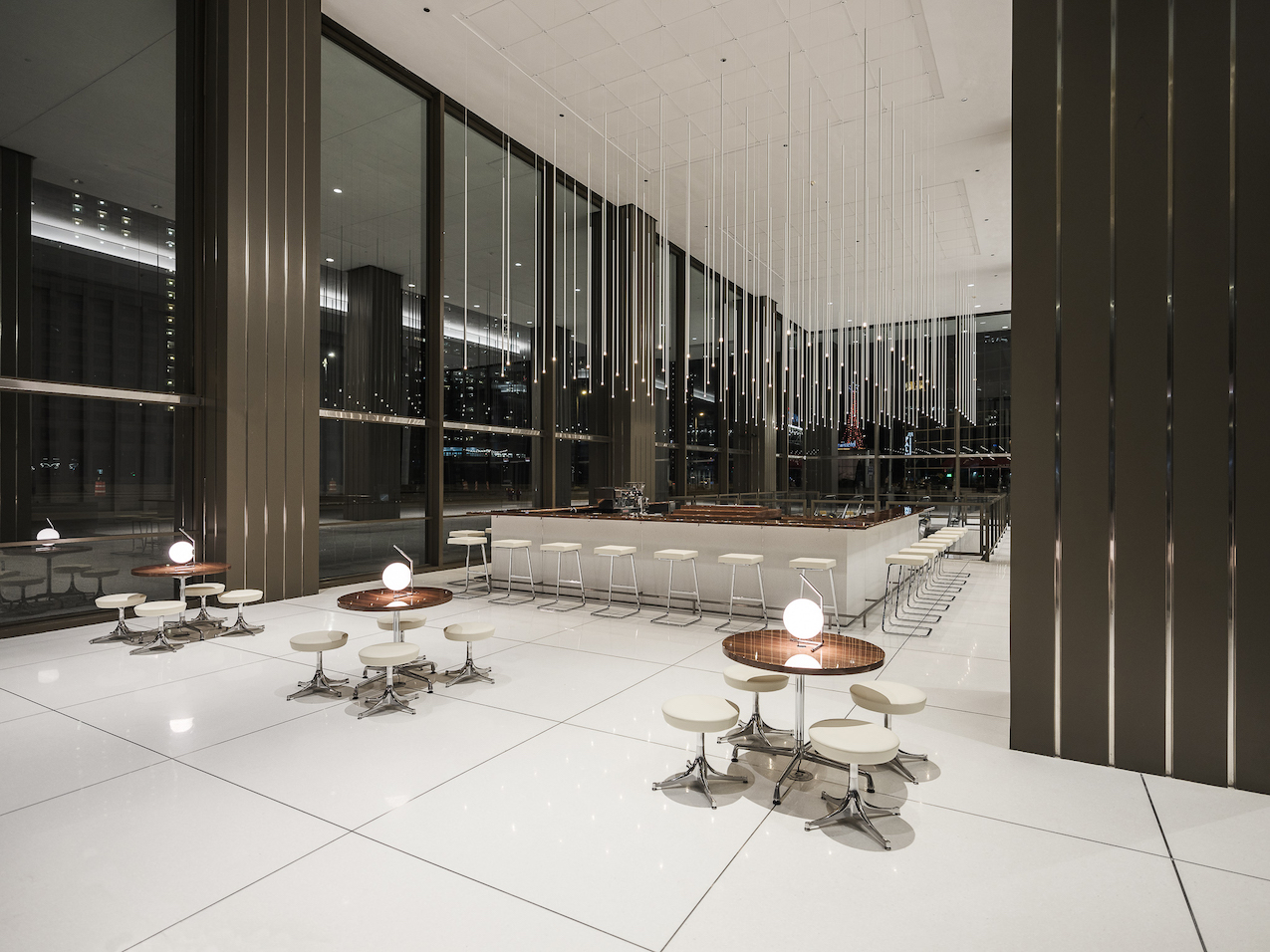
Richard Lippold’s brass sculpture suspended above the Four Seasons grill room bar.
What colors and materials are central to the visual identity?
Matte terrazzo, piano finish walnut, brushed stainless steel, beige leather, and warm point light from above.
In terms of space, how does the layout flow?
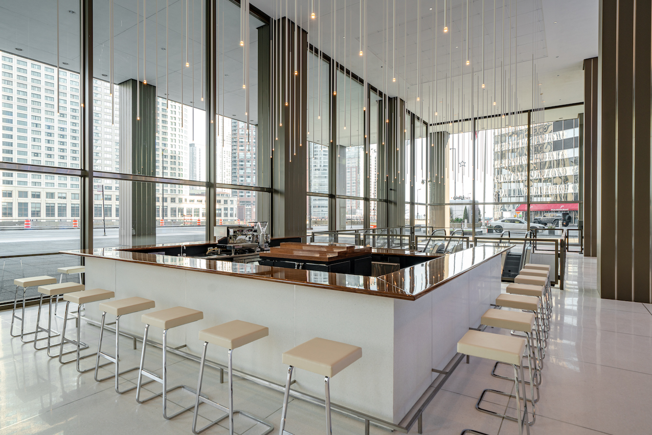
The main features of the altered lobby are a square bar and two suspended light arrays. The additions were intended to not alter the existing egress plan, but serve as distractions. Tenants and guests are able to meander in and around the new features on their way in and out of work.
What stands out to you the most now that you’ve finished it?
The lobby is now a detour—a place to spend some time. Too often the lobby experience is rushed when it should be slowed down. Most lobbies that serve any kind of food or beverage tend to be overbranded, replete with vendor signage and grab-n-go coolers. Our alterations are intentionally muted and bent on making the tenants linger. We are proud that the owner appreciates the added value of a more public lobby.
What tools were indispensable from ideation to actualization?
A historical appreciation for context and the original architect, Joseph Fujikawa. Along with Dirk Lohan and Bruce Conterato, Fujikawa took over the office of Mies van der Rohe after Mies died in 1969. In 1982, Fujikawa would go on to start his own firm, but his body of work would always be tied to the aesthetic of his old boss: rigorous alignments, streamlined material palettes, and a brazen love of the grid. Chicago is a town with many buildings designed by Mies and many buildings that look like they were designed by Mies. You can’t always tell the difference and that should be OK and also not.
Something that happened along the way that was pleasantly unexpected:
We developed a bespoke lay-in ceiling tile system that allowed us to meet our local fire code requirements while concealing the attachments and drivers of the 128 suspended light fixtures.
Did you encounter anything unforeseen that was especially challenging?
The die wall that supports the 18-foot by 18-foot walnut countertop and provides all of the electrical and plumbing routes for the bar equipment is as minimal in thickness as possible in order to minimize the bar footprint on the lobby’s existing egress plan. This posed a lot of challenges and required us to coordinate closely with the different trades so that every square inch of the bar was utilized efficiently.
References of inspiration:
Four Seasons Restaurant, Richard Lippold, Joseph Fujikawa, and all Miesian lookalike buildings.
What’s your favorite detail?
The half-inch square brushed stainless steel foot rail connection between terrazzo floor and terrazzo bar wall.
Next project on the horizon:
Exhibition design for “Chicago Comics” at the Museum of Contemporary Art in Chicago, curated by Dan Nadel–opening June, 2021.
