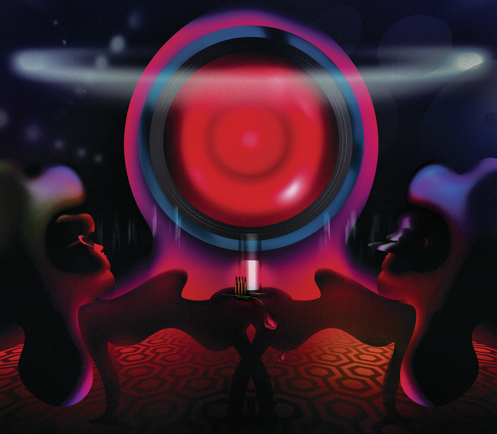
Like practically every other designer of the time, I was in awe of Stanley Kubrick when I first saw 2001: A Space Odyssey; to see how he had taken the subject of existentialism and created this vision, how he connected prehistory and the end of the world as we know it in such a seamless, beautiful, poetic fashion. He’s always been at the top of my list when it comes to set design, from Dr. Strangelove to Barry Lyndon to A Clockwork Orange. Every single one of his films has a totally different perspective, but always there are serious interior-design overtones. For Kubrick, a set wasn’t just a set, it was an expression of mood and history.
I see a lot of parallels between Kubrick and the original James Bonds — those movies that had this retro-contemporary edge, especially when it came to the places where the villains existed: under water, in the sky. I think all the contemporary comic-book movies are pale imitations of this. It’s no coincidence that the late Ken Adam, who frequently collaborated with Kubrick, was the production designer on many of the early Bond films. As much as you like Iron Man and the way he lives, nothing compares to the ominous grandeur of these old archvillians. Take the bar in A Clockwork Orange: people are still afraid of designing a bar like that, this ultra-violent, drug-infused, crazy white-on-white space.
I recently designed a private villa in Dubai. The client wanted an eight-person movie theater. I was thinking of Kubrick, who I don’t think ever left home. I said to myself, “Poor Kubrick. If he likes to watch movies, he must have very comfortable chairs.” Which is how a new crazy collaboration with Poltrona Frau, the Stanley chair, came about.
What was so impressive about Kubrick’s work, to me, was the variety. Every movie that came out was another world. I find a lot of parallels in my world. I feel a sort of kinship to him. I don’t know if there was ever another director with his versatility in storytelling or breadth of influence. With Kubrick you had to brace yourself every time a film came out. The Shining, Eyes Wide Shut, you name it — every movie was a completely new set of rules, circumstances, subjects, design.
I would not be so presumptuous to compare myself to Kubrick. But frankly, I was always envious of people like Philippe Starck, who have a very specific brand and design they can sell over and over again. It’s such a difficult thing to create, but a very comfortable life to proceed with, versus having to reinvent your work every time. People often tell me none of my projects look the same. That’s my temperament; it’s who I am. I can’t channel myself into one track. I wish it wasn’t so, but it is.
Adam D. Tihany is a New York–based hospitality designer. His recent projects include the Four Seasons Dubai DIFC, and Oro at the Belmond Cipriani in Venice.

