For more on Milan Design Week, including must-see moments at Salone, a guide to Milan, and more, check our featured section on the site »
10 Slam-Dunk Presentations by Members of The List at Salone del Mobile
In our final recap of this year’s fair, we highlight some of our favorite booths—which featured horsehair mattresses, showers that feel like kisses from angels, fringe-lined hideaways, and more.
BY THE EDITORS May 02, 2018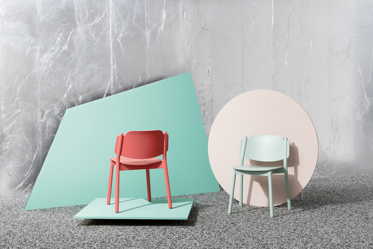
The 107-year-old Italian furniture company used white fringe to decorate a series of airy living rooms, which held intimate configurations of objects including Emilio Nanni’s wood My Chair, marked by the earlike appendages on its backrest and shown in colors from matte white to upholstered seafoam green, and its first foray into outdoor furniture, in the form of noodle-y black-and-white tables and chairs. Each curiously private space provided a sense of what it might feel like to live with the objects inside. Perched on top of each room in clusters were ebony-hued versions of the wide-standing Drum lounge chairs, also by Nanni, and low-slung ashwood Lilliput coffee tables, designed by Milan-based Studioventetto.
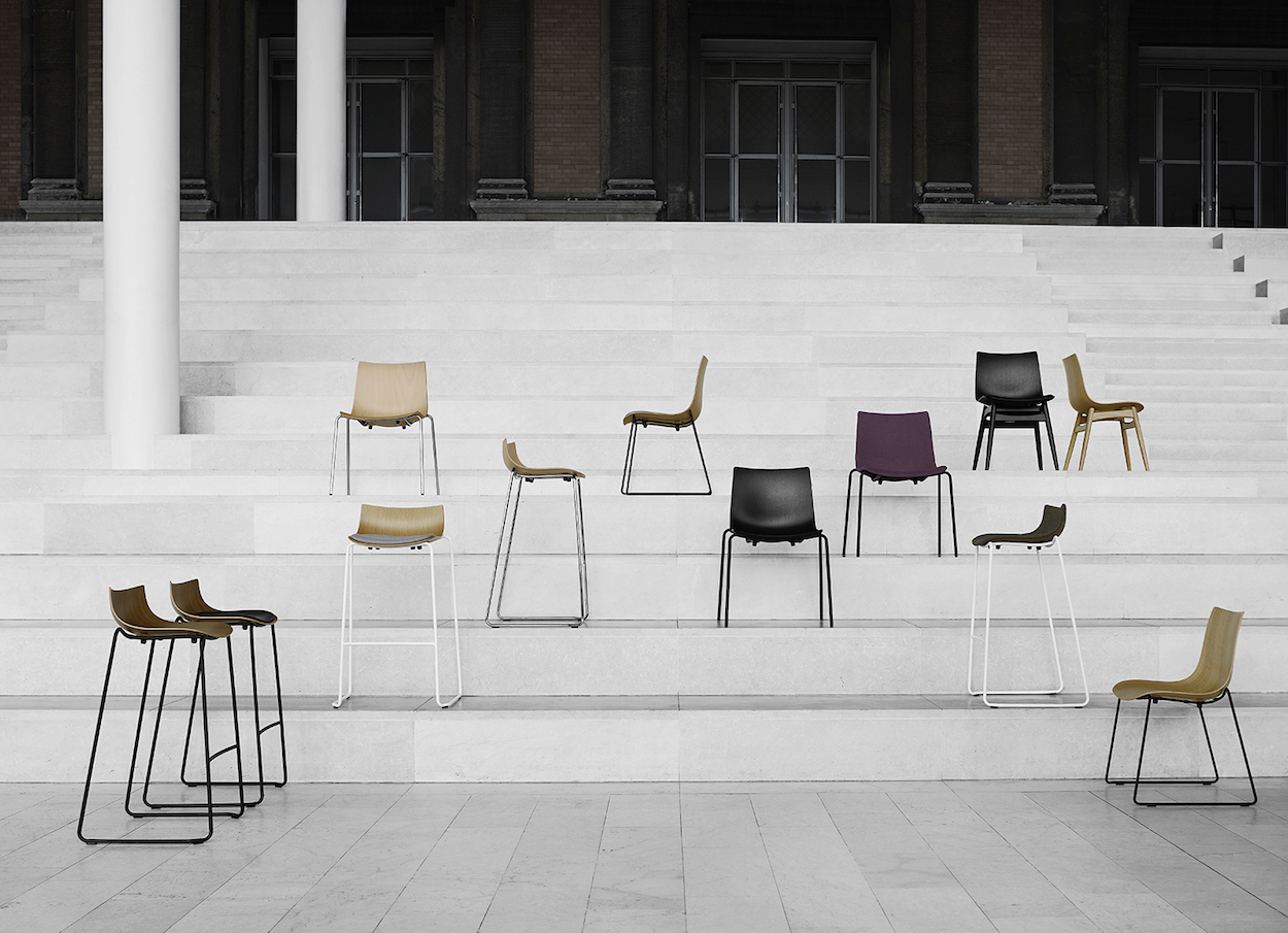
In a cozy two-story space designed by London-based stylist Destina Curtis that felt like an actual home—complete with notebooks and classic plays such as Shakespeare’s Antony and Cleopatra strewn about—the family-owned Danish furniture brand offered new and re-issued objects designed by Hans J. Wegner, Arne Jacobsen, Poul Kjærholm, Børge Mogensen, and Bodil Kjær. In a collection called the Preludia Series, contract furniture by Brad Ascalon—the first American designer to work with the 110-year-old company—was based on his interpretation of a quintessentially Danish wood chair, creating a bridge between the company’s iconic pieces and his contemporary ones. Various configurations of it were used to inform the design of seats fit for the workplace, including some that slide into a tabletop to enable easy Hoovering below.
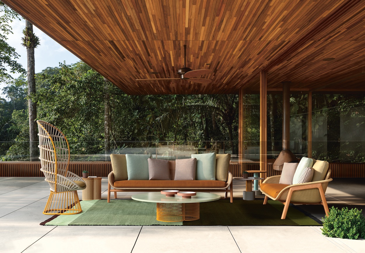
A soundtrack of birds chirping and strategic sunlight-like illumination brought the superb outdoor furniture from Kettal to life—to the point where some visitors forgot they were indoors! A favorite among the company’s debuts was Patricia Urquiola’s Vimini collection, named for Bimini (a favorite island of the designer) and the Italian word for “wicker.” The pieces, which include rounded side stables, sofas, and a dining armchair, combine traditional braiding with square cushions, creating a contrast that is as familiar as it is inviting.
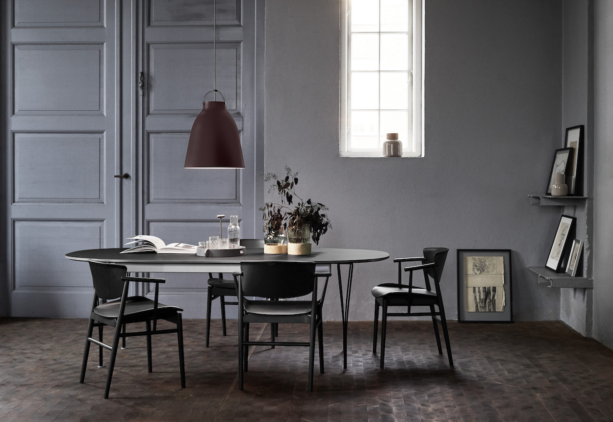
In a sprawling space dotted with Jaime Hayon’s flower-filled Ikebana vases, Fritz Hansen introduced a quartet of collaborations. There was the Planter coffee table by self-taught American designer Paul McCobb, pendants by Michael Geertsen (best-known for his sculptural ceramics), and table lamps by Danish architect Bodil Kjær, who’s having something of a resurgence at the moment. Most striking was the SP01 chair by Tokyo-based studio Nendo, who used nine layers of veneer for its seat and back panel. Its solid wood and veneer materials consist of just 23 parts, which are assembled by hand in the company’s Belgium workshop.
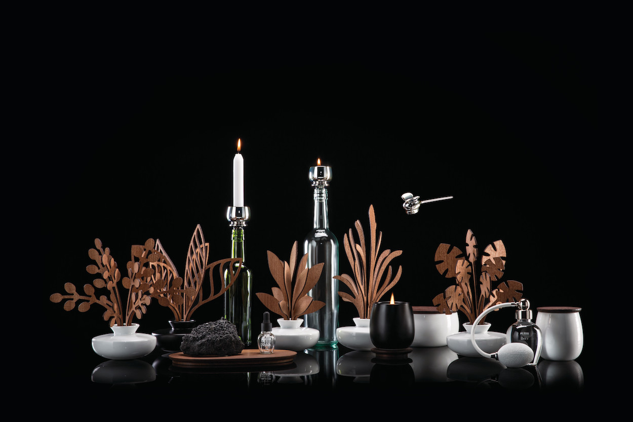
“Brrr,” “Ahhh,” “Hmm,” “Grrr,” and “Shhh” aren’t only exclamations—they’re also names of the scents in Alessi’s home fragrances collection, designed by Marcel Wanders. Called The Five Seasons, the series includes quirky details such as a bumblebee-shaped candle snuffer and a candleholder-cum-stopper that fits on top of a wine bottle. Another major feature of the Italian houseware brand’s stand was an egg pan, named Tegamino, designed by the sweet-looking Alessandro Mendini (a photo of him, using the fryer, at the back of the booth made hearts melt). The stainless-steel dish, which is designed to go directly from the stovetop to the table, has squiggly handles that mimic the shape of a fried egg.
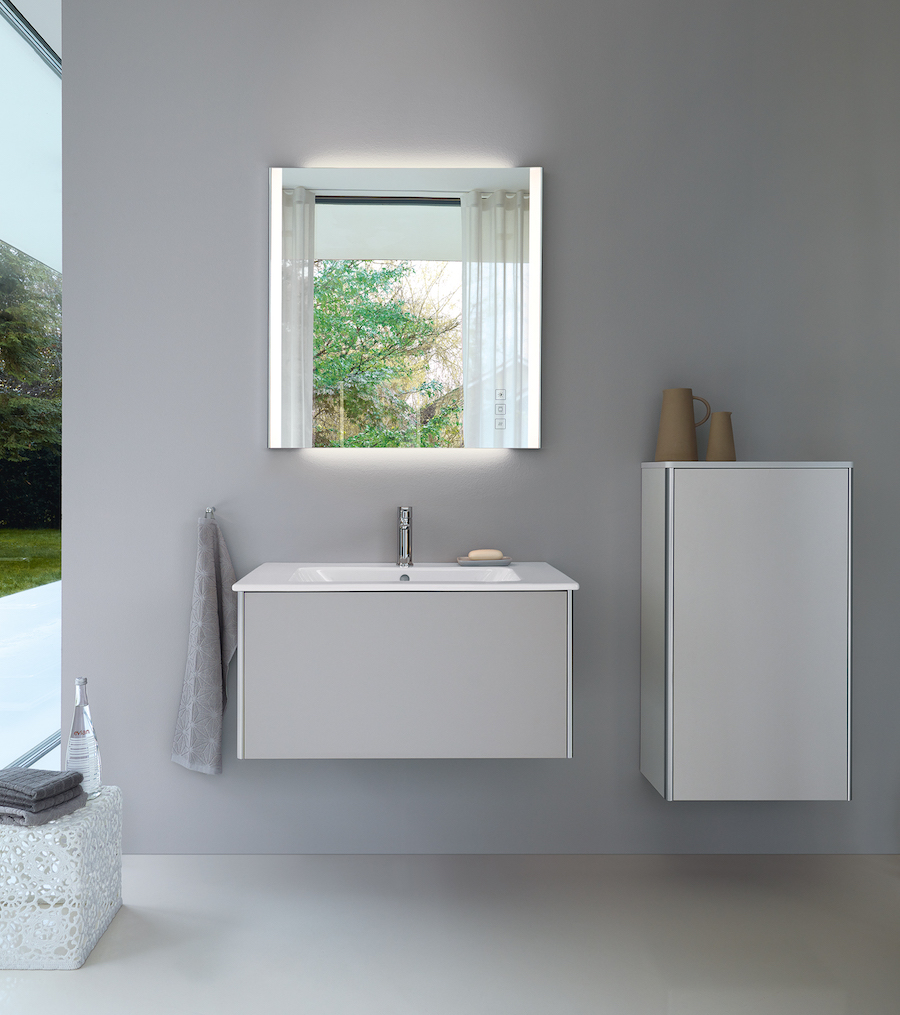
“We offer something for everyone,” says Timothy C. Schroder, Duravit’s president. The German bathroom-fittings company showed a range of objects for washrooms both large and small—an offering that, according to Schroder, sets the company apart in the U.S. (which typically wants something bigger) and Europe (which tends to skew toward smaller fixtures)—in its warmly lit booth. Its above-counter or sunken-in basins, along with its variety of materials and colors, allow for maximum customization, as apparent in the Me by Philippe Starck’s Me series of sinks, toilets, and tubs. Cecilie Manz’s Luv collection, marked by various oval basins and circular taps, stole the show.
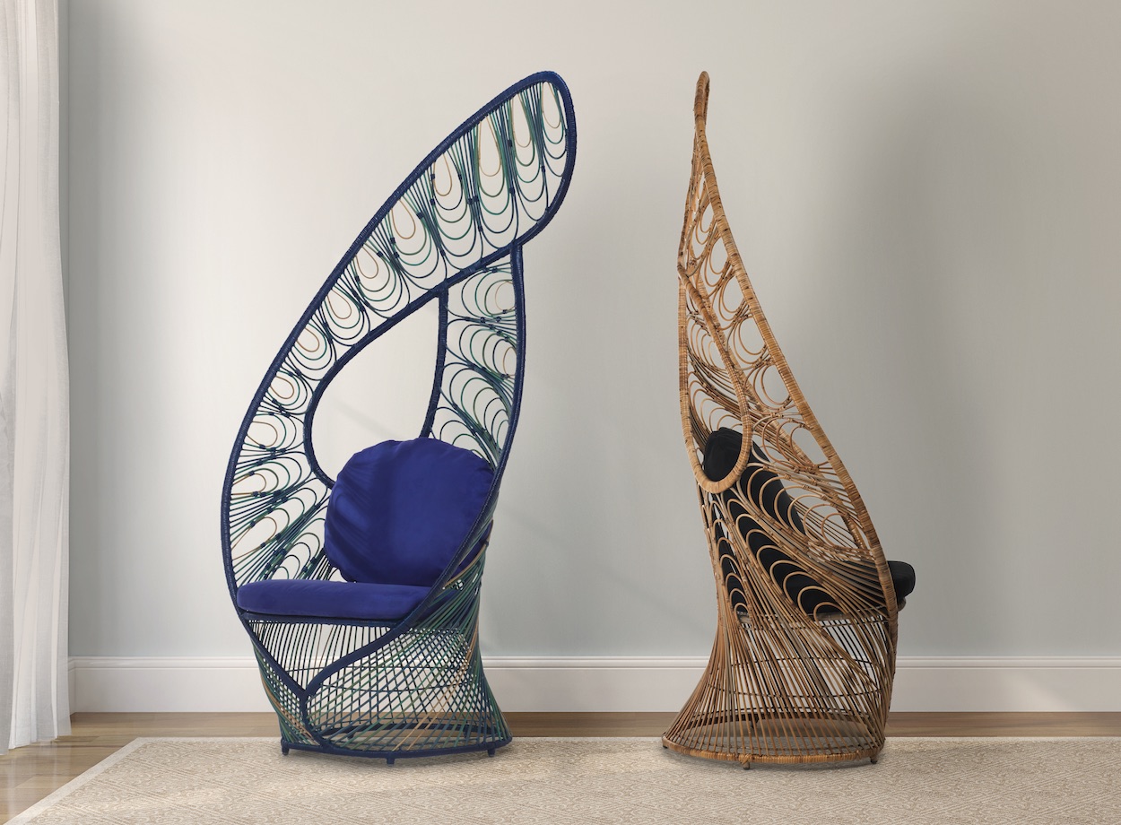
Birds seemed to be on the mind of Filipino designer Kenneth Cobonpue, whose characteristically sculptural, sometimes out-there hand-woven outdoor furniture was on view in rich hues including burnt orange, seafoam, and a chocolate brown. Thronelike and feather-shaped, the iridescent Peacock and Lasso chairs offered a refreshingly unique take on a typical wicker seat, while Limbo, a pendant shaped like a life-size flying trapeze artist, took home the prize for being utterly one-of-a-kind.
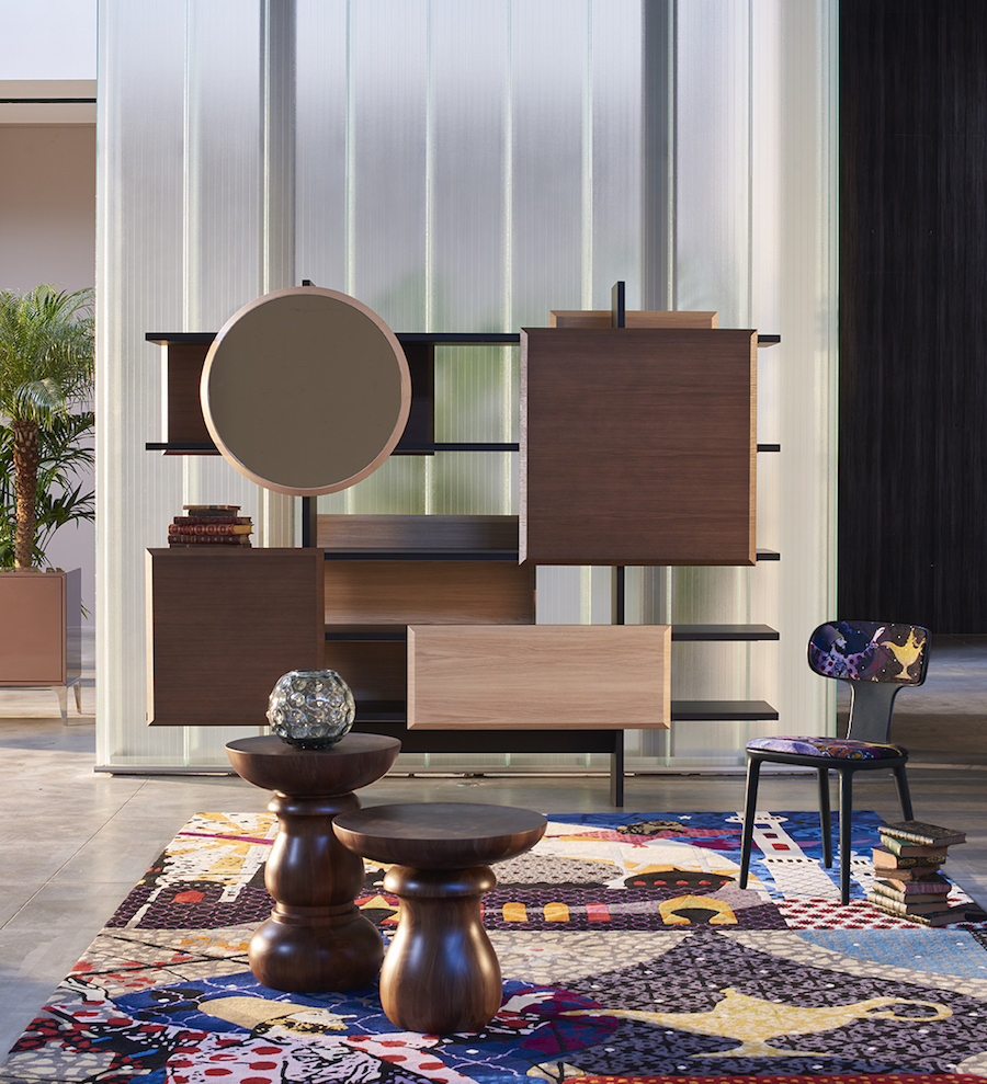
Using a color palette of black, brown, and mauve, Roche Bobois’s booth featured an excerpt of Marcel Wanders’s new Globe Trotter collection, which was on view in its totality at the French furniture retailer’s pop-up space in Brera. At the fair, the designer’s Dojo bookcase—in which classic shapes overlap with a classic shelving system—and Mariposa suspension lights and Aqua pedestal and dining tables offered an enticing peek at what lay beyond the fairgrounds.
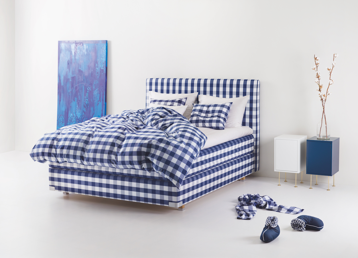
The Swedish heritage brand, whose name means “horse” in Swedish, positioned artisans at either end of its space to demonstrate how its handmade horsehair mattresses are side-stitched—a technique that creates both an aesthetically pleasing shape and creates a kind of firmness, using a very long needle, patient hands, and thick thread. Four beds—the Herlewing, Eala, Maranga, and a revamped 2000T—and a series of vibrant bed linens designed by Swedish design duo Bernadotte and Kylberg were shown for the first time.
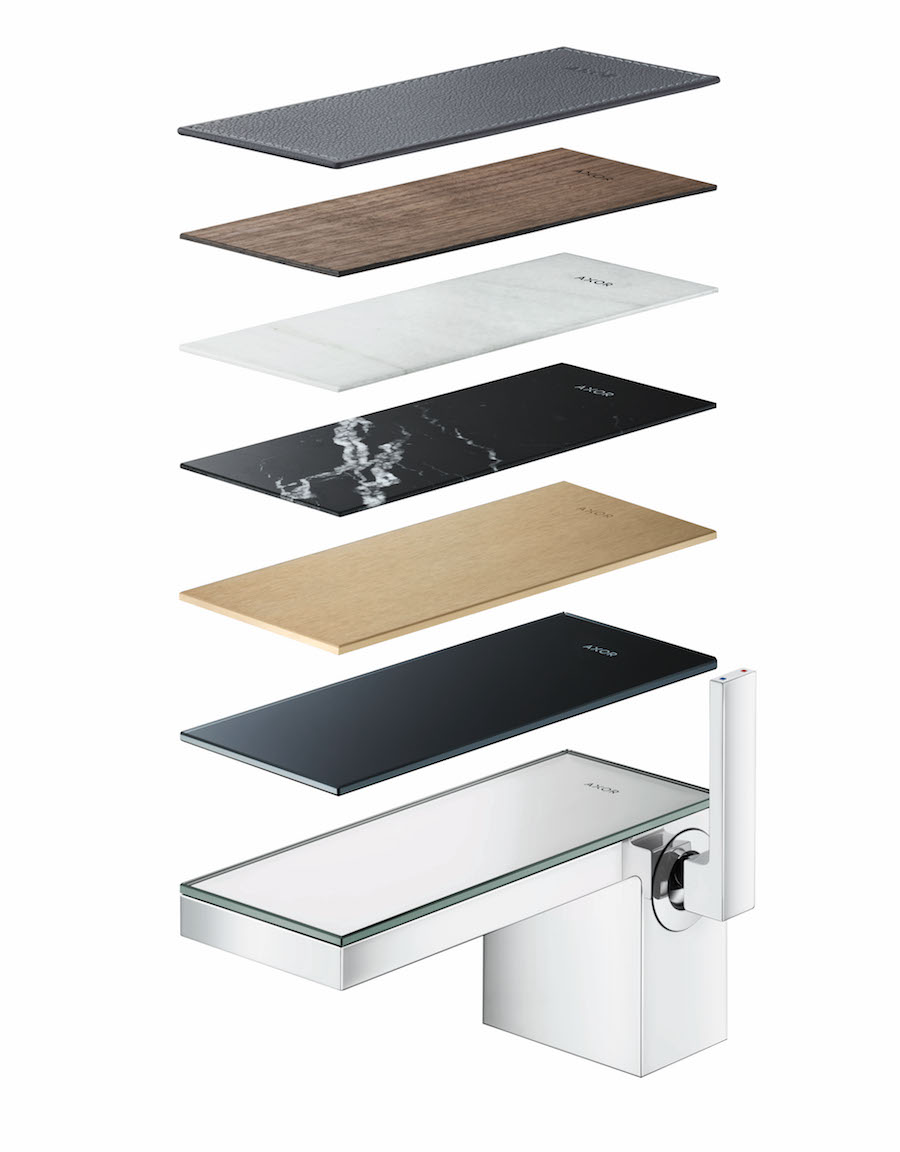
A series of showers lined one wall of Axor’s booth, encouraging visitors to switch on some of the most original bathroom fixtures around. Particularly compelling was Nendo’s Lamp Shower, which looks exactly like its name suggests, and a hand shower by Barber Osgerby. Andreas Diefenbach, business design manager of Axor’s longtime design partner, Phoenix Design, described his latest innovation: the MyEdition faucet. Its wide, architectural form can be customized with a range of materials, with the aim of seamlessly connecting with its surrounding environment. And the water it spouts? “It’s like kisses from angels,” he says.
