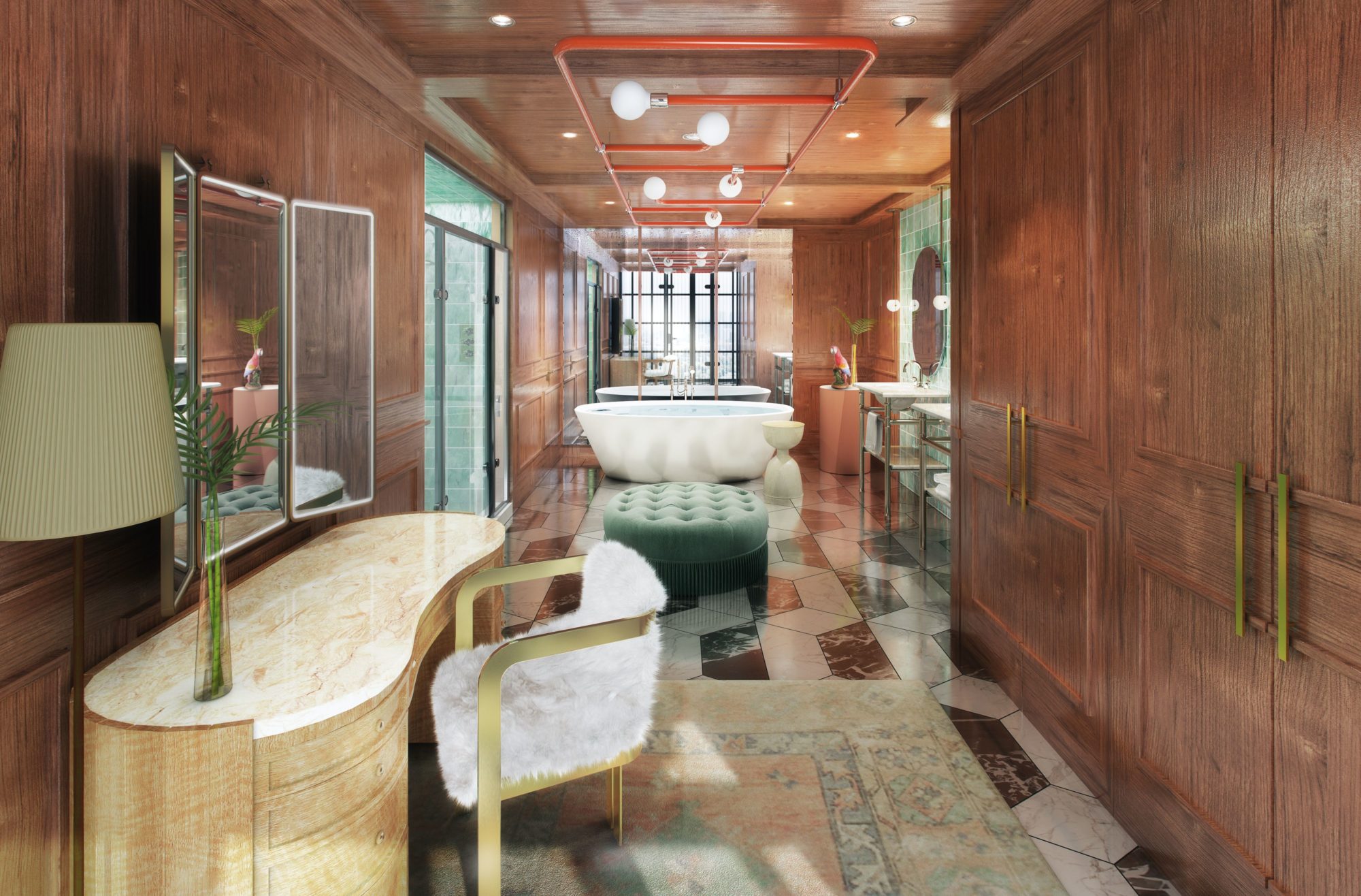
Spatial Awareness is a column that hones in on a standout element of a new project deserving of a deeper look. In this edition, we train our lens on the glamorously retro bathroom in the penthouse, Richard’s Flat, at the new Virgin Hotel New Orleans.
Firm: Logan Killen Interiors
Instagram: @logankilleninteriors
Practice location: New Orleans
Project: Virgin Hotel New Orleans
What was the vision for the bathroom in Richard’s Flat?
Richard’s Flat overlooks the rooftop lounge and terrace which has a 70’s pool club feel. To tie these spaces together, we lined the ceiling and walls with mahogany wood, giving it a nautical feel. A bold marble patterned floor grounds the space and a custom Lambert et Fils light fixture in signature Virgin red is incorporated for a bit of whimsy. The shower walls are a textural acqua zellige tile which gives the effect of moving water.
How does the layout flow?
The entry wall to the bathroom runs parallel to the full-height windows overlooking the Pool Club. To accentuate this connection, we incorporated full-height steel windows and a door as the entryway. Since it’s the only natural light into the space, we mirrored the entire back wall to reflect the opening and provide the illusion of another window. A freestanding tub sits in front of the mirrored wall and upon entry guests will find a wardrobe built into the mahogany-clad walls opposite a vanity and makeup mirror. Beyond the dressing space is double sink vanities, a large shower, and a discrete private water closet with a hidden door.
What stands out to you the most now that you’ve finished it?
The beautiful mahogany wood. It provides so much depth and richness to the space.
What tools were indispensable from ideation to actualization?
The incorporation of the mirrored back wall. It makes what would be a rather deep, dark space feel spacious and light-filled.
Did you encounter anything that was unforeseen or especially challenging?
The lower ceiling height was a challenge, however, the wood on all surfaces feels enveloping and cozy.
References of inspiration:
1920’s Parisian luxury hotel design.
Favorite detail:
The custom Lambert et Fils fixture is an unexpected playful detail.
Next project on the horizon:
Some really exciting historical residential renovations here in New Orleans.


