Destination
Surface Travel Awards | 2018 Winners
Surface Travel Awards | 2018 Winners
CITY
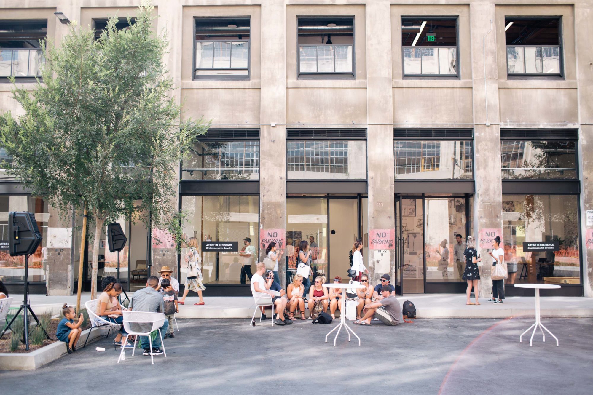
Considering the recent spate of adaptive development projects, it would appear that Los Angeles has finally taken notice of its architectural bounty. The renaissance of DTLA is evidence enough—early-20th-century buildings have been rehabbed and recast as innovative cultural institutions, incubating a new generation of artists and designers, and architecturally ambitious projects such as The Row DTLA, a 30-acre railroad terminus by Rios Clementi Hale Studios that’s now home to shops, restaurants, and galleries, are reimagining once-overlooked spaces—but there’s more to the story. Design-conscious hotels are sprouting up all over the city, including The Freehand LA, Roman & Williams’s boho reskinning of downtown’s Commercial Exchange Building; Jacques Garcia’s sumptuous NoMad Hotel, in the old Bank of Italy headquarters; the swank La Peer, by Gulla Jonsdottir, in West Hollywood; and the Surfrider Hotel, whose elevated beach house look is perfect for Malibu. Eric Owen Moss’s geometric building for the restaurant Vespertine competes for the spotlight with Chef Jordan Kahn’s avant-garde food. And that favorite Los Angeles pastime—shopping—now doubles as a conceptual design tour: Casa Perfect, the West Coast outpost of beloved home brand the Future Perfect, moved into Elvis’s former pad in Beverly Hills; artist Sterling Ruby took over the new Calvin Klein flagship; Snarkitecture did a store for Kith; and local architecture firm Johnston Marklee designed a showroom for Knoll. Perhaps most significantly, the city hired its first Chief Design Officer, Los Angeles Times architecture critic Christopher Hawthorne.
CULTURAL INSTITUTION
ABU DHABI, UNITED ARAB EMIRATES
JEAN NOUVEL
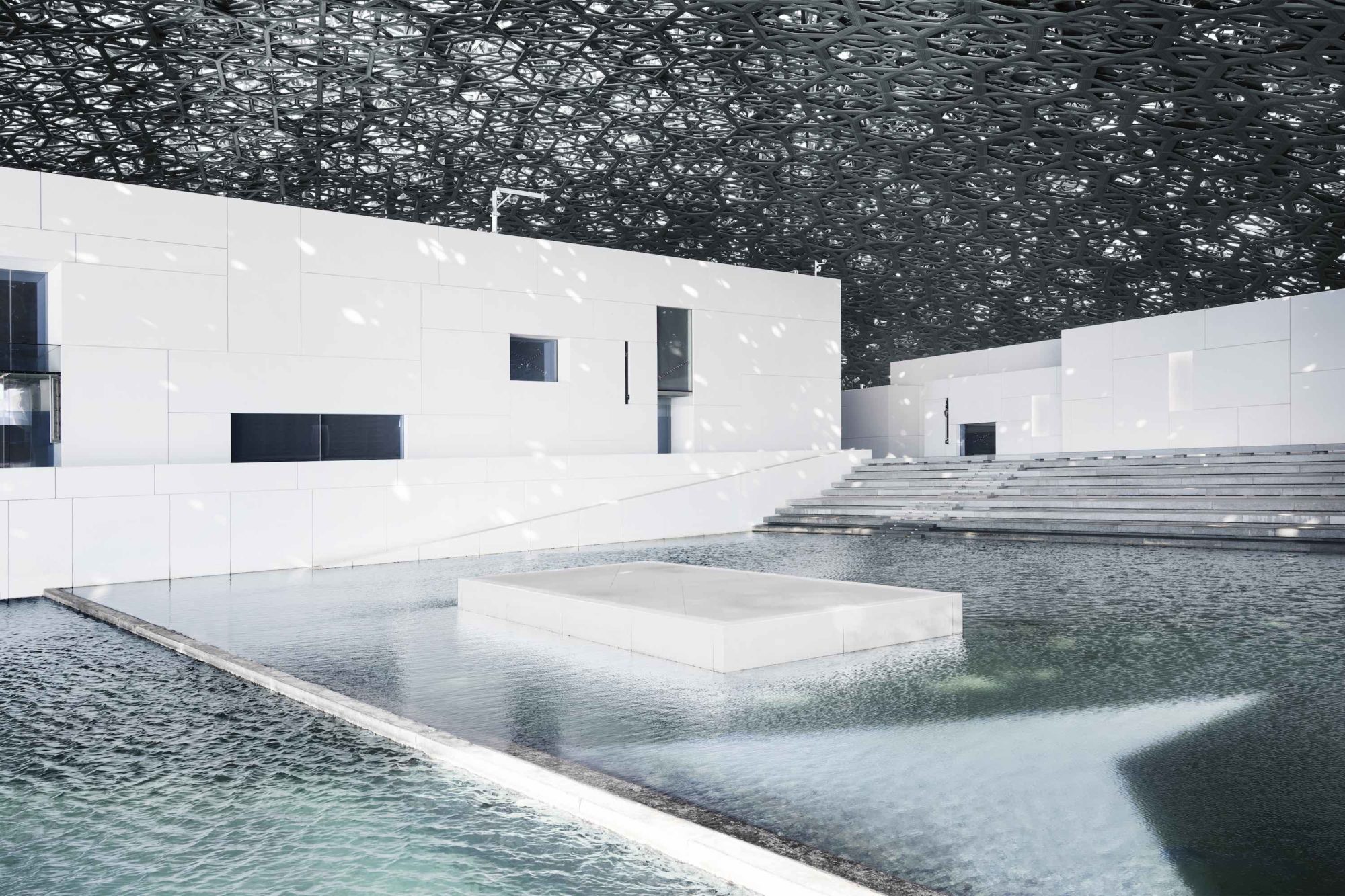
Jean Nouvel’s design for the Louvre Abu Dhabi is a contemporary meditation on traditional Arabic motifs, an engineering marvel that’s also an architectural coup de maître. Built to house a rotating selection of masterworks borrowed from French institutions, as well as new acquisitions, the museum is a veritable city unto itself: a medina-like cluster of 55 buildings, all covered by a vast, nearly 600-foot dome made of eight interlacing layers of aluminum and steel. A tapestry of 7,850 star-shaped apertures allow light to filter into the interior, a magical filigreed effect that significantly reduces energy consumption. Gallery ceilings are made up of 25,000 individual pieces of glass that incorporate both natural and artificial light, optimizing viewing conditions while protecting the works on display.
CULTURAL INSTITUTION
MARRAKESH, MOROCCO
STUDIO KO
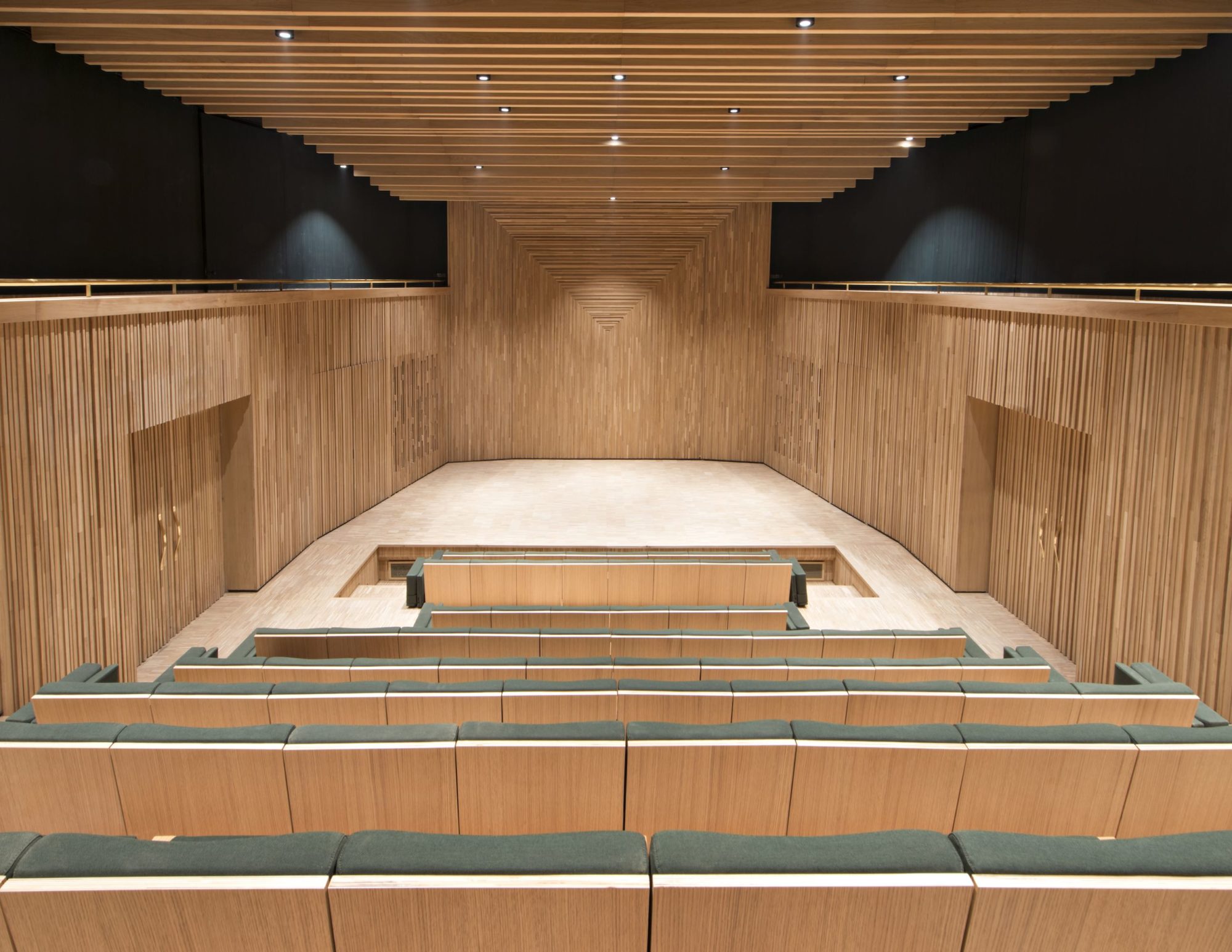
Arguably the last of the great French couturiers, Yves Saint Laurent found his spiritual home in Marrakesh, a place dominated by the intricate patterns and vibrant colors that informed much of his work. Now the designer’s legacy—thousands of garments, accessories, sketches, photographs, and other arcana—is preserved and showcased in a museum worthy of his creativity. Inspired by Saint Laurent’s juxtaposition of curves and straight lines, tight tailoring with loosely flowing fabric, Karl Fournier and Olivier Marty of Paris-based Studio KO designed a structure of smooth terrazzo topped with tessellated brickwork that appropriately calls to mind a lace cape worn over a satin gown.
PARK OR PUBLIC SPACE
COPENHAGEN
MARSHALL BLECHER
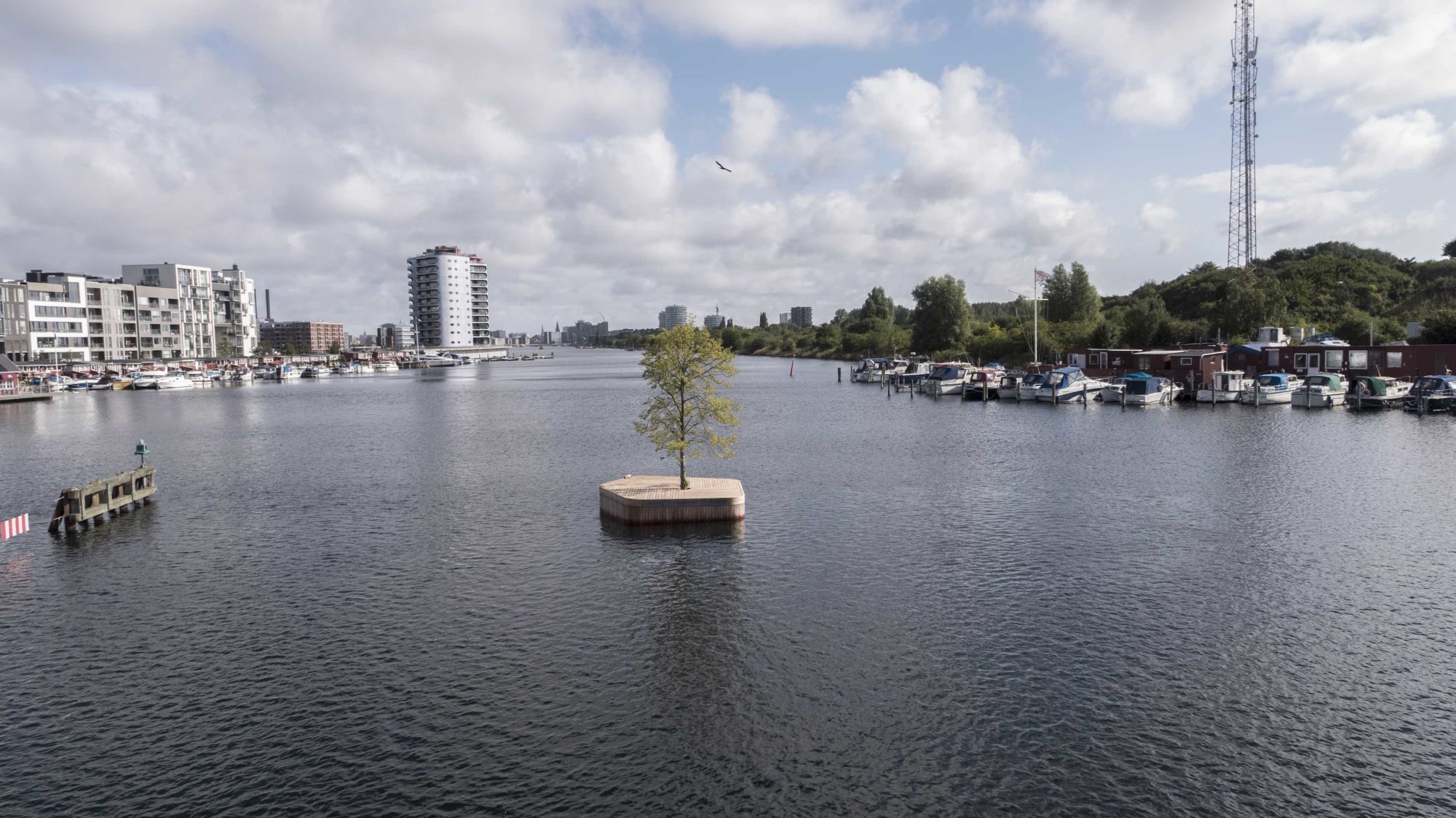
Equal parts metaphor and public space, CPH-Ø1 is a 215-square-foot floating platform moored in Copenhagen’s busy harbor. Made from local, sustainable wood using traditional boat-building techniques—and with nothing but a linden tree at its center—it’s part of hometown architect Marshall Blecher’s broader vision for a recreational “Parkipelago,” designed in response to the city’s increasingly industrialized waterfront and concerns about rising sea levels. Blecher has big plans for additional islands—including a sauna, mussel farms, and a sail-in café—to be accessed by boat or even strung together for special events. But even how it sits now, this tiny contemplative oasis fills the void.
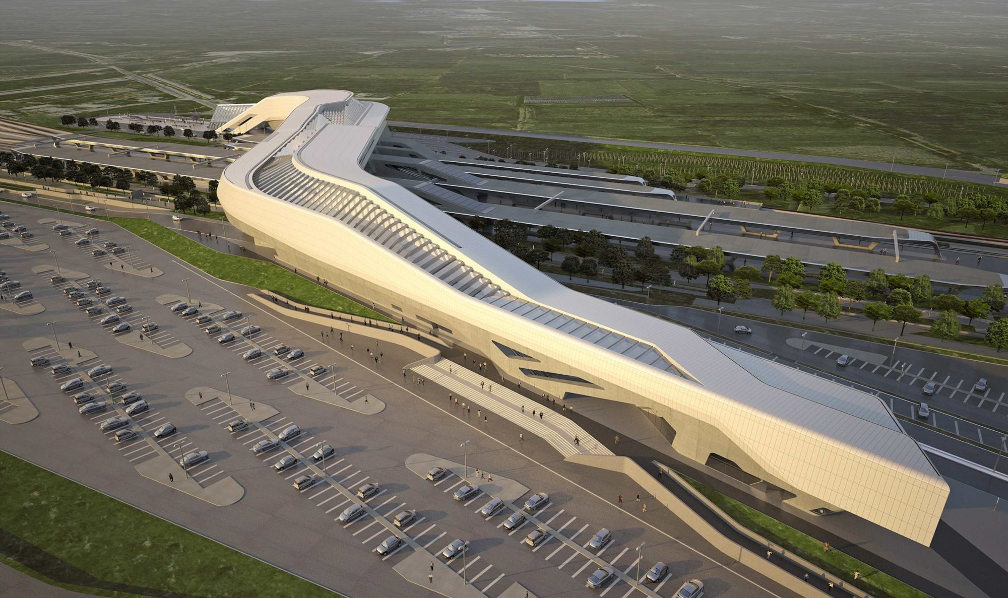
TRANSPORTATION — STATIONS AND TERMINALS
NAPLES, ITALY
ZAHA HADID
A critical hub linking several high-speed railway lines across southern Italy, Napoli Afragola is destined to be remembered as one of Zaha Hadid’s most beloved public works. The late architect and her team envisioned the structure as a bridge that unites the communities on either side of the tracks, while also serving as a main concourse where passengers can eat, shop, meet, and lounge before departure. A sinuous glass roof, held up by Corian-clad steel trusses, provides natural light—all the better to appreciate Hadid’s signature swoops and curves, used here to stunning effect. Taken as a whole, the building expresses speed, efficiency, and elegance, just like the future-leaning network it serves.
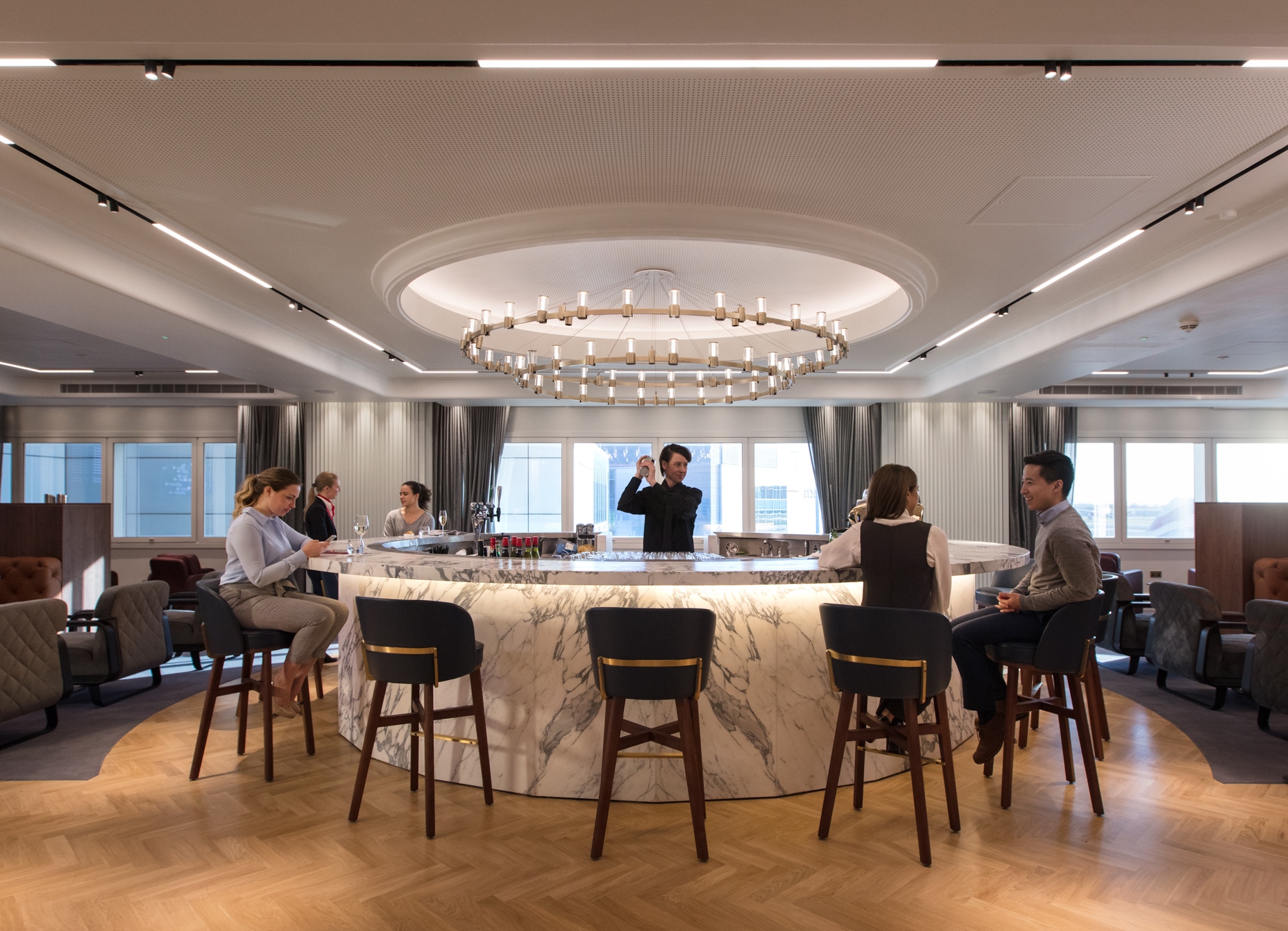
TRANSPORTATION — LOUNGES
LONDON
WOODS BAGOT
The new Qantas London Lounge at Heathrow is a welcome refuge from the tedious holding pen that is the airport experience. Architecture firm Woods Bagot gives the interior the kind of beauty befitting a stylish café, all of it inspired by London itself: fluted European smoked-oak wall panelling, a steel-and-brass staircase with terrazzo steps that mimic those in the Underground, and furniture upholstered in the green and blue hues of the River Thames. Naturally, a gin bar is at the ready, proffering the best Australian and British labels—because if the relaxed setting doesn’t relieve your travel stress, a proper G&T will.
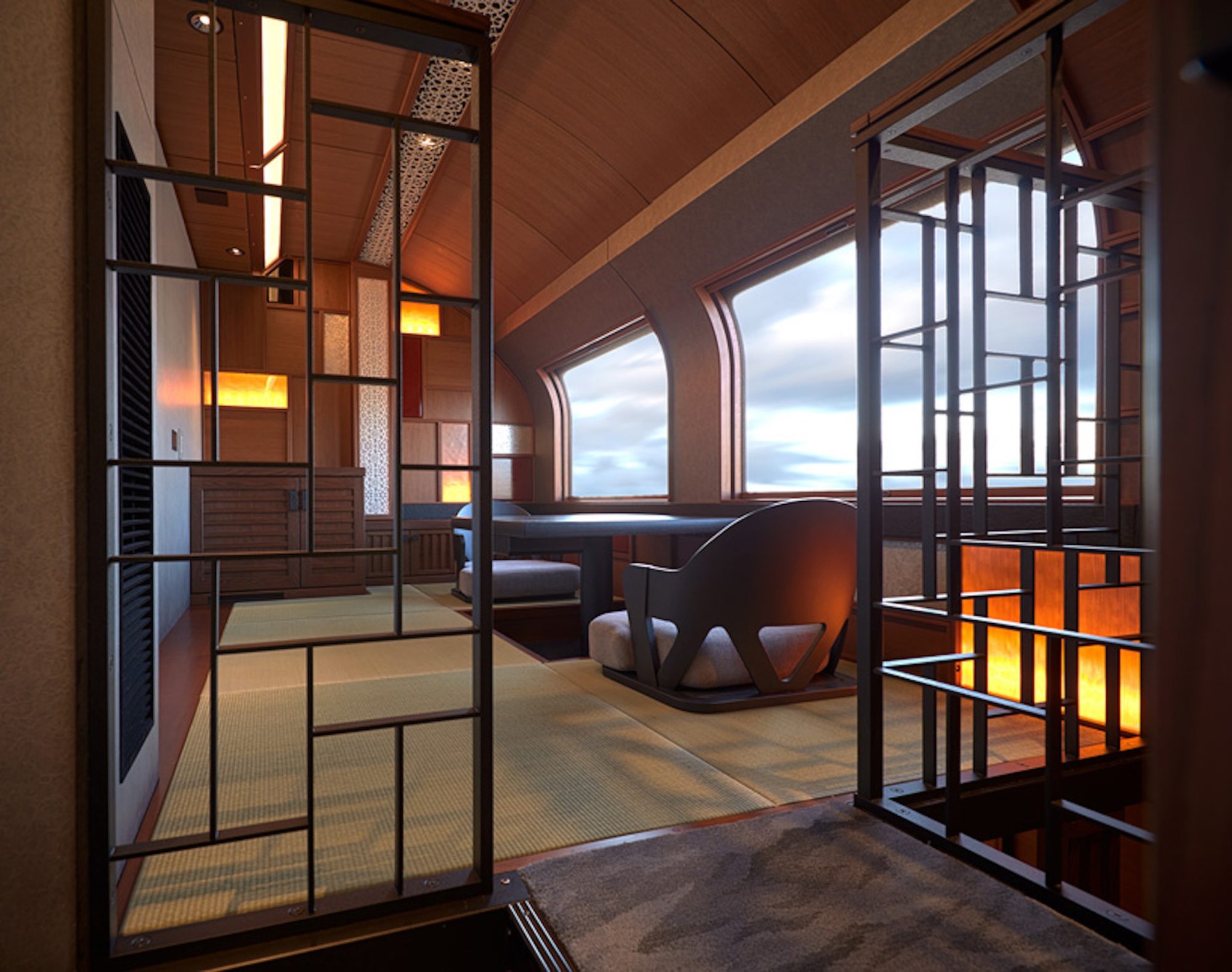
TRANSPORTATION – CONVEYANCE
JAPAN
KEN KIYOYUKI OKUYAMA
Though the restorative romance of train travel dissipated around the same time chapeaus fell out of fashion, a few outliers continue to emulate the glory of the Orient Express. The best example: Train Suite Shiki-Shima, a Ken Kiyoyuki Okuyama–designed train that looks like an anime scene. Bentwood beams resembling trees appear to grow up the walls of the lounge car; the blond-paneled dining car recalls the belly of a Nordic whale; and a handwoven carpet in the observatory car could be mistaken for forest moss if not for the white leather swiveling chairs that sit atop it, creating an ideal place to take in Japan’s ancient panoramas.
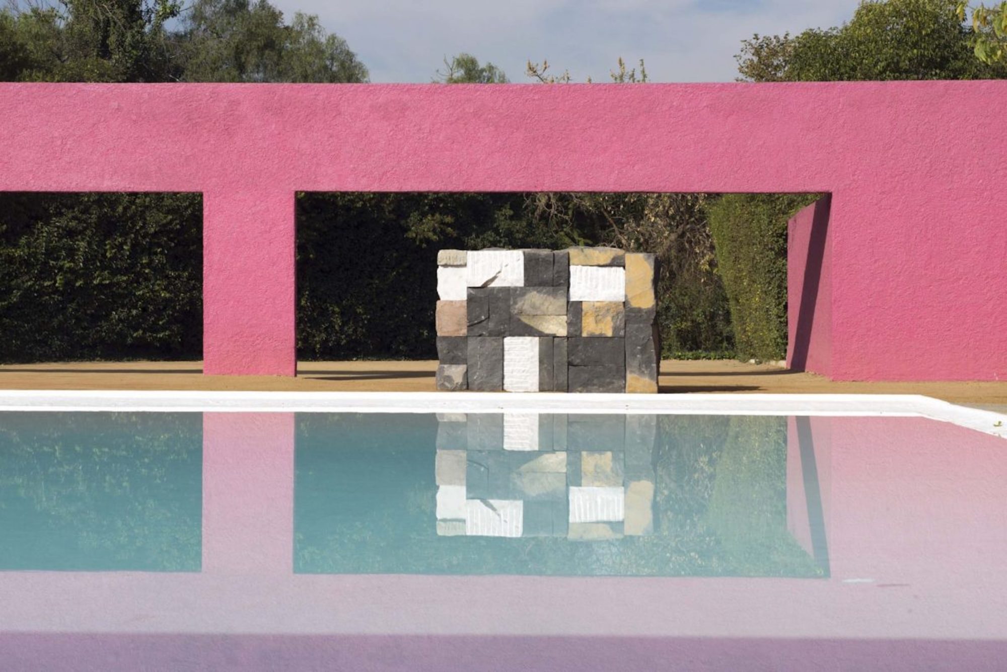
EXHIBITION
MEXICO CITY
SEAN SCULLY
In 1966, Mexico City’s Egerstrom family commissioned architect Luis Barragán to design an equestrian center that would make others look shabby. The result is Cuadra San Cristóbal, an exercise in Crayola-bright geometry against sunlit sky. This year, the iconic space opened to the masses for the first time, thanks to Dublin-born artist Sean Scully, who strategically placed his paintings and sculptures within its pink walls. (Don’t miss Brown Silver Tower and Boxes of Air, in which Cor-Ten steel cubes are stacked atop each other like wood palettes.) The effect is an ode to coloring outside the lines—by staying firmly within them.
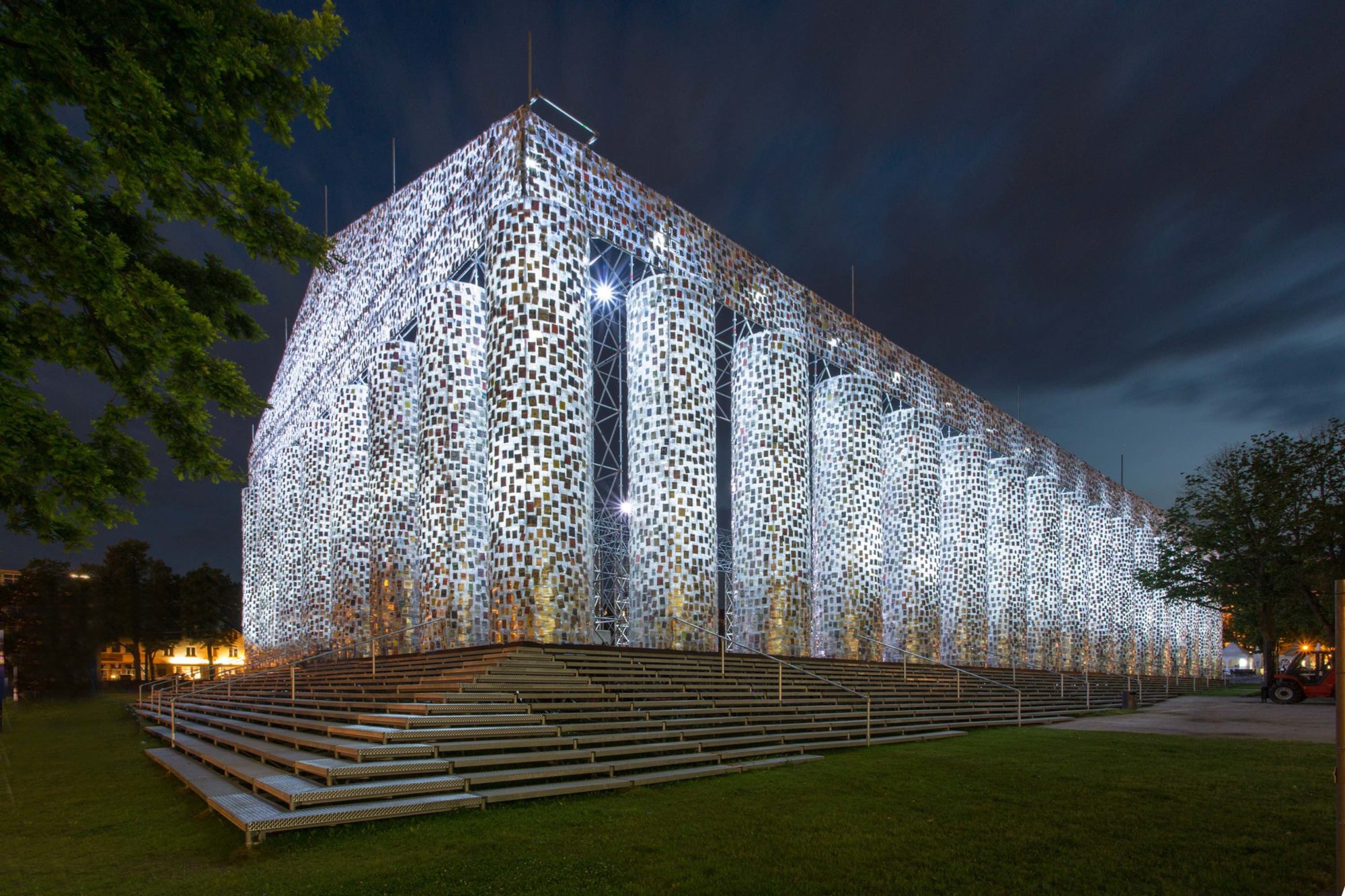
TEMPORARY SPACE OR INSTALLATION
KASSEL, GERMANY
MARTA MINUJIN
At Documenta 14, the 2017 edition of the quinquennial art exhibition in Kassel, Germany, Argentine artist Marta Minujín constructed a 1:1 scale replica of the great Athenian monument to democracy with 100,000 plastic-wrapped volumes. Built on a site where the Nazis once held anti-literary rallies, the structure contains books that were formerly or are currently banned, each donated by the public. The work is a thought-provoking commentary on free speech and the continuing threats to it, and a reminder that single-purpose architecture—in this case, the glorification of the goddess Athena—can taken new meanings and responsibilities over time.
Please submit your application below, and it will be reviewed by our editorial team. Your card will only be charged if you are approved. Learn more about membership tiers here.
Please submit your information below, and it will be reviewed by our editorial team. Learn more about membership tiers here.
Plus, an arthouse cinema’s transfixing film series on the effects of fame, Rosewood heads to...
Plus, 'The Brutalist' sweeps the Golden Globes, and Kenwood House prepares to welcome a show of...
The fine jewelry house and luxury beauty brand follows its passion for artisan handicraft all the...
Plus, Sociedad Texil Lonia purchases Christian Lacroix, and Sephora's first female CEO will be...
Plus, the fashion world remembers Rosita Missoni, and Meta rolls back its fact-checking program.
Get the Daily Design Dispatch
Essential news from the design world delivered to your inbox before you’ve had your coffee.
Think of it as your cheat sheet for the day in design.