Hospitality
Surface Travel Awards | 2018 Winners
Surface Travel Awards | 2018 Winners
SMALL HOTEL – DOMESTIC
GREENPORT, NEW YORK
STUDIO TACK
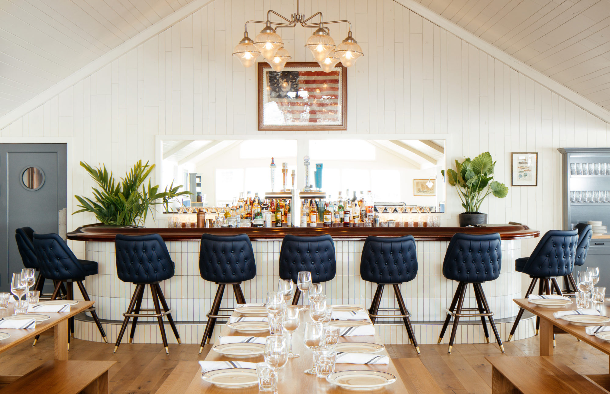
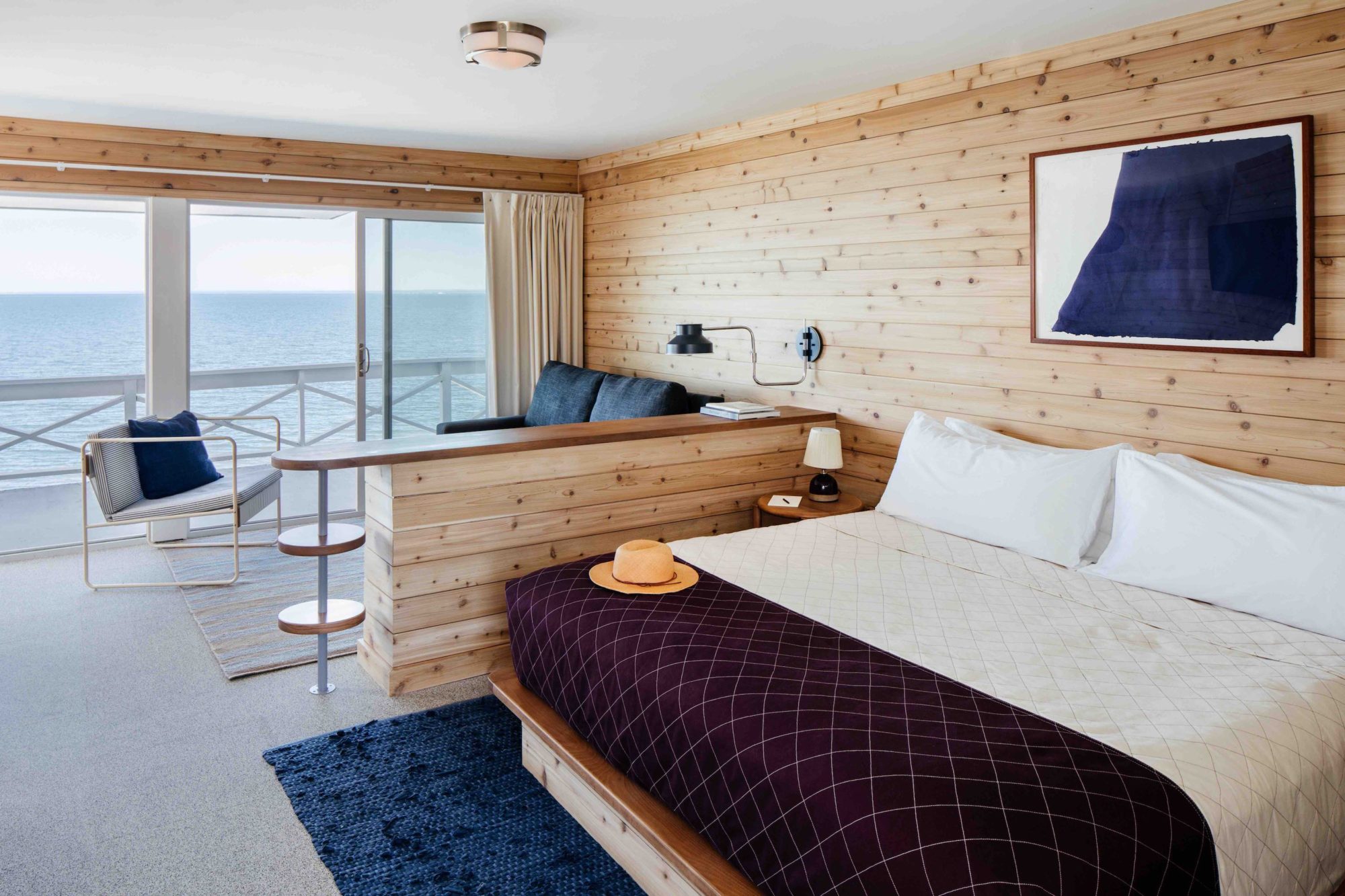
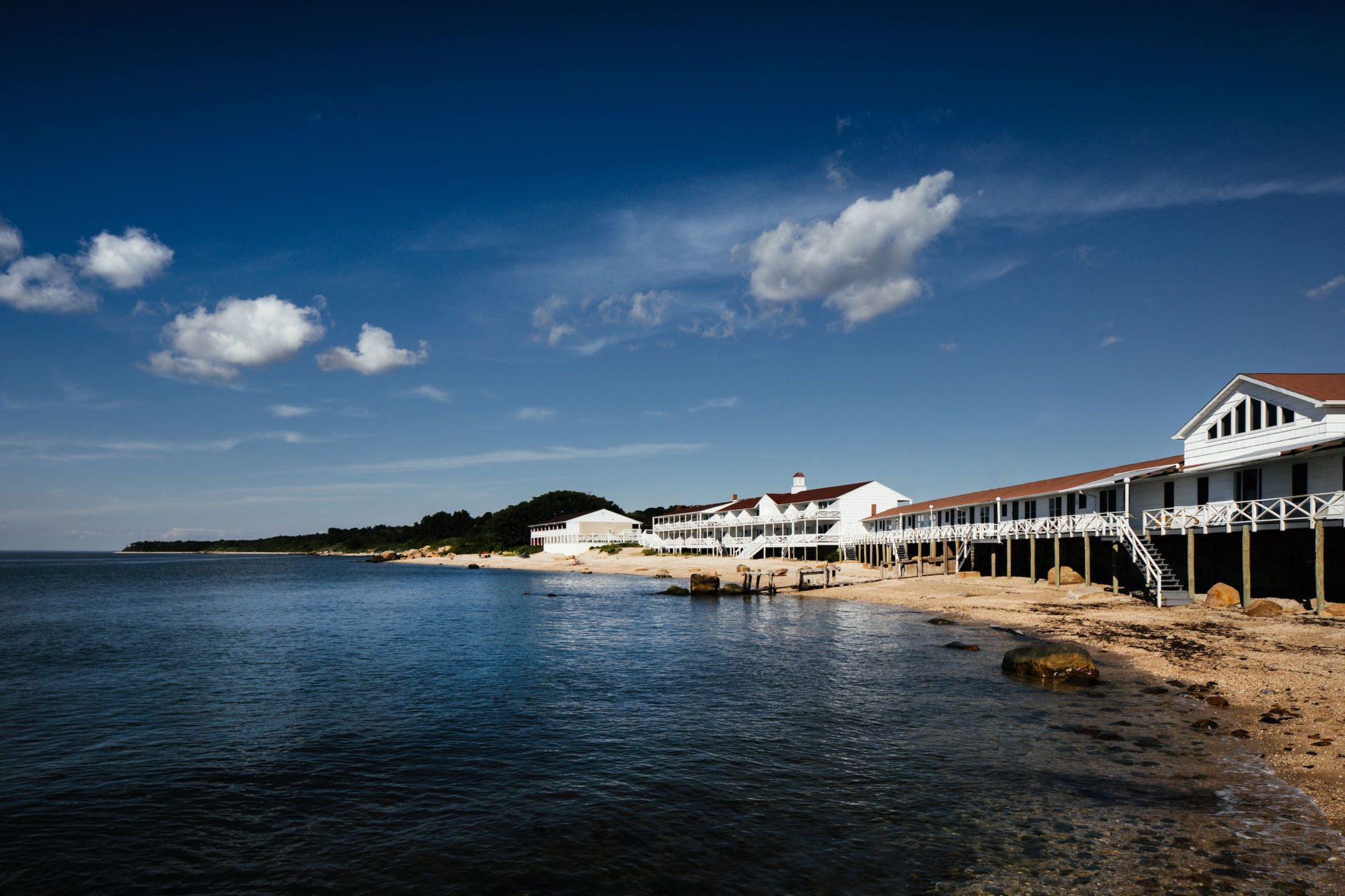
Fronting a quarter mile of private beach on Long Island’s North Fork (the Hamptons’ less flashy cousin), this revamp of a 1950s motel by New York–based Studio Tack marries twin impulses: nostalgia for the Great American Road Trip and the laid-back beach house Modernism of Cape Cod and Fire Island. The mix of elements—ship-lapped cedar paneling, midcentury lighting fixtures, seating woven from rope or rattan—conjures a summer seaside vibe while deftly avoiding kitsch. Except, perhaps, in the tavern-like bar, whose dark wood walls, round leather booths and captain’s barstools have remained virtually unchanged.

LARGE HOTEL – DOMESTIC
NEW YORK CITY
IAN SCHRAGER COMPANY
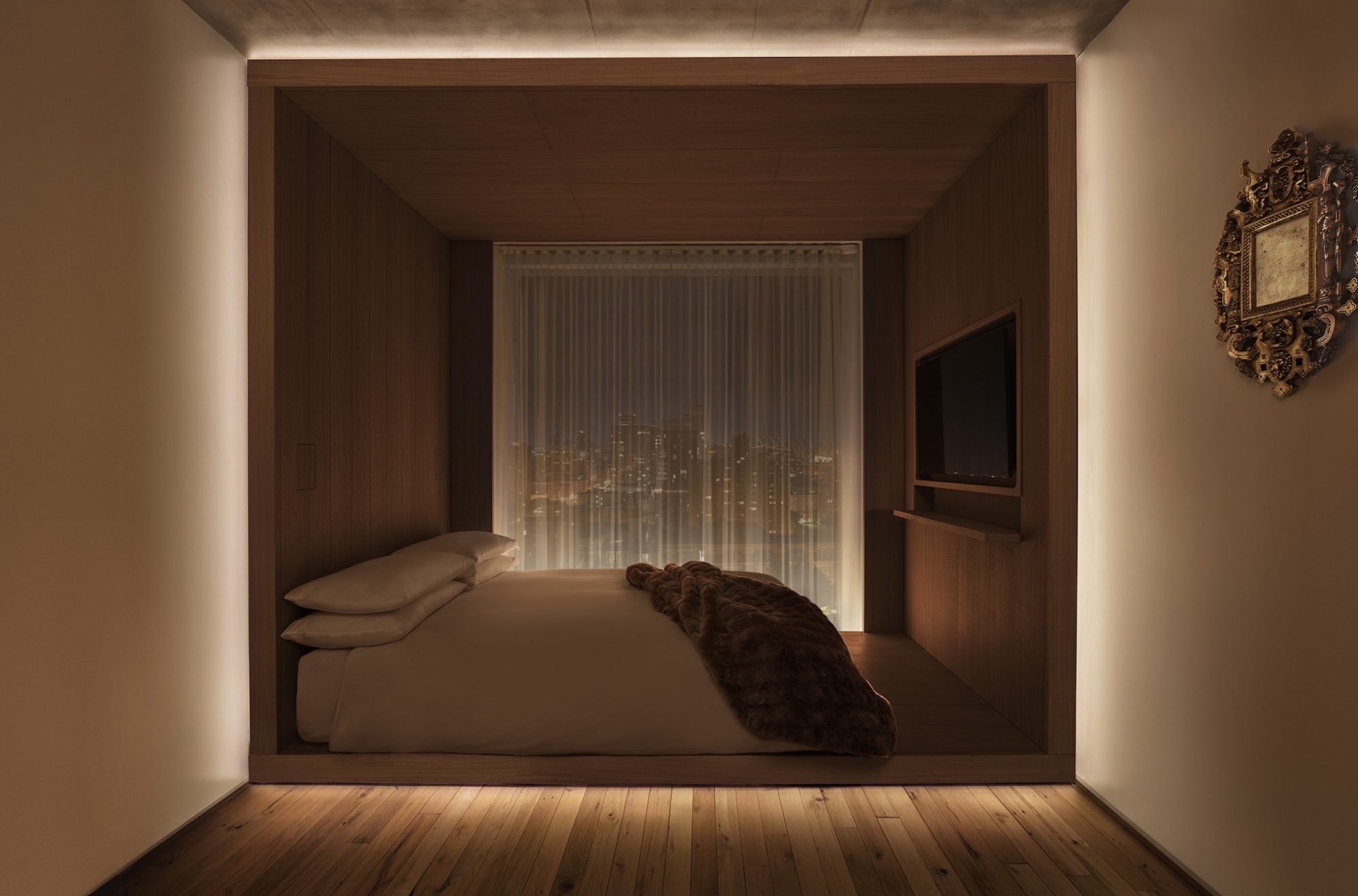
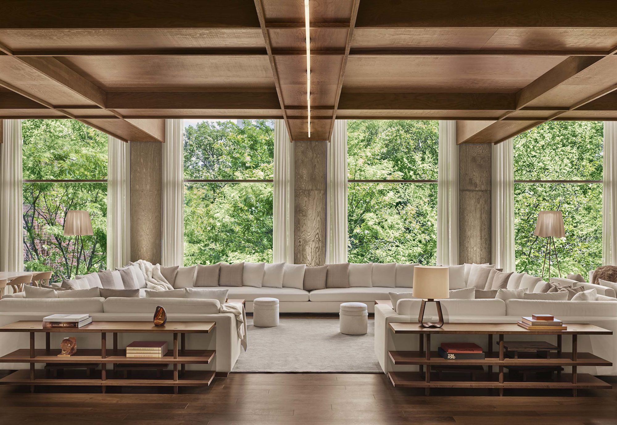
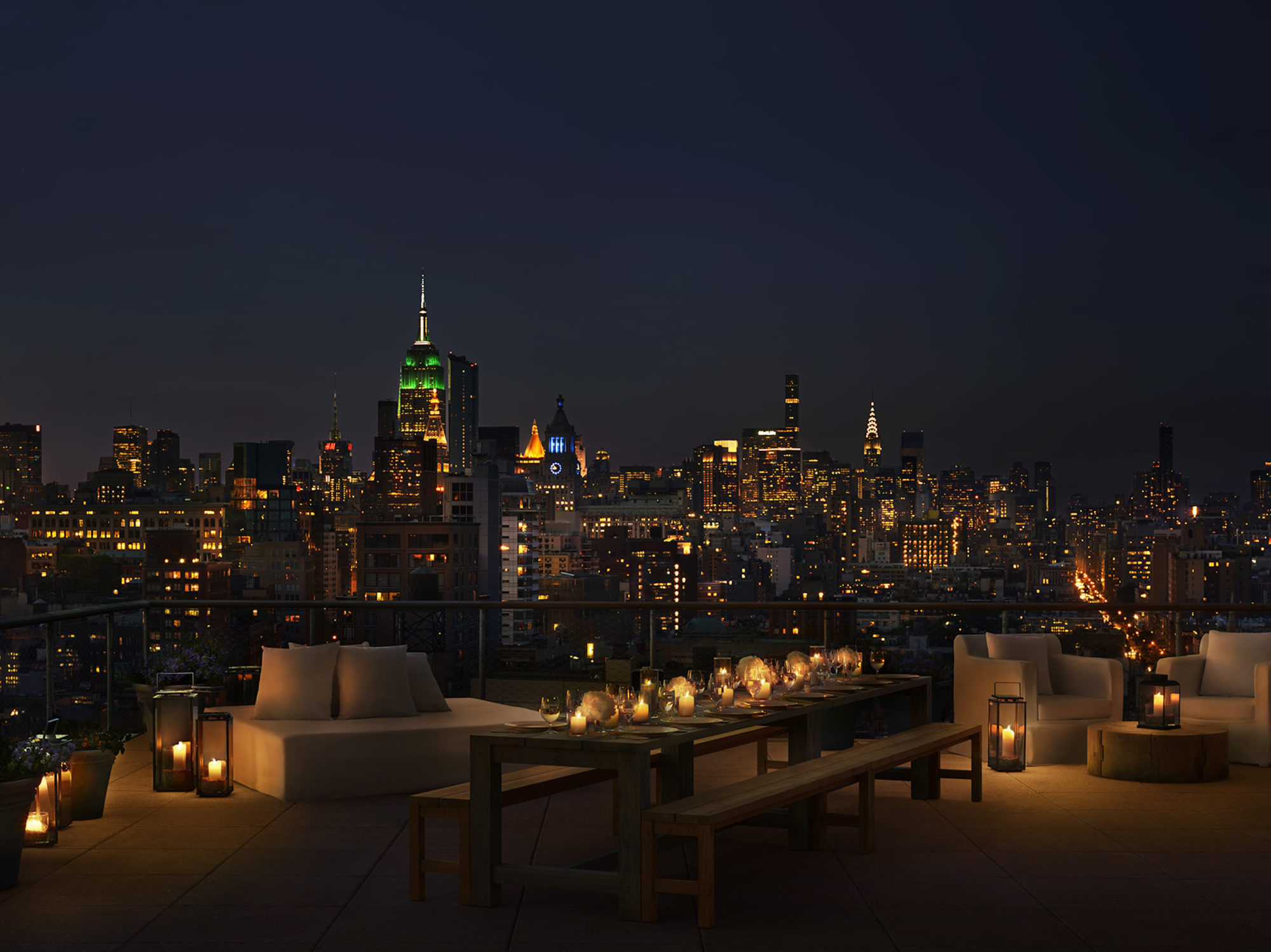
Tentative travelers might be overwhelmed by New York City’s glut of hotel rooms. Thankfully, Ian Schrager has streamlined the decision-making process yet again. Ascending the Japanese copper, Donald Judd–inspired escalator at his new PUBLIC New York in Nolita, you’ll promise to reward yourself for your boldness. Each of the 367 Herzog & de Meuron–designed rooms include Italian-made, wire-brushed- oak beds (inspired by Thomas Jefferson’s at Monticello); halo-lit vanity mirrors; and in-room control systems that allow you to change the window treatments, lighting, or temperature via keypad—all of which is easy to navigate, even after a few drinks at the Jean-Georges restaurant downstairs.
SMALL HOTEL – INTERNATIONAL
YANGZHOU, CHINA
NERI & HU
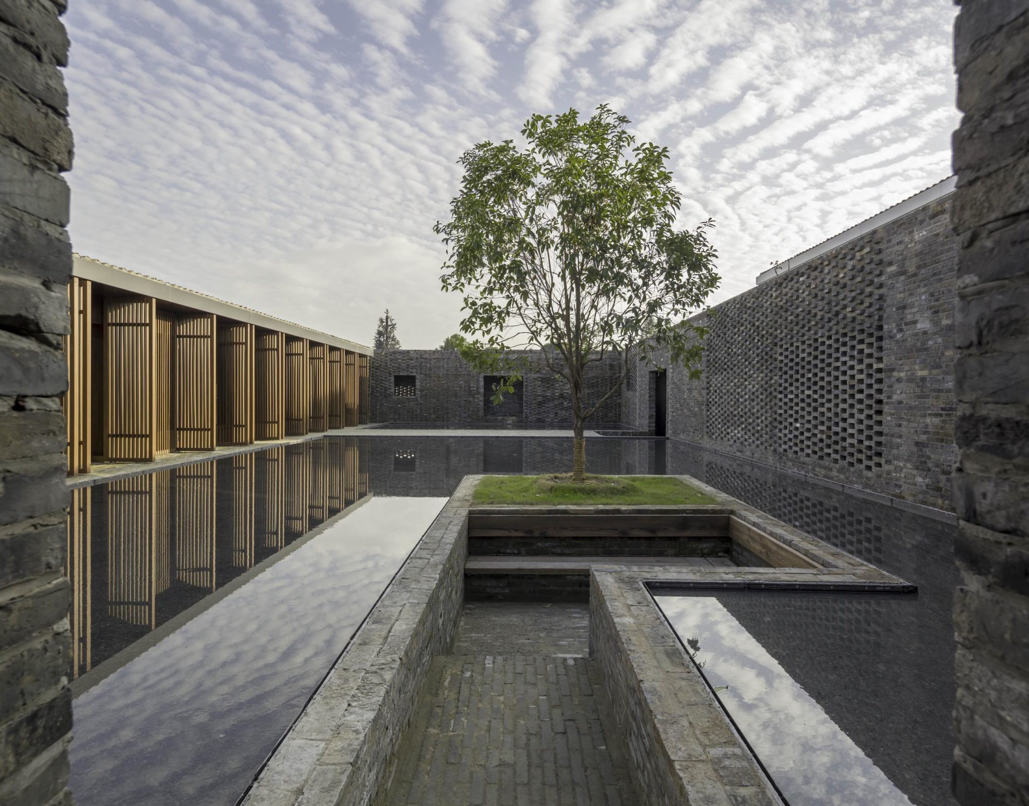
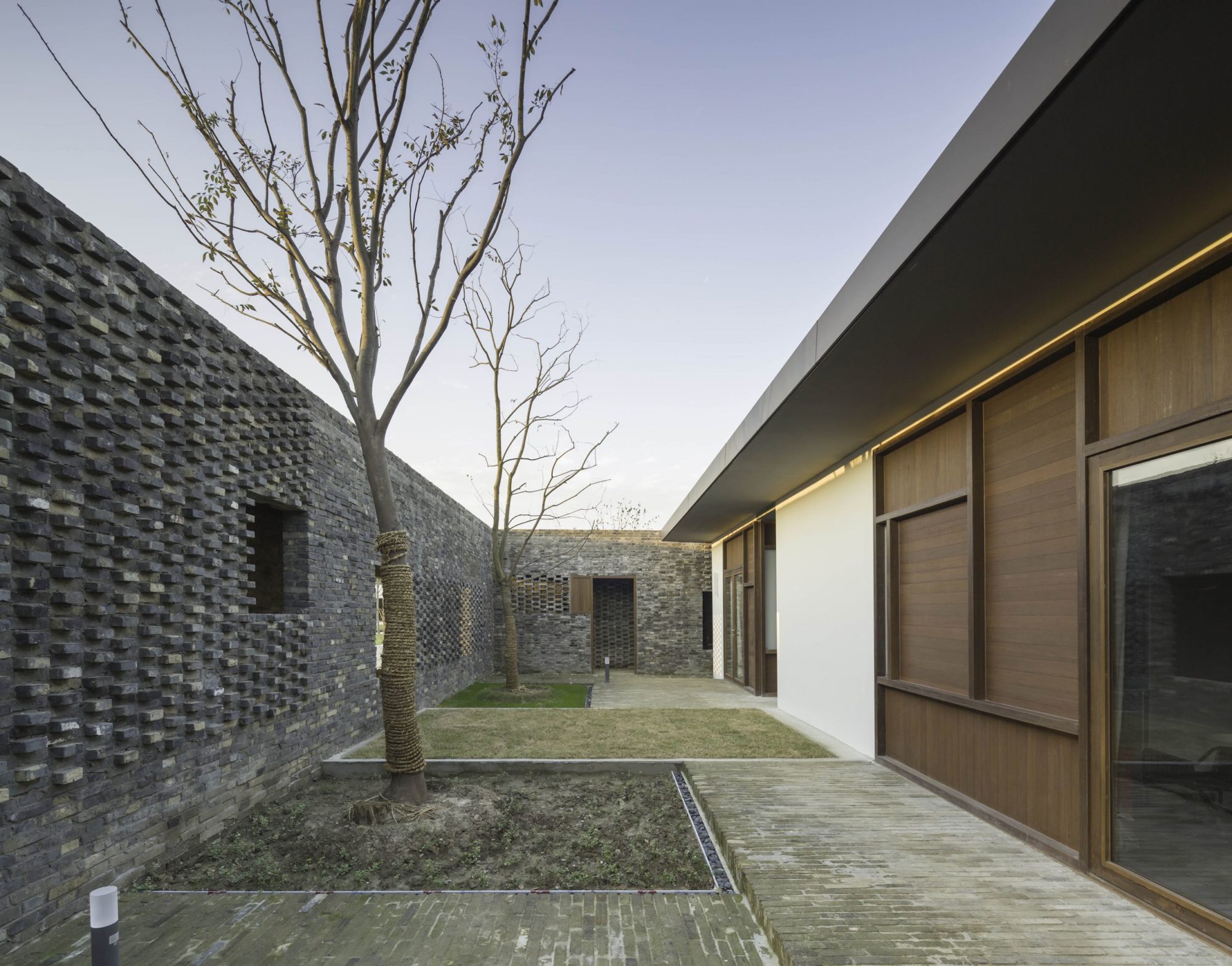
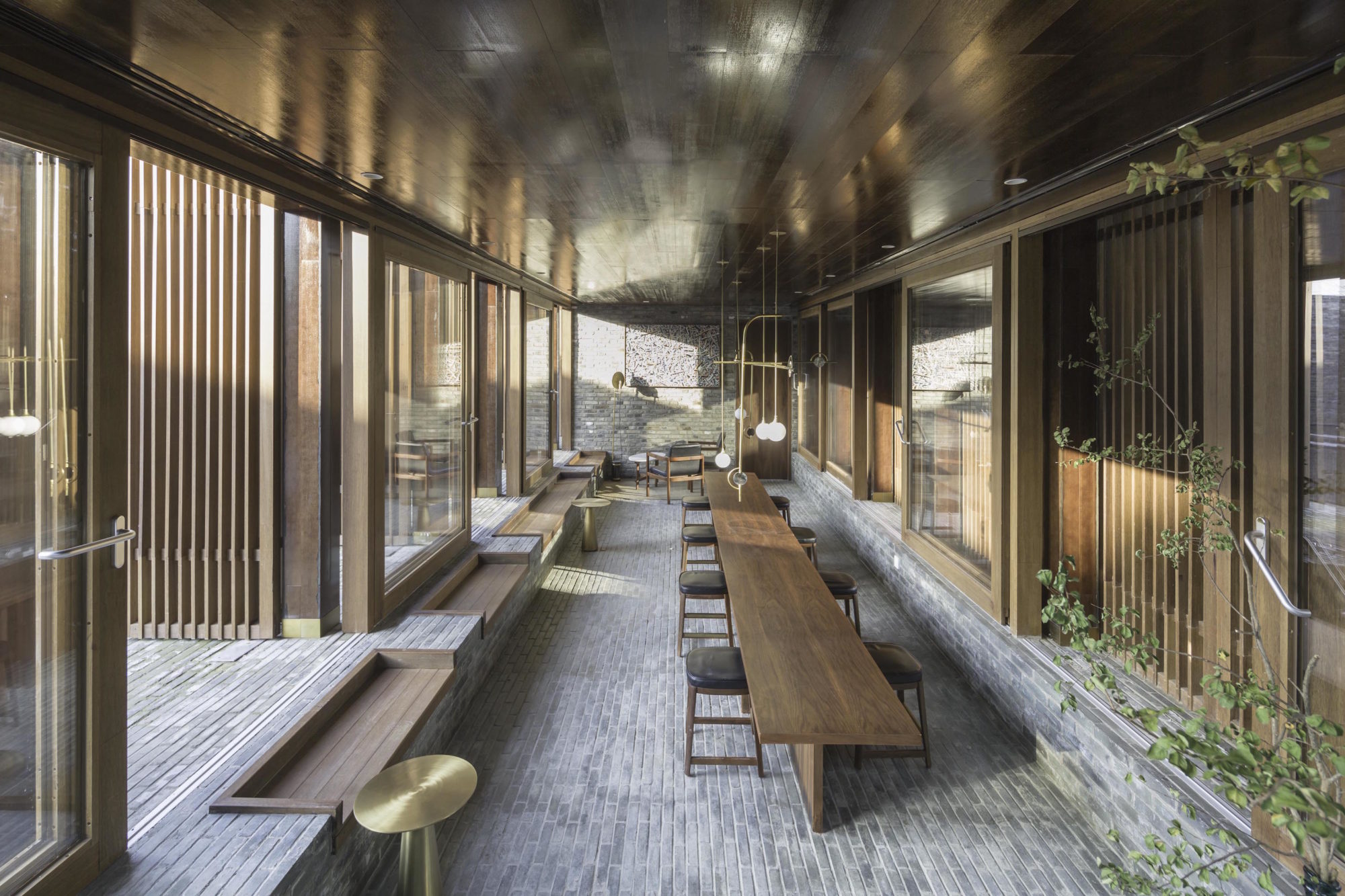
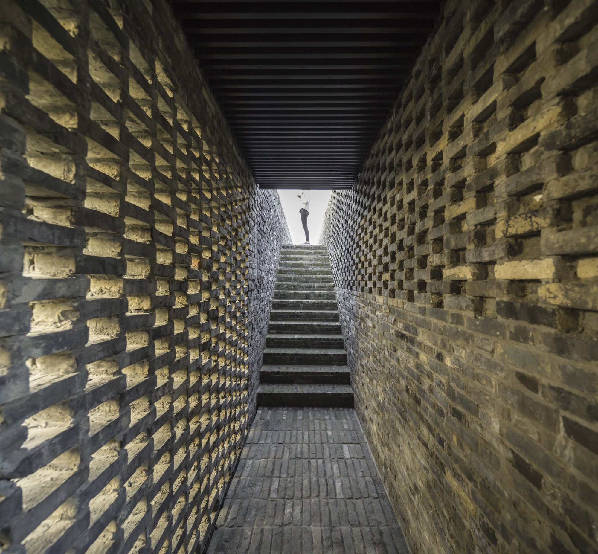
The reclaimed-brick walls of Tsingpu Retreat frame the sky as if it’s an ever-changing painting. Inspired by Chinese hutong houses, Shanghai-based firm Neri & Hu conceived the 20-room hotel, near Yangzhou, China’s Slender West Lake, to meld landscape and architecture inside—where terrazzo meets white oak and brass—and out. With public spaces that include an art gallery and teahouse, not to mention a network of pathways, courtyards, and water features, the resulting experience is one of meditative solace—a place where time is at a standstill, even as clouds roll on above.
LARGE HOTEL – INTERNATIONAL
ENNISMORE, HUMBERT & POYET, SOHO HOUSE
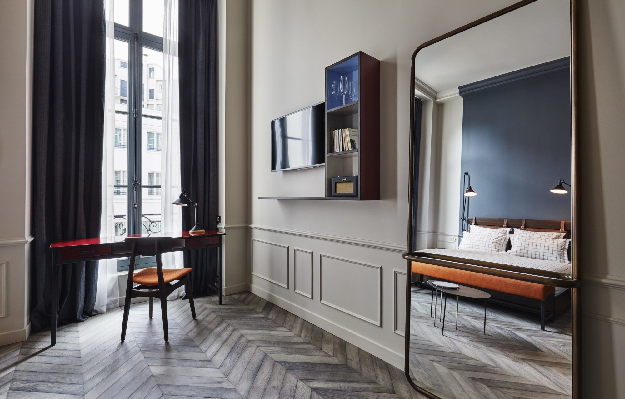
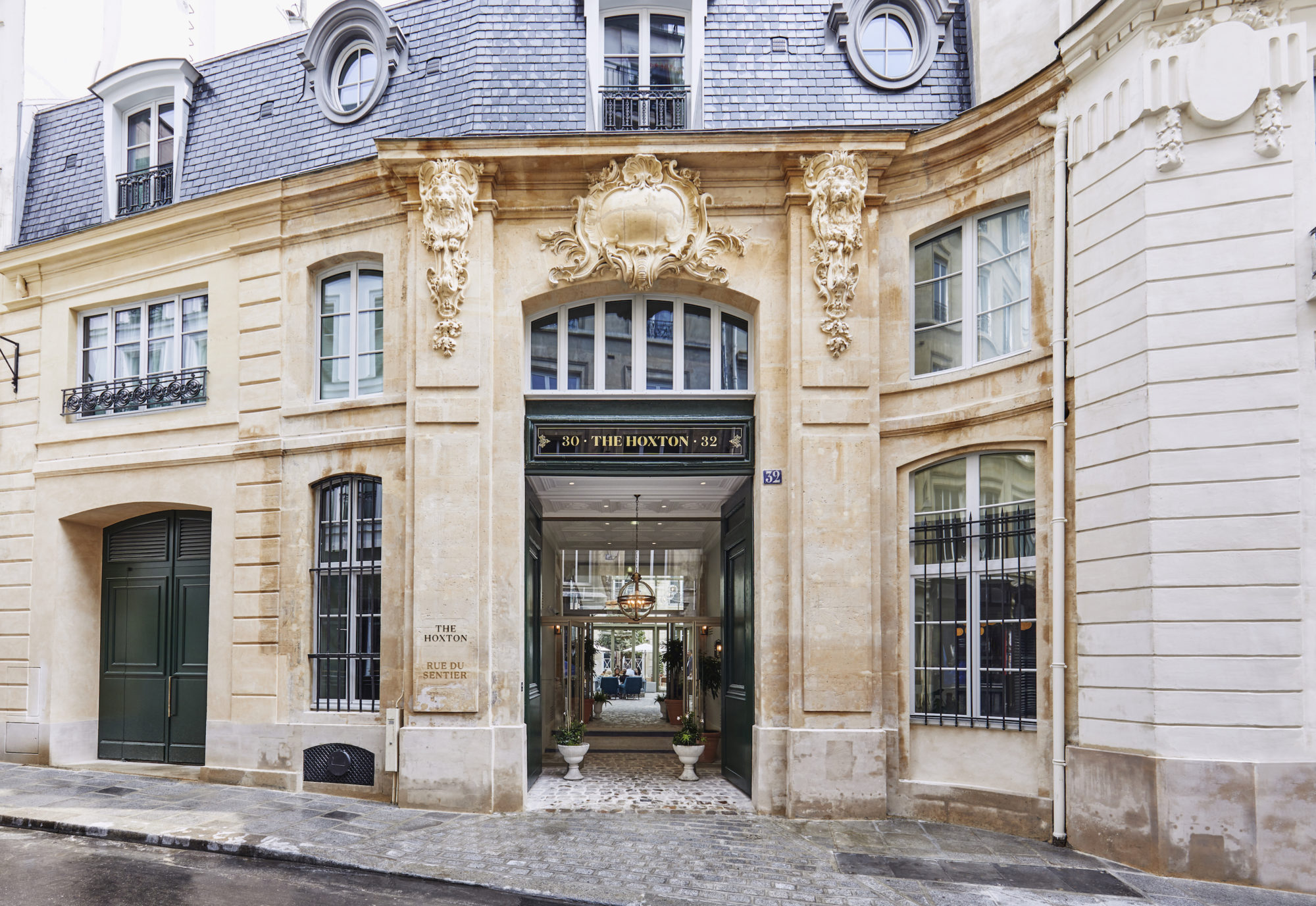
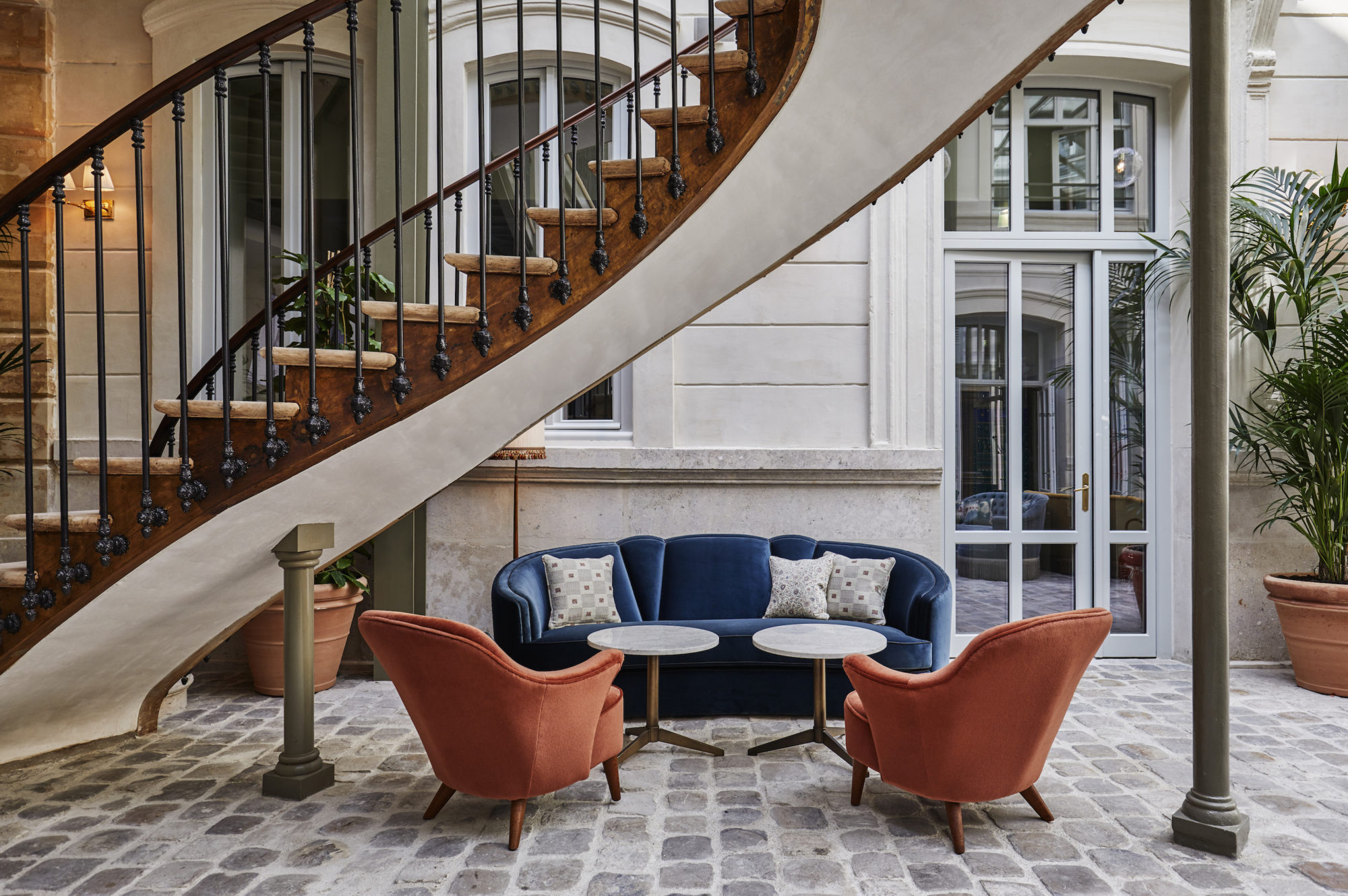
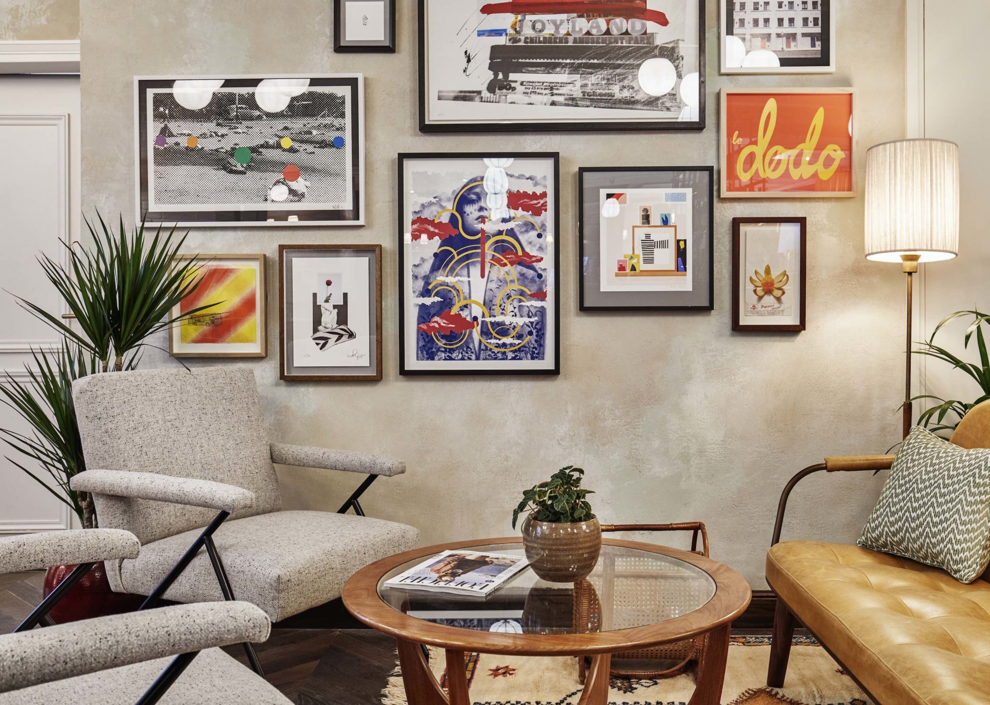
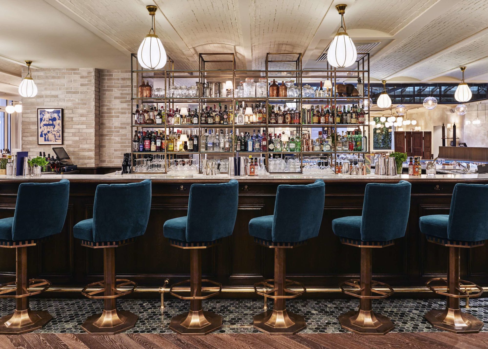
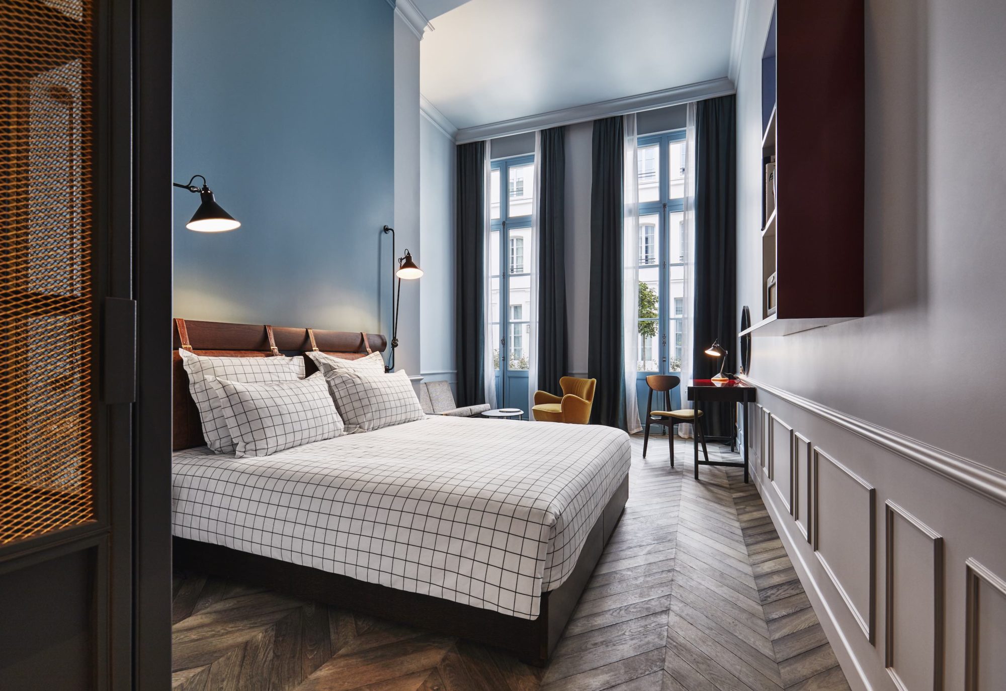
Paris has no dearth of exquisite places to lay your head. But a collaboration between three design firms—Humbert & Poyet, Soho House, and Ennismore’s Creative Studio—has transfixed even the most discerning Francophiles with its modern appeal. Housed in an 18th-century hotel particulier once owned by a counselor to Louis XV Thomas de Rivié, the 172-room Hoxton channels the city’s golden age (think oak chevron flooring, a pair of 300-year-old spiral staircases, and wallpapers that look straight out of la Belle Époque.) But it’s not all nostalgia: Rooms feature open-plan showers and Jean Prouvé furnishings.
RESORT
MALDONADO, URUGUAY
MAPA ARCHITECTS
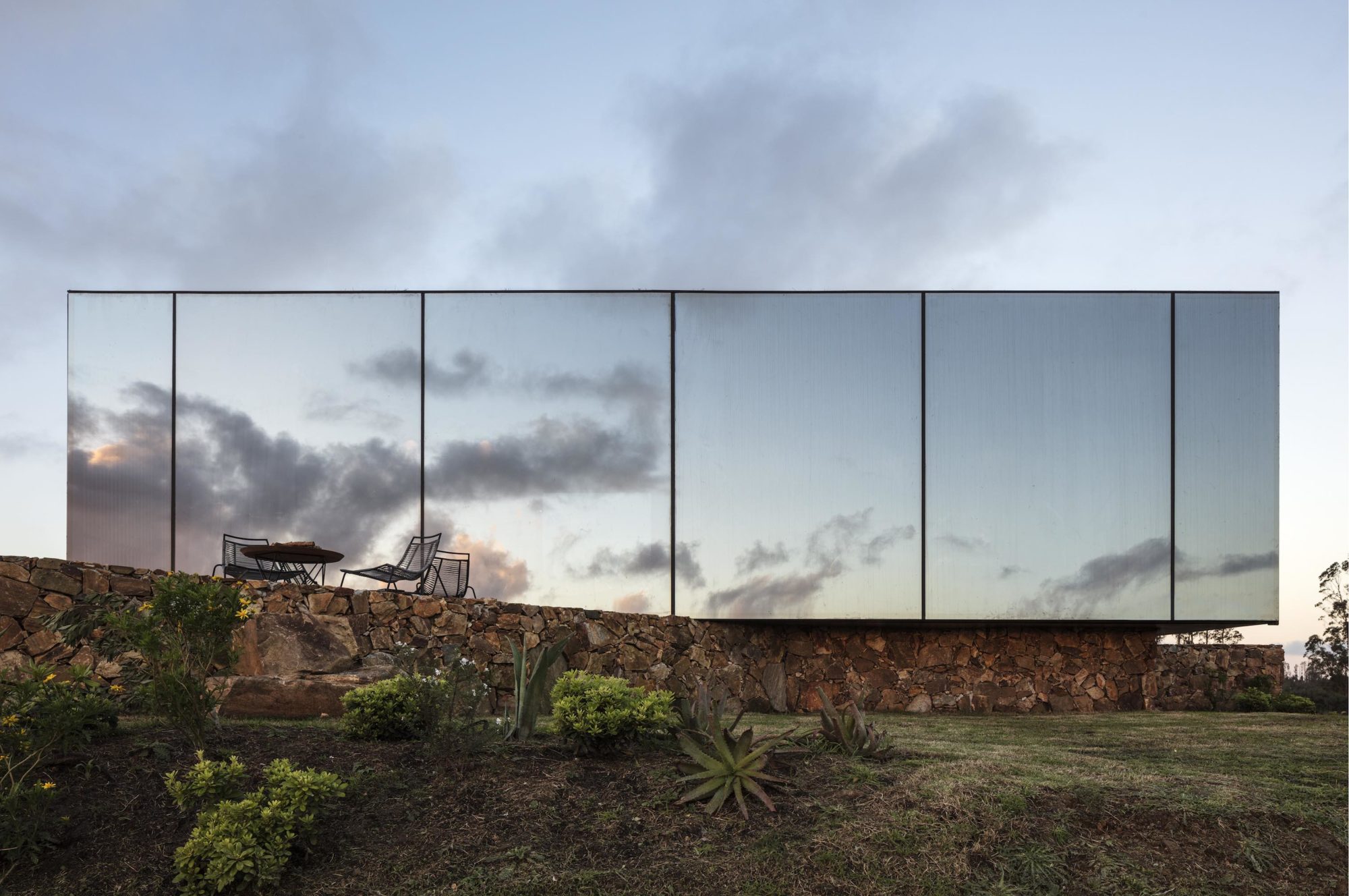
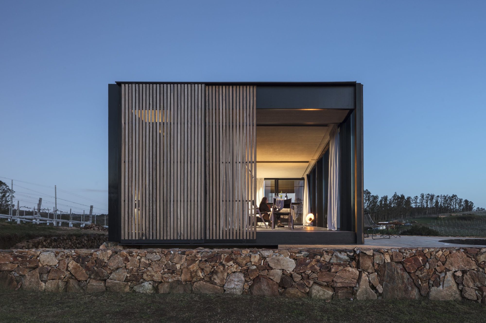
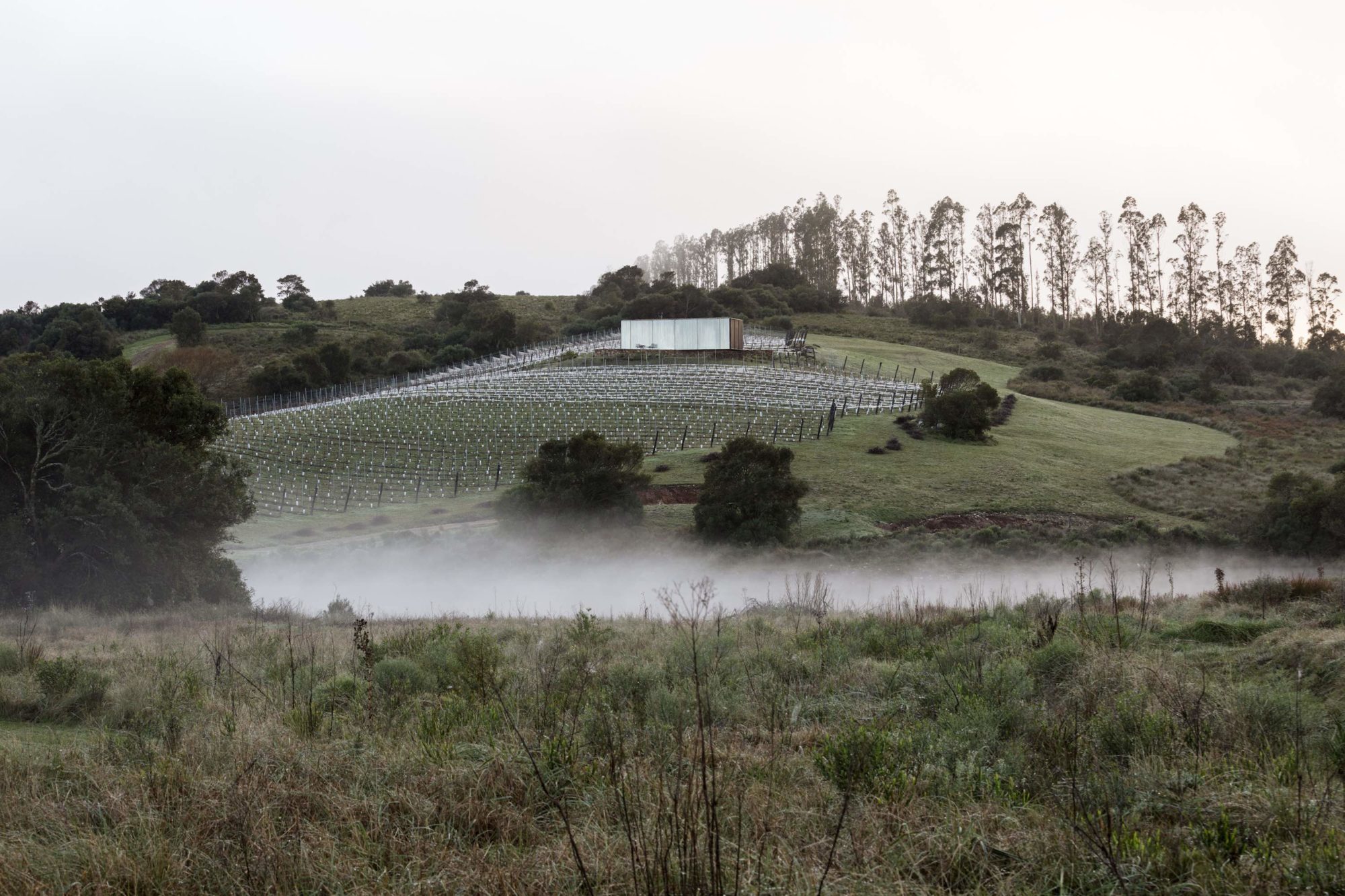
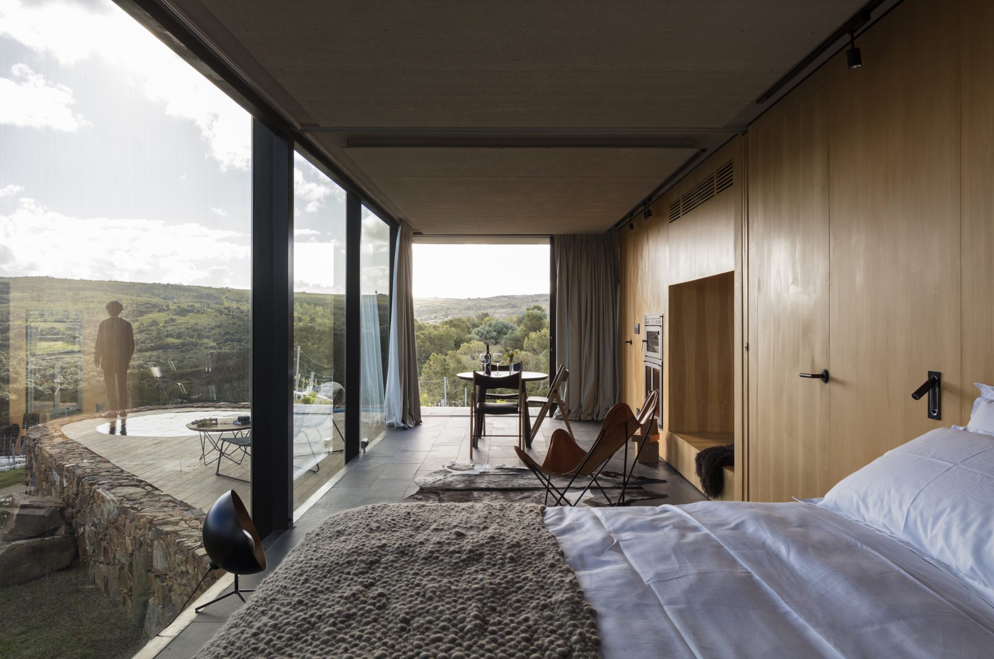
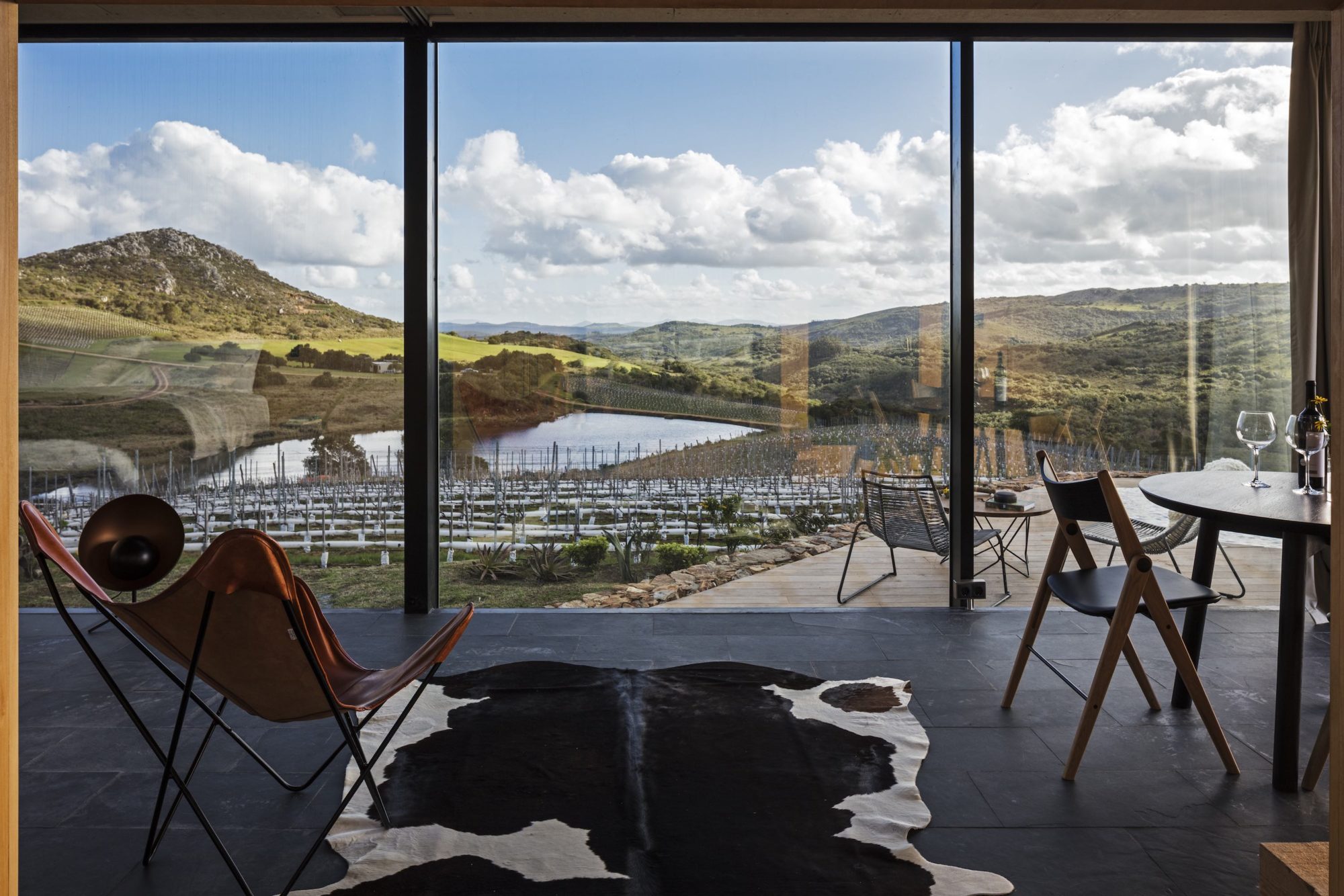
Plenty of countryside hotels are designed to blend into the background. Sacromonte almost disappears. Spread over 250 acres in Uruguay’s wild Sierra Carapé, about an hour north of Punta del Este, and designed by Montevideo-based MAPA Architects, the wine resort’s structures are sheathed in one-way mirrored glass that reflects the mountains, vineyards, and skies filled with fluffy clouds that surround it. The 13 steel cabins were prefabricated, then brought to the site and erected on platforms of local stone; rear walls were assembled from stacked cut timber. Given the setting, sustainability was an important consideration (as evidenced in the low-emissivity glass, living roofs, and wastewater treatment) but the overall effect is one of beatific calm.
MICRO-HOTEL/HOSTEL
ROMAN & WILLIAMS
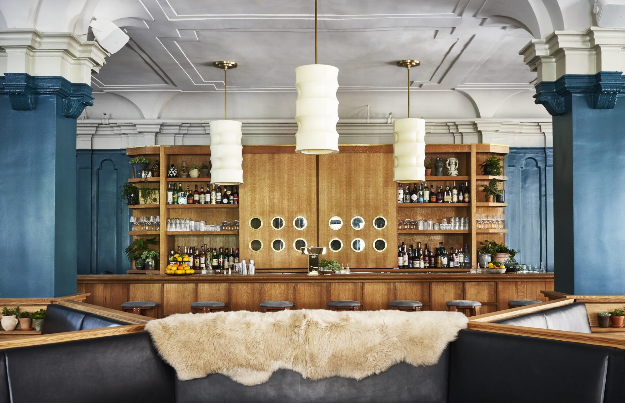
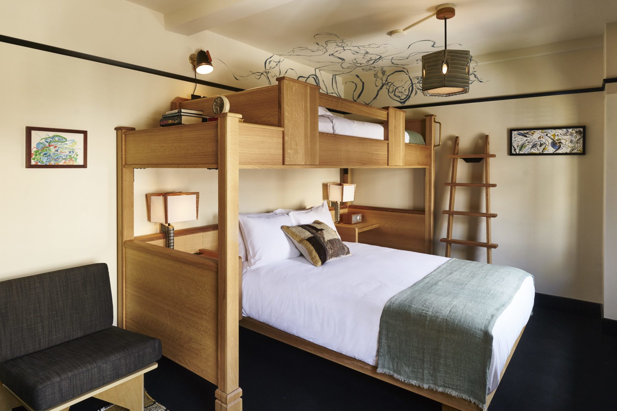
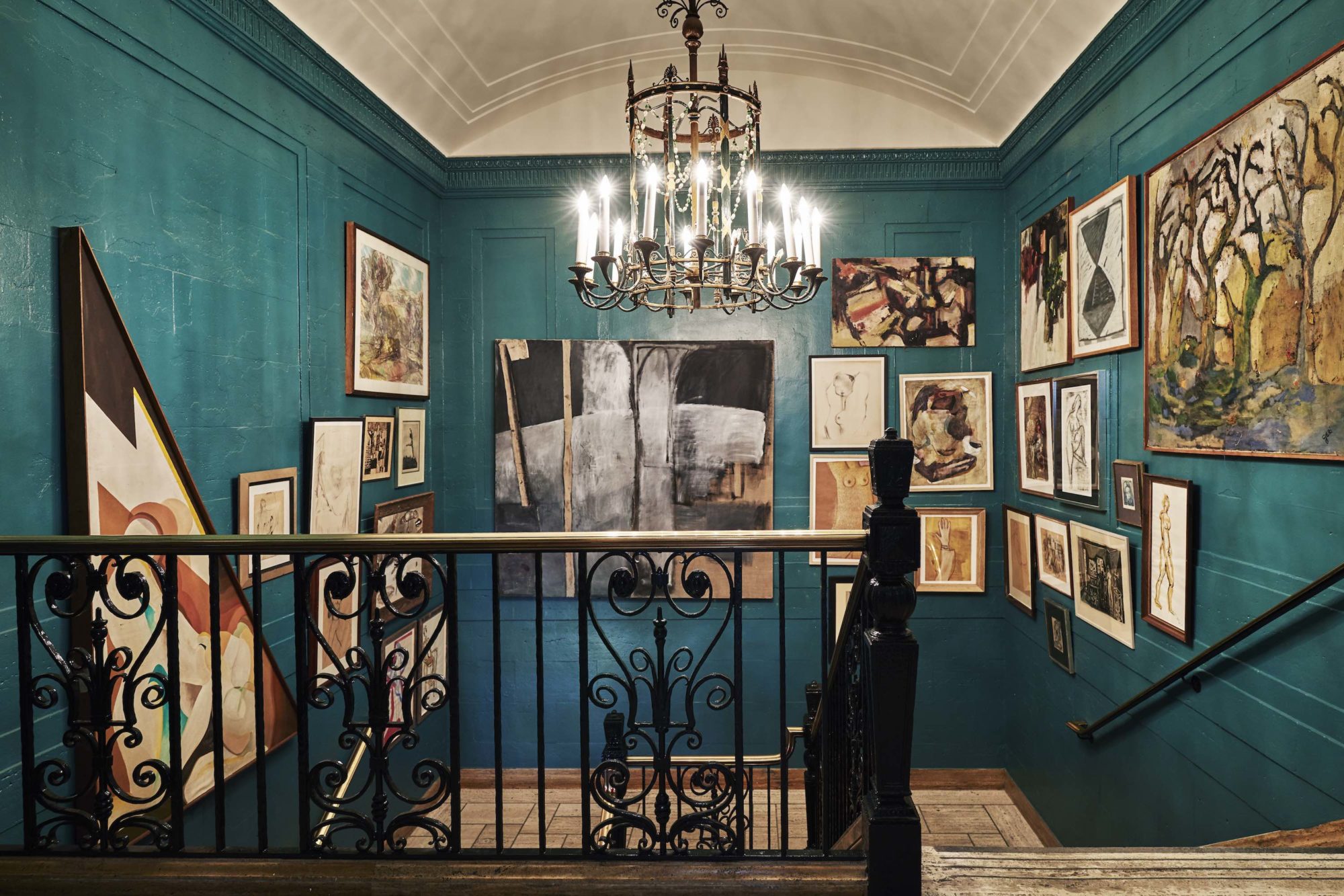
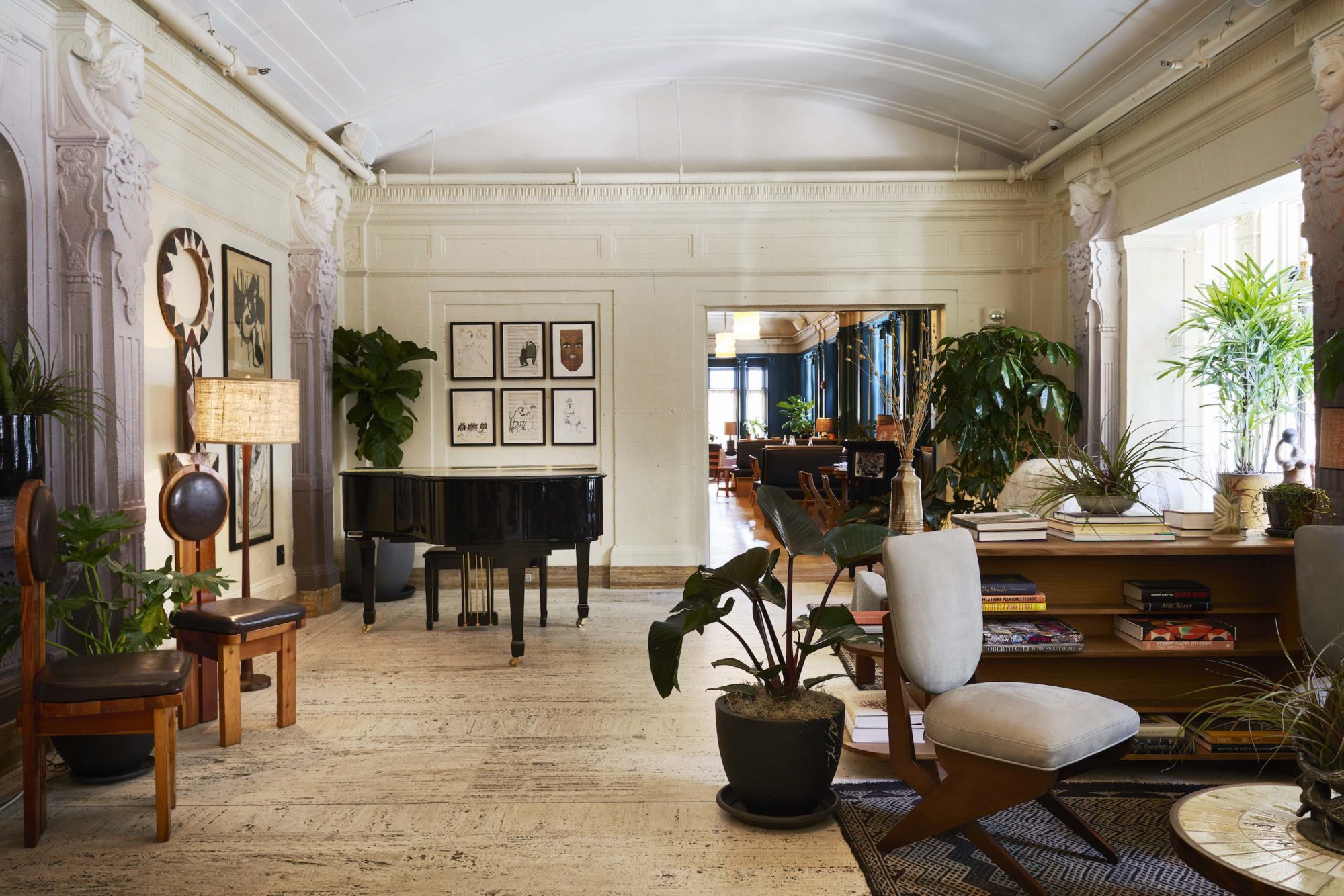
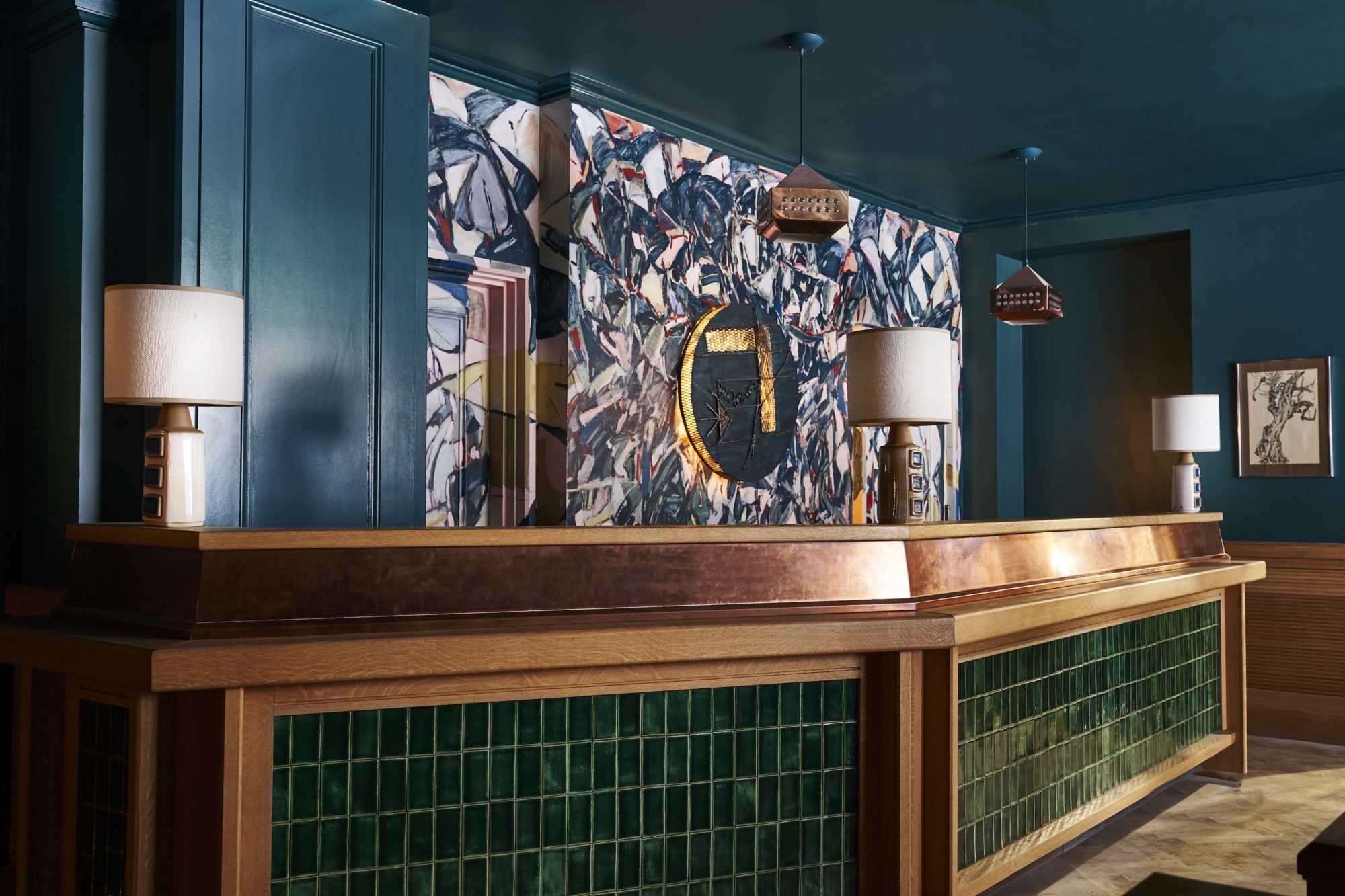
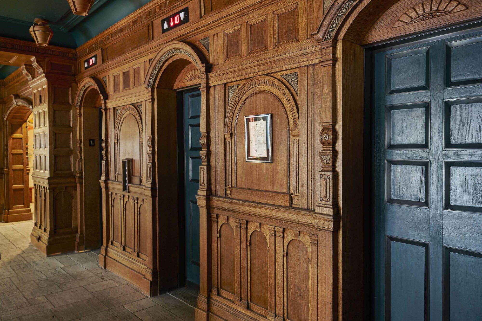
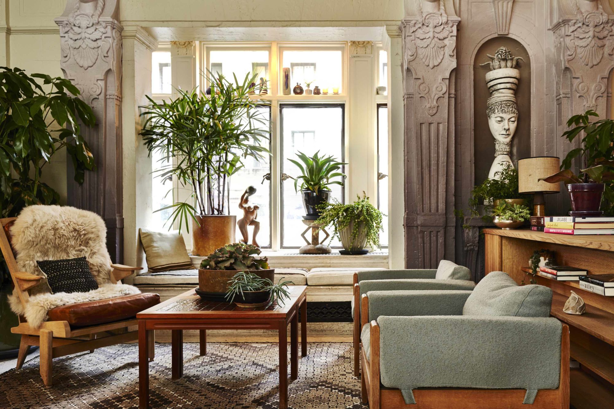
Designed by hospitality gurus Roman and Williams, the fourth outpost of Freehand Hotels is its most captivating yet. Set in the 1928 George Washington Hotel, just two blocks from Madison Square Park, Freehand New York’s 395 rooms cater to group travelers—suites with bunk beds are a great choice—with a local focus but nary a whiff of hostel frugality. Bard College students adorned the walls with murals you won’t find at sedate stays uptown; custom wood furniture falls in line with the original millwork. Our one bone of contention: providing “fresh apples in lieu of a mini bar” is a treacly move, even in the Big Apple. (After all, rule number one of room-sharing states that alcohol is a must.) But that pain point is easily relieved at the Broken Shaker rooftop bar, managed by Miami’s most innovative cocktail duo, Gabriel Orta and Elad Zvi.
FULL-SERVICE RESTAURANT — DOMESTIC
MIAMI
CHAD OPPENHEIM AND HENRY TIMI
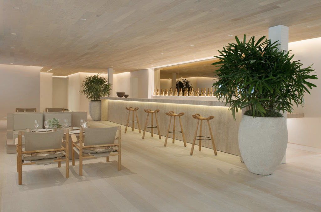
From the outside, the 1938 Mediterranean Revival building is pure Miami Beach, but inside Forte dei Marmi the atmosphere evokes another celebrated coastline. Named for the classic Tuscan beach resort, and with a kitchen helmed by Antonio Mellino (whose Amalfi hot spot Quattro Passi has earned two Michelin stars), the restaurant captures Italy’s effortless yet refined vibe. Credit goes to the thoughtful renovation by Miami architect Chad Oppenheim, pared-back interiors by Milanese designer Henry Timi, and gardens by Enzo Enea. These all incorporate natural materials to evoke the muted palette of ivory, sand, and linen. Mellino’s menu is similarly elemental, focused on local seafood and produce as well as a list of biodynamic and organic wines.
RESTAURANTS — FULL-SERVICE — INTERNATIONAL
LONDON
DIMORE STUDIO
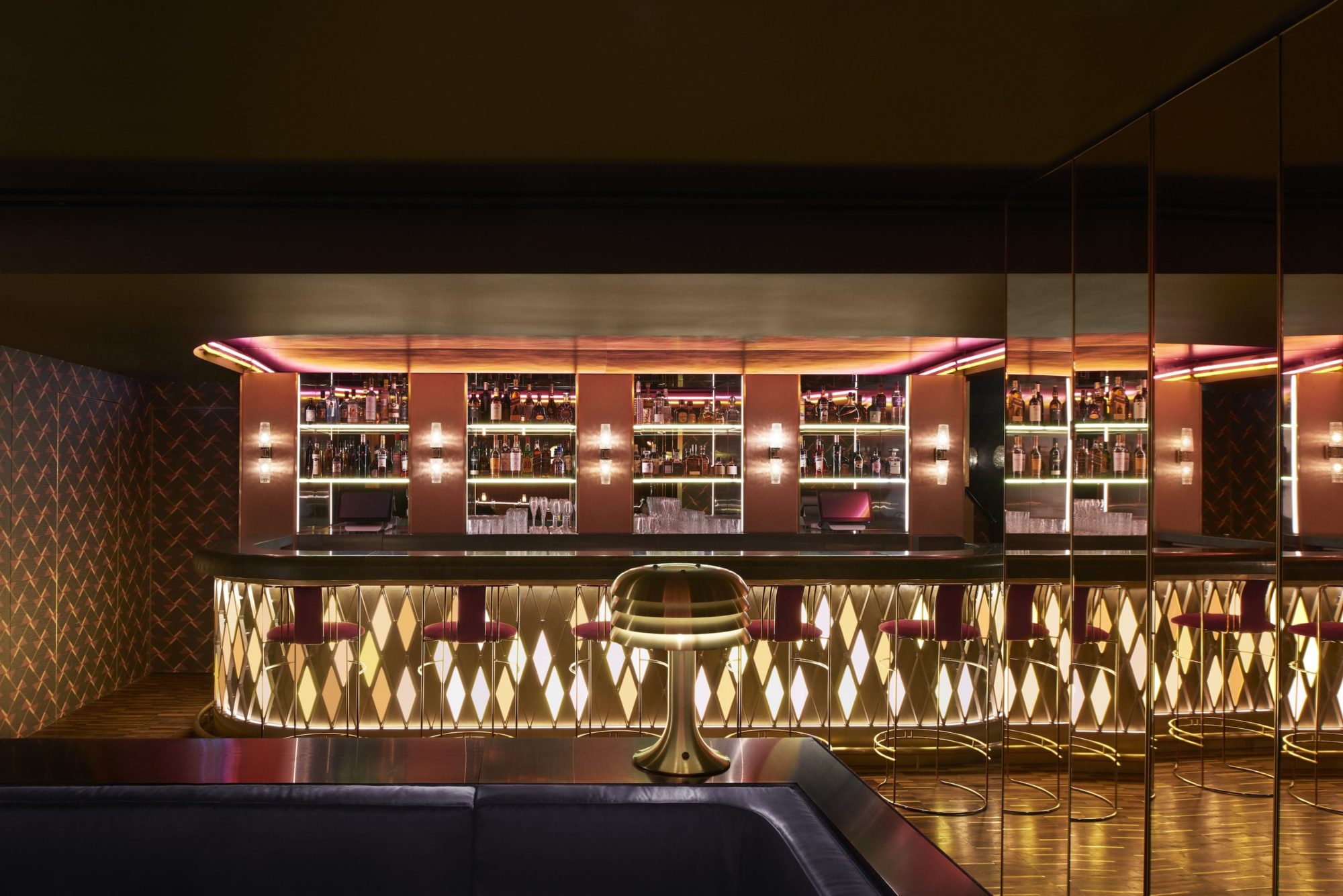
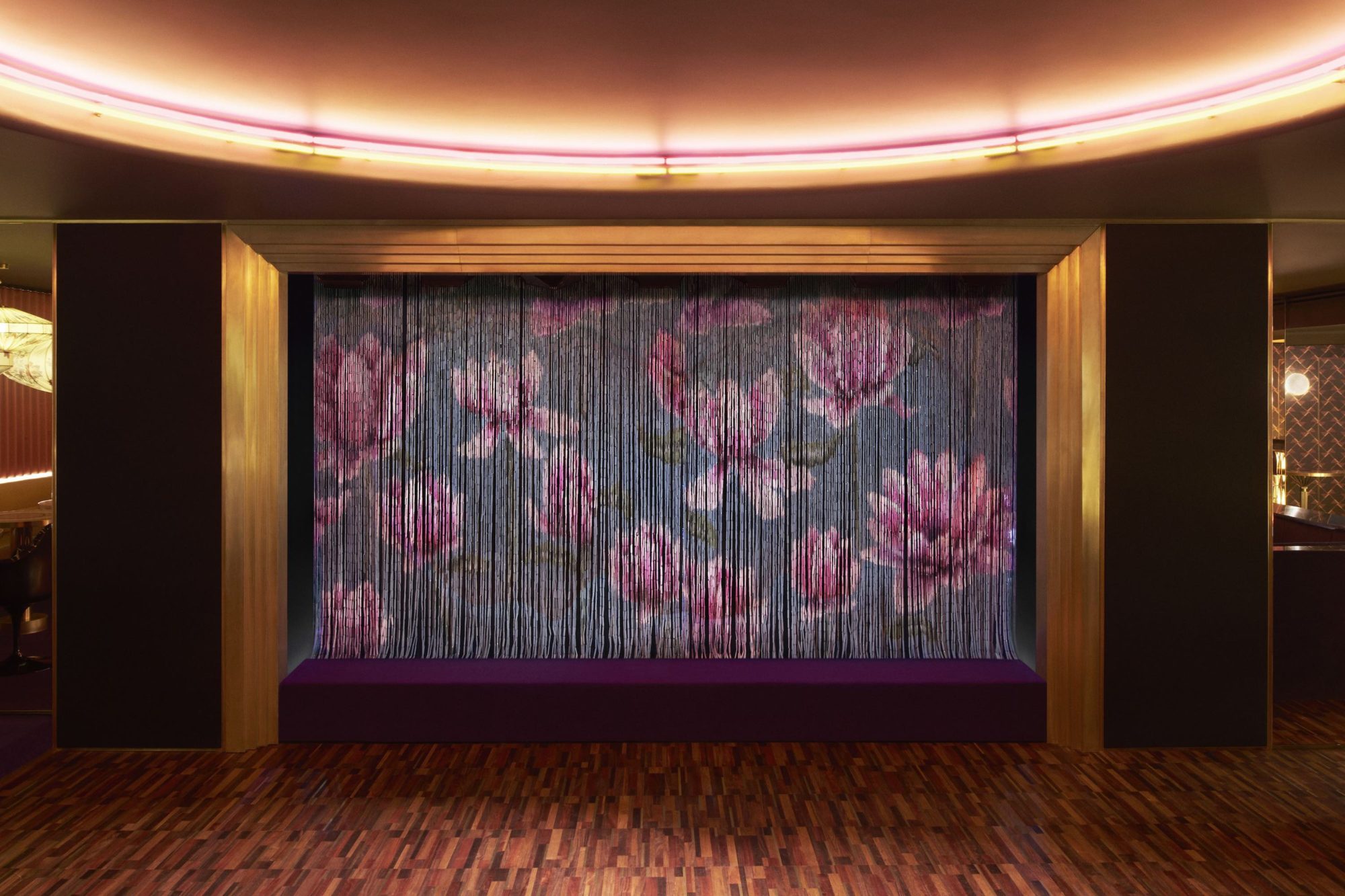
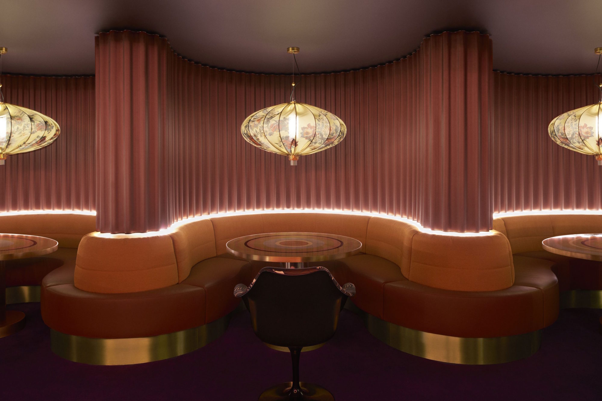
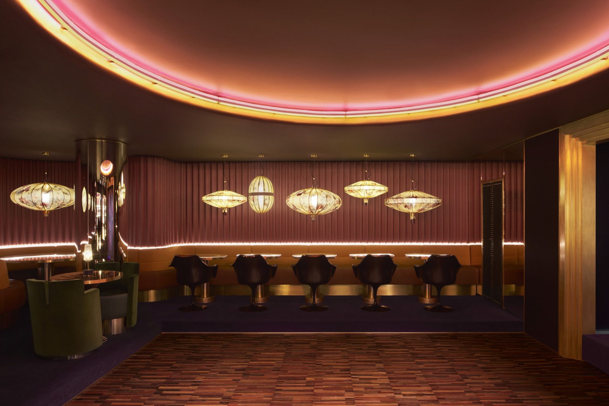
Members-only clubs call to mind stuffy dens with stiff drinks (and stiffer chairs). Not so at Mayfair’s Leo’s Supper Club, in The Arts Club on Dover Street. Designed by Dimore Studio, the subterranean nightclub of the 1863 Georgian townhouse is a saturated hideaway that gibes with the nightlife spots of midcentury Europe, offering green Guatemalan marble and pink mirror finishes, not to mention DJs spinning until 3 a.m. The firm took cues from the Riviera Clubs of the 1960s, as well as the sultry ’60s throwback film In the Mood for Love, directed by Wong Kar-wai, rather than England’s traditional gentlemens’ parlors. It’s not a reboot for the yesteryear British aristocracy—and that’s precisely the point.
RESTAURANTS — LIMITED SERVICE
LOS ANGELES
KELLY WEARSTLER
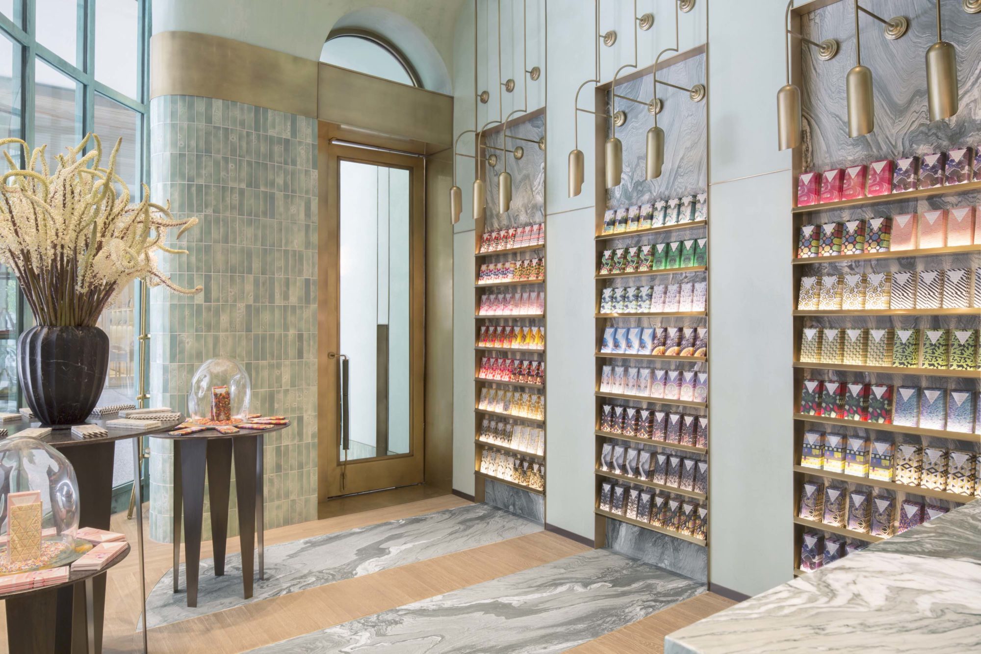
The experience of opening a Compartés chocolate bar can fill the most hardened cynic with childlike wonoder: Pulling back the foil wrapper reveals chocolate studded with marshmallow cereal, birthday-cake sprinkles, or sugar crystals that glisten like glitter. So it’s no surprise that the Kelly Wearstler–designed Los Angeles flagship is a jewel box of a space, paying homage to Old World European confectionaries and stirring up whimsical feels. Venetian plaster walls, copper-and-onyx paneling, and lighting inspired by Wiener Werkstätte are all here. Wearstler even collaborated on a special-edition, gold leaf–coated bar that would send Wonka sprinting through the streets of Century City. In other words, utterly delicious.
BAR
WEST HOLLYWOOD, CALIFORNIA
HOME STUDIOS
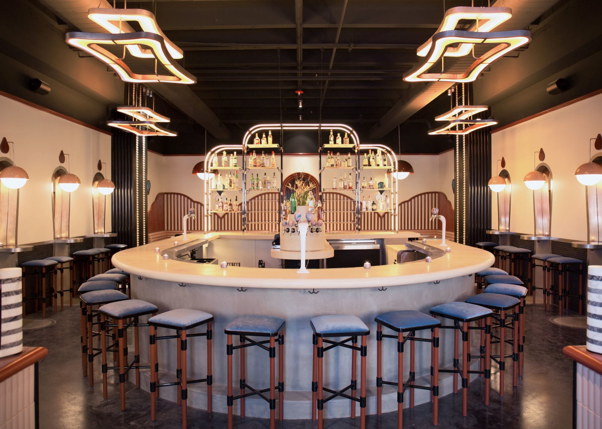
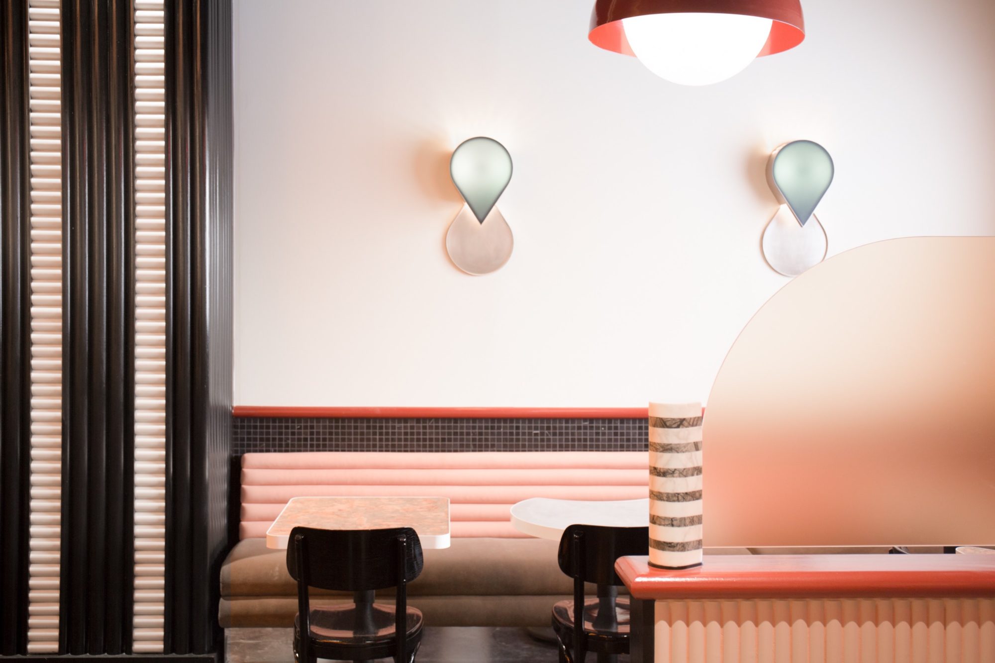
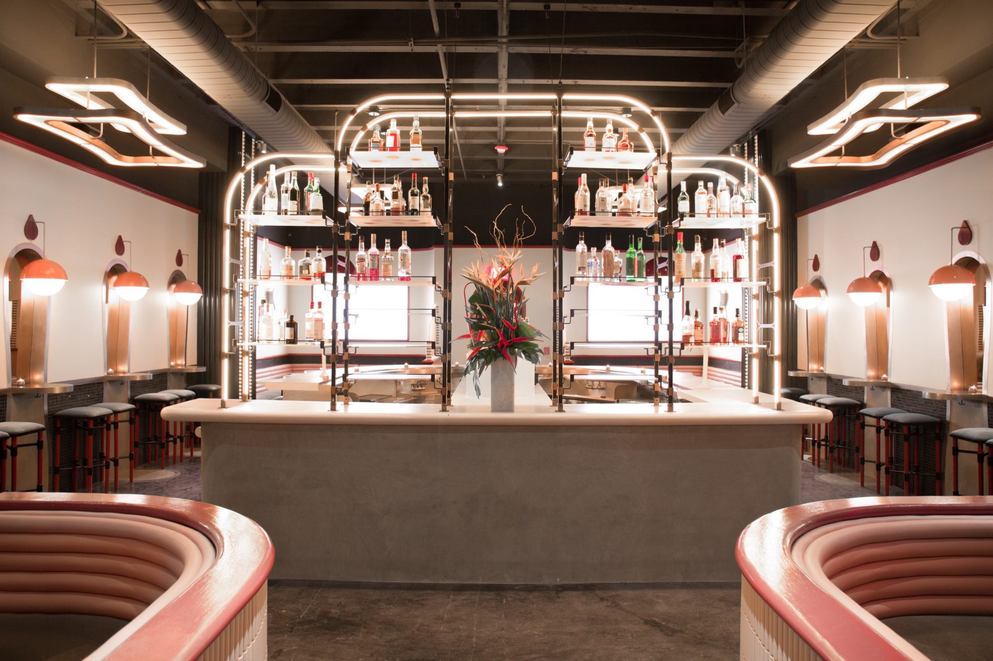
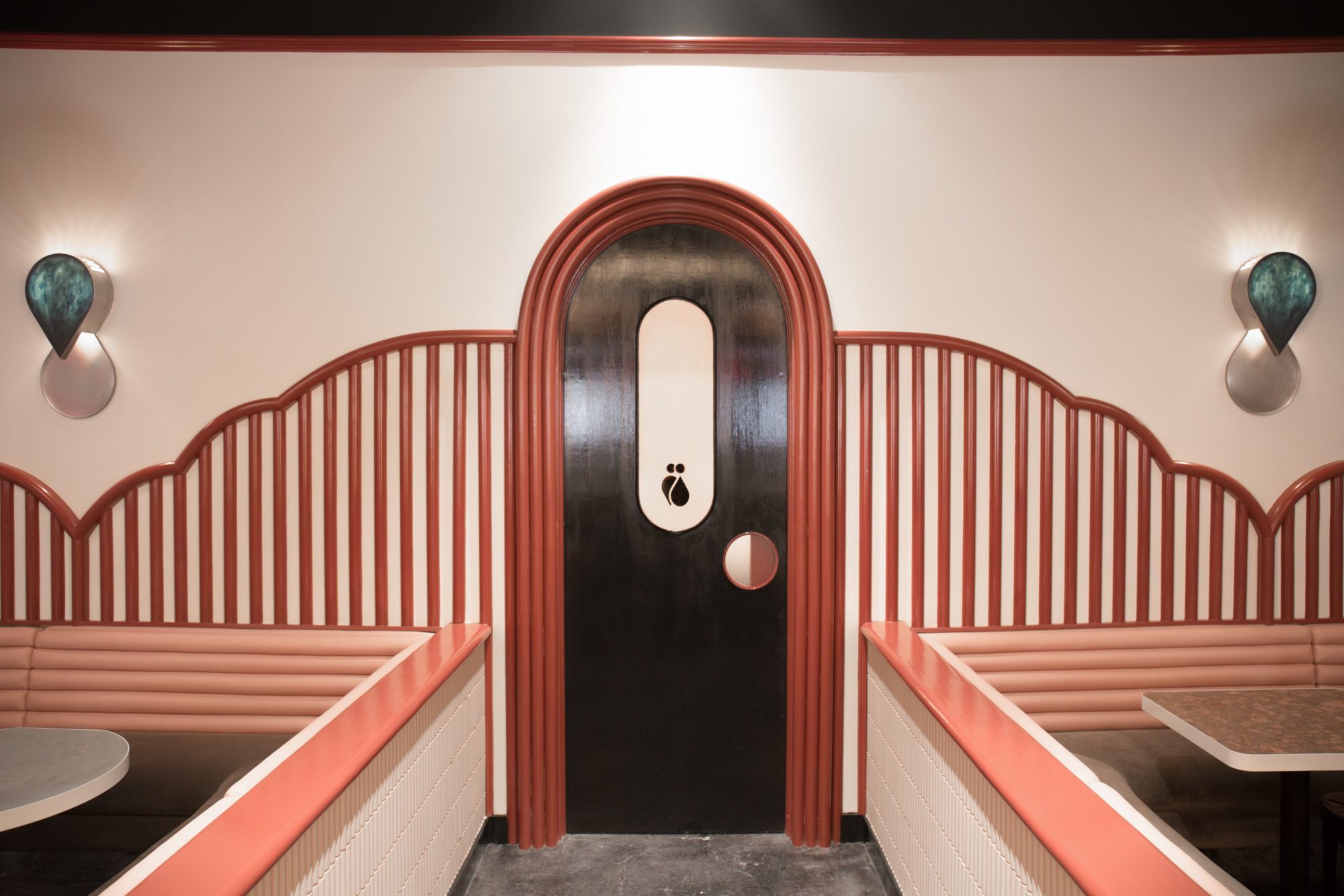
Walking certain stretches of West Hollywood can feel like guest-starring in a scene from Bladerunner 2049, but one step into Bibo instantly teleports you to deco-era Vienna or Paris. Designed by Brooklyn’s Home Studios, all 1,800 square feet of the rose gold–accented bar on Robertson Boulevard are custom: The banquettes were hewn from peach vinyl and taupe velvet, the sconces of steel and resin, the tables with cork. The team behind New York’s Death & Co. conceived the cinema-inspired menu—order the Niemeyer’s Martini, with olive oil–washed Plymouth gin, white cacao, and castelvetrano olives—served to guests perched on coquettish blue bar stools.
RETAIL SPACE
MIUCCIA PRADA
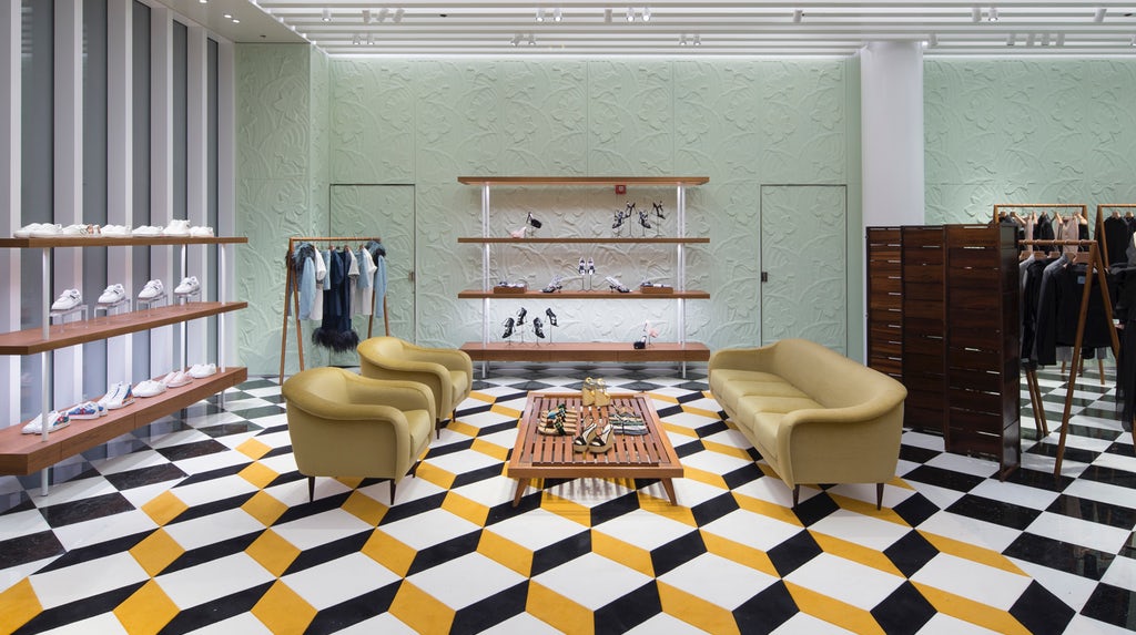
Dutch graphic artist M.C. Escher died, in 1972, but his spirit endures, alighting in the most unexpected places, among them the Prada boutique in Miami’s Design District, where the art deco floor tiles recall one of his 3-D lithographs. Architect Roberto Baciocchi softened those with sherbet hues, and dotted the space with midcentury Brazilian furniture by Carlo Hauner, Jorge Zalszupin, and celebrated interior designer Joaquim Tenreiro, much of it crafted from jacaranda.
SPA
GRINDAVIK, ICELAND
DESIGN GROUP ITALIA AND BASALT ARCHITECTS
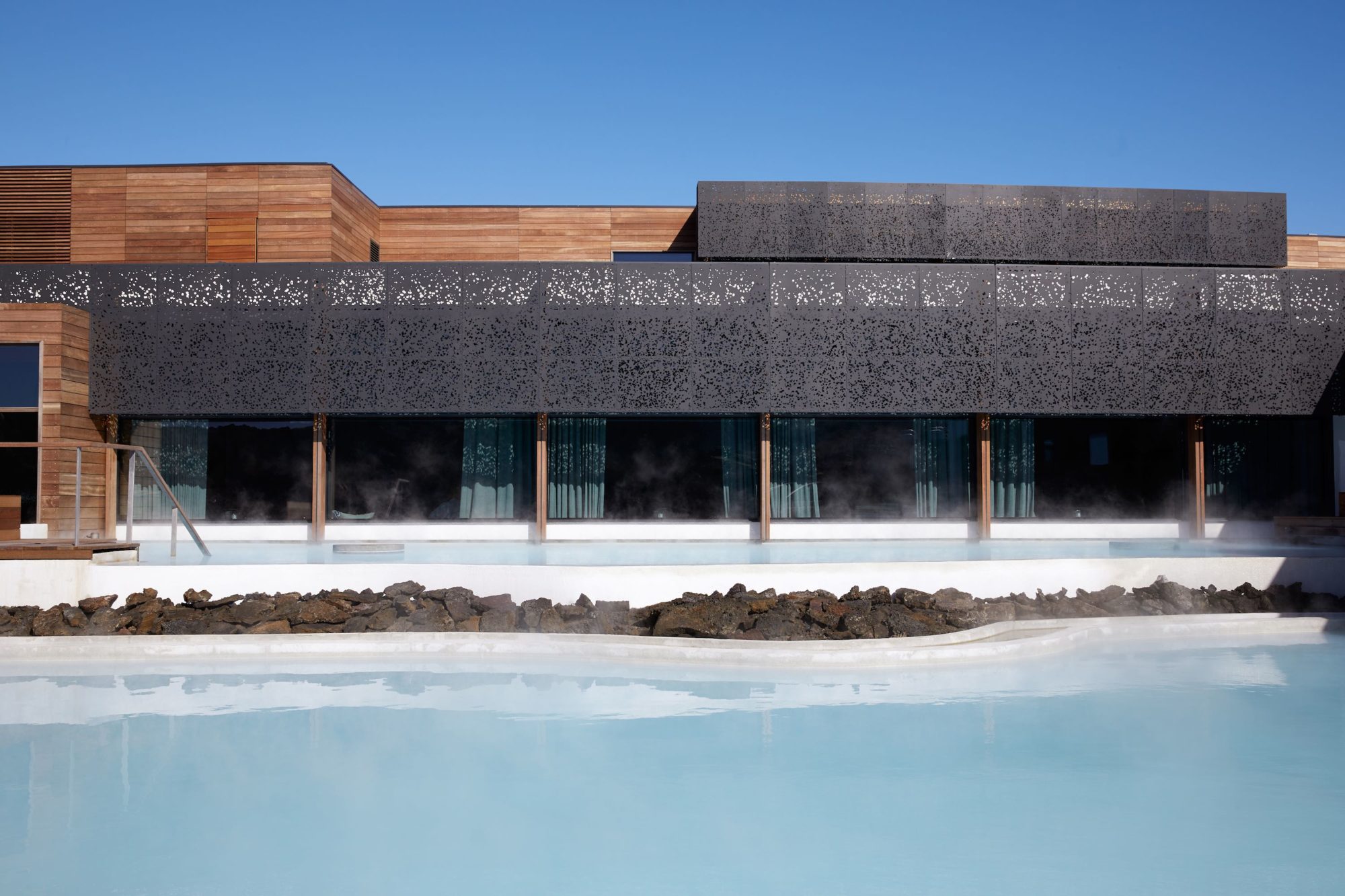
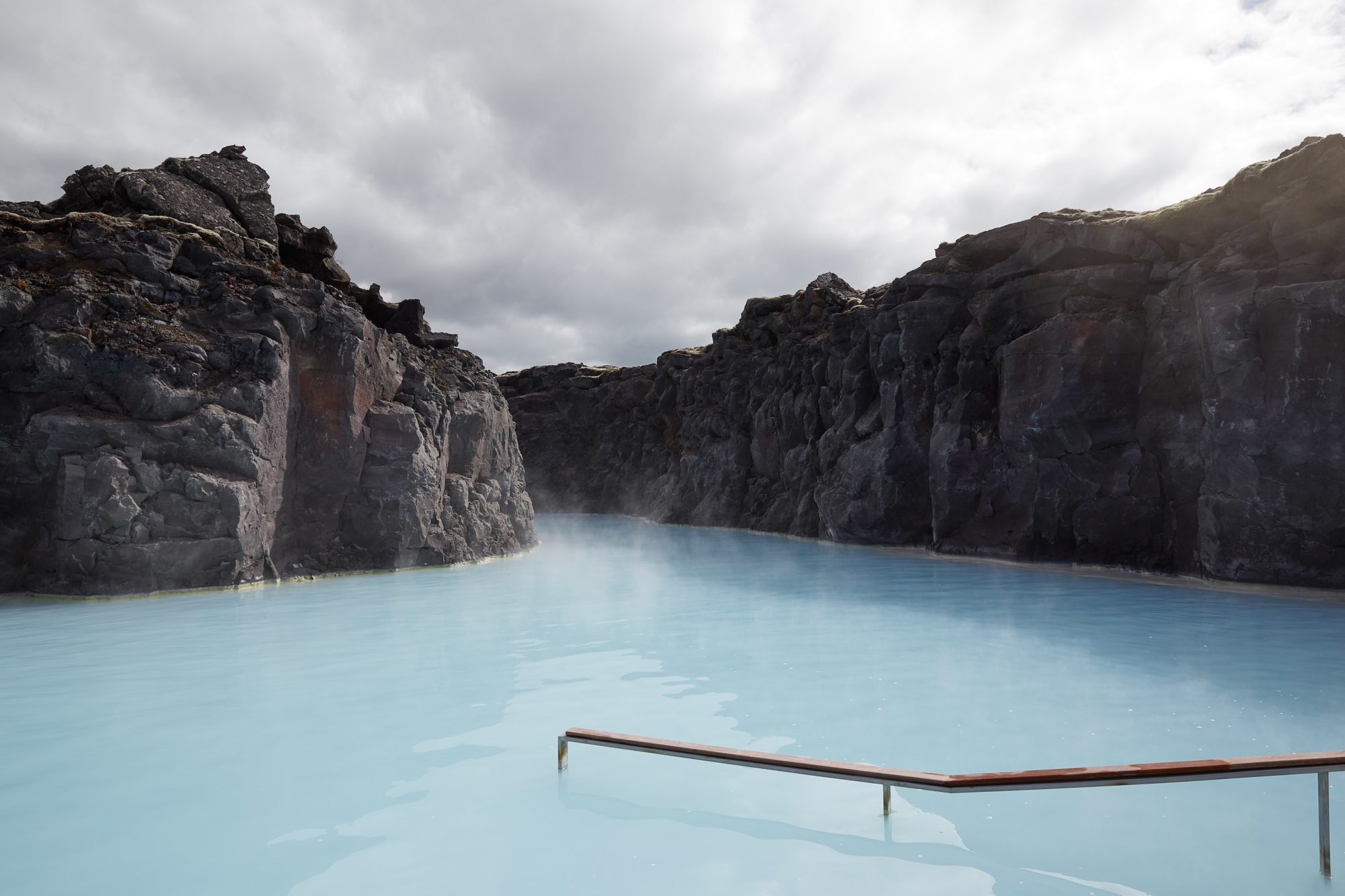
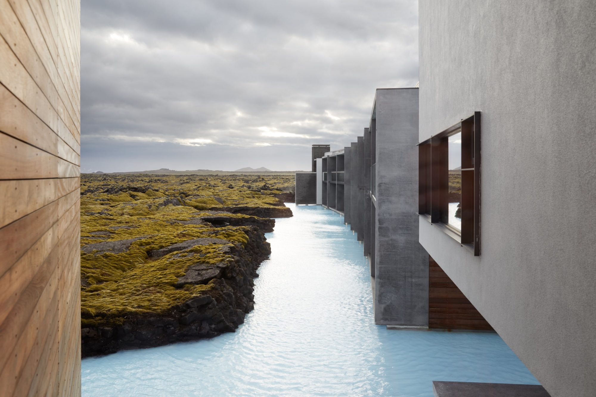
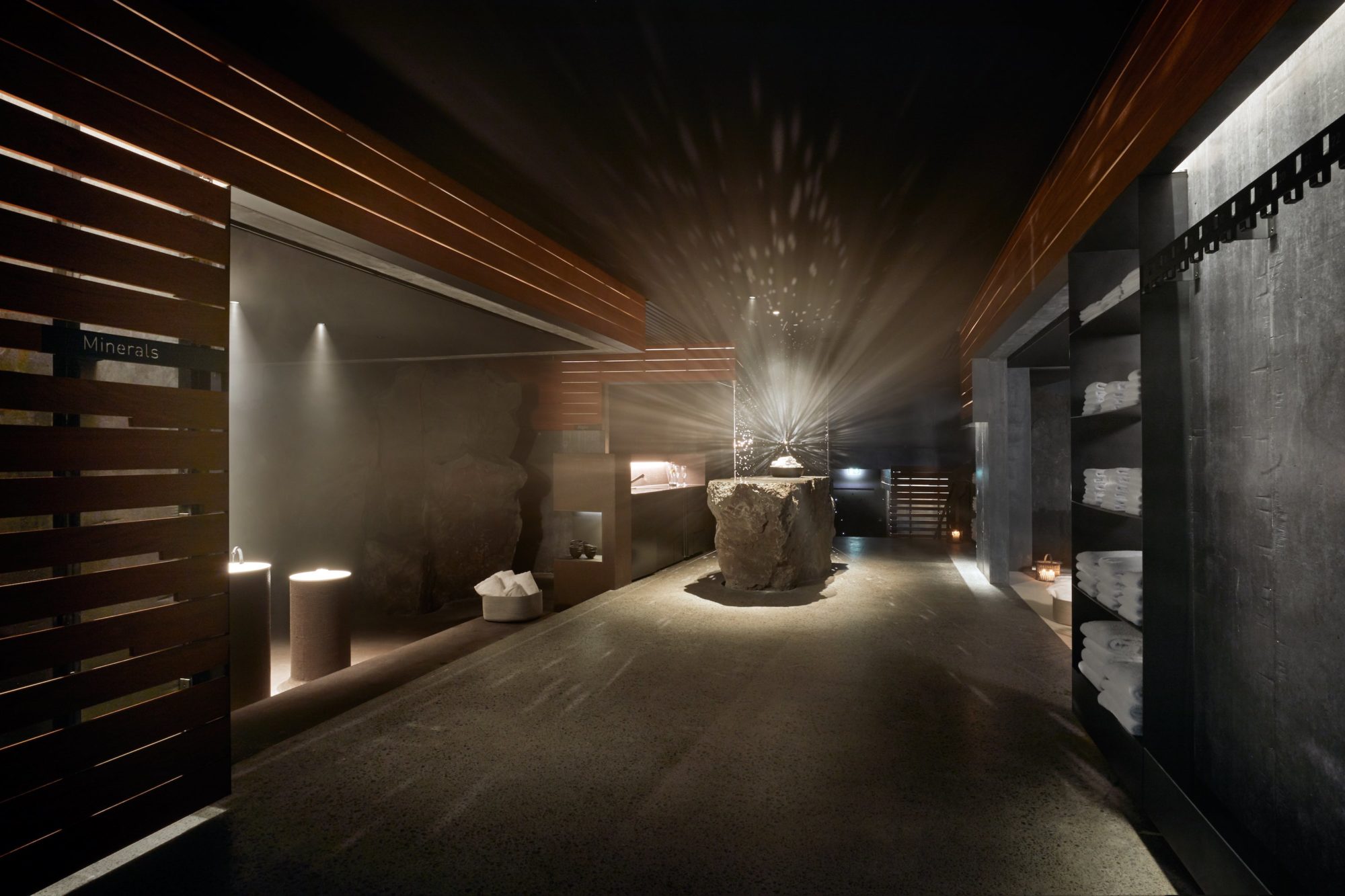
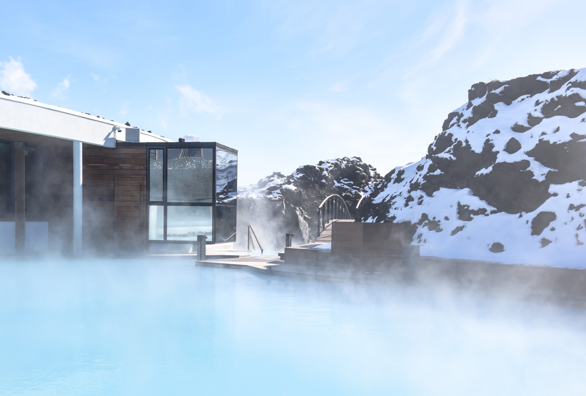
The Blue Lagoon has become the setting for a million selfies, but a new luxury spa and hotel—designed by Iceland’s Basalt Architects and Milan-based Design Group Italia—promises a much more serene experience. Built on 800-year-old lava flows and surrounded by silica-rich, geothermally heated waters, The Retreat’s spare geometries draw inspiration from the environment while taking care not to detract from it. The spa dispenses treatments like underwater massages, and utilizes silica, algae, and minerals from the site, while the 62 rooms employ local wood and stone, the portrait of Scandi-mod cool. Guests also have access to a private area of the lagoon, so they can post to Instagram in peace.
MIXED-USE SPACE
MADRID
PLANTEA ESTUDIO
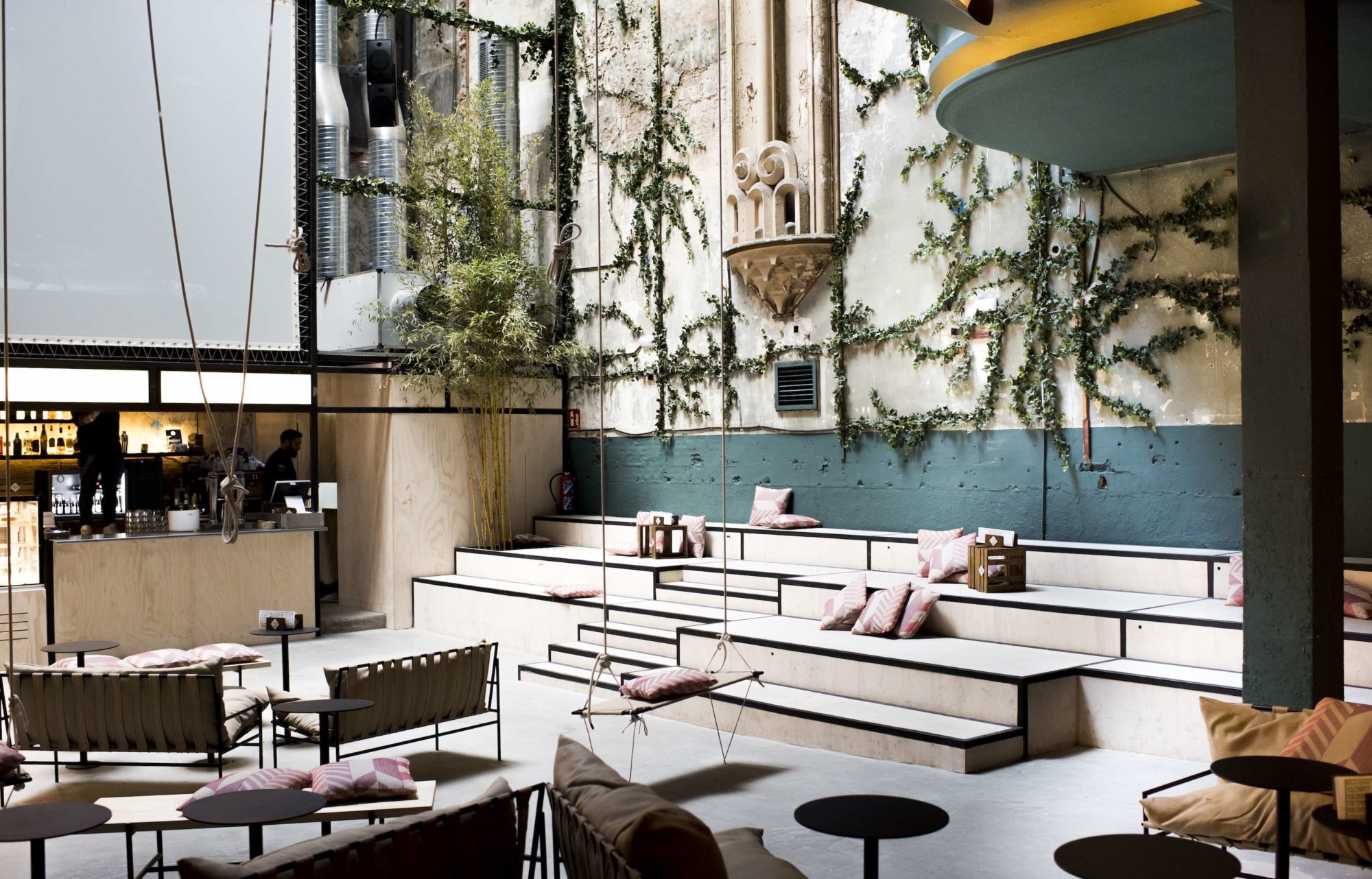
In the 1980s, before it became a hub of Madrid’s flurrying social scene, the building that houses Sala Equis was a porn theater. Fitting, then, that the mixed-use space—which hosts movie screenings and exhibitions and serves pinchos and cocktails at the former concession stand—is now a warren of visual eye candy, albeit of the design variety. Climbing vines appear to shinny up the walls, and neon lights cast the interior in an ambient glow, while a range of seating options, from velvet banquettes to hanging swings, serve as the starting blocks for those Spanish nights that famously conclude only when the sun rises.
CRUISE
YASUSHI HORIBE
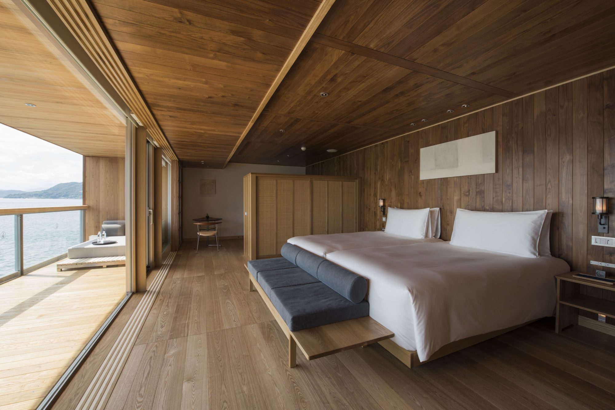
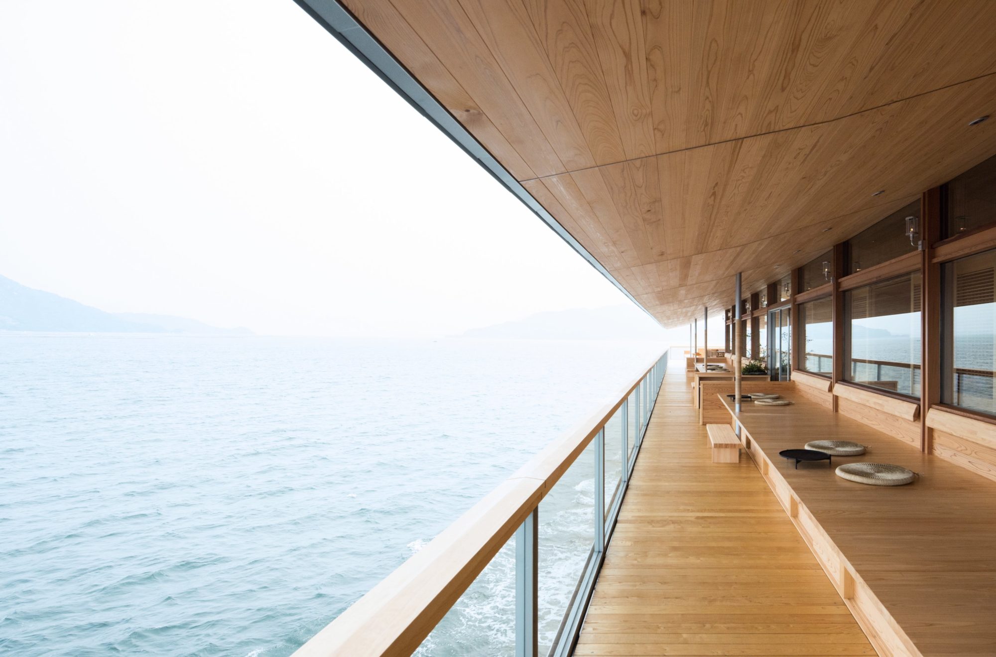
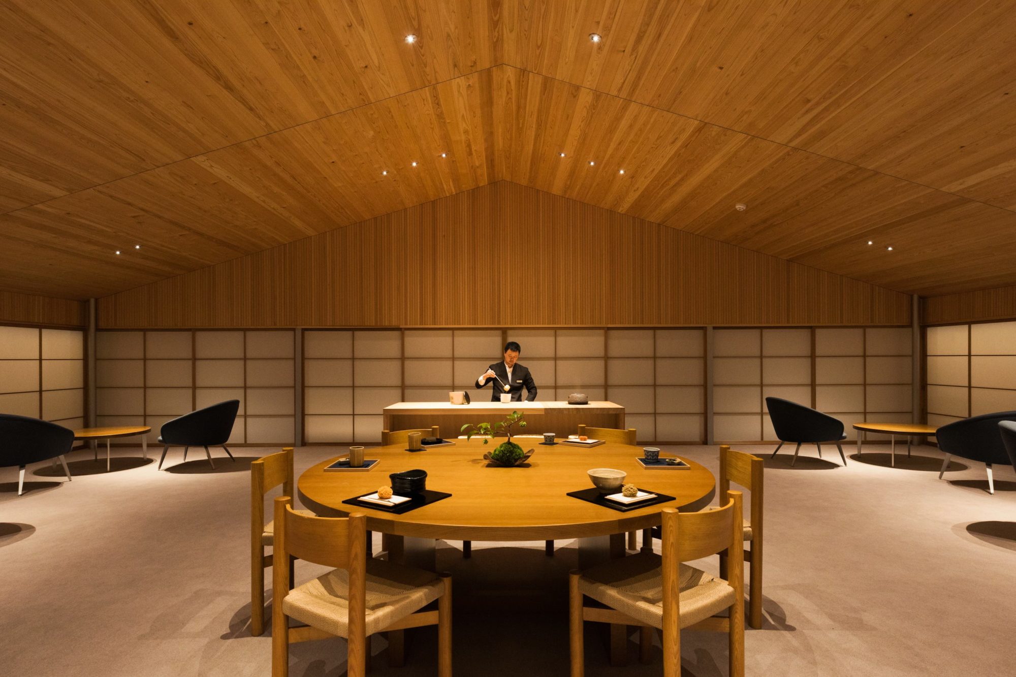
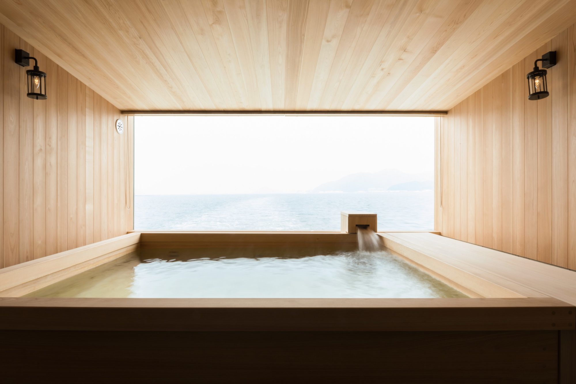
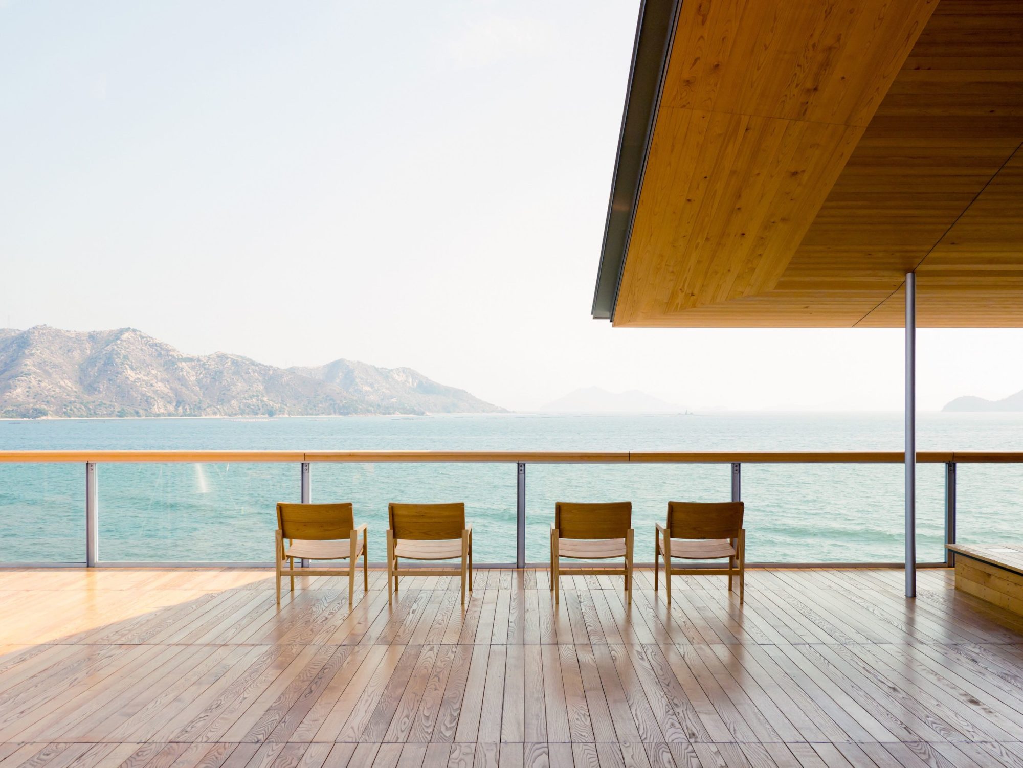
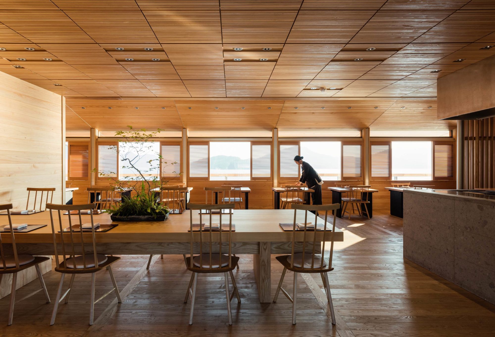
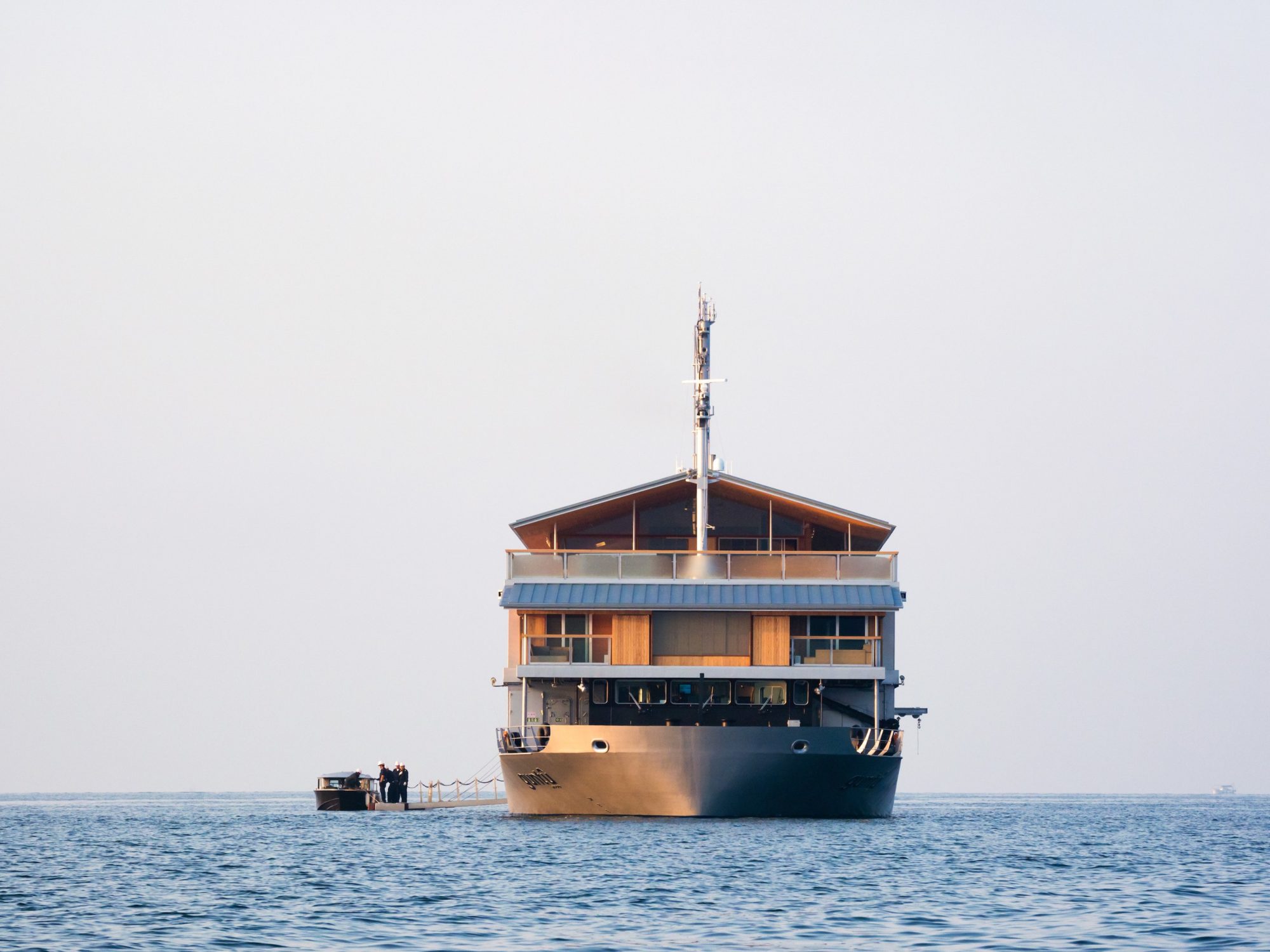
Is it a bamboo barge? A floating ryokan? A tricked-out yacht for modern-day samurai? One thing that Guntû certainly is not: a behemoth ocean liner crammed with thousands of booze-cruisers. Only 38 passengers can live aboard this Zen garden of a vessel, crafted by Japanese architect Yasushi Horibe out of cypress, walnut, and glass. The 19 cabins are envelopes of warm timber, shoji screens, and windows opening onto private terraces, most of them equipped with soaking tubs. Among the onboard facilities are a sushi counter, lounge, spa, communal bath, sauna, and engawas, traditional Japanese porches that provide views of the tranquil Seto Inland Sea. Calm waters, indeed.
CO-WORKING SPACE
LONDON
AVROKO
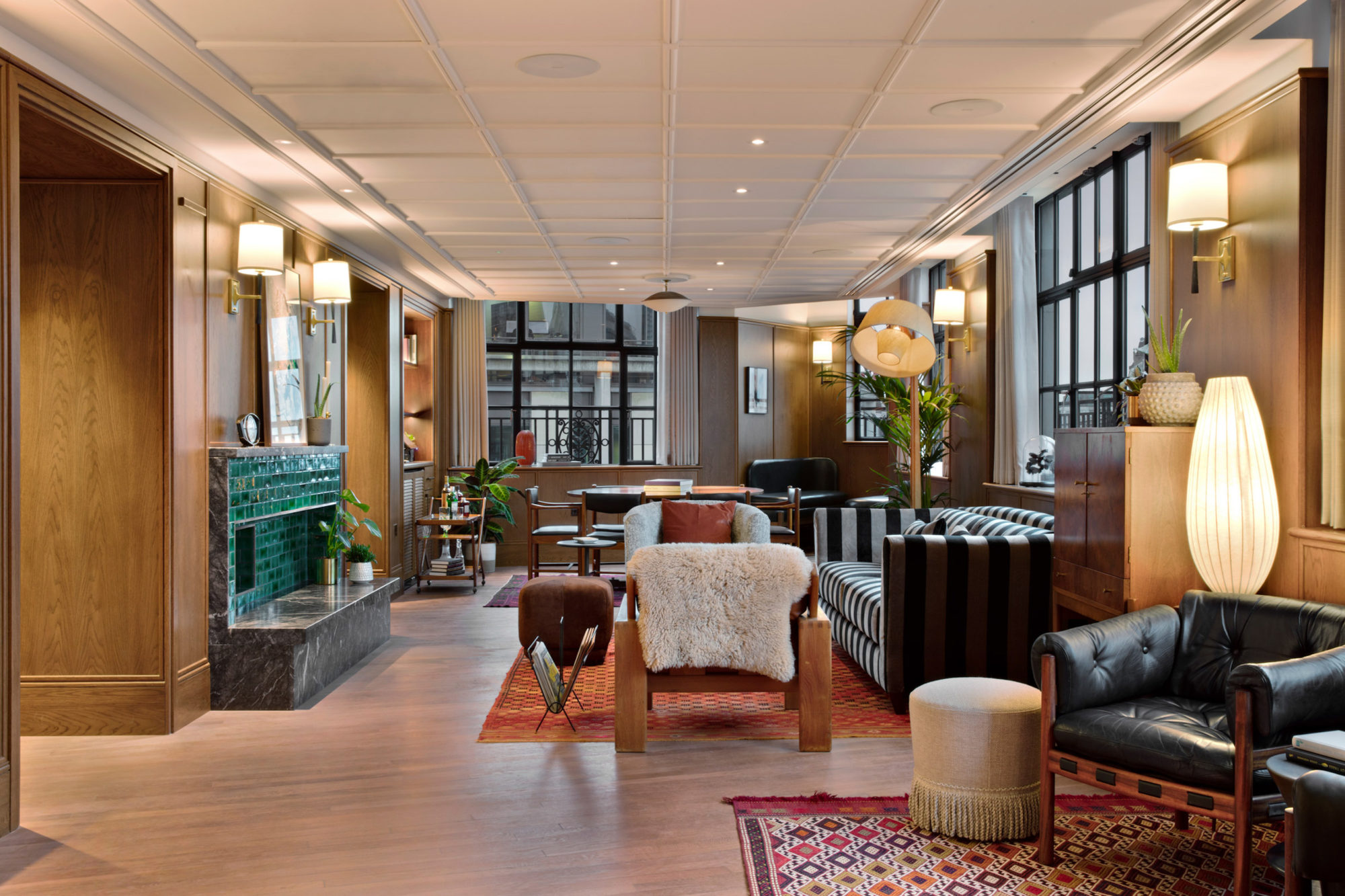
Ersatz co-working spaces can technically get the job done (for proof, see Steve Jobs and his garage). But in the Instagram era, aesthetically conscious ones seem to do it better. London’s six-story Maslow’s Mortimer House, designed by AvroKO, is about as far from the Ping-Pong-and-graffiti offerings of the world as you can get. It retains the 1930s sensibilities of the building it’s housed in—original timbers, terra-cotta ceilings, mosaic tile floors—but is outfitted with velvet AvroKO-designed furniture and antique midcentury European pieces. “The concept is derived from the venue’s eponym, Abraham Maslow, and his psychological theories surrounding human motivation and happiness,” says principal William Harris. We call that nice work, defined.
Please submit your application below, and it will be reviewed by our editorial team. Your card will only be charged if you are approved. Learn more about membership tiers here.
Please submit your information below, and it will be reviewed by our editorial team. Learn more about membership tiers here.
In an interview with 'Surface,' Vallese speaks on carrying that legacy forward, how the whirlwind...
Plus, the CFDA bans furs at New York Fashion Week, and a tragedy at the Seattle Gas Works Park
In the warm glow of the lavish, visually layered private dining room of Major Food Group’s...
Plus, the top honorees of the British Fashion Awards, and Björk's next big debut.
A careful transformation of a medieval fortress into a deluxe retreat in the heart of Tuscany.

Get the Daily Design Dispatch
Essential news from the design world delivered to your inbox before you’ve had your coffee.
Think of it as your cheat sheet for the day in design.